

johne9109
-
Posts
1,580 -
Joined
-
Last visited
-
Days Won
6
Posts posted by johne9109
-
-
Houston Texans
So the Houston Texans have never really changed their uniforms so what I decided to do is use another Houston Texans team as the base; the short lived Houston Texans of the WFL. While they didn't even last an entire season it's something different for the Texans to do rather than a simple color swap of what is essentially still their uniforms. The WFL Texans used green and yellow as their colors so they are swapped with the current Texans colors. I put the WFL Texans logo on the helmet, but it could easily be swapped with the current team logo if legalities were to arise.

-
 3
3
-
-
Green Bay Packers
The Packers throw it back to their undefeated and championship winning season in 1929. The colors get swapped with the teams current colors.
-
1
-
-
Detroit Lions
In 1957 the Lions had these asymmetrical uniforms, as in the dark jersey did not feature striping while the white jersey did. So I took the white jersey and swapped it to a blue jersey to finally make a matching set.
-
2
-
 1
1
-
-
Denver Broncos
It was probably a given that I would go with the throwback uniforms for the Broncos. I went with 1977 specifically as it was arguably their best season outside of their Super Bowl winning seasons. I took the white uniform and flipped the orang and blue and gave them orange pants to spice up the uniform a bit
-
5
-
-
6 hours ago, colinturner95 said:
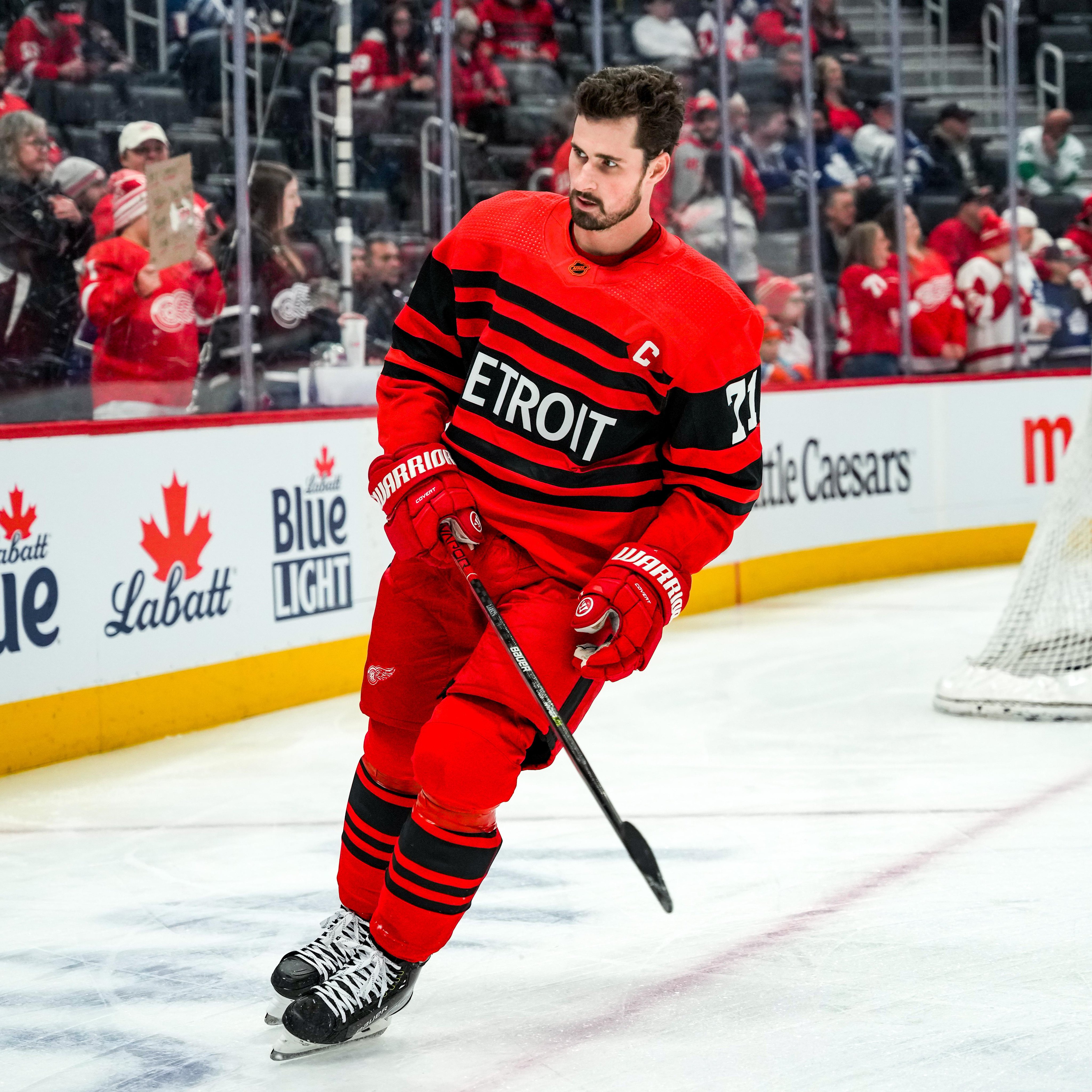
13. Detroit Red Wings
My homerism is about to shine bright like a diamond. I wasn't sold on these at first but after seeing them in action, I think their better than people gave them credit for. If they didn't use black and just went with a straight color swap, easily top-5 or best in show. But since the black is there, more middle of the pack. Even I couldn't justify putting them above most of the Pacific Division uniforms.
- Option #A is the logical choice, just eliminating black and going for a color swap.
- Option #B is the unhinged option, going for an all-black look with red stripes and white numbers
The new option, which isn't that new since it came from my Nike NHL series goes back to the 1928-1929 Cougars uniforms, this time going red with a retro Red Wings logo and the fonts and script from the 2014 Winter Classic uniforms.
C&C appreciated!
Totally agree. When Detroits jersey was revealed I was like eh, but seeing it as a whole kit sells it a lot better. They shold've gone with white over black like you did here. You're 1926 inspired uniform is great!
-
1
-
Dallas Cowboys
I took the 1995 Dallas Cowboys blue jersey and swapped it into an all grey look. I know this style was worn in other years, but with them winning the SB in 95 I decided to go with that year
-
4
-
1
-
-
This is a great look. It feels like it combines all the different eras of Sens uniforms into one new look
-
Your original RI set was better then new one feels overdone.
-
Cleveland Browns
For the Browns I took their 1957 white uniforms and swapped around the orange and brown
-
2
-
-
That green Toronto set looks nice, easy fix
-
1
-
-
I LOVE that Rhode Island set. I want it now!
-
I think the only reason the Leafs haven't done a green uni like that is there will be idots that say "HaHa It LoOkS lIkE a PoT lEaF" the blue uni looks great
-
1
-
-
Cincinnati Bengals
For the Bengals I went with their 1975 uniforms as I felt it was the most unique and different form what they're worn in recent decades. This time around we get an orange jersey to go with their orange helmet
-
2
-
1
-
-
Chicago Bears
By a point in the Bears history all their uniforms were essentially what we see today so I went all they way back 1921 when they wre still called the Satyleys. I chose this year over others as they won the APFA championship. The jersey is of course swapped with the Bears colors
-
4
-
1
-
-
Carolina Panthers
So I did something interesting for the Panthers. Most of their previous uniforms really aren't far off from what they currently wearand really the only color swap is using their silver as the main color and I don't think anyone really wants that. So I decided to instead base their uniform on the 1975 Charlotte Hornets of the WFL. The colors are of course swapped to the Panthers colors and the logo replaced with the Panthers logo
-
5
-
-
I would love this as an alternate for the Rangers. They need a jersey that actually has their logo on their front and the design is still very classic and timeless. Fantastic
-
1
-
-
Buffalo Bills
For the Bills I went with their 1964 uniforms as they were the AFL champions that year. I swapped the main jersey color to red and then swapped the colors on the helmet to blue. I know I could've kept the helmet red but it felt more balanced also reverseing the helmet colors.
-
5
-
1
-
-
Sorry I was sick for a few days, but here's the next team
Baltimore Ravens
For the Ravens I went with 1997. Not for any particular reason other than they've essentially had the same uniforms since the redesigned them in 1999. I guess I could've gone 96 for their inagural year, but none the less....
-
4
-
1
-
-
Love the color connection to the Cavs. I'm a sucker for that kind of stuff
-
1
-
-
Atlanta Falcons
The Falcons get a red uniform based on their 1998 season where they went to the superbowl.
-
4
-
3
-
-
For the Arizona Cardinals I went back to 1925-1926 when they were still in Chicago. This may not be the actual first choice the Cardinals would go with, but it's arguably their best season so it's what I chose
-
5
-
1
-
-
Decided to take a stab at a series of Reverse Retro uniforms for the NFL. I love the NHL's Reverse Retro program and have done the NBA so I figured why not do the NFL
- Arizona Cardinals
- Atlanta Falcons
- Baltimore Ravens
- Buffalo Bills
- Carolina Panthers
- Chicago Bears
- Cincinnati Bengals
- Cleveland Browns
- Dallas Cowboys
- Denver Broncos
- Detroit Lions
- Green Bay Packers
- Houston Texans
- Indianapolis Colts
- Jacksonville Jaguars
- Kansas City Chiefs
- Las Vegas Raiders
- Los Angeles Chargers
- Los Angeles Rams
- Miami Dolphins
- Minnesota Vikings
- New England Patriots
- New Orleans Saints
- New York Giants
- New York Jets
- Philadelphia Eagles
- Pittsburgh Steelers
- San Francisco 49ers
- Seattle Seahawks
- Tampa Bay Buccaneers
- Tennessee Titans
- Washington Commanders
-
As a huge Outkast fan I LOVE this. After Bleacher Report did those crossover jerseys, I don't know why the Hawks didn't attempt something like this. Great job
-
Yes get me a Maine hat with the lobster claws asap


More Reverse Retro Concepts: 11. St Louis Blues
in Concepts
Posted
I prefer A or B