

johne9109
-
Posts
1,586 -
Joined
-
Last visited
-
Days Won
6
Posts posted by johne9109
-
-
22 hours ago, eegl75 said:
because washington fans might not like the name because of the philadelphia eagles and eagles fans might not like that washington is using their team's name. washington would probably already have a team called the eagles, but they dont and that could be a reason, its really not a big deal though.
IDK cross sport like that I don't think it carries as much. Like if there was a new team in south Florida it wouldn't bother me if they were named the Lightning.
-
 1
1
-
-
2 hours ago, DTConcepts said:
Maybe one day I'll revisit the Wild's jersey and do a flat mockup for it. But for now, I'm marching on over to the Eastern Conference for the next theoretical matchup. These two teams have one of the fiercest rivalries in the modern NHL, two of the most spirited fanbases in hockey, and some of the biggest stars in the league. Giving them an outdoor game seems like a no-brainer.

Like the Avs and Wild jerseys, I tried to employ the same design philosophy behind both of these uniforms. They're both two-color throwbacks to the '90s with modern flourishes — like if the Reverse Retro program extended to the Stadium Series. The Islanders' uniform draw heavily from their old 1990s "wave" jerseys, but bring the design into the modern-age with a more subtle striping pattern and color scheme. The Penguins' uniform does much of the same, taking cues from the team's first Robopen jersey and their Vegas gold uniform.
It's also a color vs. color matchup, because frankly the NHL needs more of those.
How are we feeling about these?
Islanders is about what you would expect from them. I dont know what it is, but there's just something about their branding that does not work for me. It's done very well though. The Pens is great. I would just say maybe add a black stroke around the main logo. The white gets kinda lost in the yellow. The wordmark on the shorts is standout. Is there a particular inspiration for that?
-
Now that I see it I gotta say blue pants are the way to go
-
1
-
-
I agree it'd be interesting to see the Avs uni with red pants
-
1
-
-
New York Yankees
-
1
-
-
Oakland Athletics
-
1
-
-
Minnesota Twins
-
1
-
-
-
Detroit Tigers
-
2
-
-
Cleveland Guardians
-
3
-
-
34 minutes ago, eegl75 said:
so many designers try the logo striping pattern, and not many succeed, but this works really well. every flyers jersey has had a variation of the same design, so this is very refreshing, especially considering the team desperately needs changes at all levels, so a new look could go well with that. im glad you didnt use the liberty bell or just throw in a quakers jersey with a "flyers" text like most people who try to redo the flyers. overall solid set right here. new, but not too out there for a team who likes to stick to what they know.
I hate when people do the Liberty Bell for the Flyers. Unless it's a city uniform it does not fit the Flyers branding at all
-
Kansas City Royals
-
5
-
-
-
Houston Astros
-
2
-
-
Chicago White Sox
-
5
-
-
Great job! I think this shows that Colorado just needs to employ a full time alternate in the Colorado Roc-*ahem* excuse me state flag colors. (that's not a dig at you it's a dig at the Avs not being able to refer to their RR as a call back to the Rockies because the Devils)
-
1
-
-
1 hour ago, Liladam26 said:
-The Orioles concept is good, but I would lean more into black than white. They're a franchise that uses both team colors well, and often. Overall very well done though.
-I'm loving the Sox set! Nothing against the classic "B" logo but the sock logo is better in my opinion. I absolutely could see these unis on the field.
I went with a white helmet with striping because of their use of a multi colored panel hat. If I were do a color rush type uniform then Id probaly go full on orange and black. The B works for baseball but as a football uniform the Sox workmuch better on a helmet. Thanks for your words
-
Boston Red Sox
-
3
-
-
53 minutes ago, edjb93 said:
This Orioles concept is something that the BC Lions should adopt as their new look: really classy and timeless, but still with a little touch of modernization.
I could see that working
-
Baltimore Orioles
-
3
-
-
To Follow up from my NHL X NBA series and my NBA X NBA series I am now doing a series of MLB teams as NFL uniforms. Unlike the other two series I will be doing 2 uniforms per team as Baseball uniforms as kind boring justbeing white and grey (for the most part) so I did a white uniforma and a colored uniform (usually based on an alternate) per team. Love to hear comments and critiques!
- Arizona Diamondbacks
- Atlanta Braves
- Baltimore Orioles
- Boston Red Sox
- Chicago White Sox
- Chicago Cubs
- Cincinnati Reds
- Cleveland Guardians
- Colorado Rockies
- Detroit Tigers
- Houston Astros
- Kansas City Royals
- Los Angeles Angels
- Los Angeles Dodgers V 2.0
- Miami Marlins
- Milwaukee Brewers
- Minnesota Twins
- New York Yankees
- New York Mets
- Oakland Athletics
- Philadelphia Phillies
- Pittsburgh Pirates
- San Diego Padres
- San Francisco Giants
- Seattle Mariners
- St. Louis Cardinals
- Tampa Bay Rays
- Texas Rangers
- Toronto Blue Jays Ver 2.0
- Washington Nationals
-
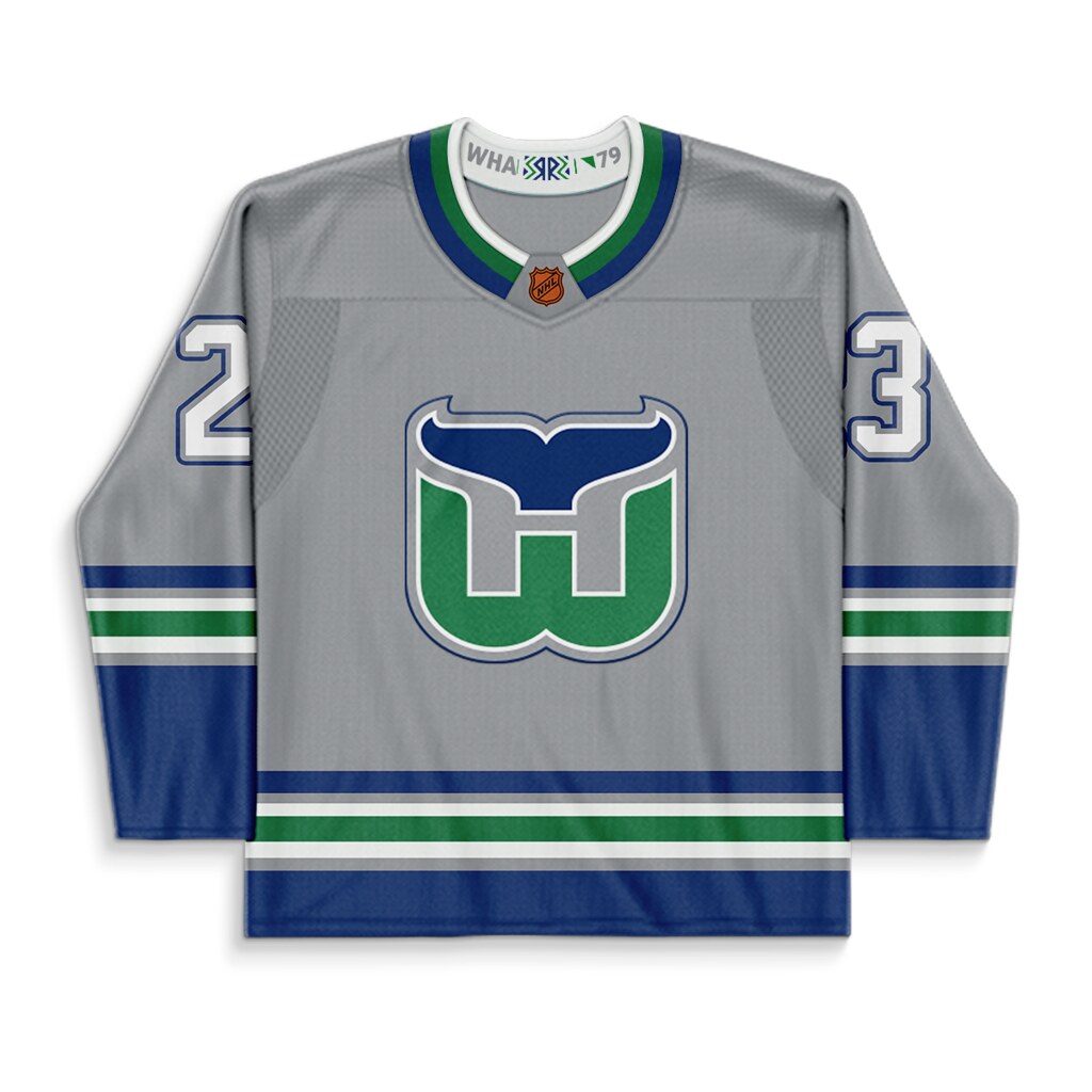
Final entry is the Whalers redesigned uniform (which never should've happened) this time it is swapped from blue back to green and then also to the tertiary silver. I could've also taken this design and swapped it to the WHA and original shades of green and blue but they didn't work well with the silver so I just kept it with the colors that were originally apart of that uniform
-
3
-
 1
1
-
-
6 hours ago, pHiL Kizer said:
Being from Connecticut, thank you...
You're Welcome; but wait there's more!
This is the one that would make the most sense IMO. A literal reverse of the Whalers NHL jersey. I see quite a few people swap the Whalers into a blue jersey and it just doesn't work for me, but I think if the Whalers were still aorund this would've been their 1st Reverse Retro.
-
3
-
-
Now we get the Hartford Whalers look. This time colored with the New England Whalers colors of green and yellow. Can't say I like it more than the green and blue, but it'd be cool for a small run
-
2
-


2024 Stadium Series by DT Concepts — Set Four ARI vs. LAK 3/14
in Concepts
Posted
I really like the white stripes witht the orange underneath. Makes the all white logos fit in more. I would still stick witht he blue pants however