

johne9109
-
Posts
1,586 -
Joined
-
Last visited
-
Days Won
6
Posts posted by johne9109
-
-
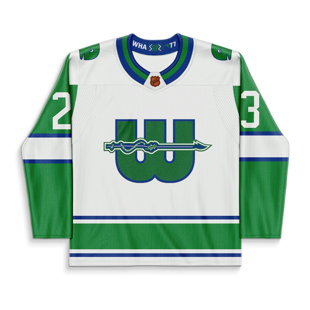
Next up is the later era uniforms for the New England Whalers; specifically 1977 as that was when the Howes signed with the team. Again I swapped the darker green and yellow for their NHL era green and blue

-
 1
1
-
 1
1
-
-
I am thinking of coming back around to it to do away versions, alternates, RR, and throwbacks. This will be a continuous thing
-
1
-
-
I like the more subtle use of the tequila sunrise staged gradient.
-
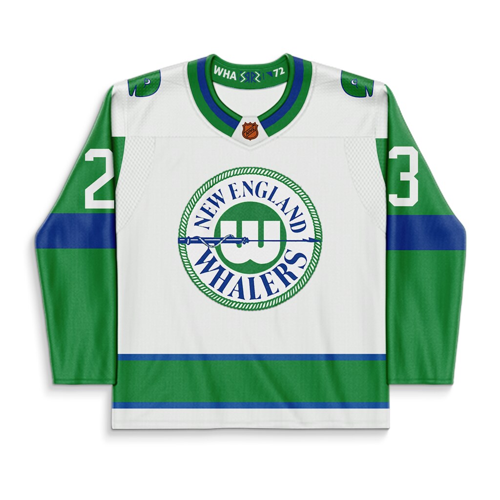
So I recently got inspired to do a series of what if series of Reverse Retro jerseys if the Hartford Whalers were still around today. I guess they technically be done by the Carolina Hurricanes if the program were to continue, but it seems like they're moving away from their Whalers experiment for the most part. Anyway moving onto the first design.
For the first two designs I based them of of the Inaugural WHA uniforms of the New England Whalers. The team wore these when they won the Avco Cup and are a very different and unique look from their NHL days. I reversed the uniforms by using the teams NHL colors of green and blue.
-
2
-
-
We have reached the end of the road with the Winnipeg Jets
-
2
-
-
Washington Capitals
-
1
-
-
20 hours ago, TheMilkman said:
Now for one that might get people talking! The Tampa Bay Rays!
Tried to do something brand new with the team. Using colors from their original gradient logos and their fauxback logos, I created a whole new identity, not to mention one that stands out in the league. Thoughts?
This has the potential to be a great set. I like the logos and wordmarks as they feels very Florida (especially Tampa area) What doesn't work for me are the colors. For a team called the Rays I feel like they should have lighter and brighter colors. The green could probably stay as a tertiary color but not as a main color. Maybe try using a lighter blue as the main color with the green and yellow as secondary and tertiary colors.
-
1
-
-
Vegas Golden Knights
-
Vancouver Canucks
-
Toronto Maple Leafs
-
1 hour ago, TheMilkman said:
Still in the AL as just last night I finished up the DETROIT TIGERS!
* Added orange as a true secondary that shows up on each uniform and logo
* Logo drop shadow adds the pop of orange without altering a classic “untouchable” uniform
* New hat options
* Alternate top can be worn with home white and road grey pants
I'll never understand why the Tigers don't just add orange as a full secondary color like this
-
Tampa Bay Lightning
-
St. Louis Blues
-
Seattle Kraken
-
1
-
-
San Jose Sharks
-
6 hours ago, edjb93 said:
HARTFORD WHALERS
Even if I already did a Whalers-inspired Reverse Retro for the Hurricanes, I still would like to take a shot at making a separate concept set. The home and road uniforms are a mix-up of the team's long-time green-heavy NHL uniforms and the ones from their final years—without any trace of silver. I used a recolored version of their 1992-1997 logo as the primary logo/front crest to even out the color distribution of the jerseys.
I can tell that the alternate I made looks similar to my Islanders alt, but it contains an homage to the team's WHA uniforms, specifically the 1974-1977 uniforms.
Speaking of which, that's also the inspiration of my Reverse Retro concept: a yellow version of the jerseys from that period.
Beautiful all around. Few Whalers concepts are able to balance forward thinking and classic, but you nailed it here. There are touches of the Whalers previous NHL uniforms while also taking that step further and making them feel new and different. The alternate does the same. The RR is where you loose me a little bit. I get that these were their WHA colors, but the mostly yellow just feels weird for the Whalers. With it being a RR and only being worn a handful of times I'd be ok with it, but this would not work as a full time thing. I'd be interested in the WHA era uniform colored in NHL colors or the NHL uniform colored in WHA colors. Still amazing job all around
-
1
-
-
Pittsburgh Penguins
-
I think I'll keep it as is. Something about the crown on the numbers doesn't work for me. I appreciate the recommendations.
-
2
-
-
Philadelphia Flyers
-
On 1/30/2023 at 3:08 PM, TheRealPepman said:
I think putting the crown logo on top of the jersey number would look better. Something like:
Good call here it is with them swapped
-
Ottawa Senators
-
1
-
-
I think 1 or 3 would work really well. I especially like the retro feel to the AHL Barons inspired uniform
-
1
-
-
Columbus should just use this and their alternate full time.
-
1
-
-
I do like the unique C and A patches that they introduced and think would be cool to carry over. Otherwise great job


Hartford Whalers What If Reverse Retro Series
in Concepts
Posted
This is just the first two sets. Don't worry the NHL era Whalers logo is coming. Also, as a Reverse Retro I can see the original logo being used as it's just a limited run jersey. Would it be the first choice; probably not, but I could seeing it being used if Reverse Retro (or a similar program) went on for multiple years. I also think the second iteration of the NE Whalers look is a great design in and of itself; it just gets rightfully overshadowed by their NHL rebrand. I think if it was brought back for a retro program it would be pretty accepted (especially by collectors). I'd love to see it