

johne9109
-
Posts
1,586 -
Joined
-
Last visited
-
Days Won
6
Posts posted by johne9109
-
-
Indiana Pacers

-
2 hours ago, woody86 said:
Some great looks! Nuggets need a puck in stead of a basketball
Thank you for pointing that out. Don't know how I missed that one
-
Houston Rockets
-
Golden State Warriors
-
 1
1
-
-
8 hours ago, JCRGraphix said:
Most of these are solid. Not at all a fan of the Cavs look. Hockey uniforms are all about striping.
Thanks. Yeah I did what I could for the Cavs. I'm translating the NBA teams look into a NHL uniform and unfortunately the Cavs current look just isn't strong at all. I did what I could for the Cavs without taking too many liberties with their current identity
-
Detroit Pistons
-
1
-
-
Denver Nuggets
*EDIT* logo fixed' replaced basketball with hockey puck
-
Dallas Mavericks
-
Cleveland Cavaliers
-
Chicago Bulls
-
Charlotte Hornets
-
Brooklyn Nets
-
Boston Celtics
-
3
-
-
Atlanta Hawks
-
2
-
-
For my next series I decided to do a crossover series between the NBA and the NHL. We'll get to see what each of the NBA teams would look like if they were NHL teams
- Atlanta Hawks
- Boston Celtics
- Brooklyn Nets
- Charlotte Hornets
- Chicago Bulls
- Cleveland Cavaliers
- Dallas Mavericks
- Denver Nuggets
- Detroit Pistons
- Golden State Warriors
- Houston Rockets
- Indiana Pacers
- Los Angeles Clippers
- Los Angeles Lakers
- Memphis Grizzlies
- Miami Heat
- Milwaukee Bucks
- Minnesota Timberwolves
- New Orleans Pelicans
- New York Knicks
- Oklahoma City Thunder
- Orlando Magic
- Philadelphia 76ers
- Phoenix Suns
- Portland Trail Blazers
- Sacramento Kings
- San Antonio Spurs
- Toronto Raptors
- Utah Jazz
- Washington Wizards
-
Washington Wizards
And the final team in this series; the Washington Wizards. The home and away stay as they are. For the alternates I went a Reverse Retro route and took the 00's look and applied the current colors. For the throwbacks I went with this striped bullets uniform from the 80's. I went with this uniform as I felt it paired with the home and away well
-
1
-
 2
2
-
-
Utah Jazz
I think we can all agree that the new Jazz uniforms are garbage; so I went back an iteration to their previous uniforms for their home and away. For the home alternate I used the teams 2017 city edition. I was originally gonna use the 2020 city uniform, but instead I decided to inverse the home alternate. For the throwback uniforms I went with their original uniforms over their mountain uniform
-
3
-
-
Toronto Raptors
I had to change the Raptors home and away uniforms; their current uniforms do not work for me. So I took the current statement uniform and made that the away uniform and made a white version for the home. This uniform is a good balance between their current branding and their original branding. For the alternates I took the 2020 city uniform and made a red version for home and a black version for the away. The throwback uniforms are of course the original "Barney" uniforms
-
2
-
-
San Antonio Spurs
The Spurs have no need to change their regular uniforms so neither do I. The home alternate is their current city uniform. I love the fiesta looks the Spurs have used here and there and this is the best in my opinion. For the away alternate I then made a black version to go with it. The throwback uniforms are from the 70's
-
i love this idea and cannot wait to see the rest. it was a missed opportunity not making a thrashers inspired uniform for the falcons especially if they are paired with winnipeg.
-
2
-
-
Sacramento Kings
The Kings home and away are essential left in tact; I kept the king on the front of the jersey like they had a few years ago. The home alternate is their purple alt from the 00's and the away alternate is their black uniform from the same time frame. The throwback uniforms are then their red and blue uniforms from the 70's
-
1
-
-
Portland Trailblazers
Portland has a classic look so there's no need to change anything with the home and away uniforms. For the alternate uniforms I based them on the 2018 city and earned editions. I changed the away alternate slightly; making it all black rather than black and grey. The home throwback is the 70's vertical wordmark look and the away throwback is the script wordmark uniform seen earlier in the 70's
-
2
-
-
6 hours ago, iamdaviinci said:
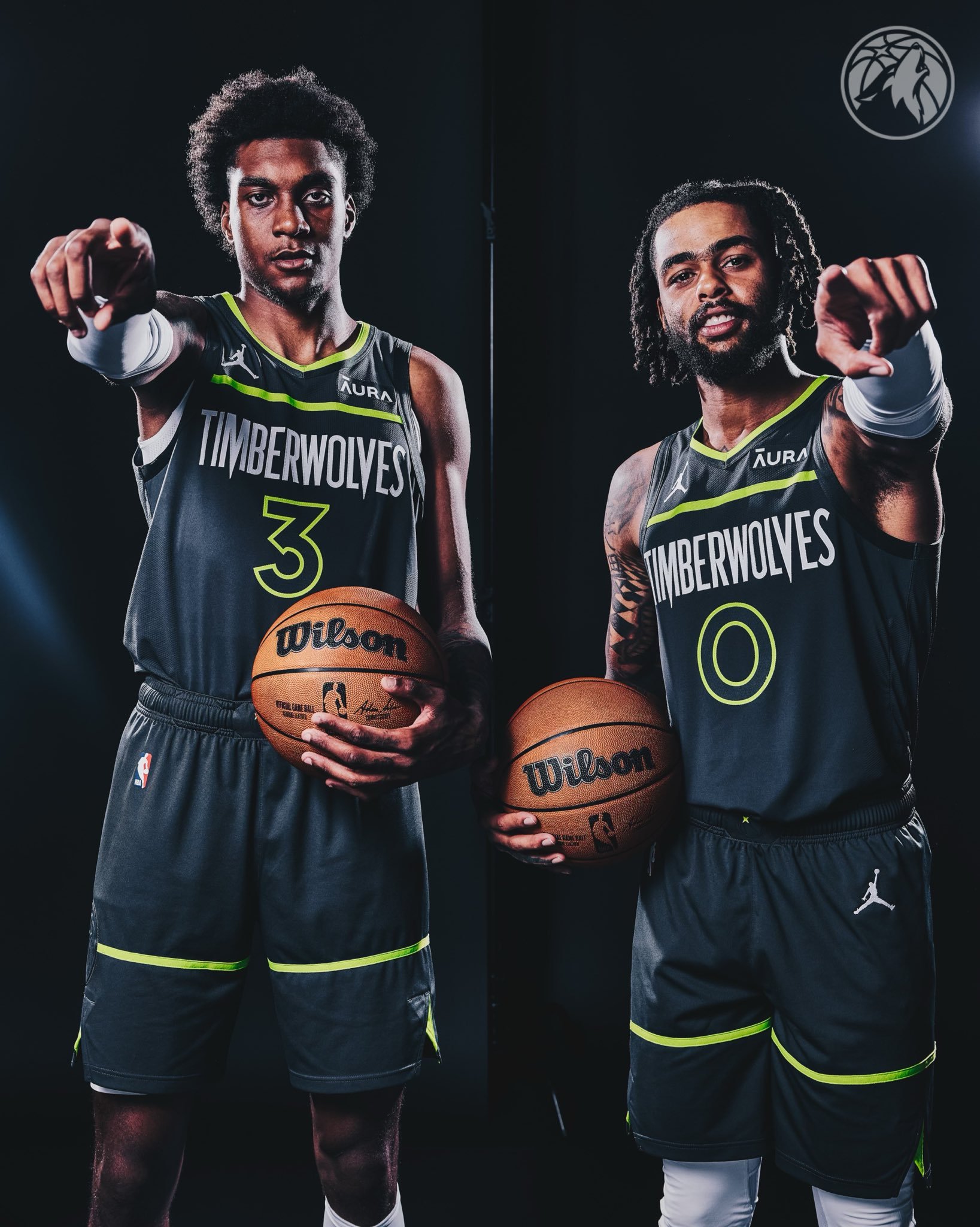
MINNESOTA TIMBERWOLVES
I don’t mind the Timberwolves’ current set of uniforms, but I also don’t love them. I think the issue lies in that they’re fine basketball uniforms, but not great Timberwolves uniforms. Their '90s look set an incredibly high standard, but even with changing times and trends I think it can offer some insight into creating an improved look. Last year’s City Edition established an excellent foundation with the front-to-back wolf pattern and tree trim, and their new Statement Edition introduced an unexpectedly nice “TIMBERWOLVES” wordmark. Combining these elements with neutral tones – grays, silver, black – and a pop of bright green makes for a new and exciting look that feels unique to the Timberwolves.
Timberwolves is beautiful
-
1
-
-
Phoenix Suns
The Suns could do with doing something similar to what the 76ers have done over the years where they do a modernized version of a classic uniform and they almost had that with their previous uniform. So I took that and modified the colors a little bit and dropped some of the over the top elements to create a modern uniform that nods to their past. The alternates are based on the much loved City uniform, however I made the home version orange and the away purple so that the colors of the log blend into the uniforms. The throwbacks are of course the Barkley era.
-
3
-


NBAxNHL (30/30 Wizards ADDED)
in Concepts
Posted
And Denver is fixed