

johne9109
-
Posts
1,586 -
Joined
-
Last visited
-
Days Won
6
Posts posted by johne9109
-
-
And we're back! Let's start it off with the Hawks
For the home and away I kept their recent redesign as it is a great look. Only change I made was I brought back the previous uniforms font as it felt more modern and is great lettering (I realize I swapped the wordmarks on the jerseys) The alternates are a combination of their city edition from last season and their uniforms from the 90's. I dropped the gradient and went for a yellow base for the home alt and black for the away alt. For the throwbacks I personally prefer the blue and green uniforms, but I realize the 80's uniforms are the more beloved, and go better with the entire set.

-
 3
3
-
 1
1
-
-
19 minutes ago, LA Fakers+ LA Snippers said:
Boston Celtics
One of the most iconic and legendary brands in all of sports is the Boston Celtics. That being said, still having a white man as their logo seems a bit dated, so everyhting black becomes dark green, while everything not green becomes gold.
Association/Icon: If it ain't broke, don't fix it. (although "CELTICS" is back on the Icon instead of "BOSTON")
Statement: A green-on-green alt seems more appropriate for the C's than a black one, taking cues from Boston's 2021 Earned edition
City: The City jersey is a tribute to the late great Bill Russell, with the late 50's-60's wordmark on the front, gold striping, and eleven #6 shamrocks representin the 11 championships won during Russell's career.
--switching to @edjb93's template. lmk which one you guys like better.--
Not a fan of the green on green, but that City Edition is on point
-
2
-
-
5 hours ago, Discrim said:
80s night...I didn't want to do a second straight black jersey, and I didn't want to do a gold jersey since I've done it before...so the only real option was red, but somewhat different. Went with the Calgary script from that short-lived alt from a few years back, changing the C to the burning C in the process. Needed a half-decent anniversary logo to carry me the rest of the way, so a big 50 that incorporates both Atlanta's and Calgary's flames came to mind. The opposing Canucks sport their late 80s design, and in an homage to the skate logo, Johnny's skating the other way and has blue and green motion lines,
90s night is Podium night
 probably against the Kings.
Both of these are gorgeous. I don't really like when Calgary uses black but this done really well and feels very 80s. The anniversary logo is beautiful. I love the way it incorporates the Atlanta logo design as well as Calgary. The Calgary uniform is great as well. Love the colors and I love Johnny Canuck skating the opposite direction to pay homage to the skate logo
-
1
-
-
LOVE that Bills look
-
I really like the updated logo, but I wonder if it would look a little cleaner with the full lion on the sleeves and just having the head on the helmet? The full body on the helmet makes it look a little empty
-
1
-
-
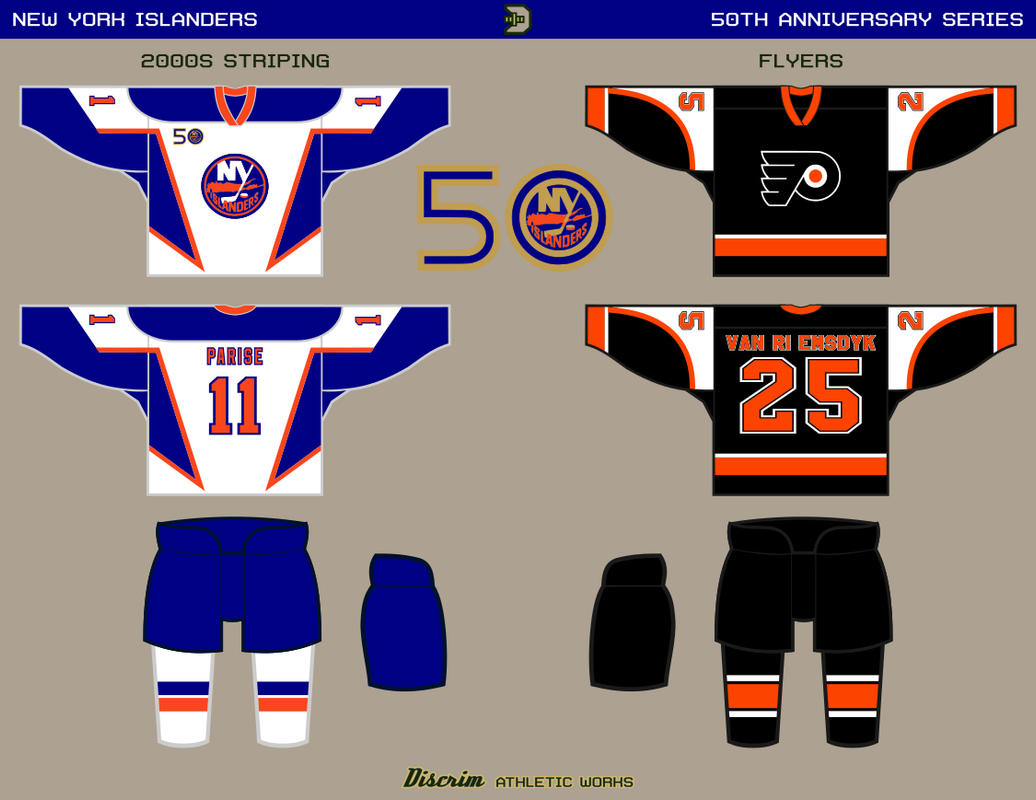
8 hours ago, Discrim said:
Went with the orange alt's design, but in white and with the 80s version of the crest. Figured the Flyers should finally appear in one of these things, so we have a battle of crappy pre-Edge alternate designs tonight. I kinda feel bad about this, I left them out of the big Expansion Six project (granted, for good reasons), and when I finally use them as an opponent, I go with the worst jersey design they've ever worn. Only upside is these two combined didn't take as insanely long to trace as the fisherman waves.
The last of this series will probably be a blue version of the Brooklyn jersey. Already got the perfect opponent in mind. Starting on the Flames series after that.
That actually looks really clean in white. If the NHL does another round of Reverse Retros this should be what they do
-
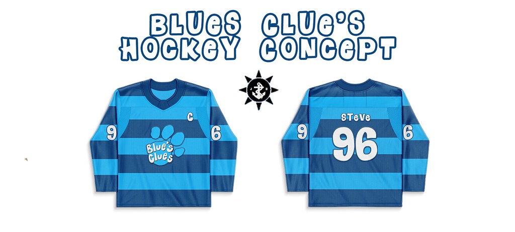
Here is a Blue's Clues set as requested by @Silence of the Rams I decided to use visuals cues from each of the hosts of the show's sweaters as well as putting their names on the jerseys. The last name is of course Blue herself. I did keep the Blue coloring across the 4 jerseys to keep some cohesiveness across the set
-
1
-
1
-
 1
1
-
-
I like the colors in the striping on the pants to match the P on the helmet. That's some nice balancing
-
So here is my Dragon Ball set. I decided to base them all on Goku thematically as he is the face of the series. I may go back later on and do some based on other characters. The font I used for names and numbers is based on the Saiyan scouters so I thought it was fitting to use
-
1
-
1
-
-
Well now that the Reverse Retro's are out here's the breakdown of how I did. If it's colored green that means I nailed or got pretty damn close. Yellow is I'm in the ballpark and maybe off by come colors or they went with a different colorbase. Red is I was just way off
Green-6/32
Yellow-9/32Red-17/32
Overall not bad and I gotta say I'm impressed with how many I was either spot on or close to; almost half -
There needs to be some more contrast in the uniform. Maybe a brighter yellow; similar to what is currently in the logo?
-
1
-
-
2 hours ago, Silence of the Rams said:
This might sound massively corny but how about blue's Clues
Naw doesn't sound corny because I was probably gonna do a Thomas the Tank Engine set at some point. I'll see what I can do
-
3 hours ago, Bomba Tomba said:
Maybe something related to Dragonball or GTA?
Dragonball is on my list for sure. I'll see about GTA. Was never my thing, but if something speaks to me then maybe
-
My next new set is the Teenage Mutant Ninja Turtles. I decided to base each sport off of a different Turtle; so baseball is Donatello, basketball is Michelangelo, football is Raphael, and hockey is Leonardo
-
2
-
1
-
-
Here's Game Grumps on the Football template
-
1
-
-
Probably not. Like I said in a vacuum it works for this series, but I wouldn't want to see the Steelers actually do it. Also it's your series you can do whatever you want ultimately
-
1
-
-
Here's Ghostbusters in the football style
-
1
-
-
So one thing I love about Pittsburg's sport teams is their synergy with their branding. The incorporation of red and blue into the uniform is great in it's own bubble but overall it separates them from the Pirates and Penguins in a way I personally don't like. I like your wordmark and the modernized alt logo
-
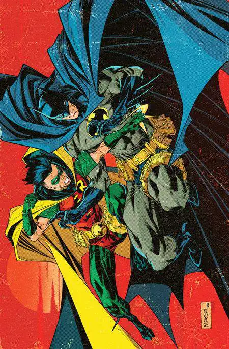
For this next set I decided to do Batman and Robin jerseys. With each sport I decided to focus on a different Robin and the Batman look from that era
First is the 40's Batman and :censored: Grayson's Robin as Football jerseys and helmets
Next is 80's Batman and Jason Todd's Robin as Basketball jerseys
Then we get 90's Batman and Tim Drake's Robin as Hockey jerseys
And finally current day Batman and Damian Wayne's Robin as Baseball jerseys and hats
-
Ijust noticed the skulls nose was a spade, great touch
-
1
-
-
My next set is a little more niche, but one I really enjoy. Game Grumps is a Let's Play channel on YouTube that I've watched for about 9 years now and thought their branding lent itself well to jersey design so here ya go.
-
1
-
-
Basketball versions
-
Baseball versions
-
1
-
-
And here's a Ghostbusters 2 version
-
1
-


Unifying the MLB (30/30) NFL (32/32), NHL (32/32 Complete), NBA (30/30 Wizards Added)
in Concepts
Posted
Boston Celtics
For the C's I wanted to do something different for them. So often we see the Celtics play the safe route with their uniforms and that often carries over to concepts as well. So for the home uniform I based it on the 2018 City Edition and the away uniform in the Earned Edition from the same year. The Celtics have used yellow as a tertiary color in much of their branding for years except for in uniforms. I really like the yellow so it makes sense to make it a permanent color in their uniforms. For the Alternate uniforms I based them off of the 2019 City Edition. I know A LOT of people did not like these uniforms, but it fits so well into the Celtics moniker and I'm honestly tired of the black uniforms. For the throwback uniforms I went back to the 40's; mainly because I like the clovers on the shorts and kind of prefer the older font. What is nice about this series is that in theory the teams could use any of the jerseys as they wish. So even though it's labeled as a throwback that could be the main uniforms that the Celtics wear; therefore not disruptive the purists all that much