

johne9109
-
Posts
1,594 -
Joined
-
Last visited
-
Days Won
6
Posts posted by johne9109
-
-
Here is the updated checklist

-
I had to come back to this series briefly. After the recent tshirt leaks I realized that I totally intended to do what I think the Habs/Expos uniform is gonna look like. So here it is.
-
 1
1
-
-
11 hours ago, B-mer said:
After looking at it for a while I'm not as sold on the home as I thought I was. The Road and Alt stand out more to me. I tried this out, which is obviously more of a traditional look, so I'm not sure if I really want to go this route as i feel it loses some of the modern update feel to it.
This is the best set for me. It feels more true to the Whalers brand. The alternate grows on me the more I look at it. has a real feauxback feel to it
-
1
-
-
Houston Texans
I mad a big change for the Texans to help set them apart from the other blue and red teams; especially since I shifted the Bills back to navy blue. So the Red uniforms become their home uniforms and the away uniform is recolored to match. The home alternate keeps the red jersey but is a bit more blue forward with the pants,gelmet, and numbers now being blue and is given a white counterpart in the away alternate. Now for the throwbacks I decided to go with the WFL Houston Texans and gave it the current teams colors. I usually try to keep the throwbacks historically accurate, but with this being an adaptation from completely different team I felt ok with the recoloring.
-
 1
1
-
-
Green Bay Packers
You can't touch the Packers uniforms they are wonderfully designed and have a great color combination. So the home and away stay as is. With that being said the Packers could use something new and different so I designed alternates that are a combination of their color rush uniforms and their uniforms from the 40's. The home is majority green while the away is mainly yellow. The home throwback is of course the original Acme Packers uniform with the away throwback being from the 50's
-
1
-
-
2 hours ago, coco1997 said:
Thanks! Yeah, some of the designs might not be to everyone's tastes. But along the way I'm hoping to tally a few more base hits and maybe even home runs than strikeouts. (You'll also come to learn if you didn't already that it's not without precedent for a team to wears its full name on their jerseys.)
Here's how that looks:
Up today is the AL East!
ORIOLES:
For the upstart O's, I used Baltimore's 1992-94 primary logo, which I found lends itself surprisingly well to a jersey design.
RED SOX:
I gave the Red Sox a '70s-esque pullover look using a variation on Boston's 1960-2008 wordmark logo.
YANKEES:
The Bronx Bombers get the monochrome treatment with a recolored version of their 1973-present secondary logo for the front of the jersey.
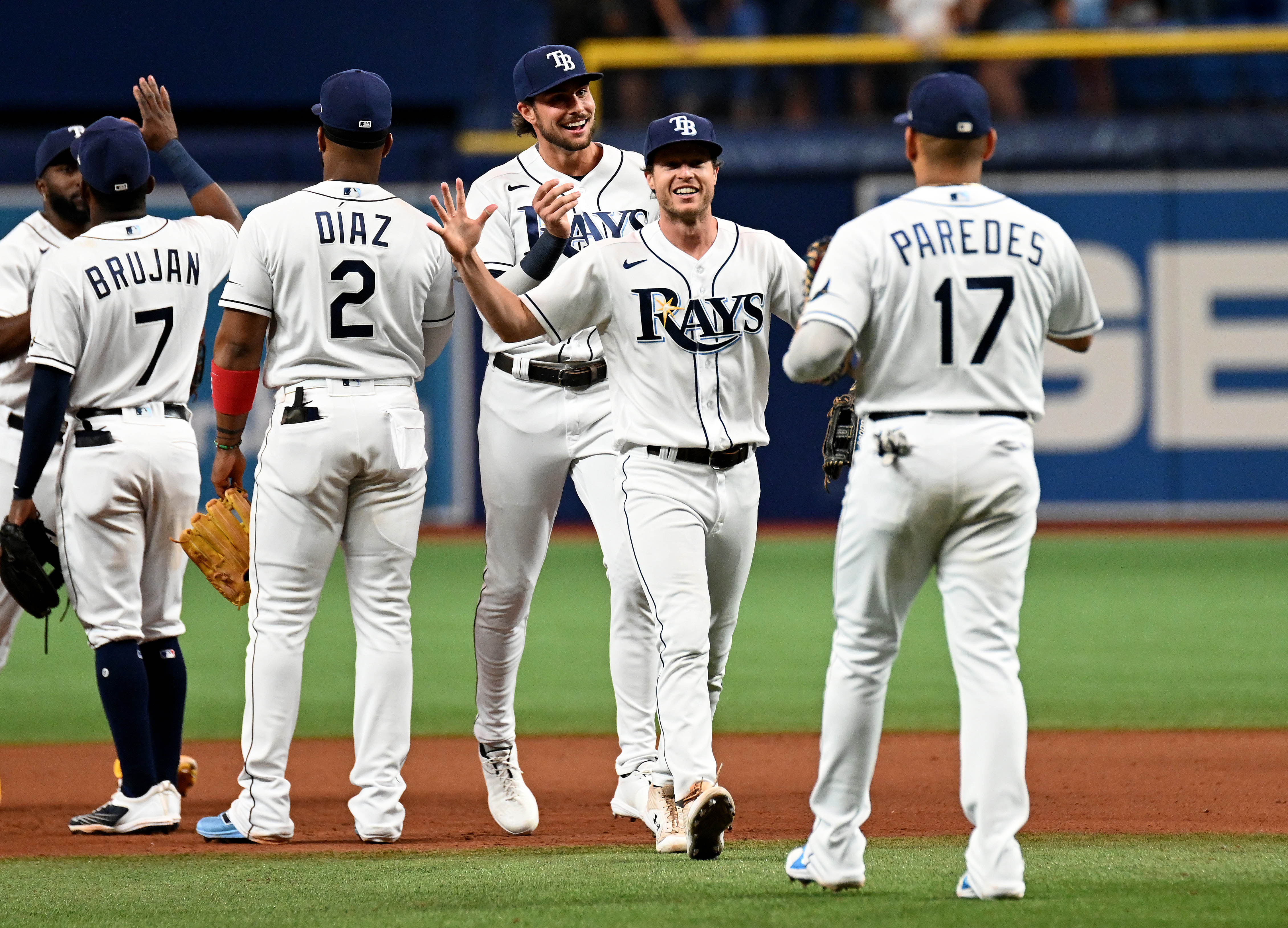
RAYS:
Rather than just rehash the Rays' 1970s fauxback uniform, I combined the fauxback with the team's everyday look, swapping out the funky, Padres-esque scripts and rounded numbers for the team's usual wordmark and block numbers and opting for a more traditional button-down design. Losing the drop shadows from the "RAYS" wordmark makes for a big improvement, IMO.
BLUE JAYS:
I went with the midnight blue from Toronto's blue jay logo and replaced the bird on the lower left with numbers so the maple leaf wouldn't show up twice on the jersey. The front of the jersey uses Toronto's current wordmark logo.
C&C appreciated! I'll have another NL division up soon.
Arizona-looks great
Boston-Maybe because I'm used to seeing the Red Sox word mark higher on the jersey the whole wordmark looks too low.
New York- Interesting take
Tampa- Amazing, this could be an actual jersey for them-
1
-
-
2 hours ago, coco1997 said:
Thanks! I think dropping the snake from the front causes the design to lose some of its personality, but here it is anyway. And replacing white with cream was a good call:
Keep the cream bring back the snake and I think that's as good as it's gonna get. Arizona Diamondbacks is such a wordy name it's hard to come up with somehting that's not gonna look out of place or tacky.
-
1
-
-
The Marlins is a great feauxback and the Red Sox are great. I'd buy that jersey in a heartbeat. over all very well executed. I dont think there's a single one I dislike
-
1
-
-
2 minutes ago, Kevin W. said:
Boston Bruins
While I like the Bruins current shoulders these feel more classic. Great job melding the classic and modern look. Works great for the B's
-
9 hours ago, GrayJ12 said:
I get what you're going for with the Carolina blue on the helmet, but something about it just doesn't add up...maybe it reminds me too much of the Lions. I personally think that black would look better with the home and away to distinguish themselves from the Lions - the alt's look great too!
Now that I've got Detroit done we can look at them side by side and I think they'd be fine. I think they both stand distinctly enough apart that a matchup between the two wouldn't be confusing
-
Detroit Lions
I really like the current look for the Lions. It feels fresh and classic at the same time; if that makes any sense. So the home and away stay essentially as is, except I dropped all white out of the away uniform (except in the logo). The home alternate is all blue and the away alternate is all grey. The home throwback goes back to the 30's while the away throwback is from the 50's
-
Denver Broncos
I, like a lot of people, feel like the Broncos are in need of a rebrand, but I'm not sure what. I tried some different things, but couldn't come up with something that didn't feel derivative of something else. So I stuck with what they have. They've had it for so long now and is a unique look that I didn't feel terrible leaving it in place. The navy blue is designated as the home uniform while the orange with an accompanying white uniform. The home alternate is a navy blue color rush set while the away alternate is an orange set. The home throwback is from the 60's with the goofy bronco logo that I love and the away throwback is beloved uniform from the 70's and 80's.
One thing I do really like about this set is that it gives the Broncos 2 blue, 2 orange, and 2 white uniforms overall.
-
 1
1
-
-
1 hour ago, GrayJ12 said:
I get what you're going for with the Carolina blue on the helmet, but something about it just doesn't add up...maybe it reminds me too much of the Lions. I personally think that black would look better with the home and away to distinguish themselves from the Lions - the alt's look great too!
Yeah I could see that, but the Lions use more of the grey than the Panthers and almost no black so I think it would stand out enough. I definitely wouldn't put the away alternate up against the Lions. I could maybe put a black helmet with the home and away, but I like the blue home jersey. You also then get three different striping patterns (blue and silver on the helmet, black and silver on the jersey and blue and black on the pants) so I probably wouldn't.
-
This might be another one I get some flack for but the Cowboys are getting some changes here. The biggest change I made was matching the home and away uniforms. It always bothers me when teams don't have symmetrical uniforms. So I took the striping with the star logo from the dark jersey and put it on the away jersey as well. I also dropped the light blue pants. They never made sense to me as the color is nowhere else in their uniforms. The alternates are based of the teams alternate uniforms they've used on and off for decades which are in turn based off of their original uniforms in the 60's. The throwback uniforms are from the 70's
-
Cleveland Browns
The Cleveland Browns are another team that for the most part have had the same image since their inception. I've always wished they added a helmet logo, but at this point it's become their look not to have one. So I kept the home and away uniforms as is. The alternates however I did add the bulldog logo to their helmets to give the alternates a more standout look. The home is a brown jersey with orange while the away is the inverse. The home and away throwbacks take us back to the Browns inaugural year.
-
1
-
-
Cincinnati Bengals
The Bengals latest redesign is easily their best look so it is the basis for the home, away, and both alternates. The biggest difference is the dropping of the black uniforms. It doesn't make sense to me as it is the stripes on a Bengal tiger that is black and not the rest of it's fur. So the home jersey is orange and the away keeps the orange stroke around the numbers and striping. The home alternate is a all orange uniform while the away alternate drops orange entirely to give the uniform the look of a white tiger. Don't worry fans of the Bengals black jerseys as you still get it in the form of the throwback uniforms from the 60's
-
Chicago Bears
The Bears look is pretty classic and pretty untouchable; so the home and away uniforms stay as is. The home alternate is a navy uniform with orange numbers while the away alternate is an orange jersey with blue numbers. These uniforms are twofold as they have both been used as alternates over the past few years, but both are also nods to the Bears uniforms of the 40's. The actual designated home and away throwbacks are from the 20's giving the Bears some unique uniforms to pull out from time to time.
-
1
-
-
Carolina Panthers
One thing that's always bothered me about the Panthers is that they have this beautiful color in their blue, but it's always been a secondary color. I get the reasoning is that panthers are black so that's why they wear black mainly, but it's such a great shade of blue that I made it the primary color for the home and away uniforms. There is still a black uniform in the form of the alternate home and we also get a silver uniform in the alternate away. The throwback uniforms are from the 00's; I went with these over their original uniforms as I felt the sleeve striping was more unique.
-
1
-
-
Buffalo Bills
So I know I am going to get quite a bit of flack for this one but for the Bills I put them back in a darker blue; I did however keep the lighter blue as a tertiary color. Why? To help differentiate them from the Goants and the Patriots (You'll understand when you see them) Other than the color change most of the design cues come from uniforms in the early '10's. I changed the sleeves stripes to mimic the red bar in the teams logo and played with the combinations of the red with the two shades of blue. The home and away alternates take most of their design cues from their 00's uniforms. The home away comes from the 60's and don't worry the Bills still get their classic colors in their away throwback from the 80's
-
 1
1
-
-
Baltimore Ravens
The Ravens home and away uniforms are left in tact here. The home alternate then takes that look and make sit into an all black look with more emphasis on purple and gold as secondary colors the away alternate is a purple uniform with gold as the secondary color. The home and away throwback then take us to their original uniforms. While I'm glad they went away from these original uniforms it'll be cool seeing them break them out every now and again
-
1
-
-
Atlanta Falcons
The first thing I did with the Falcons is went back to their pervious style of jersey. It just looks so much better than their current uniforms. Next I made black the main color for the Falcons; I always preferred the Falcons in black and so the home is black while the red becomes the away alternate. The home alternate is a black color rush style uniform. I also created new pant striping that mimics the wings in their logo. The Home throwback is from the 60's with the sleeve numbers moved up to the shoulders; while the away throwback is from the 80's
-
1
-
 1
1
-
-
Arizona Cardinals
And we're back and to start us off is the Arizona Cardinals. The Cardinals are one of those teams that are in need of a redesign. Their current look is pretty bland. So what I did for the home and away is I took the main idea of the current uniforms and put the Arizona flag back onto the sleeves. The home alternate is maroon color rush of sorts with the yellow from the logo added as a secondary color. The away alternate is the same but with a yellow jersey. The Home throwback goes back to the team's time in Chicago while the away throwback is from the 90's. I did remove the logo from the sleeves on the away throwback due to the current uniform sleeves not having the room
-
1
-
-
And that's it! Those are my predictions for this upcoming round of Reverse Retros. As a little bit of fun I made this tracker that I will update as they uniforms are officially released just to see how many I got right.
-
1
-
 1
1
-
-
Winnipeg Jets
So the Jets have been rumored to be doing a throwback similar to their Heritage Classic uniforms, but using their current colors. I decided to go with their WHA white uniforms with their current colors
-
3
-


:no_upscale()/cdn.vox-cdn.com/uploads/chorus_asset/file/13448876/147485515.jpg.jpg)
Unifying the MLB (30/30) NFL (32/32), NHL (32/32 Complete), NBA (30/30 Wizards Added)
in Concepts
Posted
Indianapolis Colts
No need to reinvent the wheel with the Colts so the home and away stay as is. With the away uniform being all white I decided to make the home alternate all blue and then make the away alternate a white jersey with the blue pants; giving them an alternating look with their uniforms. The home throwback is from 1956 with an interesting logo placement on the helmet and the away throwback being from a few years earlier in 1953