

johne9109
-
Posts
1,562 -
Joined
-
Last visited
-
Days Won
6
Posts posted by johne9109
-
-
Kansas City Royals
So the biggest change for the Royals is that the main home away and alternate home and away all feature script wordmarks on the jerseys. I always felt the script font fit the Royals better than the block font they use on their away uniforms. The home throwback only goes back to the 2000's. The away throwback however takes us back to the teams original away uniforms

-
 2
2
-
 2
2
-
-
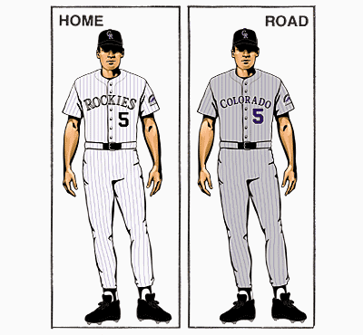
Houston Astros
The Astros home and away stay as is. The alternates are a mixture of their current alternates and the Astros look from the 90's. The home throwback is from the 60's. The away throwback is of course the "rainbow" uniforms from the 70's
-
3
-
-
Detroit Tigers
The Tigers get some color added to their home and away uniforms. I added orange into their striping to liven up their look a bit. The Home alternate is a colorful take on the teams uniforms from late 80's to the early 90's while the away alternate is a recreation of their away uniforms of the 80's. Their home throw back takes us back to 1927 with a unique tiger head on the front of the uniform. The away throwback is from the following year. The tiger head was originally featured on the back of this uniform, but I moved it to the sleeves to make room for player numbers.-
1
-
-
-
Winnipeg Jets
For the Jets I wanted to model the uniforms off of the Royal Canadian Air Force dress uniforms. The main logo is slightly altered to more closely resemble the RCAF logo. Instead of a captains C we get a nameplate that reads Captain and opposite of that we get a take on the rating badges on the uniforms, but if you look closely there is a puck and hockey sticks. The sleeves get rockers that read Winnipeg and the striping on the bottom of the sleeves replicates the ranks seen on the uniforms. The collar features one of the RCAF mottos; Per Ardua ad Astra which translated reads Through Adversity To The Stars.
And with that we're done. I really enjoyed this series and thought I was able to get really creative with some of these teams. C&C always welcomed. Thanks!
-
3
-
1
-
-
Washington Capitals
The Washington Capitals get a uniform that gets it's design elements from the different monuments and buildings throughout DC. The main logo features the Capitol building and is actually an unused concept for when the team was going through their redesign in 1995. The pants and sleeves get striping in the shape of the Washington Monument and the shoulders feature the Lincoln Memorial. The collar reads Justitia Omnibus, Latin for Justice For All, the motto of DC. The Promotional image is a take on DC's flag with a CAPS wordmark
-
2
-
-
Vegas Golden Knights
For the Golden Knights I took inspiration from the bright neon signs of the Vegas Strip. The main and secondary logos are made to look like glowing neon; as well as the striping on the sleeves. Card suits are added to the sleeves to give them an added Vegas connection. The collar reads Battle Born; the State motto. The promotional image is of course a take on the Las Vegas sign.
-
1
-
 2
2
-
-
9 hours ago, Chromatic said:
I think the uniform as a whole looks good as a Chinese New Year jersey, but I just wanted to say that adding "The Couve" doesn't fit, as NOBODY in Vancouver calls it that. It's a shorthand used exclusively by visitors and it sounds really cringy. It would be like calling Toronto "The Ront" or Washington "The Shing".
Thanks for that insight. I suppose instead they could put year of the rat, dog, etc depending on the year and design
-
Vancouver Canucks
I kind of cheated for the canucks, but it's such a great design and choice for Vancouver. I took their Chinese New Year jerseys they've done for the past few years and adapted it a bit. This is a nice choice because they can change it every year and build up to unveiling the new design each year once the new year happens. The collar reads The Couve, a given nickname to Vancouver.
-
5
-
-
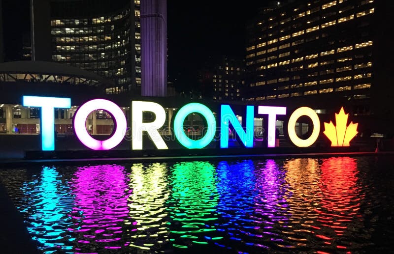
Here's Toronto with the corrected letters
-
1
-
-
1 hour ago, VampyrRabbitDesign said:
You got the gradient the wrong way around for Mexico, and you used the same gradient used for the T for both China and Japan instead of going with the actual national flags. And they look like they were picked randomly.
Thank you for catching that with the gradients. I dont know why it didnt save China and Japan. I'll have to go back and fix that
-
Toronto Maple Leafs
I took a couple of sources of inspiration for the Leafs. The main one is the TORONTO sign in Nathan Phillips Square. The colors in the letters are given a gradient to represent the different cultures in Toronto to represent the diversity of the city. T-French, O-Irish, R-Chinese, O-Mexican, N-Lebanese, T-Metis (Native), O-Japan. These were chosen as they are the most prominent cultures in Toronto. The collar reads Diversity Is Our Strength and the Promotional image is taken from The City of Toronto.
-
1
-
-
Tampa Bay Lightning
For the Lightning I expanded on their warm up jerseys they used this last season that were inspired by the Gasparilla Pirate Festival. The collar reads The Buccaneer Way, taken from their sister team the Buccaneers. The promotional image is taken from the city's website, but given a lightning twist.
-
1
-
2
-
-
100 percent better than what they actually unveiled. Great job
-
1
-
-
On 7/12/2022 at 3:14 PM, coco1997 said:
Thanks guys!
Up next are the Yankees and Red Sox!
RED SOX x 1936 YANKEES
The Yankees lay claim to what's probably the most universally recognized uniform in all of professional sports. Though the Red Sox have worn pinstripes before, they've never had a pinstriped uniform with just their "B" logo on the chest. With help from @Victormrey, the jersey/cap logo is a modified version of Boston's 1935-46 cap logo, meant to match the style of the Yankees' iconic "NY" monogram.YANKEES x 1986 RED SOX
The Bronx Bombers are done up in the style of Boston's 1980s batting practice pullovers, complete with Tuscan style "YANKEES" script and a non-interlocking cap logo that vaguely resembles the New York Black Yankees.'
C&C appreciated as always!
That Red Sox uniform is amazing. I would easily buy that jersye if the Sox ever did something like that
-
1
-
-
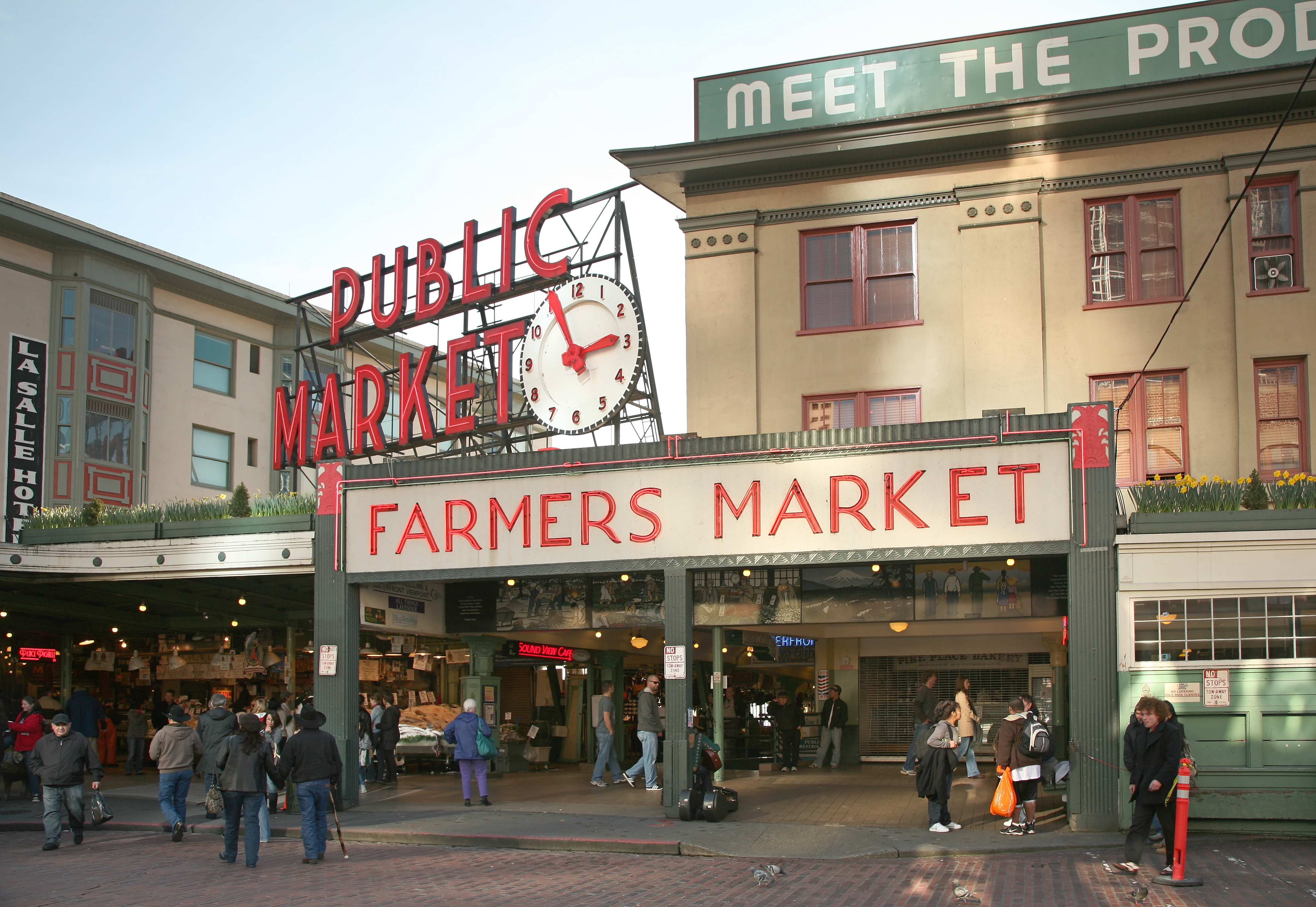
Seattle Kraken
For the Kraken I took inspiration from Pike Place Market. The collar has the market's address while the jersey wordmark matches the sign above the market. The promotional image is a take on the sign as well
-
1
-
 1
1
-
-
1 hour ago, coco1997 said:
Yeah, I tend to agree. I think this newest version has too much going on.Up today are the Padres!
PADRES:
Very minor tweaks for the Friars, as I really love what they did with their set. I made the bill of the cap pink for color balance sake and modified the back numbers to match the script--bicolor with a yellow drop shadow.
I also worked up a fauxback design:
PADRES 1979:
The Padres' 1979 raglan-sleeved look lent itself well to a design with contrasting colored sleeves. Everything else is pretty straightforward. No drop shadows, as that wouldn't be very 1970s/80s-ish.
Next, for the more traditional-minded uni fans, here's the Padres set in more conservative colors:
PADRES (in blue):
This one's a simple color swap of the City Connect's seafoam green and pink for the navy and ocean blue from the Padres' 2004-11 look (while keeping athletic gold instead of sand).Lastly, here's a mashup of sorts--the Marlins in the style of the Padres' City Connect design:
MARLINS x PADRES CITY CONNECT:
Many have (probably correctly) observed that the Pads' City Connect colors feel more Miami than they do San Diego, so that's what I did here. I kept the basic design of San Diego's set but replaced the Friars' scripts, logos and numbers with Miami's. I also swapped out yellow for black since the Marlins apparently always need to incorporate black in anything they wear. And with palm trees also being prevalent in Miami, I didn't need to change the sock design at all!C&C appreciated as always!
The Padres fauxback looks amazing. I Miami design is great as well. I think the only reason they didn't do that is that it seemed like the obvious choice and wanted to really make a splash (which was the right choice as the marlins have one of the best city connect jerseys). I wouldn't be surprised though if they do another round of city connect jerseys is that we see something like this
-
San Jose Sharks
For the San Jose Sharks I expanded upon their stealth uniforms and connected it a more to Silicon Valley by making the circuitry pattern the main focus in this uniform. The circuitry is placed to make it look like it is spreading from the striping on the sleeves and the pants. The collar reads Never Finished which is San Jose's motto. The Promotional image comes from the city of San Jose but with an added Sharks twist
-
2
-
1
-
-
For the Blues I really went out of the box. I decided to base it off of this flyer from the World's Fair in St. Louis. All imagery and design elements are taken from this image. the colla reads Gateway to the World and The promotional image takes the St. Louis flag and adds the blues logo
-
1
-
1
-
-
Love this. Great idea and wonderful concepts. I'd love to see something similar for the Whalers!
-
1
-
-
55 minutes ago, coco1997 said:
Thanks! I've already found a font that matches that one pretty closely. I'll get working on your ideas soon.Good. That's the idea.

Today I have another Giants concept:
GIANTS (Discrim recreation):
It hit me that @Discrim nailed the idea of what a Giants City Connect uniform should look like six years before Nike crapped out their "fog" design last season. This is merely my humble attempt to recreate that concept. Discrim's design incorporates most of the iconography I think of when I think of San Francisco: the Golden Gate Bridge, trolley cars (which I poached from the Warriors' uniforms) and "The City" nickname, done in the Giants' typeface. The only changes I made were to basically combine his home and road design into one and replace orange with international orange of the Golden Gate Bridge.
I don't think I can come up with something better than this for the Giants, so why try to improve on perfection?So I'm a sucker for inter city synergy with teams uniforms and I love how borrowed elements from the GSW uniforms and brought them to this uniform. I'd be interested in seeing this a step further and how this uniform would look with some colors closer to GSW as well
-
I really like what you did with the home and away. A nice melding of eras
-
Pittsburgh Penguins
For the Penguins I took the emblem from the city flag and added the penguins logo. I also included silver striping as a nod to the Steel City moniker. The collar reads Benigno Numine which translates to By Divine Providence; which is the state motto
-
1
-
-
Philadelphia Flyers
So I went a bit out there for the Flyers. For most Philadelphia teams concepts tend to go on the founding of the county route and I wanted to do something different here. I did use the Liberty Bell in the logo, but the striping gets a design seen in the roof of the Kimmel Center where the Philadelphia Orchestra plays. The shoulder also features the Keystone logo. This gives the uniform a more broad connection to the city rather than just one specific thing. The collar does read 1776 to give it that connection to the nation's founding
-
1
-


Unifying the MLB (30/30) NFL (32/32), NHL (32/32 Complete), NBA (30/30 Wizards Added)
in Concepts
Posted
For the Tigers it was kind of a combination of the took (good eye). The Astros while mostly designed on the tequila sunrise uniforms, which never had a grey counterpart, they do take the grey from the away uniforms that had the pattern on shoulders and the arms so it's kind of a combination of the two eras. This also explains why I could not find a grey version of the regular tequila sunrise jersey. I did not know they wore the same uniforms home and away so once again thanks for that insight. I'll try to be a little more detailed in my explanations where all inspirations come from.