

johne9109
-
Posts
1,594 -
Joined
-
Last visited
-
Days Won
6
Posts posted by johne9109
-
-
Vegas Golden Knights
Vegas could do another recolor of their previous Reverse Retro, but instead I decided to pull from another previous Vegas team; this time the Las Vegas Gamblers. I think it's a great retro look and one that the Golden Knights can make work for them
-
 1
1
-
-
Vancouver Canucks
So this one was pretty much a gimmie as far as jersey goes this was pretty much me trying to predict the equipment for the rest of the uniform. I did change the logo a little bit as it's more of direct nod to the WHL Canucks logo with the flannel shirt rather than the suspenders look the Canucks are using.-
3
-
-
Toronto Maple Leafs
After the underwhelming jersey from the previous Reverse Retro from the Leafs I think they'll pull out a uniform they haven't gone back to in quite a few years and one that can be properly reversed. So I went with their 1927 uniform and gave it a white reverse and the white jersey at the time wasn't a match design wise
-
3
-
-
Once again great job. As always you do a wonderful job following the design trends of each era. I love the 97 redesign and the Reebok design is very of that time for sure. Moving to the more muted colors is a very of the time as well
-
2
-
-
Tampa Bay Lightning
I think this is what most are expecting to do for their Reverse Retro. It's a god awful jersey, but seeing the success of the Wild Wing jersey las go around this will probably sell. This also fixes the problem of the original having a blue sky and black water.
-
4
-
-
22 minutes ago, Djruggs said:
I don't really mind their current colors either, but in a perfect world, the first rebrand never happened lol
Yes when they moved to Miami the only change that should've happened was replacing Florida with Miami
-
2 hours ago, Djruggs said:
The Marlins are another straight forward team. I really like their current logos and word marks, but they need to return to the Florida colors.
I tried to play around with the cap logo as well, but I just couldn't get it to a point where it looked better than the predominantly black M.
As for the name on the back, I opted to just have "Marlins" on the back because I couldn't be bothered to try and fit Jazz's name on the back lol
C&C always welcome.
THIS is what the Marlins should be wearing (although I don't mind the current colors)
-
St Louis Blues
I think the Blues will follow a similar path that they went last year and stay in the same era. I went with the uniform that predated what they based their last Reverse Retro on and swapped the striping colors around.
-
Seattle Kraken
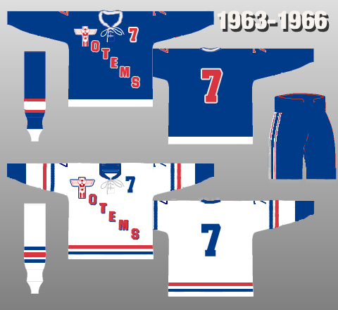
I know most people want to see the Kraken do a Metropolitans uniform for their Reverse Retro, but it's said that the Kraken will not be doing the Metropolitans; I think they want to save it for an outdoor game like the Winter Classic. So instead I think they will go for a Seattle Totems uniform. I went with their first design over the later diagonal text because I could see a very vocal group saying that if they did a vertical text they should've just done a Metropolitans uniform. I tried my best to also use all of the Kraken's colors, but the team could easily go for a different color pattern.
-
San Jose Sharks
I have a really strong feeling about this one. A few fears back is was heavily rumored that the Sharks were going to do a California Golden Seals uniform; while that never came to fruition I think now will be the time for them to do so. Now the question is do they do it in their current colors or do they go with the Seals colors? I say their current colors.
-
2
-
-
Pittsburgh Penguins
The Penguins might be the hardest to predict. They have so many options that they could pull from. I do think that they will do a another white uniform or a yellow uniform. I went with the latter and based it off of their uniforms from the 70's. I could've done a dark blue uniform, but for some reason I feel like they're gonna stick with the current colors
-
1
-
-
Philadelphia Flyers
The Flyers have essentially had the same uniforms with a few minor changes throughout the years and they could easily make a combination that we haven't seen before. However, I decided to go another route and one that I think the Flyers might do. I took the Philadelphia Quakers uniform and put it in the Flyers colors and replaced the wordmark with the Flyers logo.
-
2
-
-
Ottawa Senators
I strongly feel that the Senators are gonna go for another red uniform; balancing their rotation of uniforms. That leaves the question, which uniform will they do this with? I went with the early 2000's alternate uniform as it feels like a natural extension of their current uniforms and let's be honest no one wants to see a return of the SENS uniforms. Some may say that they could go the original Senators uniforms, but they've fully extended that option with previous throwback uniforms.
-
2
-
-
New York Rangers
The Rangers are a team that have a couple of options available to them. The one I'd like to see the most is their uniform from the late 70's; namely the dark uniform with the red and white reversed. However, that uniform is almost universally despised so I don't see it happening. Of course there is the option of a red Lady Liberty uniform, but I think the may skip that uniform this go around. So I am predicting they will go back to their early years and make a white uniform version of their lighter blue uniforms from the 20's. I don't think this will be exactly what we see as they could go with colored gear over the tan and they could change the coloring of the numbers/striping, but I think overall it'll be something along these lines
-
New York Islanders
This is another that has been heavily rumored and is exactly what a lot of fans, including myself, want to see. The Islanders return to the fisherman uniform. Now I wouldn't be surprised if the Islanders put the regular Islanders logo on it instead of the fisherman, but I really hope they go all the way with this.
-
2
-
-
8 minutes ago, MJD7 said:
Chicago White Sox Cooperstown Collection
Of course, I went with the iconic pullover set the Sox wore from 1982-1986, but kept the now-classic grayscale color scheme.
I really like this in the current colors good job
-
2
-
-
New Jersey Devils
The Devils are another team that have had their next Reverse Retro all but confirmed; with them doing a Kansas City Scouts uniform. What hasn't been revealed though it the exact design they will go with. I decided to reverse the uniform and make it a red uniform to make it more in line with the Devils image and replaced the Scouts logo with the Devils logo
-
2
-
-
Nashville Predators
Let's be honest the Preds don't have the best uniform history for that reason I went for a Nashville Dixie Flyers throwback; similar to their Winter Classic uniform.
-
Montreal Canadiens
I think the Habs did a fine job with the previous outing, but I think it's time for them to pull further back into their history. I went with their uniforms from 1909-1910 and gave it the current colors
-
 1
1
-
-
10 minutes ago, StevenGrant94 said:
What would the Atlanta Thrashers look like if they had never left? That's the focus of part three of this "What If? series.
2011-17
A new local ownership group purchased the Thrashers in 2010, and one of the changes they made was the introduction of new uniforms for the 2011-12 season. Ice blue became the undisputed primary colour, with the stripes making use of the rest of the colours from the logo.
2017-18
The sleeve stripes were straightened during the switch to the Adidas template. Also, the thrasher-head logo was added to the back of the collars, and ice blue was further emphasized by being used for the helmets and gloves.
2018-22
A navy blue third jersey was added in 2018 which used the Thrashers' T-bird logo on the front, and stealth numbers. The players would choose to use this jersey in the playoffs.
2021 Reverse Retro
Atlanta's Reverse Retro jersey took their original road jersey and swapped the navy and maroon colours. This jersey was popular with fans, who in general prefered the T-bird logo. Also starting this season, The Home Depot began sponsoring the team's helmets.
2022-Future
Navy blue becomes the primary colour, and the T-bird logo becomes the main logo when the Thrashers unveil new jerseys prior to the 2022-23 season. The previous primary logo is ditched altogether, but ice blue remains fairly prominent being used for the pants, gloves, and road jerseys' numbers. Delta Air Lines is introduced as the team's jersey sponsor.
I'll be back soon with a "What If?" for the Minnesota North Stars!
Another great one
-
2
-
-
2 minutes ago, StevenGrant94 said:
The Stars wouldn't be called the Stars if the North Stars never left, they'd probably be an expansion team with a western theme (e.g. Wranglers) or named after an animal (e.g. Armadillos) or both (e.g. Stallions) or named after a weather phenomenon (e.g. Twisters) or have a wacky 90's name (e.g. Freeze) or something else.
Maybe they wouldn't have gone to Dallas and we'd see a Houston Aeros revival?
-
1
-
-
2 hours ago, VampyrRabbitDesign said:
Thanks. The colour for the road is according to Encycolorpedia is a "very light shade of orange", I decided on the colour as one of the (now pretty old) nicknames of Houston is The Magnolia City and their 1980s road uniform was cream with a pinkish tint, so it's not totally without precident. I decided against going with gray for the road as Orange was the dominant colour for the trim and numbers.
Love it, I really enjoy how sports design has really come into an era of even the smallest things having meaning and that's exactly what you did here.
2 hours ago, VampyrRabbitDesign said:
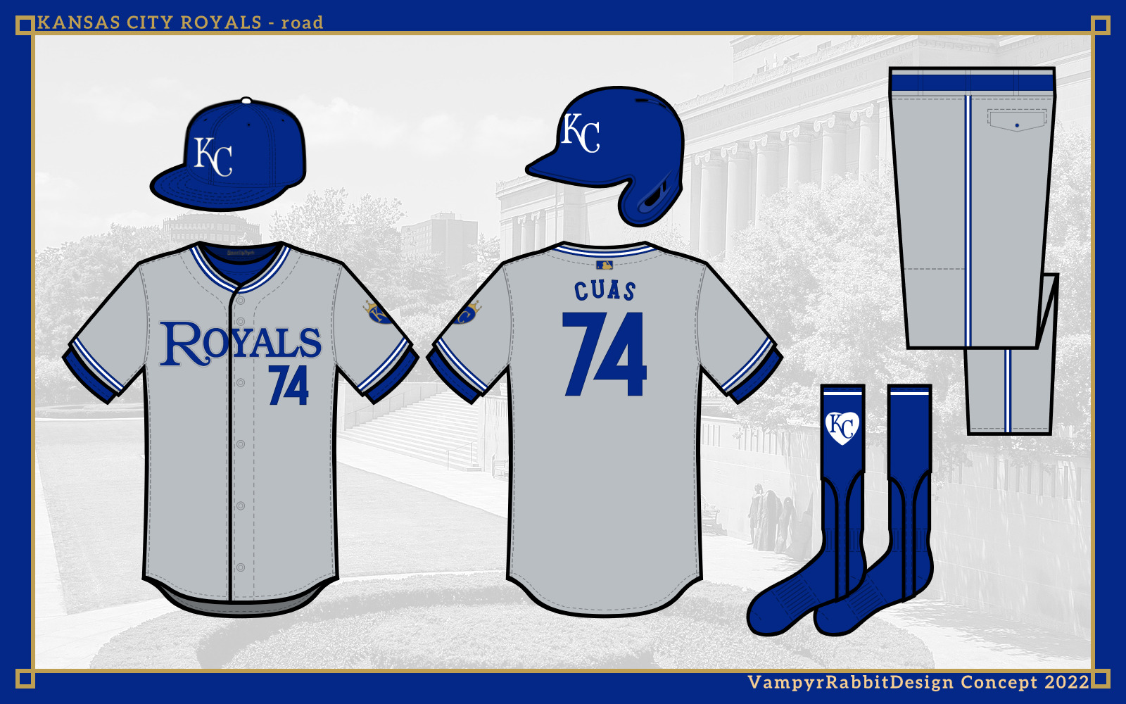
Up next, it's the team from the Heart of America.
The home and road are both pullovers, I've changed my stance on them during the last month and for some teams, I think they make sense. The Royals are one of those teams, and get one with two buttons. The trim is inspired by the 1973-82 and 1983-91 uniforms, with the home jersey script used from 1969 to 2001. The sleeve patch is in the shape of a heart with the starred crown from the batting practice logo, and on the inside of the baselayer is the "KansasCityRoyals" script.
The alternates are a blue jersey with headspoon piping and road grays. The script is taken from the original Kansas City Royals logo.
The blue jersey can also be worn with either sky blue or gray for the road.
And for special occasions at home, a Monarchs tribute uniform.
So thats the Royals. Next, a trip to LA.I really like the sleeve logo you came up with here; I don't know of the hear works on the socks here though. Maybe if thy had the crown as well it would look better, but that's just me. Overall another great set.
-
Minnesota Wild
The wild face to big problems with reversing any of their uniforms; 1. I don't think anyone including the Wild want to see and red Wild uniform and 2. Their best option is their former alternate, but it doesn't really fit the retro portion of the Reverse Retro program. Now their previous outing was very well received so I think they're gonna go back to that well. Now when it was released there were people who were saying it looked like a Subway jersey; so to circumvent this I went the North Stars later uniform that used black as well.
-
1
-
-
Los Angeles Kings
The Kings are really hard to predict. They have quite a few options due to the fact that they've changed uniforms quite often. You could do a reverse of last years Reverse Retro and make a yellow uniform, they could take their 00's uniforms and do any number of reverses including gold and forum blue, you could also take their original uniforms and do it in the current colors. I went down a similar route to the former. I took their 80's uniforms and put them into their current colors. That's what I like the best, but who really knows with the Kings
-
2
-


.png)
.png)
.png)
.png)
.png)


Reverse Retro 2.0 (32/32 Canadiens V 2 Added) COMPLETE
in Concepts
Posted
Washington Capitals
This one is another gimmie pretty much. While it hasn't been confirmed; it is heavily implied that the Capitals are doing a black screaming eagle uniform. So that's exactly what I've done here. If it was up to me I would've done a red, white, and blue version of their Capital building alternate from the same time, but I know people have been calling for a return of this color scheme so I'm not surprised the Caps went this route