

johne9109
-
Posts
1,580 -
Joined
-
Last visited
-
Days Won
6
Posts posted by johne9109
-
-
Great job all around. I love that you went a little outside of the box with not using orange and still created something that felt like Florida. Not a specific part of Florida, but the entire state W2G. California feels like it represents the entire state as well and not just SoCal or NorCal. Tennessee works great as well!
-
Philadelphia Phillies

-
 1
1
-
-
New York Mets
-
1
-
-
Milwaukee Brewers
-
2
-
-
I LOVE the aesthetic of your concpt. I would love to see more concepts done like this. You're branding here is great as well; logos, colors everything great job
-
Miami Marlins
-
1
-
-
I like option b
-
1
-
-
4 hours ago, CDCLT said:
Love to nod to the red numbers, but what if only the TV numbers were red? Kind of a nod to how only the front number is red. It would also help legibility on the blue jersey.
Thank You! I originally tried mimicking the front numbers being red and the back being white, but it didn't look right so I just went all red, but this is the way to go. Great call.
-
2
-
-
Los Angeles Dodgers
-
1
-
-
Colorado Rockies
-
1
-
-
Cincinatti Reds
-
1
-
-
4 hours ago, coco1997 said:
I'm back with my first City Connect tweak of 2023!
BRAVES:
Notes:
- The Braves' newly-unveiled City Connect uniforms are fine but admittedly, a bit uninspired. As I mentioned in another thread, they're less of a tribute to the city of Atlanta and more of a tribute to the history of the Braves, which in my opinion kind of misses the point of the City Connect program.- For my tweak, I went with a Georgia peach color scheme, replacing royal blue and red with a peachy shade of orange and leafy green. And now that the Braves' off-white alternates have sadly been retired, this felt like a perfect opportunity to bring back that look (think peaches & cream).
C&C appreciated!
Instantly better w2g
-
1
-
-
Chicago Cubs
-
2
-
-
On 3/20/2023 at 5:06 PM, MJD7 said:
Israel (ישראל)
They are one of only 2 teams in this series with a different logo design on all 3 jerseys: the country name in Hebrew on the home, English on the away, and the Star of David cap logo on the alternate.
This uniform was heavily inspired by @RoughRiders99's wonderful Israel set in his amazing WBC series.
So much better than what they acrually wore. Great job
-
1
-
-
13 hours ago, Silence of the Rams said:
That first one of the 2020's should have a star next to the Lakers logo

In all seriousness these are all very cool and I wish the NBA did something like this
As a Celtics fan I can't disagree
 Thanks! It seems like the obvious thing to do from a marketing standpoint. I would easily buy all 17 Celtics balls. Don't know where I'd put them, but I'd buy them
-
10 minutes ago, jackkmart said:
Big fan of pretty much all of these. Baseball teams look good in football unis. I think my favorites may be the Rangers, KC, and Tampa Bay. The white sox and Yankees also look really good.
My only tweak might be trying to flip Toronto's logo on the helmet but I can see why you wouldn't as it may look weird/ mess up the logo.
Thanks! Great call on Toronto. I didn't even think to do that. I just said this is the way the logo is and put it on the helmet, but it makes so much more sense to flip it. It takes a second to get used to but it totally works
-
3
-
-
Atlanta Braves
-
1
-
-
9 hours ago, edjb93 said:
In that spirit, I modified the outlining of the numbers. Since the inner outline is usually yellow, I made it red, with yellow becoming the outer outline color. I initially wanted to retain the yellow inner number outline, but I thought moving this color to the outer outline looks better.
I also changed the shoulder patch to the Mile High Hockey roundel, so that there's a right balance between blue and red all over the entire road uniform.
This is probably the best. Having the blue numbers balance with the logo on the front
-
1
-
-
Arizona Diamondbacks
-
Well There's a ball for every NBA championship so far. I'll comback to this and upload one for the future championships as they happen (Hoping for 18th for the Celtics in a couple months; crosses fingers and knocks on wood) See everyone again soon!
-
2020's (So Far)
-
1
-
-
2010's
-
2
-
-
6 hours ago, coco1997 said:
Thank you!
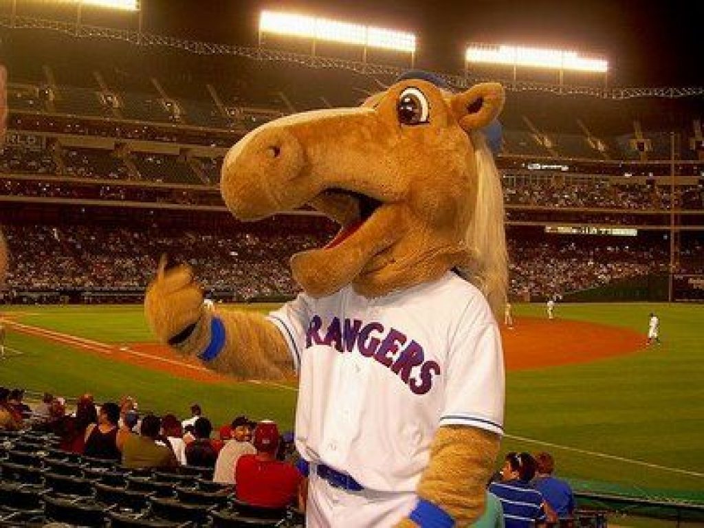
Up today are Texas Mustangs!MUSTANGS HOME;
MUSTANGS ROAD:
MUSTANGS HOME ALT:
MUSTANGS HOME/ROAD ALT:
Notes:
- The Rangers mascot is a palomino horse with a really dumb name—“Rangers Captain.” Since Palominos is too long and unwieldy a name, I settled on “Mustangs,” which evokes, speed, strength and beauty.
- Rust and black replace blue and red, giving the team a bit of a Texas Longhorns look.
- The horse is re-purposed from this Charlotte Knights logo, recolored with a blonde mane to resemble a Palomino.
C&C appreciated as always!
This is the biggest departure for the team but it works so well. Great job
-
1
-
-
6 hours ago, Magnus said:
Just one question: Why no fiesta colours for the Spurs championship balls?
I based the balls themselves on the uniforms that were worn during the season they won. They also feature the logo the team used that season so there is a Spurs ball that features the logo with the Fiesta colors


 Thanks! It seems like the obvious thing to do from a marketing standpoint. I would easily buy all 17 Celtics balls. Don't know where I'd put them, but I'd buy them


Raysox's States Baseball League 33/52 (DE, PA, IA)
in Concepts
Posted
Home runs again all around. Good job thinking outside the box a little bit for Utah. It's so easy to just make a uniform using red rock colors, but you went for something that is different and amazing. Nevada works great and Georgis is a good balance of using that peach color and black to keep the Georgia style.