

johne9109
-
Posts
1,548 -
Joined
-
Last visited
-
Days Won
6
Posts posted by johne9109
-
-
Las Vegas RaidersXThe Killers
When talking about bands and musicians that are actually from Vegas, The Killers are near the top of the list. So I took the Raiders Shield from their logo and put The Killer K logo inside of it.

-
 1
1
-
-
Kansas City ChiefsXTech N9ne
As promised before and predicted by @maxwasson here is the Chiefs crossed with Tech N9ne. I put Tech's logo inside of the arrowhead logo of the chiefs
-
1
-
 2
2
-
 1
1
-
-
Jacksonville JaguarsXRed Jumpsuit Apparatus
Not many bands call Jacksonville home, but while looking I found this gas mask logo for RJA. I recolored it to match the Jags design and it turned out pretty good
-
1
-
-
Indianapolis ColtsXJohn Mellancamp
The Colts get a John Mellancamp make over with Mellencamp's logo recolored to match Indy's logo
-
Houston TexansXBlue October
This one is kind of a selfish pick like with the San Diego Padres, but for Houston I had to go with another of my favorite bands Blue October. They have this heart logo that I took and recolored to be colored similarly to the Texans logo
-
Green Bay PackersXLes Paul
For Green Bay I modified their logo, by removing the G and replacing it with the LP from Les Paul's signature/logo
-
1
-
-
Detroit LionsXD12
You could kind of say I cheated a little bit on this one. With Eminem's staunch support of the Lions during their recent playoff run; I would've like to have used him, but I already had for the Tigers. So instead I went with rap group D12; which happens to feature Eminem in the group
-
1
-
-
1 hour ago, udubfan19 said:
That's such a clean look. The Pats really need to drop silver
-
On 2/8/2024 at 11:00 PM, udubfan19 said:
now open to requests. NFL fields coming soon. so are MLB jerseys.
I would be interested in seeing the Patriots dropping silver. I just feels so out of place with their current jerseys
-
Denver BroncosXFlobots
The Flobots have this broadcast tower logo and it recolored really well to match the Broncos logo.
-
Winnipeg Jets
Here we are at the end with the Winnipeg Jets. Rather than going with something similar to what the Jets have done with their heritage uniforms I went with their inaugural WHA uniforms. Now I did take a page out of Jets book by using the colors they use on their heritage uniforms.
-
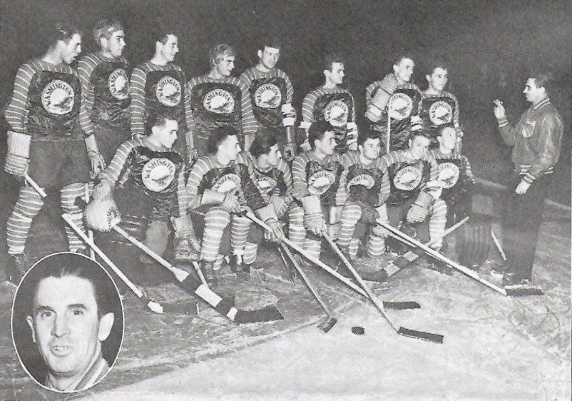
Washington Capitals
The Caps take inspiration from two places. The crest is a take on the Washington Eagles logo. The logo utilizes a portion of an unused logo from when Washington was rebranding in the 90s. The overall uniform design is inspired by the Washington Lions of the AHL.
-
Dallas CowboysXThe Toadies
I know this seems like an odd choice for Dallas, but I liked the way The Toadies logo looked replacing the Cowboys logo
-
Vegas Golden Knights
I think the Golden Knights were on the verge of something great with their Winter Classic uniform. I think what really brought that uniform down was the crest. So I replaced the V with a shield with two crossed swords that make a v shape. The shield also features a Vegas Golden Knights word mark that comes from other branding that they used around the Winter Classic. The rest of the uniform design is just modified from their Winter Classic uniform including some additional striping and using the WC gold as the main color
-
Cleveland BrownXNine Inch Nails
Now I know the Browns don't have a logo on their helmet, but there wasn't really an artist from Cleveland that I could've just used colors for and it would've come across. So I recolored their helmet and put the Nine Inch Nails logo on the helmet
-
2
-
-
Vancouver Canucks
So for the Canucks I kind of cheated. I REALLY liked their Reverse Retro 2.0, like I think it should be their home uniform. So I created a white version for this series
-
1
-
-
I loe everything about this except PELS on the white jersey. Everything else is phenomenal and makes the Pelicans really stand out in a world where they are a very bland team as far as uniforms go.
-
1
-
-
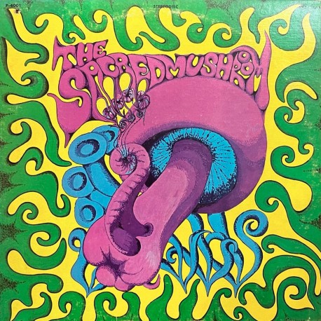
Cincinnati BengalsXSacred Mushroom
Ok this one is a bit out of the box, but hear me out on this. So the Bengals helmet is just a tiger pattern and when looking up artists from Cincinnati I came across this album by the band The Sacred Mushroom. This led me to replacing the tiger pattern with the green border from the album.
-
 1
1
-
-
2 hours ago, MJD7 said:
I had this idea of an adjustment to the Brewers’ City Connect, instead of limiting the “beer foam” stripes to the sleeves I translated it to the whole jersey. Thoughts?
I like it. It's one of those designs that's subtle to where I'd be like I don't get the reference, but then there'd be a behind the design graphic that would make me go oh that's genius
-
2
-
-
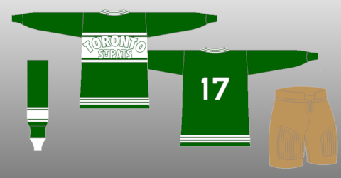
Toronto Maple Leafs
Here's another one I'm surprised the Leafs never tried to do as a Reverse Retro; especially with how lack luster theirs were. So I took their St Pats uniform and made have it Maple Leafs branding. The wordmark comes right from the logo and of course as a original six team they get vintage white.
-
1
-
-
Chicago BearsXKanye West
Regardless of controversial Kanye is; his name is synonymous with the Windy City and using his bear logo seemed fitting for the Bears.
-
3
-
-
Tampa Bay Lightning
For the Lightning I took inspiration from the Suncost Suns of the EHL. The uniform uses the Lightnings color; with black being the primary color. I use the Lightning secondary logo as the primary logo to give it that extra retro feel.
-
2
-
-
Carolina PanthersXDaughtry
With Daughtry being from the Greensboro area of NC (about an hour and a half from Charlotte) I took the bands crown logo and recolored it to fit the Panthers helmet
-
1
-
-
St. Louis Blues
I think the Blues were on the verge of greatness with their Reverse Retro 2.0. So I took that prototype jersey as the inspiration of their Feauxback. The biggest change is the front drops the wordmark and uses just the music not logo.
-
1
-


/cdn.vox-cdn.com/uploads/chorus_image/image/49166353/GettyImages-52758496.0.0.jpg)
Music X Sport Crossover Jerseys (Washington CommandersXGinuwine)
in Concepts
Posted
said not many I didn't say none. I went with RJA because their logo worked for the helmet