

johne9109
-
Posts
1,563 -
Joined
-
Last visited
-
Days Won
6
Posts posted by johne9109
-
-
20 minutes ago, coco1997 said:
Love it! I'd like to see the TCB logo incorporate somehow.If I was doing full uniforms, it'd probably be on the shorts somewhere
-
Memphis GrizzliesXElvis Presley
Memphis had to be Elvis' it just had to be. The circle wordmark is also in a similar vain to the Grizzlies wordmark. I swapped the light blue on the normal white jersey for the grizzlies yellow to tie into Elvis' jumpsuits

-
 1
1
-
-
Los Angeles LakersXIncubus
For the other LA team I decided on Incubus. There is a plethera of artists that hail from the region of California, but ultimately I felt that Incubus was a good fit for a lakers jersey
-
1
-
-
7 hours ago, MJD7 said:
Hell's Kitchen Daredevils
After making his MCU debut in Spider-Man: No Way Home & then subsequently appearing in She-Hulk: Attorney at Law (which the yellow alternate takes inspiration from), the Man Without Fear is set to have his own TV series revived.
That yellow jersey *chef's kiss*
-
 1
1
-
-
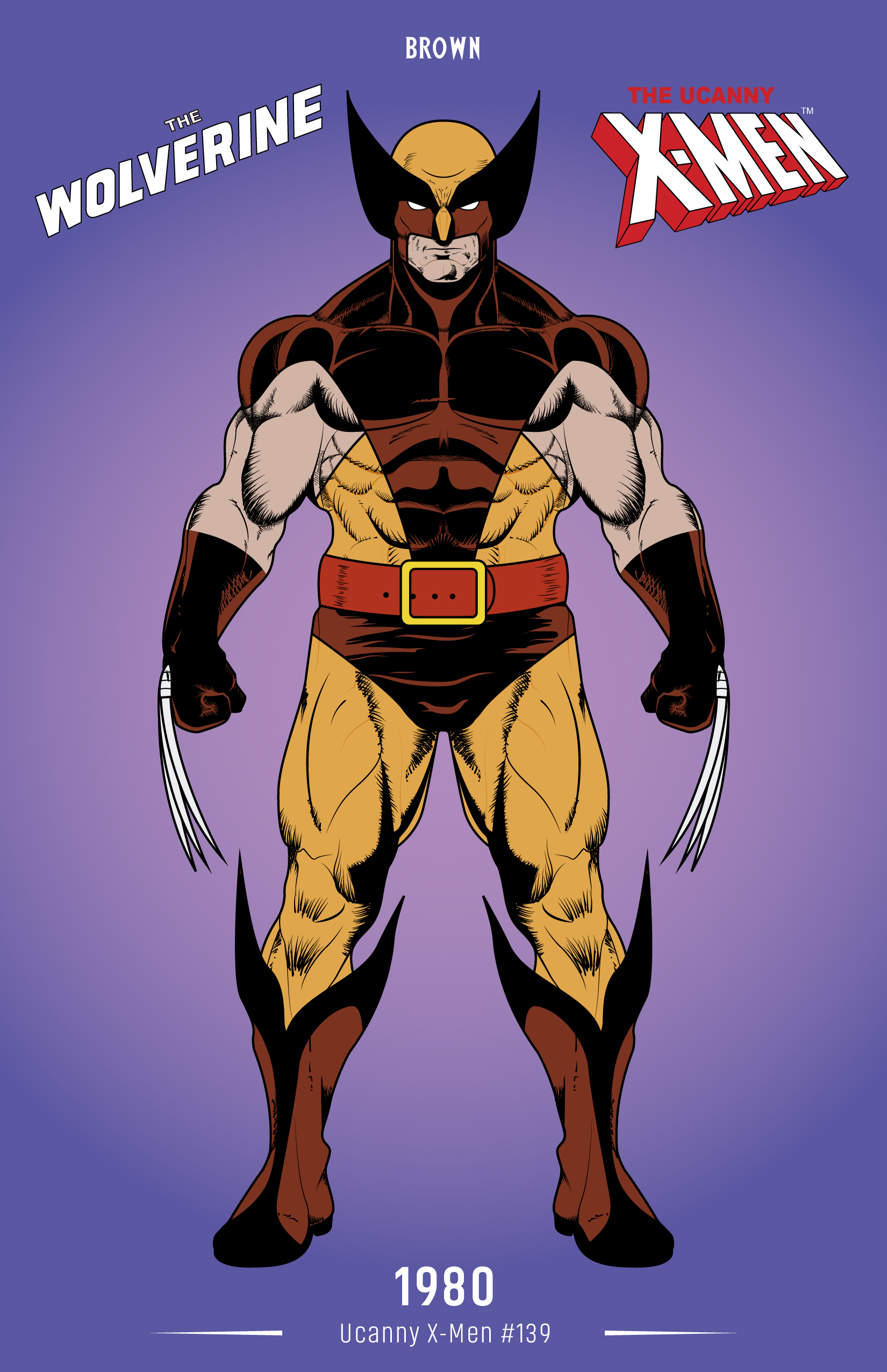
6 hours ago, MJD7 said:
That's a good idea! The shade of brown in the image you linked seemed pretty perfect, so I ended up using it:
I'd also probably have to adjust the yellow alternate to be more in-line with the main set (the original one was inspired by his costume in the X-Men '97 TV series).
Heck yeah that's sick
-
1
-
-
1 hour ago, MJD7 said:
Alberta Wolverines
He hasn't appeared in the MCU yet, but Hugh Jackman is set to return as Wolverine in the upcoming Deadpool 3. I based the uniforms on his comic book aesthetic.
These do look great, but might I suggest instead of the blue alternate doing a feauxback style uniform based on his brown outfit. Just a suggestion
-
1
-
-
Los Angeles ClippersXDr. Dre
The Clippers statement edition use a old english type letteringl which isn't too far off from the serrif lettering that Dre has used for years. The back features The Chronic and the number 2001 as a reference to his two albums
-
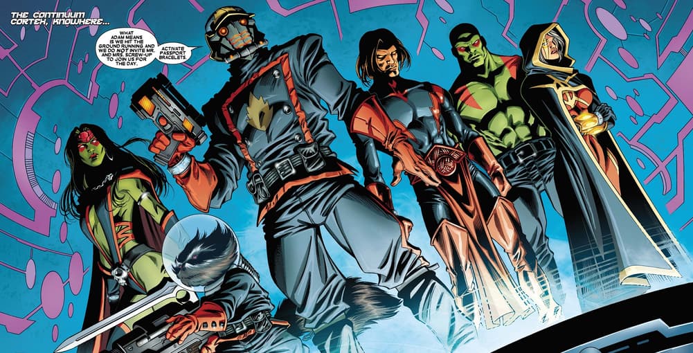
3 hours ago, MJD7 said:
Knowhere Guardians
Inspired by the most unlikely heroes of the MCU. The alternate, fitting for the holiday season, takes direct inspiration from the only Christmas special in the MCU.
Looks good, but why ths color scheme over their uniforms?
-
1
-
-
1 hour ago, wildwing64 said:
12. Toronto Guardians (Alpha Flight)
Name: Wanting a name representing all of Canada, ownership sought inspiration from the Canadian Shield, a physiographic region that spans much of the north. At some point - and perhaps taking cues from the national anthem - “Shields” instead became “Guardians”.
Logo: A red maple leaf contained within a shield. The leaf is split into three segments, with the negative space forming a “T”. Part of the white border inside the shield is cut off, forming a “G”.
Alternate Logo: The maple leaf and the T, sans shield. This is featured on the pants and as a helmet decal.
Colours: Red and white, of course.
Jerseys: A pair of classic red and white sweaters with traditional stripes. The road white jersey features a red shoulder yoke, and swaps the colours of the crest.
Third Jersey: In case their regular uniforms weren’t Canadian enough, the Guardians almost literally wrap themselves with the Maple Leaf Flag. The jersey is notable not only for being one of the wildest ever conceived, but also because the team was forced to make the back numbers black after numerous complaints about them being illegible.
In terms of his visual identity - much like his Alpha Flight teammate Northstar - Guardian didn’t give me much to work with aside from the blatant Maple Leaf Flag inspired design of his suit; in other words, a concept based on this particular superhero (or Captain Canada, or Captain Canuck, or even Major Mapleleaf) is inevitably going to look like a Team Canada. And as a Mirror Universe version of the Toronto Maple Leafs it only seems appropriate to have a uniform that’s similar to them, even if it’s simply a red and white version - or, if you will, the Maple Wings. But with a name like the Guardians, at least I can do something a little different for the logo.
Speaking of names; John Byrne originally intended Guardian to be “the Canadian Shield” (like the physiographic region, as I cited in the background text above) but Marvel wouldn’t allow it because it’s too similar to S.H.I.E.L.D. Guardian was also initially rejected because of other characters with that name (On that note, I have a different name in mind for a Guardians of the Galaxy team). For his first appearance in the X-Men comics he would instead be known as Weapon Alpha, and then Vindicator, before Byrne finally changed the character’s alias to Guardian when the Alpha Flight team got their own comic. An interesting parallel to the Maple Leafs, who were known as the Arenas and then the St. Pats before Conn Smythe bought the franchise and gave them their current name.
Be it the Shields or the Guardians, given the source of the name a shield logo makes the most sense. Elements of the shield, such as the overall shape and the T, were borrowed from the coat of arms of Toronto - though it’s fair to point out that the shield is a standard shape. Admittedly it was starting to look a bit generic, but I had an “a-ha” moment when thinking about how to form a G from that shape.
The third is directly based on Guardian’s suit, which - again - is obviously inspired by Canada’s flag. Something like this probably fits in not only with the 90’s trend of sublimated designs but also the more recent off-the-wall stuff we’ve seen for the Stadium Series.
That third jersey is a beaut!
-
2
-
-
Indiana PacersXBll Monroe
Indiana was one I struggled with. Ultimately I settled on Bill Monore; considered the Father of Bluegrass
-
Houston RocketsXBeyonce
Not a huge fan of Beyonce yself, but she does hail from Houston and it works well on the Astros jersey
-
1
-
-
5 hours ago, CRDesigns said:
Normally I would, but this series is more of a basic creative exercise than anything. if theres enough interest maybe ill make them into full sets in the future.
Sorry for the week delay, had trouble with ideas for Florida but I have come up with something that I actually quite like!
This one was inspired largely by their 'jetblue' jerseys, using similar striping (with some creative adjustments). the colours are from their inaugural years.
Hope you all enjoy! Feedback welcome as alwaysI'll always prefer the Panthers in red over blue but this is still pretty good
-
1
-
-
Golden State WarriorsXThe Greatful Dead
The warriors logo with the Golden Gate Bridge is replaced with the Greatful Dead Skull logo and ot works amazingly
-
1
-
-
Detroit PistonsXIggy Pop
The Pistons Statement edition has this block typeface which works reall well with this Stencil typeface that Iggy Pop uses. So the front features POP similar to how the jersey employs DET and then Iggy on the back
-
1
-
-
Denver NuggetsXTheFray
For the Nugets I decided to go for The Fray. Just seemed to fit the current Nuggets look
-
Dallas MavericksXMeatloaf
THe Mavs get a crossover with legend MEatloaf because why not
-
I like the nod to their Whalers history. The font feels very Star Trek, but works. That's a cool secondary logo as well
-
Cleveland CavaliersXKid Cudi
Kid Cudi has this neat logo that i felt worked really well for the Cavs statement jersey. Unfortunately the Cavs have very uninteresting jerseys so there's not much to go with
-
1
-
 1
1
-
-
Chicago BullsXCommon
I had the opposite happen with Chicago; there were a plethera of artists to choose from. I settled on Common as I like the way his branding fit with the Bulls branding. The back of the jersey features the name of his group with Mos Def; Soulquarians
-
1
-
-
Charlotte Hornets X Petey Pablo
This one is probably a bit of a deep cut, but for the Hornets I went with rapper Petey Pablo. I know he's not a relevant artist by any means, but I was struggling to find an artist that I felt fit with the Hornets branding. Whenever I hear anything NC releated I always think of Pablo's song Raise Up which was an ode to the Carolnas so he felt like a good fit
-
2
-
-
2 hours ago, fouhy12 said:
Lastly, let's head east to take a look at the New England Patriots. With their redesign in 2020, the franchise unveiled what I believe to be the best jerseys in its history. Pairing the traditional shoulder stripes with the dynasty colors and double number outline was the way to go. Unfortunately, a lack of shoulder numbers and insistence on navy below the waist set this new brand back from what it could have been. I correct that here, making shiny silver pants the primary at home and adding striped, white socks to pair with the dark pants on the road.
agree that this jersey is the best in it's history; however with there being no silver in the jersey I've always felt that they should drop silver from their colors. That's just me though; this is a great set
-
Brooklyn Nets X Jay-Z
This one seems pretty obvious considering Jay-Z's involvment with the Nets over the years. Jay's other nickname HOVA is on the back with the number 99 being a nod to his song 99 problems
-
1
-
-
6 hours ago, CRDesigns said:
Thank you!
I coloured it this way because i wanted to keep the sand outline consistent with the front crest.
I forgot to save Boston, so today we have Buffalo!
Not a whole lot of crazy stuff going on with this one. I am a firm believer that the Buffaslug is a fine logo, the jerseys just brought it down. I combined the Buffaslug era jerseys with the Heritage Classic for this look.
Hopefully Boston will be up tomorrow, lol. Feedback appreciated!You're right the Buffalug does look better on a more traditional jersey Goo job!
-
Boston Celtics X Dropkick Murphys
Probably an obvious pick, but Dropkick Murphys blends so well with the Celtics branding. I went with the Statement jersey because I think the black fits better. I put Quincy on the back as a nod to where the band actualy hails from within Massachusetts
-
4
-


Music X Sport Crossover Jerseys (Washington CommandersXGinuwine)
in Concepts
Posted
Miami HeatXMiami Sound Machine
Now for all of these so far I have used a current jersey of the team, but when doing the Heat and knowing I was going to use Miami Sound Machine it just made sense to use one of their Vice jerseys.