

johne9109
-
Posts
1,548 -
Joined
-
Last visited
-
Days Won
6
Posts posted by johne9109
-
-
The colors on this are fantastic. I like the compass as the dot of the I but maybe put it at the same angle as the rest of the wordmark so it feels like it's more a part of the word. It could also just be used for the waistband logo like @fortunat1 said. I also agree that the clipper needs to be played around with just a little but more. As it is now it feels a little hard to make out. Maybe either adjust the shape a little or adding a stroke and I think once that's figured out that will take this from a pretty good concept to an amazong concept. Great work
-
Buffalo BillsXCannibal Corpse
With the Bills I decided to use the band Cannibal Corpse. I know that doesn't sound like a match, but I think I made it work. The band's skeleton logo gets a blue stroke and I added a red blood streak to replicate the red stripe in the Bills logo.

-
 1
1
-
 1
1
-
-
San Jose Sharks
The Sharks take inspiration once again from the California Seals; this time from their first uniforms. The colors get swapped for teal and gray and the logo gets revamped to look like a shark.
-
2
-
-
Baltimore RavensXGood Charlotte
For the Baltimore I went with Good Charlotte as they are from the Maryland/DC area. I took the Ravens helmet and put Good Charlotte's GC logo in place of the B in the Ravens logo. Not a wild change but it works
-
Pittsburgh Penguins
This is something I'm surprised the Penguins haven't done especially with the Reverse Retro series but u took the Penguins inaugural uniform and replaced the awful wordmark with their classic penguin logo. I also swapped their blue color scheme with their current black and yellow
-
1
-
-
10 hours ago, MCM0313 said:
I’m loving this thread!
Thank you
-
The pink works so well for Miami
-
2
-
-
Philadelphia Flyers
The Flyers don't take inspiration from any one specific place, but rather get a more tradition style unofficial similar to what they did for the 2012 Winter Classic. I know a lot of people want to see them do a homage to the quakers but I feel like that is played out and wanted to do something different
-
Super Mario Bros
Instead of doing different sets for each character I decided to pick a different character for each of the sports. I picked baseball for Mario as that feels like the default sport as Mario is the default character. Basketball seems to fit Waluigi's lanky frame. Wario's size was a perfect fit for Wario. Leaving Hockey for Luigi
-
1
-
-
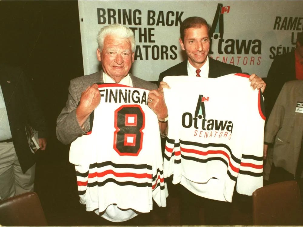
Ottawa Senators
The inspiration for the Sens was their prototype that was used back during the Bring Back The Senators campaign. I combined elements from both jerseys into one cohesive design.
-
1
-
-
Atlanta FalconsXOutkast
I had to get Outkast in here as one of the Atlanta teams. I used their winged O logo over their more recognized crown logo as I felt it fit more in line with the Falcons branding. Everything then gets colorized using the Falcons colors.
-
6
-
-
I love the blue gloves for the Pens logo. That Islanders jersey would be great for a Winter Classic. Great job
-
1
-
-
19 hours ago, DTConcepts said:
A lot has been said about the Islanders' recently-unveiled Stadium Series jerseys, most of it pretty negative. While I don't hate the jerseys, I do agree that they could've been stronger.
I attempted to fix them while retaining the same design features & philosophy as the actual design. I followed the Rangers’ motif of blowing up the arm stripes by splashing in a little color and adding a white stripe to mimic the Isles’ road jersey striping. Looks miles better than what the team actually unveiled, if you ask me.
What do you think?
It's crazy how much better this looks. The addition of white makes this uniform pop much more than the actual jersey and pairs much better with the Rangers jersey. The lighthouse on the pants is dope and is very Stadium Series. I like the idea of using two blues but I wonder if they should be swapped on the jersey that way the dark blue of the jersey is blocked together with the dark blue of the equipment. Oerall good job.
-
6 hours ago, VampyrRabbit said:
Can we see the Hartford Whalers?I second this notion. Always love to see some Whalers concepts
-
 1
1
-
-
Arizona CardinalsXDead By Sunrise
And we're back! Everytime I look for artists from Arizona I keep seeing Chester Bennington and while I love him and Linkin Park; it felt weird doing a LP for Arizona just because the lead singer is from there. So what I did instead was Bennington's side project Dead By Sunrise. Their logo is put onto a white helmet and given the colors of the Cardinals
-
1
-
1
-
-
Hades (Disney's Hercules)
Here's another Disney set; this time based on Hades from Hercules. His robes are the main basis of the jerseys with the triangle pattern becoming the design for a lot of collar, sleeve, and striping designs. For the numbers I used the roman numeral for 13 as 13 is related to Hades and the underworld in Greek mythology
-
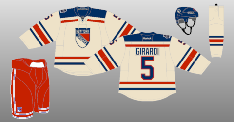
New York Rangers
It's always kind of bothered me that the Rangers home and away aren't direct mirrors of each others. So I did my best to take the white jersey and translate it over to a blue jersey. To give it a more throwback feel I used their shield logo that they used in the 2012 Winter Classic and then used off white and tan on the equipment
-
1
-
-
New York Islanders
I took inspiration from an unlikely source, the short lived New York Raiders of the WHA. I originally modified the Raiders logo with it having say islanders instead, but I can't see the NHL doing a direct reference to a WHA team that a team doesn't already have ties to (a la Winnipeg Jets.) So I used the Islanders logo and just used the overall design from the Raiders
-
1
-
-
Montreal Canadiens
The Habs are always tricky as they haven't changed a whole lot and fans are very reluctant to changes in their uniforms. So what I did was take their Pre NHL uniform from 1910 and drop the green for their more common blue. I also used vintage white for the Habs as they are an original 6 team and they are the only teams getting to utilize it in this series
-
New Jersey Devils
The Devils take inspiration from the Kansas City Scouts as they eventually became the Devils. The colors come from the Devils prototype logo that was used when the team was announced. That logo is also used on a jersey for the first time.
-
2
-
-
5 hours ago, Section30 said:
That Washington set is really sharp, but the color tweak and the blue jersey over red pants is giving major Ranger vibes rather than Caps.
I agree. I would be interested in seeing the colors stay, but swapping them so red is the main color and blue is secondary
-
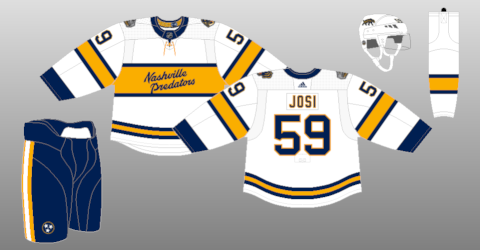
Nashville Predators
The Predators are pretty straightforward. They once again nod to the Dixie Flyers, however this time the front features their secondary logo from the Winter Classic instead of the wordmark.
-
1
-
-
Minnesota Wild
The Minnesota Fighting Saints first uniforms are the basis for the Wild. The Wild M logo gets primary logo duties here.
-
Los Angeles Kings
My first decision was to bring back forum blue and gold as the Kings should. Next I took inspiration from the striping from the Kings golden anniversary jersey and worked to make it feel more like a classic jersey
-
4
-


NHL Feauxback Series 32/32 (Jets Added)
in Concepts
Posted
Seattle Kraken
We have all heard about the lawsuit with the Kraken and the man who owns the rights to the Seattle Metropolitans, so what I decided to do was take inspiration from another Seattle team who wore similar uniforms, the Seattle Eskimos. The colors are swapped with the Krakens colors and the wordmark adapts the Eskimos wordmark, but uses a S similar to the Kraken's. I originally put the Kraken logo in place of the S, but it looked to modern and out of place