

johne9109
-
Posts
1,548 -
Joined
-
Last visited
-
Days Won
6
Posts posted by johne9109
-
-
40 minutes ago, Coiler said:
I'm a little surprised there haven't been more 1908 Red Sox throwbacks given how obvious and "logo-y" (one of the first of its kind!) the sock is.
And maybe it's just wanting variety, but I think some form of the sock would look good on the cap instead of the familiar B.I agree. I think something like this would work well with their blue or red jerseys
-
 1
1
-
-
Edmonton Oilers
The Oilers pay homage to the Edmonton Eskimos. The Oilers colors are brought over and the logo features an oil drop.

-
2
-
-
Detroit Red Wings
The Red Wings striping is a modified version of the striping on their jersey from their couple of years as the Falcons while the color scheme and logo comes from their 2014 Winter Classic; sans the wordmark.
-
7 hours ago, Sidney said:
Hi guys after a while I'm back. I'll post some stuffs that I've reworked on but haven't posted yet here.
The Calgary Hitmen.
-Changed the jersey to brown, the secondary to match Hart's famous color.
-Added a contact effect behind the secondary to make it less boring and kind of vintage.
Any C&C are welcome!
Logo #3 is amazing
-
Dallas Stars
A few years back the stars had revealed a homage jersey to the Minnesota North Stars. I really like that logo and the old school feel it has. So I took that and put it on a North Stars uniform from the late 70s and used a color palette more in line with Dallas. I know the Wild have been doing the North Stars tributes lately but it's a part of Dallas' history
-
Columbus Blue Jackets
So I could've went the easy route and just made a white version of their cannon alternate, but I decided to go another route. I decided to do an homage to the previous Ohio NHL team; the Cleveland Barons. The design is taken from their uniform while the colors and logo is taken from the teams alternate uniform as I felt that logo better fit the throwback nature of this series. Now I have been trying to keep vintage white for the original 6 teams only, but this cream color is already a part of the Blue Jackets branding so I kept it.
-
1
-
-
Colorado Avalanche
The Avs are loosely based on the Colorado Rockies. Reverse Retro showed us that the Avalanche would not be able to do a direct homage to the Rockies so we get a uniform design reminiscent of the Rockies, but with the Avs colors and the C from the state flag is free from the mountain
-
1
-
-
Chicago Blackhawks
The Blackhawks design is an amalgamation of uniforms from their history. The main design is from their inaugural uniform; however instead of being black and white I used the teams current colors with a vintage white. The main logo comes from the 50's as well as the secondary logo. The shoulders that feature the secondary logo reduces the striping of the original design to make room for the secondary logo
-
Carolina Hurricanes
Last year the Hurricanes introduced this vintage Stormy run of merchandise and while I don't think Stormy makes sense as the mascot for a team called the Hurricanes it works perfectly for this series. So we see Stormy on the front of the jersey. The overall design of the uniform is a nod to the Hurricanes history; originally being the Hartford Whalers. I adapted one of the Whalers WHA uniforms
-
1
-
-
Calgary Flames
While the Flames does share some similarities to their 2011 Heritage Classic uniform the inspiration for this one actually comes from the first battle of Alberta and the 1898 Calgary Fire Brigade hockey team. The colors become a desaturated version of their current colors and the logo is replaced by a script Calgary
-
2
-
-
Buffalo Sabres
The Sabres are one of those teams that have dabbled in throwbacks and feauxbacks in the past; heck their current uniforms are throwbacks. So for them I had to find a different source of inspiration. What I ended up doing was using the old Buffalo Bisons as inspiration. I thought about using their regular logo, but it didn't stand out too much so I used their secondary logo from the Heritage and Winter Classic uniforms.
-
Boston Bruins
For the Bruins I wanted to do something that was different than any of their throwback or winter classic uniforms. The logo I pulled from old promotional work and then the design is an amalgamation of old Bruins uniforms. I really like the dark/ almost black brown that Boston has been using over the last few years and wouldn't mind if they moved to it full time
-
1
-
-
Arizona Coyotes
The Coyotes I did something I'm surprised the team has never done themselves and that's take the jersey the coyote is wearing in their logo and make a jersey based on that. I simplified the colors and dropped green and used the Sedona red for the equipment to harken back to the old leather equipment hockey players used to wear
-
1
-
 1
1
-
-
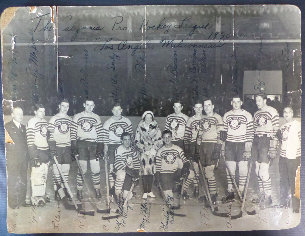
Anaheim Ducks
For the Ducks I pulled inspiration from the Hollywood/LA Millionaires of the California Hockey League that ran during the 20's and 30's. I kept the white base but the striping becomes gold. The logo is an adapted version of the Mighty Ducks secondary logo, but Wild Wing is replaced with an actual duck to enhance that retro look. I originally had this as a black jersey but wether I tried orange stripes or gold stripes it looked less like a Ducks jersey and more like a Vegas or Flyers jersey.
-
1
-
1
-
 1
1
-
-
So I had the idea of doing a series of jerseys that aren't straight throwbacks, but jerseys that are made to look old but don't have any actual basis on a teams old jersey. Think what Vegas did for this Winter Classic or what teams like the Wild and the Stars did for their outdoor games. For some teams I may pull inspiration from other historic non NHL teams or do an amalgamation of older designs (i.e Bruins Winter Classic jerseys) and some will be completely original.
- Anaheim Ducks
- Arizona Coyotes
- Boston Bruins
- Buffalo Sabres
- Calgary Flames
- Carolina Hurricanes
- Chicago Blackhawks
- Colorado Avalanche
- Columbus Blue Jackets
- Dallas Stars
- Detroit Red Wings
- Edmonton Oilers
- Florida Panthers
- Los Angeles Kings
- Minnesota Wild
- Montreal Canadiens
- Nashville Predators
- New Jersey Devils
- New York Islanders
- New York Rangers
- Ottawa Senators
- Philadelphia Flyers
- Pittsburgh Penguins
- San Jose Sharks
- Seattle Kraken
- St. Louis Blues
- Tampa Bay Lightning
- Toronto Maple Leafs
- Vancouver Canucks
- Vegas Golden Knights
- Washington Capitals
- Winnipeg Jets
-
24 minutes ago, CRDesigns said:
Definitely agree. Though it was fun to experiment like this!
Today I have Pittsburgh, where I did something a little different...
Yup. The striping from this one is inspired by the tried and true look of the Steelers, to continue the strong unity between sports in Pittsburgh.
Feedback is appreciated as always!A lot of times when people try to give the Pens more traditional striping it ends up looking too much like the Bruins, but using the Steelers striping make this distinctly Pittsburgh. Well done!
-
Kirby
Did a set based on one of my all time time favorite not just Nintendo franchise, but overall video game franchises, Kirby. Pink is the main color of course with accents of a darker pink. The warp star is used in the logos and secondary logs. The number 92 is use as that was when the first Kirby game came out
-
2
-
-
The Little Mermaid
Keeping with some more Disney properties I did a set based on Ariel from The Little Mermaid. Designs are pretty straight forward. For all of the jerseys I used the teal of Ariel's tail as the main color as I feel it's the prominent colors of her character design. The hat for the baseball uniform is red like her hair; as well as elements of the football helmet. The basketball and football jerseys employ a scale design; while the hockey jersey gets some wave striping
-
2
-
-
I'm going to go ahead and post the last couple of teams while I take a break from this series. I will be back with the NFL and NHL, but I need a break
San Antonio SpursXHolly Dunn
I struggled a little but finding an artist that matched the Spurs, but ultimately landed on country singer Holly Dunn as I was able to keep the Spurs logo on the front; replacing the u in Dunn with the logo
Toronto RaptorsXDrake
This is one I knew early on I was going to do and it worked out perfectly. A simple swap of Raptors with Drake on the front and then the back features the name of his label OVO
Utah JazzXNeon Trees
This might be my favorite for an artist I don't listen to. The band Neon Trees utilize a winged heart logo; so I took one wing off and it was an easy replacement for the Jazz logo. The bright yellow jersey that doesn't work well for the Jazz is a perfect fit for a band named Neon Trees as well
Washington WizardsXFugazi
For the Wizards I decided to go with punk rock band Fugazi. The red white and blue of the Wizards doesn't fit an old school punk band like Fugazi so I swapped in a black and white scheme to better fit the band
-
2
-
-
15 hours ago, Chi-Tex_Kidd said:
Back with an update for the Bears and a new team the Broncos.
Now with GSH patch.
The Broncos have a history on this thread with some ugly past but now 3.0 is here with the old colors and simple streamlined jerseys to evoke a Wyoming Cowboys feel.
Feel free to comment and help me improve.
Brown and yellow surprisingly work for the Broncos, but I can't see another NFL team employing brown as their main color when we already have the Browns. Wonderful concept though
-
8 hours ago, CRDesigns said:
Happy Friday everybody. Today I have Ottawa!
Lets just get to it
This one is largely inspired by the NHL100 / Heritage Classic jerseys and their current home/away set. I will forever believe that the Sens need to use gold in their actual jerseys so it has been added here.
Feedback is appreciated, as always!Just adding a little bit of gold makes the Sens stand out so much
-
7 hours ago, coco1997 said:
Thanks!
Stay tuned.
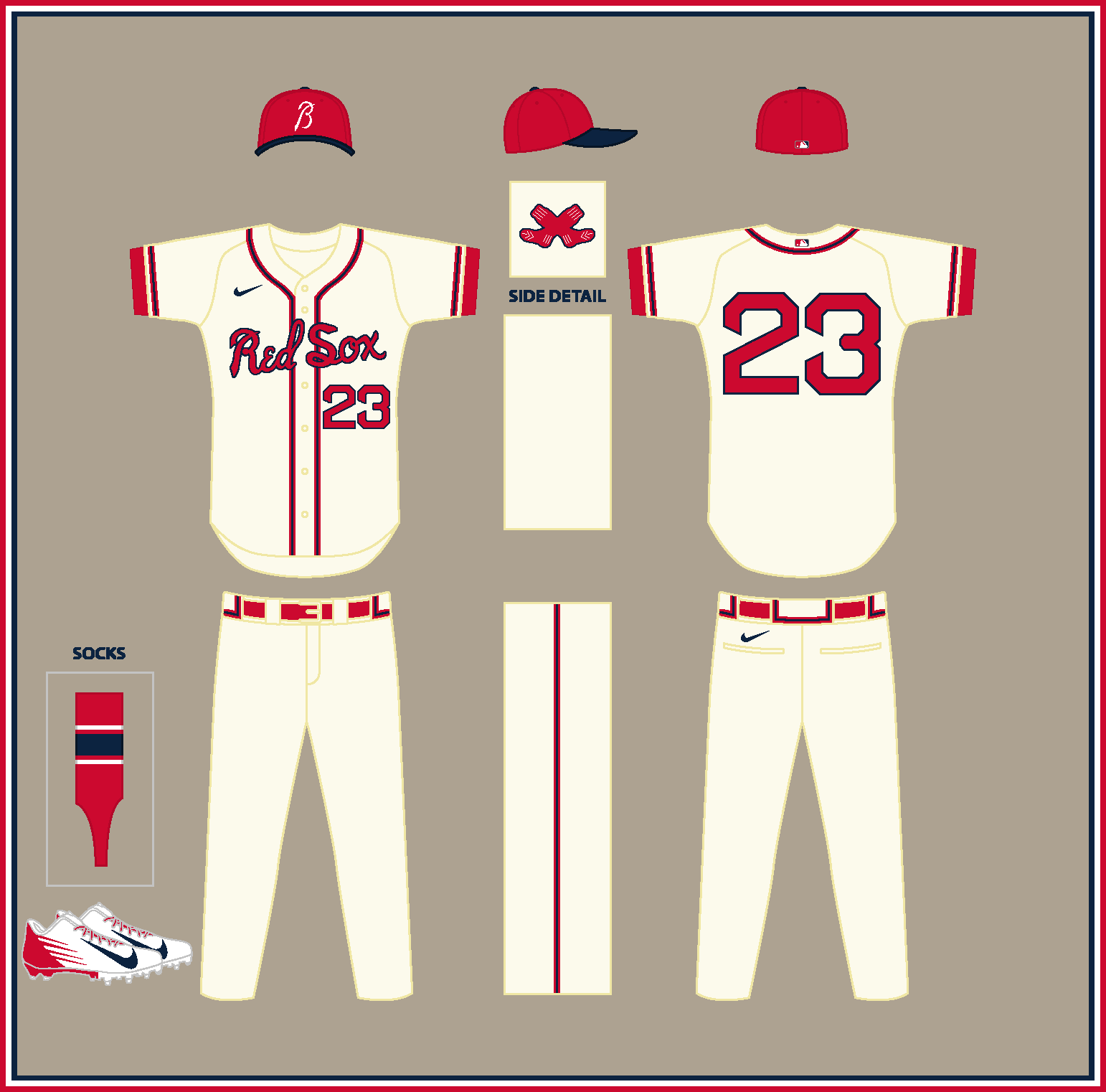
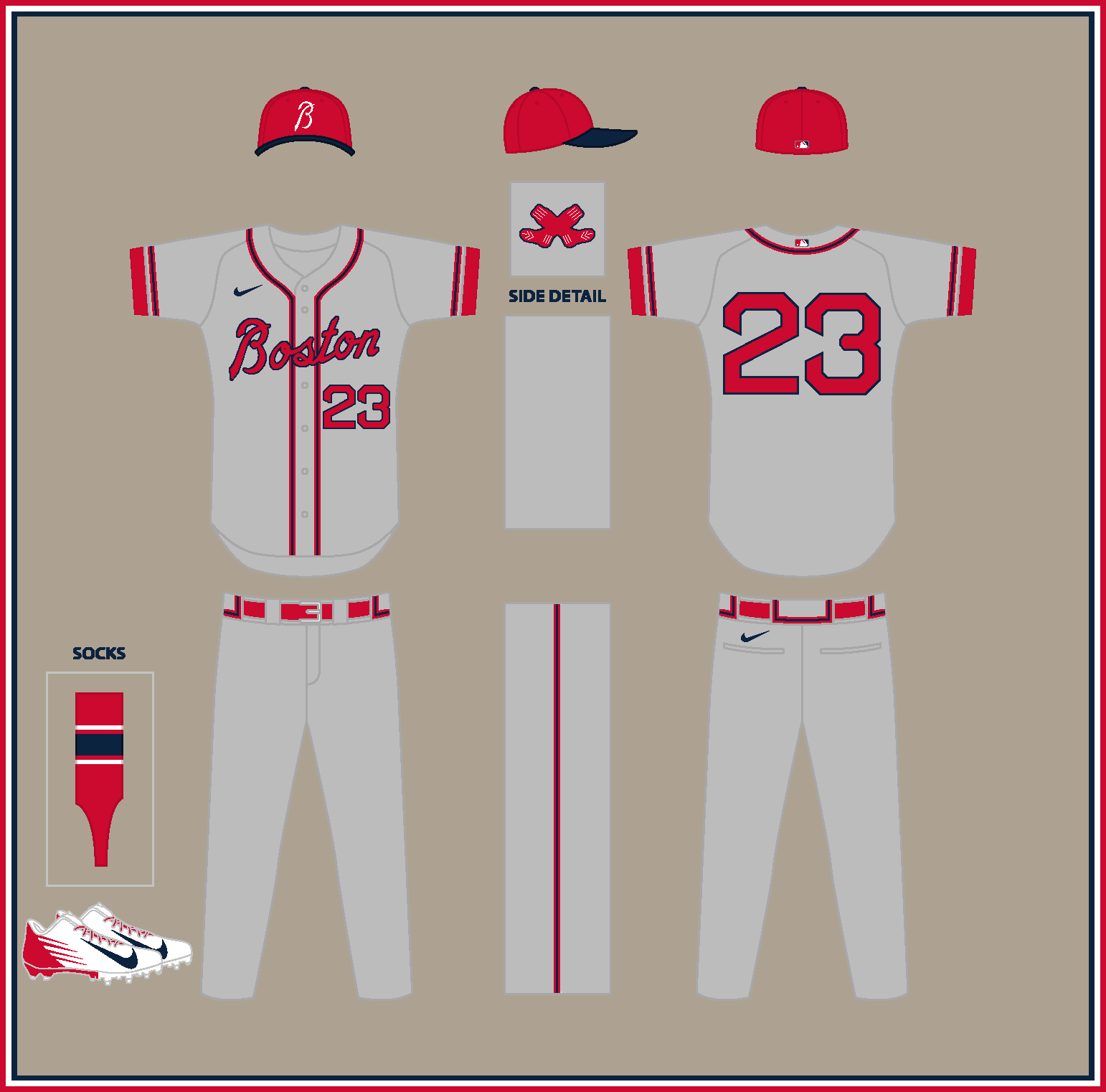
BOSTON RED STOCKINGS (est. 1871)
HOME:
ROAD:
HOME ALT:
ROAD ALT:
Notes:
- Like the Reds, the (Boston) Braves started off as the “Red Stockings” and went through several interesting name changes before becoming the Braves in 1912.
- The uniforms combine design elements of the Red Sox (McAuliffe numbers) with the Braves (triple piping), along with wordmarks in the style of Atlanta’s scripts.
- The sleeve patch is a recolored version of the White Sox’ 1926 cap logo, which evokes the crossed tomahawks from the Braves’ alternate logo.C&C appreciated!
These REALLY work!
-
1
-
-
Sacramento KingsXDeftones
This is another one of my favorites. The Deftones script works so well on the Kings black jersey. I went with Cheng and 13 on the back in remembrance of band member Chi Cheng who passed away in 2013
-
2
-
-
Portland TrailblazersXThe Shins
The Blazers jersey and the Shins work surprisingly well together


NHL Feauxback Series 32/32 (Jets Added)
in Concepts
Posted
Florida Panthers
I took the striping from the Panthers Reebok Edge design and made it look like more traditional striping and merged that with elements of the Panthers original uniforms. The logo comes from their abominable alternate jersey from the Reebok years as I felt it has a more classic feel to it than any of their other logos. The colors are lightened up a bit as well to give it a 60's/70's team feel.