


ruttep
-
Posts
1,263 -
Joined
-
Last visited
-
Days Won
41
Posts posted by ruttep
-
-
56 minutes ago, VampyrRabbit said:
though it probably is more suited to a Winter Classic than a Stadium Series match.
Oversized striping and TV numbers, massive diagonal letters that spell out an abbreviation rather than the team name. All elements that toally belong more on a Winter Classic jersey than a Stadium Series jersey.
-
On 1/24/2024 at 11:32 AM, MDGP said:
Correct, 2008 was the first season the Titans wore Columbia full time.
Huh, didn't know that. I assumed it was an alternate because that's the only time they ever wore that jersey in the playoffs.
-
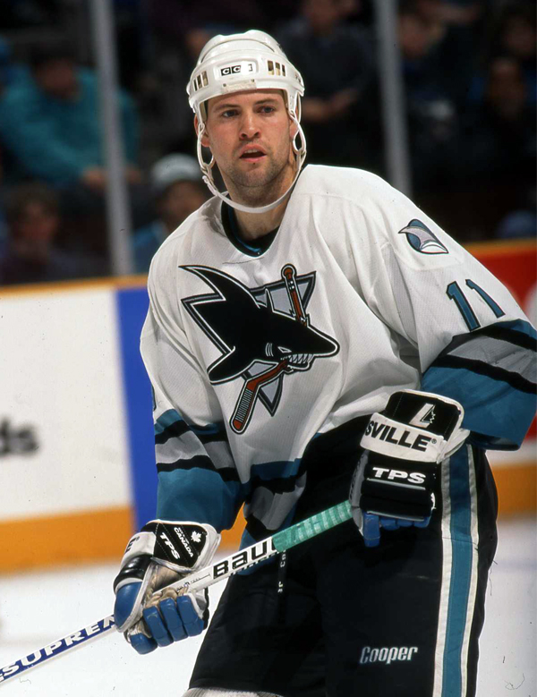
11 minutes ago, SFGiants58 said:
This is best Sharks uniform ever.Nah.

-
 9
9
-
 1
1
-
 4
4
-
-
Found a picture of the Flyers uniform with a player actually wearing it. Seems to confirm black pants, and, strangely, black helmets. I assumed the Devils would be in black helmets, and under current rules, the Flyers wouldn't be able to. Maybe they got an exception from the league to do so
-
1
-
-
Predictions for the helmet/pants colors:
Rangers: white helmet, same red pants they use for every uniform
Islanders: navy helmet, navy pants
Devils: black helmet, black pants
Flyers: white helmet, black pants (I think they might've gone with a black helmet if not for the rule that teams cannot wear the same color helmet as their opponent)
-
1 minute ago, SSmith48 said:
It amazes me how every single new Islanders look that has been released in the past half-decade or so is completely devoid of any character. It's like they have a checklist that every new look be basic and in navy and orange. I'm almost impressed by how hard they are trying. Like seriously, the Stadium Series is one thing, but how in the world do you mess up a Fisherman-era Reverse Retro uniform as bad as they did?
Lou Lamoriello
-
4
-
-
52 minutes ago, PurpleHayes said:
The Cowboys should get rid of their white jerseys, then, since they've lost far more games wearing those than they have in their 'bad luck blue jerseys.' Especially against the Packers a couple of weeks ago...

Expecting the Cowboys to get rid of their primary white jersey is like asking the Yankees to get rid of pinstripes or the Canadiens to get rid of their blue chest stripe. It's not gonna happen.
-
1 hour ago, Carolingian Steamroller said:
Most of the Lions' history is TERRIBLE. Having a sense of history would only bring revulsion and self-loathing. Part of what Dan Campbell and his team have done is erase a lot of that history.
They've won a lot of big games in the all whites, starting with the one in Green Bay at the end of 2022 which really kicked their present run into high gear. If they win on Sunday, I promise the all-whites will become a classic that people will clamor for in 20 years.I promise you that there will be an all-white jersey in their new set because it essentially became their primary road look in their best season since 1991. The outcome of this game won't change how the Lions and Lions fans view that look.
-
 1
1
-
-
I'm actually pleasantly surprised by the Rangers. It's just a Rangers jersey with several design elements blown up to comically large proportions. They didn't make a complete fool of themselves.
Islanders jersey is completely terrible. They make TV numbers massive to help fans in the stands see them, but navy on orange is a way bigger obstacle to legibility than that. The Islanders also join the list of teams to wear a nickname on their jersey.
Devils is about what I expected all of these teams to do. Looks like one of the 2019 Stadium Series jerseys
Flyers jersey is fine. They showed a surprising amount of restraint on that jersey. Not sure how it's even close to the worst, let alone worst by far.
-
3
-
-
1 hour ago, JQK said:
What makes you think that?
Think they'd try to match it up with this year's playoff endzones
-
1 hour ago, Patchey13 said:
might be one of the best overall looks in the league now
If they ever remember that white helmets exist and can be worn with a white jersey
-
4
-
1
-
-
1 hour ago, CreamSoda said:
Whoop. Der it, unfortunately, is:
One team in the NFCCG has a rich history and tradition to uphold. The other flaunts their lack of history and tradition in everyone's face.
I know they haven't made the playoffs, much less have success in them in forever, but this is embarrassing. This is not a serious franchise.
Go Niners.
-
2
-
-
18 minutes ago, Bomba Tomba said:
What if the Ravens go all in on darkening their purple? Condense that and the black into one color, dark purple that's almost but not exactly black
And then the Vikings keep their brighter shade, and play up the yellow to further differentiate
Don't see the point in that. The Ravens' purple is already pretty dark, might as well drop purple and go directly to black at that point.
Plus, since Nike is seemingly allergic to accommodating certain custom colors, there's a high chance that none of the equipment ends up matching this hypothetical color.
-
5
-
-
6 minutes ago, dont care said:
Do you know how many teams blow 2-0 leads, or have bad road trips. Just about every team. Calm down
Fair. It's fun to be unnecessarily dramatic about your team.
-
6 minutes ago, M59 said:
Actually, I've been here for years...but when I took some time off, I couldn't get back in under my previous user name (tpoh59). So, while I freely admit to being a contrarian (and someone who believes that jersey design peaked in the late 1990s and has been declining since) I dispute the troll characterization.

I mean, when one person comments six times in a row, all in snarky disagreement with the consensus opinion, I assume they're trolling.
-
1
-
-
2 hours ago, M59 said:
And now we know where the weird collar treatment on the Angels pullovers is coming from. IMO, it's official: Nike had the basketball division design the new MLB templates.
2 hours ago, M59 said:If the Mets had changed the white trim from a drop shadow to an outline, they would have hit a sartorial home run. This is just another step in MLB's current uniform direction: cheaper and more boring.
2 hours ago, M59 said:Sorry, I just fell asleep for a moment. The Yankee$ have finally gotten what their fans have wanted for a while now: the most boring road kit in MLB. Congratulations. I'm sure the $ you saved on no longer paying for white outlines will be well spent.
1 hour ago, M59 said:I'm sure it will come as a shock to no one that I 100% disagree with you on which of those two is the better jersey...although the new Nike template would have wrecked the headspoon. I wonder if the "n" is gonna get split?
1 hour ago, M59 said:Agree that getting rid of that number font would be an upgrade.
59 minutes ago, M59 said:In this case, 2+2 very much =5!

I see we have another contrarian troll on our hands. Welcome!
-
2
-
-
7 hours ago, Old School Fool said:
Really? You want the Lions to lose because of pants? The team is on one of the greatest runs in sports history and you want to see it come to an end because of pants?! I know what site we are on and complaints are valid but at the end of the day we're all here because we love sports. Who cares what they wear right now because this season is crazy. I want to see the Lions get to the Super Bowl and win.
I also happen to be a Niners fan. I'm rooting for the Niners to win anyway.
-
 1
1
-
-
Rangers just blew a 2-0 and lost in OT to the
 Sharks to complete a 1-2-1 road trip. This is a five-alarm fire. Something needs to change here.
-
9 minutes ago, infernoqueso said:
This might be a weird personal taste, but I dislike the matte finish much more than a chrome finish. Still prefer the standard glossy. In hockey the helmet shouldn't be a design element.
At least matte doesn't distract your eyes from everything else going on in the hockey game
-
3
-
-
-
Yankees new road uniform should look great.
I think both sides of the argument make a good point: The lack of white is much more retro and pulls off the "untouchable classic" vibe better, but it's also factually correct that the uniform has had the white-outlined design for half a century at this point. The Yankees won most of their World Series in the non-outlined jerseys, but their most recent run of dominance did occur in the outlined jerseys. I'd call both designs equally iconic at this point, with a slight advantage to the outlined jerseys since they're more recent.
I think that the road uniforms really shouldn't have been tinkered with in the 70s. No one would have a problem with the non-outlined design if it was here for the last 50 years.
In a vacuum, I think the new (old) road uniform is perfect for the Yankees, it's just that the previous uniform lasting as long as it did makes this change unnecessarily controversial.
-
4
-
-
2 hours ago, GFB said:
Don't shoot the messenger, but the Lions will likely be in all-white.
Yup. It's up to the 49ers to keep the practice pants out of the Super Bowl.
-
1
-
-
Chrome helmets seem to be in the same category as color helmets on the road and monochrome uniforms in the NFL where it's the cool new fad, and if you don't like it then your an old head who doesn't like fun. The fans of chrome helmets seem to relish in the fact that people hate how it looks.
-
3
-
-
12 minutes ago, Chromatic said:
That trend needs to die yesterday. Any design that draws all the attention to the helmet (I'd argue the chrome even draws it away from the game) is simply not a good design. Especially when one of the main complaints from new fans is how it's hard for them to follow plays and follow the puck.
-
9
-


 Sharks to complete a 1-2-1 road trip. This is a five-alarm fire. Something needs to change here.
2023-24 NHL Jersey Changes
in Sports Logo News
Posted
That's not a cream base, as far as I can tell.