


ruttep
-
Posts
1,267 -
Joined
-
Last visited
-
Days Won
41
Posts posted by ruttep
-
-
2 hours ago, GFB said:
Don't shoot the messenger, but the Lions will likely be in all-white.
Yup. It's up to the 49ers to keep the practice pants out of the Super Bowl.
-
 1
1
-
-
Chrome helmets seem to be in the same category as color helmets on the road and monochrome uniforms in the NFL where it's the cool new fad, and if you don't like it then your an old head who doesn't like fun. The fans of chrome helmets seem to relish in the fact that people hate how it looks.
-
3
-
-
12 minutes ago, Chromatic said:
That trend needs to die yesterday. Any design that draws all the attention to the helmet (I'd argue the chrome even draws it away from the game) is simply not a good design. Especially when one of the main complaints from new fans is how it's hard for them to follow plays and follow the puck.
-
9
-
-
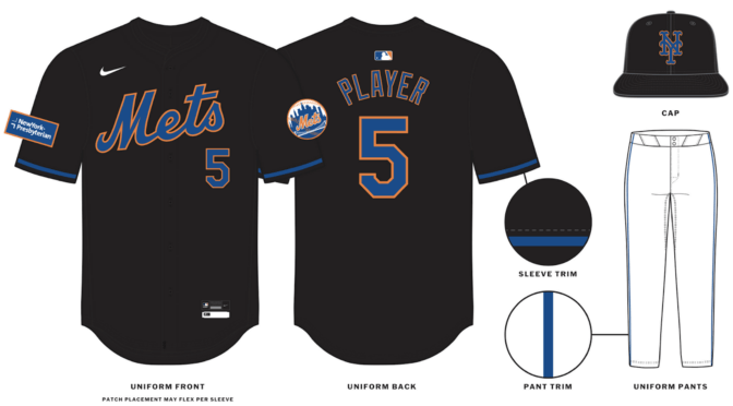
1 hour ago, Old School Fool said:
I like it. Reminds me of the old Lakers black jerseys in how they execute the colors. The orange outline is gonna pop most likely.

That works better than this Mets jersey because yellow is brighter than orange.
And I'd rather see a black Mets jersey serving as a 2000s throwback than a "stealth" version of their primary jersey.
-
7
-
-
16 hours ago, pitt6pack said:
Down tot he final 4 teams, and the final 4 field possibilities for the Super Bowl (assuming the NFL follows the same field design patterns from the past few seasons).
Fortunately, for any matchup we get this year, we will at least have some good colors. Ravens 49ers would look best in my opinion, and works perfectly with the Super Bowl logo, and I'd probably take Chiefs Lions as the second best look.
49ers would likely use the red version of the saloon font that they've put in their end zones for the playoffs this year
-
5 hours ago, AstroCree said:
So far what I see from the style guide, they remind me of the Marlins black alts and those are VERY hard to read on TV.
Don't like it. I thought the original purpose of bringing back the black Mets uniform was for 90s/00s nostalgia purposes, and "modernizing" it completely contradicts that purpose.
Plus, yeah, the readability (or lack thereof) is a massive downgrade.
-
5
-
-
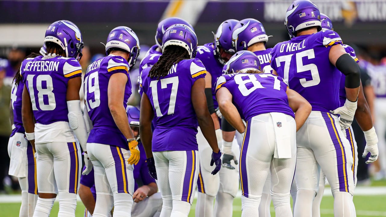
14 minutes ago, 4_tattoos said:
Same could be said about the Vikings. Outside of that color rush uniform, they're a purple and white team with yellow accents.
You have a point, but I'd argue that the yellow on the shoulder and pants stripes for the Vikings is more noticeable than the gold in the Ravens' numbers and logos.
Also, I think it's clear that these are two visually different teams.
-
9
-
-
1 hour ago, JakeH28 said:
keeping that over the blackout uniform might be the right call for the Jets to make
I thought that getting rid of that uniform was the one thing that everyone on this forum could agree on. Turns out I was wrong.
-
1
-
-
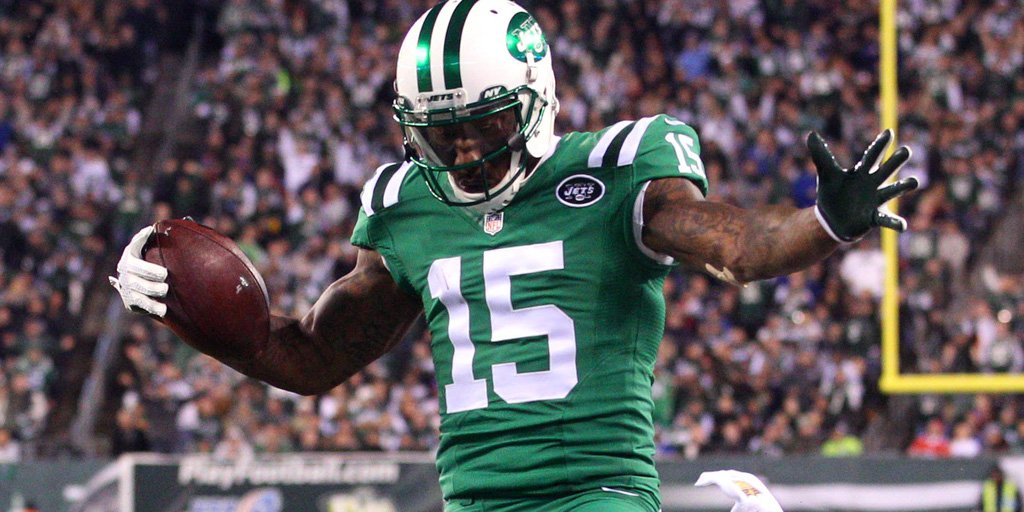
Even this small change with the striping could've helped with the Namath era uniforms
-
8
-
-
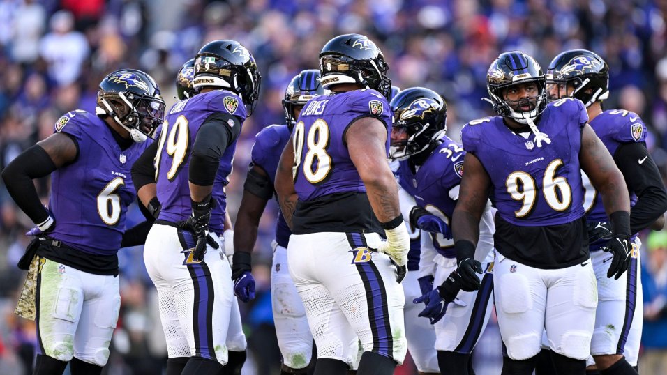
Just now, leopard88 said:
It's not about the Vikings wearing gold pants. It's about the Vikings being a purple and gold team.
Gold is a tertiary color, at best, for the Ravens. Any uniform that puts it on equal footing with purple and black will inevitably invite comparisons to the Vikings.
The mustard gold that the Ravens used for their gold pants is different enough from "athletic gold" (yellow) that there shouldn't be too much confusion. I always thought of the Vikings as the "brighter" purple team and the Ravens as the "darker" purple team.
-
6
-
-
I'm just gonna keep repeating what I've been saying all season: This has to be the year for the Niners. If not now, I don't know when they're gonna get a better shot. Everything has fallen into place for them.
-
3
-
-
7 hours ago, wildwing64 said:
Choice of photo aside
Yeah, sorry about that. Isn't always easy to find good photos of a game on the day that it's played
-
Saw this one in person. Cannot understate how much better these colors look than black, tan, and orange.
-
6
-
 2
2
-
 1
1
-
-
6 hours ago, BBTV said:
The Ravens best combo. Should be their only dark option.
??? All three of these blow black leggings out of the water. I'll go a step further and say the Ravens should throw out stripeless black pants entirely.
-
11
-
 1
1
-
-
7 hours ago, CaliforniaGlowin said:
Texans have already confirmed four jerseys. If one each is red white and navy, what color would the fourth be?
Considering the jersey set being retired includes two navy jerseys, that isn't a guarantee of four jersey colors.
-
1
-
-
1 hour ago, DrunkKidCatholic said:
The Color Rush uniform pretty much solved the issues with the Parcells era shoulder stripes. Just replace that secondary dark green and it's pretty spot on.
Ehh, that would literally turn the Jets into the Colts but in green
-
5
-
-
Buck and Aikman have gotten a lot more fun since they moved to ESPN. It's like they got their money and then decided that they don't care anymore so they just let themselves be more loose.
-
1 hour ago, BBTV said:
I used to feel the same way. In fact, I've probably made posts adamantly against any notion of color v color games.
But as I get older, I've backed off of some of my hard-line stances, and allow for some exceptions to my "rules". This particular matchup, in a championship game, would be one of them (provided the Lions weren't mono-blue, because I'd never support anything that allows that stupid combo.)
I'm the opposite. If you want to do some gimmicky color vs color game in the regular season, be my guest. Have fun with it. But in the playoffs, I'm a hardline traditionalist. I just want primary uniforms in traditional combinations (i.e. no monochrome or leggings). Bringing the color vs color gimmick to a playoff game would cheapen it to me.
-
2
-
1
-
-
1 hour ago, CaliforniaGlowin said:
I'm also hoping the H-town blue is somehow combined with a black or gray jersey for like a sci-fi space look.
That's probably the worst way they could possibly use the H-town blue: BFBS/GFGS. What are you smoking?
-
2
-
-
7 minutes ago, BottomlessPitt said:
That 49ers d-line is a little leaky when it comes to stopping the run.
This is the 49ers 19th appearance in the NFC Championship game. 7-11 record so far.
4th of the last 5. I think having this one at home will be a significant help for us.
-
Just gotta hope that the 49ers figure out what was malfunctioning tonight and get back to their regular season form. Especially in the playoffs, though, I'm just happy to see my team win. That's the most important thing, everything else comes after that.
-
3 hours ago, Brave-Bird 08 said:
Plus, they need to make the alternates true throwbacks by wearing plain red shells. There would be a greater first-glance differentiation between the primary uniform and alternates. Don't know why they didn't follow through with that, but they are throwing back to a pseudo-throwback when one tweak would make it an actual throwback.
No, no, no. The 49ers belong in gold helmets and gold helmets only. Plus, the uniforms are already true throwbacks. It's explicitly stated in every single bit of marketing that the throwbacks are 1994 throwbacks. The current helmet with throwback decals is accurate to the 1994 uniforms. I've never liked the idea of seeing the 49ers in red helmets, and I hope they never do it.
-
1
-
 1
1
-
-
53 minutes ago, Klondyke said:
Worked for the Sharks. Marketing departments know well in advance what jerseys teams are going to wear in the playoffs. Playoff merch is the biggest sellers of the year and teams want their branding to figured out in advance.
People like you with no sources, who talk out of their ass is one of the most entertaining things I see on here. Like when you wake up each morning, do you go "well its time for me to post on the internet as if I am an expert in a field I have no experience in".
Dude, no one takes what's being said here that seriously. We come on this site to bicker about sports logos and uniforms, none of this is gonna affect your life.
-
1 hour ago, SSmith48 said:
IMO need an updated number font. Nothing too fancy or outlandish, but something to help these uniforms feel more modern.
There's no reason to update the font. That's just changing something for the sake of changing something. You can never go wrong with standard block font.
-
3
-


/cdn.vox-cdn.com/uploads/chorus_image/image/72641911/1674655711.0.jpg)


/cdn.vox-cdn.com/uploads/chorus_image/image/73019348/usa_today_22200771.0.jpg)
/cdn.vox-cdn.com/uploads/chorus_asset/file/22128141/1287073736.jpg)


MLB 2024 Uniform/Logo Changes
in Sports Logo News
Posted
Yankees new road uniform should look great.
I think both sides of the argument make a good point: The lack of white is much more retro and pulls off the "untouchable classic" vibe better, but it's also factually correct that the uniform has had the white-outlined design for half a century at this point. The Yankees won most of their World Series in the non-outlined jerseys, but their most recent run of dominance did occur in the outlined jerseys. I'd call both designs equally iconic at this point, with a slight advantage to the outlined jerseys since they're more recent.
I think that the road uniforms really shouldn't have been tinkered with in the 70s. No one would have a problem with the non-outlined design if it was here for the last 50 years.
In a vacuum, I think the new (old) road uniform is perfect for the Yankees, it's just that the previous uniform lasting as long as it did makes this change unnecessarily controversial.