


ruttep
-
Posts
1,267 -
Joined
-
Last visited
-
Days Won
41
Posts posted by ruttep
-
-
1 hour ago, Morgan33 said:
I'm more impressed with his mask... Shades of Jon Casey.
Still, no one will ever convince me that this scheme isn't exponentially improved with black. And that the final green North Stars jersey isn't one of the best looking sweaters of all time. Just needed to ditch the black pants.Yeah, I have no idea why they decided to go with a green helmet and black pants for the late 80s/early 90s jersey:

-
 1
1
-
-
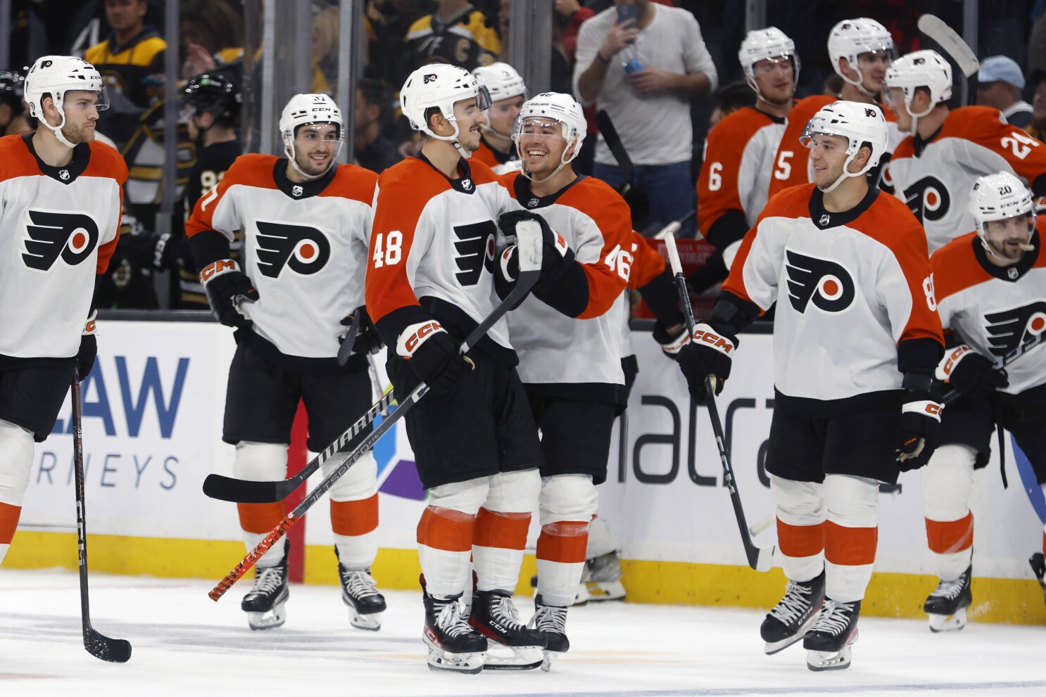
12 hours ago, Kirill_The_Thrill97 said:
Top tier uni matchup in St. Paul
Fleury's yellow pads look amazing.
-
3
-
-
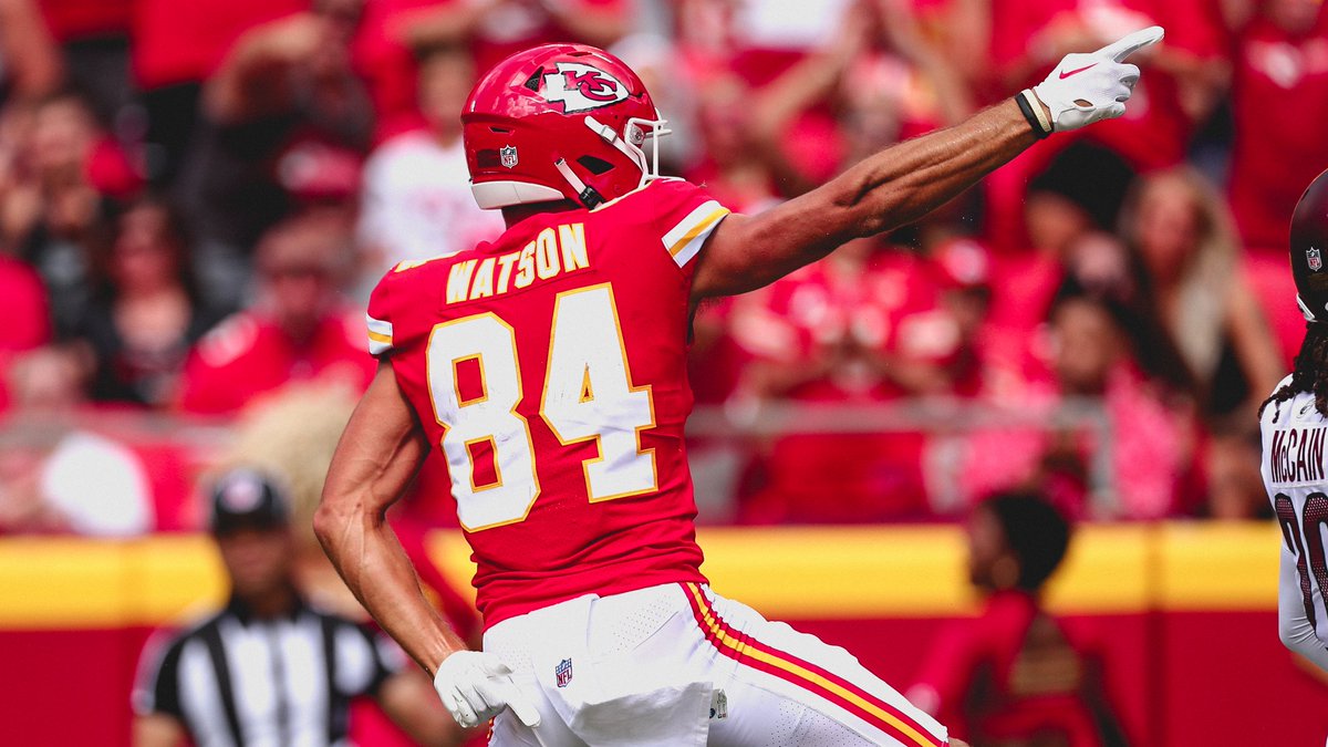
57 minutes ago, DCarp1231 said:
Just noticed how the 4 on the Chiefs jerseys have a tiny sliver of jersey color on the inside of the number. What’s the point? Mildly infuriating stuff.
I think it's better than the alternate approach to tiny spaces within the uniform numbers:
-
9
-
-
15 minutes ago, timjameskohler said:
So, as it stands now, we have basically a number of teams with good color schemes:
Saints
Jets
Jaguars
Eagles
Falcons
Who have become, essentially, black and white teams. It’s gotten to a point that when we see Eagles green pants or Jets green jerseys, we’re rejoicing. If we see Saints ‘gold’ pants, we throw a dang parade.
(Yes, the Jags have a teal primary, but look at them on the road and tell me there’s teal in their identity).
You’re on thin ice too, Panthers…
Agree with all except Eagles. (A) I just don't like midnight green and (B) we at least still see the green jerseys for pretty much every home game.
-
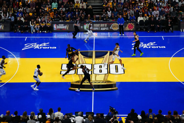
12 hours ago, Cujo said:
How are we suppose to focus on the players this way? A friggin joke!

Don't usually pay attention to basketball, but I had to pop in here to say, what are these courts? Is this a joke?
-
2 minutes ago, FinsUp1214 said:
I’m very intrigued and curious about this. Is it green in general that they hate, or the particular shade as opposed to other greens? Or something else about it?This is all 100% coming from a place of pure curiosity, as I’m mostly just surprised to hear of a team’s traditional primary color that gets flak from its fanbase. I haven’t heard many cases of that before and would love to understand why that is (or see if I’m misunderstanding this altogether, which is totally possible haha).
If I had to guess, green is the "boring" or "safe" option. All white is "
 " and black jerseys/pants are "
 ". There probably is an element of morale to it, where trend-hopping makes them feel stronger or something. I don't know. This is all speculation, but that's the sense that I get from how players and fans react to uniforms on social media.
-
1
-
-
44 minutes ago, AFirestormToPurify said:
Exactly. That's what the problem is. It's boring
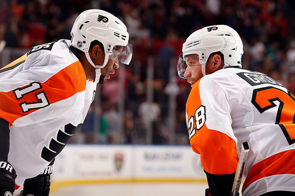
They've used quirky, unique and at times unusual fonts for captain letters (or at the very least the A, the C has been a bit more on the basic side for a few decades now I'll give you that) for most of their history. If you have no problem with the Flyers using a plain, generic, one color block font I have no idea what to tell you. The whole redesign screams "low budget" and this is another downgrade added to the long list imo
There are definitely issues with the low effort put into this rebrand, but I really don't think the font of the captaincy patches is one of them.
-
2
-
-
1 hour ago, FiddySicks said:
And there have been rumors that they may look to go elsewhere if SJ doesn’t publicly fund a new arena for them and the city is just like lol please leave!
I’m not sure what the future of this team really is, but I’d have to assume it’ll be as a tenant at the Chase Center at some point in the not too distant future.
Is the Chase Center even suitable for the NHL? I'd like to avoid another Barclays Center situation.
-
1
-
-
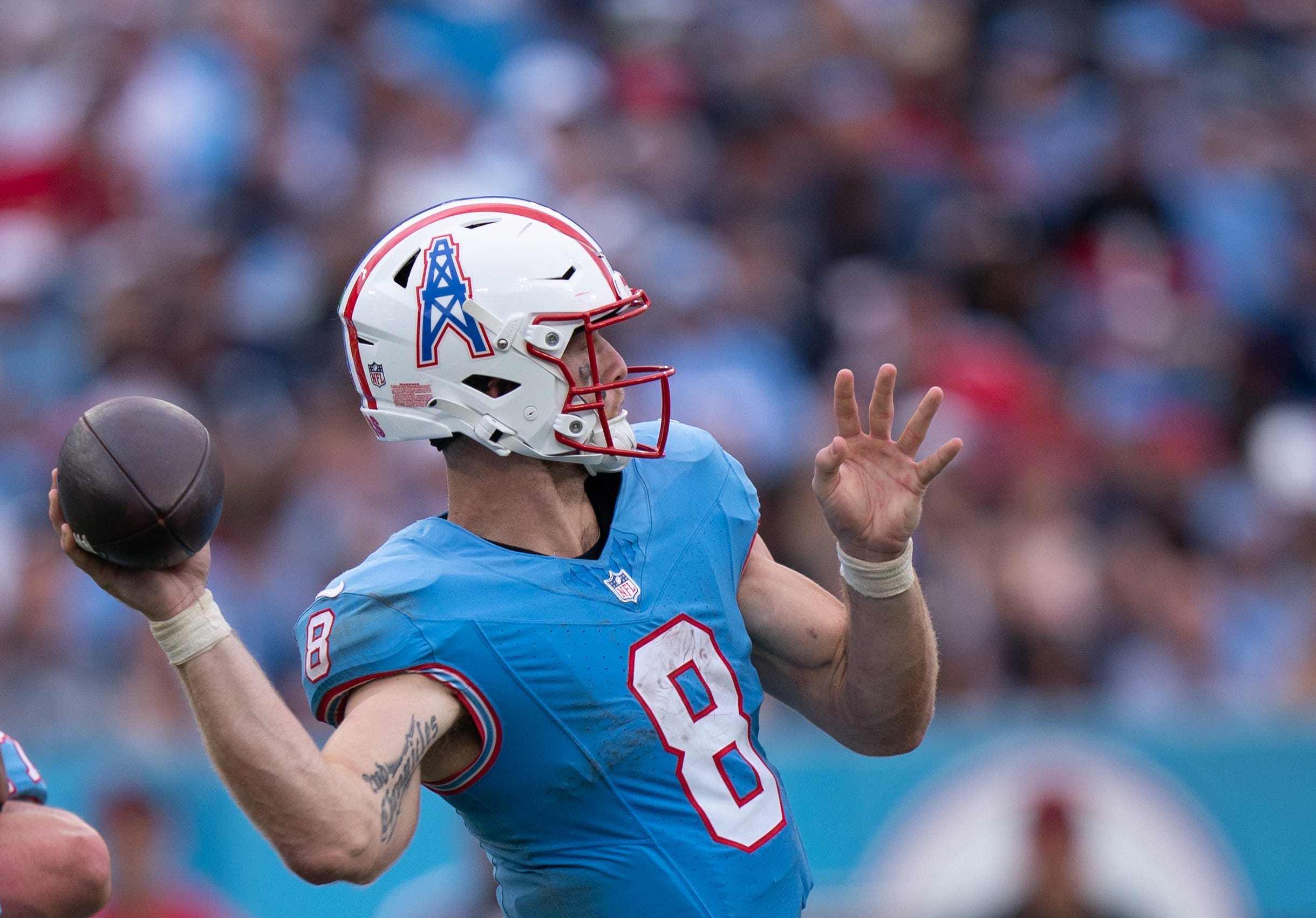
48 minutes ago, Cujo said:
If/when the Titans cosplay as the Oilers again, they gotta center that helmet decal better.
That's more the fault of the helmet manufacturers than anything. There isn't room to move the decal up on the helmet.
-
1
-
-
I actually liked the patch being on the front of the jersey where it was (maybe that's just because I'm so used to watching football and hockey), but I absolutely hate the reason for it. Also, it's going to look horrible when they have to put a chest patch on a team with a chest logo, like the Yankees or Tigers home jerseys.
-
3
-
-
20 minutes ago, Ark said:
Agreed but the old uniforms are better
Look at the outlines! Not to mention the standard name on back...
I agree. My point is that the new uniforms are already a significant step in the right direction.
-
1
-
-
7 minutes ago, GFB said:
Disagree with your point, but if you're going to make a side-by-side comparison between the old and new, don't use a super washed-out photo as your comparison point:
Fair, I always liked the 80s-90s look better than the 70s/2010s design, so I'm happy with a design that's closer to the 80s-90s.
-
11 hours ago, throwuascenario said:
A double outline is different than a ghosted outline. A double outline uses three colors - none of which match the jersey. And then there's the variation of the ghosted outline where the outer outline matches the color of the number, like the Cowboys navy jerseys.
Single outline (Panthers for example) > double outline (49ers shown above, Patriots) > ghosted outline with different color (80s Dolphins shown above, Canadiens) > single-color number (Jaguars) > ghosted outline with same color (Cowboys, Lightning)
Here's my ranking:
1. Single Outline
2. Single-color number
3. Double Outline
4.
5.
6.
7.
8.
9.
10a. Ghosted outline with different color
10b. Ghosted outline with same color
(The Lightning actually have a double outline on the home jersey with the inner outline being black and a ghosted outline different color on the away jersey with the outer outline being black)
-
 1
1
-
-
Interested to see how white pants would look on the ice when not paired with white jerseys and socks. Haven't liked any recent jerseys that utilized white pants.
-
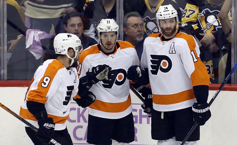
I cannot understate how much I like the new (old) shade of orange more.
-
10
-
-
6 hours ago, timjameskohler said:
I think I figured out what gets people riled up about the Titans/Oilers discussion.
They threw it back to the very last set of Oilers uniforms. In 2009 they wore ‘61 (I think) uniforms for the AFL celebration, but this past Sunday they wore the very last set that they wore before they bucked off to Tennessee(Yes I know that they wore WAH as the Tennessee Oilers, but you get my drift).
It evokes the memories of an empty Astrodome, the Bud Adams demands, the sadness of Houston fans. I don’t think the discussion would be as fraught if they threw back to the 60s again. It’s like “remember these uniforms? This is what you could have if you just gave Bud what he wanted.” People outside of Tennessee probably aren’t thinking “this is paying homage to our history in Houston.”
I simply can't get over the fact that they decided to wear this uniform against the Texans. Honestly, it's just a ridiculous troll job that you almost have to respect it.
-
3
-
-
19 minutes ago, DCarp1231 said:
And yet the idiot decided to be “that guy” and not wear the proper socks.
Either way, white pants for this suck.
I don't disagree. This look is horrible either way.
-
32 minutes ago, DCarp1231 said:
Rams @ Cowboys
Could’ve been a lot better if Dallas actually wore their intended silver pants with the navy jersey. At the very least wear navy socks. Rams looked fine as is.
Have at it folks!
To be fair, the actual design does call for navy socks, you just chose a picture of a guy that wasn't wearing them.
-
8 minutes ago, DCarp1231 said:
I really think the Cowboys would benefit from using a shade of blue that isn’t the usual suspect.
No navy
No royal
No powder
What other shade of blue makes sense for a football uniform?
-
This is dumb -- there's a reason that every single league in the world makes players wear their actual last names.
-
1
-
 1
1
-
 1
1
-
-
4 hours ago, Lights Out said:
I actually like the sleeve stripes, weird as they are. I wish the hem stripes matched.
The logo doesn't suit the design very well, though.
That logo is just not designed to be on the front of a jersey. There's a reason the only time it ever was put on a jersey it led to the most hated design in franchise history.
-
22 minutes ago, Cujo said:
Every single thing about this is wrong. The jersey color. The stripeless pants. The helmet color. The helmet logo. The combination of all of the above. And the opponent that also wears silver.
-
10
-
-
2 hours ago, Unocal said:
Should have flexed Eagles/Commanders to SNF
Nah. Tired of seeing the NFC East on primetime.
-
2
-
-
7 minutes ago, tBBP said:
Simple: they ARE.
 Really the only difference is the offset outlines on the top sets...but that one little detail fits nicely with the stripe pattern. I'll take either of those (preferably the top set with numbers more akin to what the Browns wear now) over their currents.
They're the same uniform except for the number font.
-
 1
1
-


/cdn.vox-cdn.com/uploads/chorus_image/image/72807111/1763496238.0.jpg)


NFL 2023 Changes
in Sports Logo News
Posted
The Patriots would benefit from any component of their uniform not being navy when wearing all navy