-
Posts
1,272 -
Joined
-
Last visited
-
Days Won
41
Posts posted by ruttep
-
-
-
23 minutes ago, TheBigFiz21 said:
Ooh, that's against the Bears. The game might turn into a rout, but it'll look gorgeous.
-
 8
8
-
-
7 minutes ago, Old School Fool said:
I honestly have to give the Cardinals credit. They debuted a new uniform and are sticking with it quite literally. It may not be what we want but the consistency in keeping the same combos is kinda nice? I'm sure they are doing what the Falcons did in Year 1 of their new set and just getting the "default look" into everyones brains then they finally do combos in Year 2.
Consistency doesn't matter if the uniforms are consistently bad.
-
 2
2
-
 1
1
-
 1
1
-
-
25 minutes ago, Pigskin12 said:
This team infuriates me.
Wasted potential. So much wasted potential.
-
 3
3
-
-
-
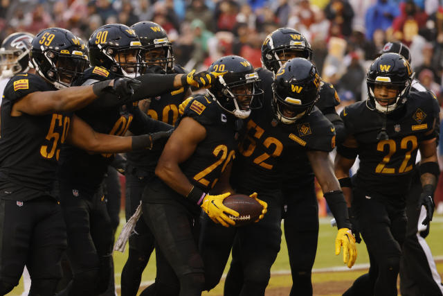
A bonus of repurposing the WFT look is that it would remove black from the uniforms, undoing the loophole that allows them to wear one of the worst uniforms of all time

-
 1
1
-
 1
1
-
-
1 minute ago, simtek34 said:
Yep.
I expect they'll wear orange pants against the Steelers again, per tradition. Should be a great-looking game.
-
 7
7
-
-
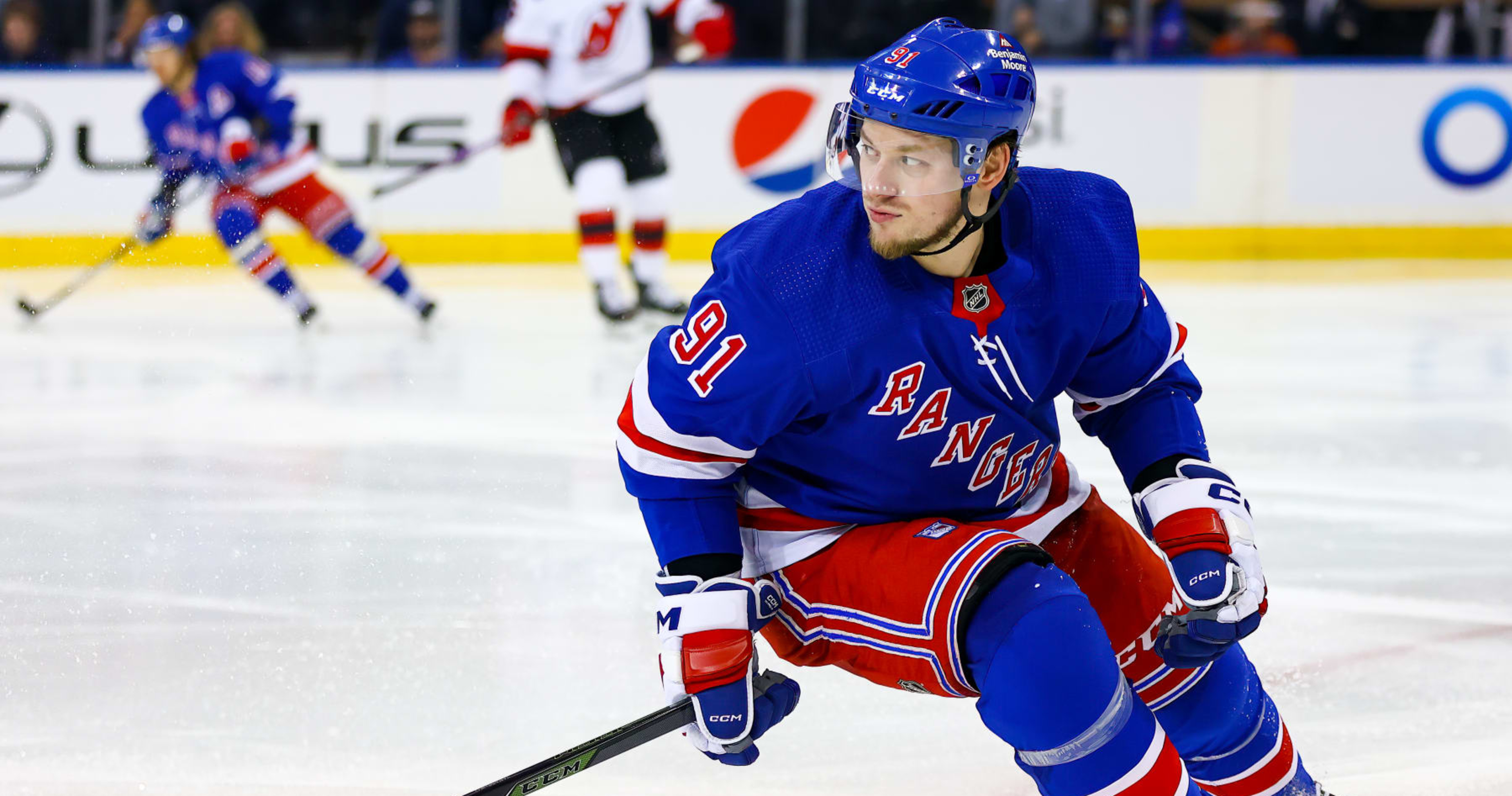
With Tarasenko on the Senators and the Rangers reportedly out on Kane, I think we can call both of these the "wrong" uniform:


-
1 hour ago, Pigskin12 said:
It will be neither of those:
This at least gives me hope that their "blackout" game against the white tiger Bengals may end up featuring teal pants, since they haven't worn that combo yet and have just that game left to do so.
Nevermind then. White leggings continue to be the most popular uniform element in the league.
-
Thoughts on this week's matchups ahead of tomorrow's game:
- The Ravens wearing the all-black at some point this season was inevitable, but that doesn't mean I have to like it when they do go all-black. Could have chosen a different opponent than the Bengals, whose white uniforms are basically black and white below the helmet.
- Cardinals/Texans will look bizarre. I'll reserve judgement on the red helmet/navy color rush until we see it on the field, but I don't have high hopes for it.
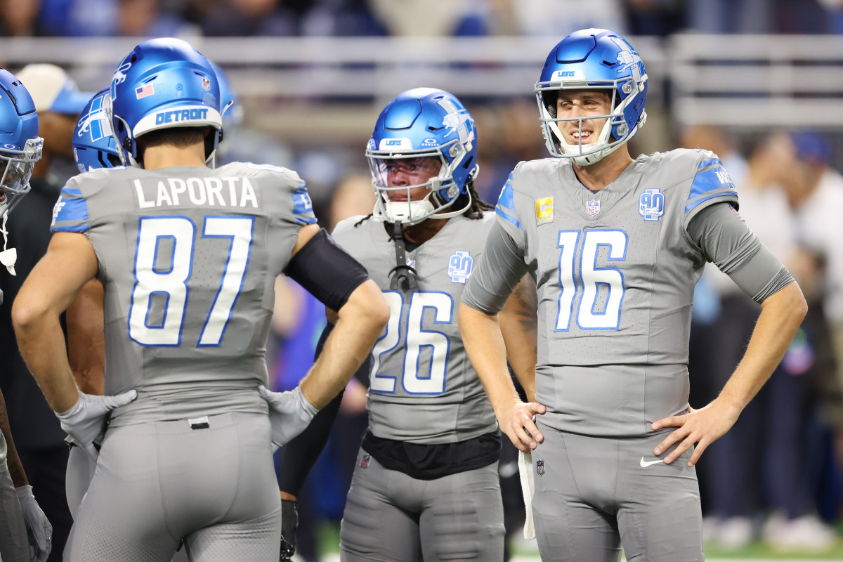
- Bears/Lions should look good, as long as the Lions wear their silver pants.
- Panthers, whatever you do, please don't wear white leggings with your black jersey ever again. I'm still holding out hope that they break out their classic black jersey/silver pants home combo against the Cowboys.
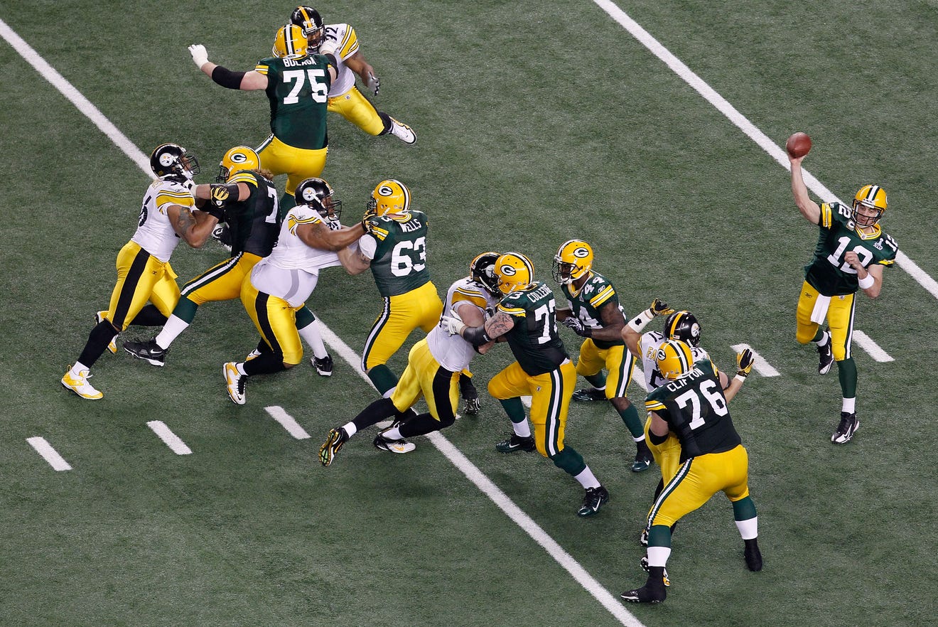
- Not the biggest fan of the Packers' throwbacks, but the Chargers aren't the worst opponent to wear them against. They're certainly better than last year's throwback game against the Jets, who were in the middle of their black leggings run.
- Raiders/Dolphins should look good. Dolphins will probably be in all-white, but it's one of the better all-white looks in my opinion, and will pair fine with the Raiders in black.
- Commies need to burn their BFBS alternates yesterday. Actually one of the worst uniforms in NFL history. Despite not wearing grey pants anymore, the Giants' road uniforms can actually look fine against the right opponent. The BFBS Commies aren't that opponent.
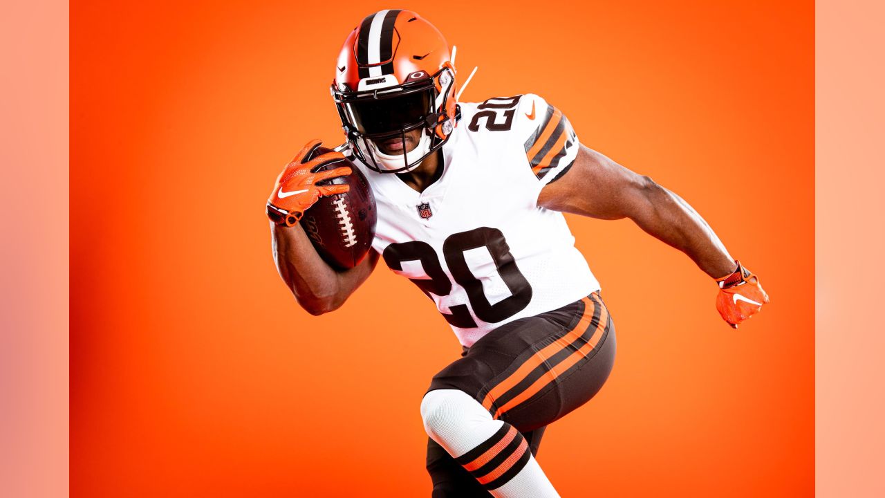
- Steelers/Browns will look incredible, per usual
- Titans/Jaguars will be fine if not spectacular. At least the Titans are wearing their socks properly this week.
- Bucs/Niners will look good. I expect pewter pants for that game.
- Jets/Bills will likely be ruined by the Jets. They only wear all white or black leggings with their white jerseys these days.
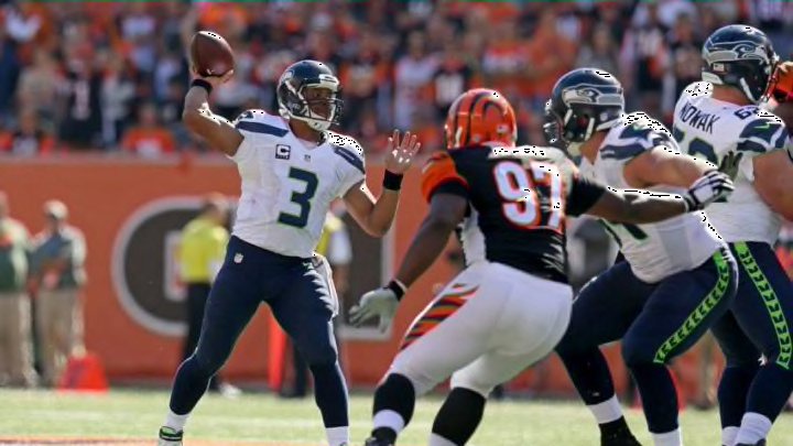
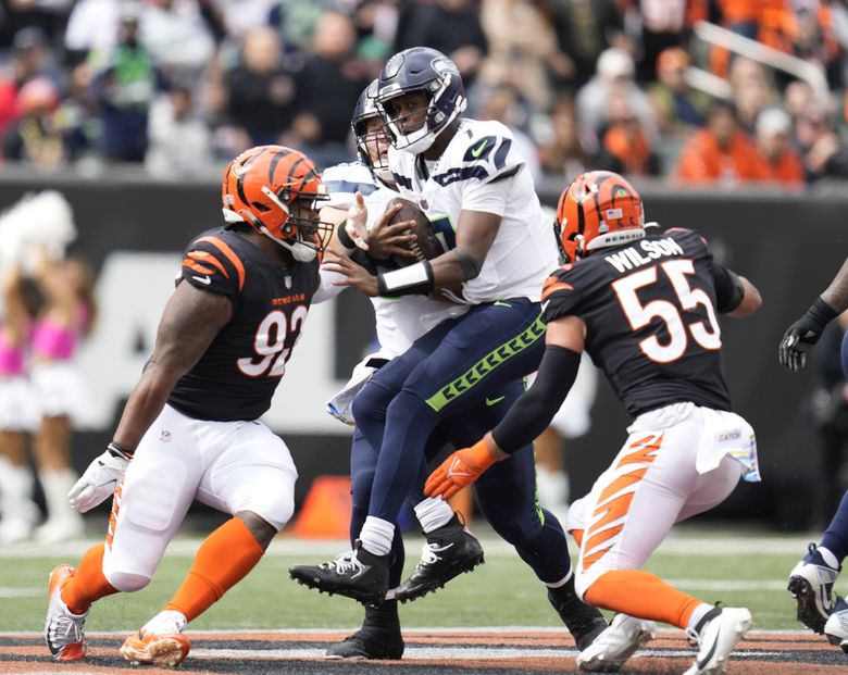
- Seahawks/Rams will look as good as it can with the Seahawks in grey pants. Hoping the Rams wear their yellow pants.
- Vikings/Broncos will look good with the Broncos in the alternate that should be a primary. They'll probably go mono-navy, but it's not even that bad as far as mono-navy goes.
- Chiefs, Eagles, do not, I repeat, DO NOT go all-red vs all-white. I know the players probably want to. Don't listen to them.
-
4 hours ago, tigerslionspistonshabs said:
Man I thought the Lions-Chargers was a beauty of a game, and that's not even my bias talking.
Honestly, even if the Lions wore a proper combo instead of practice pants, the light blue of the two teams would have clashed a little too much.
-
-
This was just posted on the week-by-week thread, but the red helmet with the navy color rush, along with the tweet containing emojis in a significantly lighter shade of blue, must be hinting at something.
Edit: it has been brought to my attention that that is just the standard blue emoji.
-
 1
1
-
 1
1
-
-
2 minutes ago, DCarp1231 said:
Hmm, needs red socks.
The more I look at the red helmet, the more I just do not like the Texans logo. The white outline isn’t enough to stop the blending of the reds. Same goes for the regular blue helmets. I’m also not a huge fan of the initial white helmets that so many clamor for.
I think the issue lies within the logo. It not good and never has been.
Hmm, if only there was a brand and logo that is so closely associated with the city and has established that brand so well that the colors are Houston. I just can't think of one...

This is all your fault, Bud Adams.
-
 1
1
-
 3
3
-
 1
1
-
-
32 minutes ago, NYCdog said:
Needs red socks but this is FYAH
Also note admin got the Color Rush pants mixed up with the Road Blue pants (see striping) lol
This makes me wonder if this a preview of their rebranded look next season to test the waters on a red helmet, blue jersey home look.
Anyone notice that the color circle emojis in the tweet are red and something close to Luv Ya Blue? That has to be a hint at something
-
 1
1
-
-
1 minute ago, DCarp1231 said:
The only times they’ve dabbled in monocolor were the CR all whites and those throwbacks. The all whites were done because they had to do it. Throwbacks are throwbacks. It’s not much of a reason to believe an uber-traditional team such as Green Bay would fall for the leggings gag.
It's more that whenever a new uniform is debuted these days, the default seems to be the sock color matching the pant color. I'd love to be proven wrong. I just take a very pessimistic view of current-day NFL uniforms.
-
Just now, DCarp1231 said:
Yeah, the Saints are definitely the least egregious out of the three examples that I posted. I just don't like the NFL devolving into alternate helmet madness. The only alternate helmets that I've liked are the ones associated with throwback looks.
-
 7
7
-
-
1 minute ago, DCarp1231 said:
I see what you're going for, I just don't trust modern-day NFL franchises to
(a) Wear white socks with that
and
(b) Put stripes on those white socks
If the Packers were to wear green pants with their white jerseys, I see them most likely go for green leggings, in which case I'd scrap the idea entirely.
-
 1
1
-
-
1 minute ago, DCarp1231 said:
I’ll be honest, I would’ve like to have seen Green Bay go white over green (from the throwback) for this game. More-so than color rush whites. Minimize the yellow.
Disagree on that. Alternate pants/socks from a mono-color look should stay with said mono-color look.
I don't need the Packers to take a page out of the New York Jets' book.
-
32 minutes ago, fouhy12 said:
I like that idea. The red helmet with the red numbers and stripes should look good.
I don't. Alternate helmets with Color Rush uniforms look completely bush league.


And (probably an old man yelling at clouds take) the wording of the tweet really makes it seem like the Texans are hopping on a trend for the sake of hopping on a trend.
-
 3
3
-
 2
2
-
-
3 hours ago, ManillaToad said:
I agree that all the yellow isn't great and this objectively isn't a good looking matchup, but I still have no real problems with it -- they gave us the best case scenario matchup for these two franchises, and that's all we could ask for.
-
 1
1
-
 1
1
-
-
13 minutes ago, DCarp1231 said:
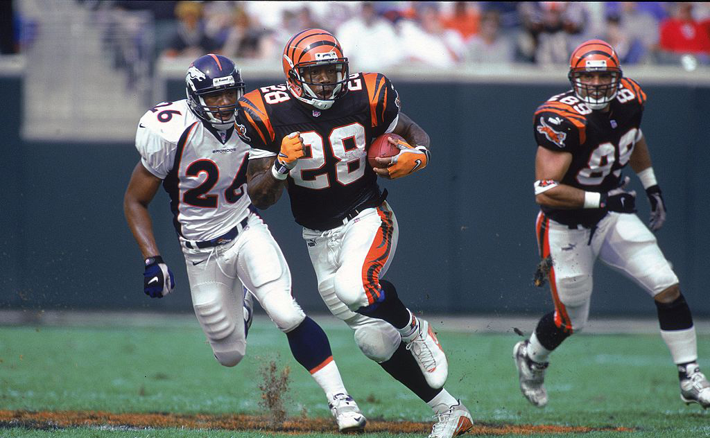
The Bengals (very minor) problems would be solved if they just used one pair of white pants with both orange and black striping
The white pants are the one thing that the previous uniforms were better at.


-
 5
5
-
-
25 minutes ago, tBBP said:
I feel like we're in a weird spot with this uniform. On the one hand, this still looks about as modern today (at least to me) as it did on day 1 in '96 (which is about all the aggrandizement Nike needs to further their own ambitions, no? lol). The navy pops off that orange SO well. I've always questioned, though, why they made the side panels navy on the white uniforms??? Orange against white has decent enough contrast (see Volunteers, Tennessee for definitive proof).
On the other hand, this set has also been around for dang near 30 years now; in fact, it's older than a good number of the posters reading this
 . That combined with the, (what, tempation? Urge? Peer pressure?) to modernize in some way means I'll be very surprised if these make it past 2025. I wouldn't be mad about it if they did. But given Nike's track record of designing for the moment (which is how we get otherwise dang-near-similar uniform designs like the New York Jets and Atlanta Falcons, which came out dang near together right after a new template design), added to their self-stated goal/ambition of "moving design forward" (which I'm not totally opposed to but at the same time it's led to some, um, "stuff" out there, like the Rams), I'm also half-afraid of what they may come up with next for the Broncos. Whatever the case, I think they should at bare minimum keep the number/NOB font.
I would rate those two in the order shown. And speaking of which, have the Bengals yet worn their current white-over-whites with orange socks? If not, I don't know how they haven't yet...
The problem with their current white jersey is that there's barely any orange (there's only orange trim around the numbers). The decision to simplify the bengal stripes to the degree they have is the one major gripe I have with this uniform set. The one I posted above at least managed to put both black and orange on the bengal stripes. Simply put, the below combination with orange socks wouldn't make sense with how there's virtually no orange anywhere on that uniform except for the wordmark and helmet. The white pants with orange stripes wouldn't work here either because the stripes wouldn't match the jersey. If they simply added orange back to the striping shown below, this would be a top tier uniform, but they oversimplified it.

-
 2
2
-
-
Best uniforms in Bengals history. Change my mind.


-
 8
8
-




/cdn.vox-cdn.com/uploads/chorus_asset/file/23406608/1348156112.jpg)

/cdn.vox-cdn.com/uploads/chorus_image/image/69976937/1344622984.0.jpg)



/cdn.vox-cdn.com/uploads/chorus_image/image/71456365/1243674183.0.jpg)
/cdn.vox-cdn.com/uploads/chorus_image/image/72734895/1724730110.15.jpg)

/cdn.vox-cdn.com/uploads/chorus_image/image/72262130/1461200303.0.jpg)
/cdn.vox-cdn.com/uploads/chorus_image/image/46764520/bal-the-sun-remembers-picture-sept-21-2014-20140921.0.0.jpeg)
2023 NFL Season week by week uniform match-up combos: From HOF Game to Super Bowl LVIII
in Sports Logo News
Posted
They don't need to make this throwback the primary, but my goodness does it make a good alternate. Please continue to wear this three times a year instead of that color rush set.