


ruttep
-
Posts
1,272 -
Joined
-
Last visited
-
Days Won
41
Posts posted by ruttep
-
-
12 minutes ago, kaleb_girod said:
Watching this Washington/Dallas game, but I’m sorry do players really think they look good in these stupid all-white uniforms? They all look like a whole bunch of fools running around with thermal underwear on. This solid white “icy” monochrome crap has to end. It’s a mess.
They do, that's the problem.
-
 4
4
-
-
15 minutes ago, MNtwins3 said:
Add a single blue stripe on the pants and helmet, and add the current Lions logo to the helmet, and these should be the primaries... Basically be the Raiders but blue
Nah, if they're gonna change the Lions' primaries, which I don't think they need to, Barry Sanders era or bust.

-
4
-
 1
1
-
-
3 hours ago, AFirestormToPurify said:
Also, considering the lousy officiating, if I were in charge of a team, I wouldn't make my players wear buckets that could very possibly make the referees job even harder, they're already struggling enough making the right calls as it is lol. The game has just gotten too fast for on ice referees. They can't keep up anymore. This will only confuse them even more imo
I was with you until the refs part. What are you talking about? The new rule explicitly states that the two teams cannot wear helmets of the same color. There are many reasons why officiating is horrible in this league, but I really don't see this being one of them.
-
14 minutes ago, DTConcepts said:
This thread’s gonna love this.
I'm tired of this debate at this point. I don't like colored helmets on the road, and that opinion's not changing. I have no further comment on this.
-
2
-
 1
1
-
 1
1
-
-
2 minutes ago, Chawls said:
What if one of them wore color jersey/white pants and the other one wore white jersey/color pants?No. Puke green does not belong anywhere near a football field.
-
1
-
 2
2
-
-
1 minute ago, Bayne said:
I disagree. The 'upgraded' flying skate jersey works better for me - the white in the logo gets in the way of the contrast of the yellow. Without the white, the yellow and red pops much better. There's plenty of crisp contrast going on. The sublimated Vs on the striping, yeah sure I could do without but its not that ergregious.
I bought one of these jerseys and I wouldnt have bought one of the original throwbacks. This newer one feels much fresher and sharp.I think you're in the minority here, and it's not even anything to do with the design of the new jersey, but the fact that it was only brought back for nostalgia. When a jersey is brought back solely for nostalgia, I think people simply prefer a direct throwback.
An example I can use is the NFL New York Giants. Their throwback jerseys feature royal blue, but due to manufacturing difficulties in the 80s, the original uniforms had navy helmets. When the Giants brought back that throwback for 2011, they paired it with their present-day royal blue helmet shells.
But when they later wore the blue version of their throwbacks, they brought back the navy shell for nostalgia's sake, and this past season they wore the white throwbacks again, but with the navy shell that's accurate to the original:
And people loved it. Not because it looks better. but because that's how it originally was. My point is that when you have throwbacks that you're just wearing as throwbacks, people want a direct throwback, even if there's a way to improve upon the original design.
-
1
-
-
2 minutes ago, derami said:
Browns should go with white jersey over brown pants since Broncos are wearing orange jersey and white pants
Yeah, this is the rare matchup where I'd prefer the Browns in brown pants over orange pants.
-
1
-
-
14 minutes ago, CreamSoda said:
Interesting it’s dark helmet vs dark helmet… thought the NHL required contrasting helmets.
They've always been lax about helmet rules for outdoor games.
-
4 minutes ago, GoHawks said:
The Seahawks having neon green instead of Kelly green would make it less of a problem as well as they Cardinals having different helmet colors.
I'm not sure neon green is a Christmas color, though. Christmas green has to be kelly green or darker (I'd say the ideal Christmas green is a forest green closer to what the Packers wear). So to me, your hypothetical scenario would just feature year after year of two horrible monochrome looks against one another. Sorry man, I don't see it.
That doesn't exactly fill me with holiday spirit.
-
2
-
-
The Week 11 Texans field featured a navy blue end zone on one side and a red end zone on the other. Has that ever happened before, where a team gets to paint both end zones in their colors but chooses different colors for each side?
-
19 minutes ago, BrySmalls said:
Here's the final six flags under consideration for the new Minnesota state flag.
They’re here! See final 6 design candidates for new Minnesota state flag | MPR News
No dog flag is an absolute crime.
That being said, I have to agree with @Germanshepherd on this one. The third flag, with what I assume to be a river, would be very unique and a welcome sight.
-
1
-
-
11 minutes ago, Bmac said:
With the gear:
Wish we could see the barber pole socks Vegas is wearing, but the graphic cuts off.
Just as I thought: The Vegas jersey looked bland and uninspiring on its own with a random person wearing it, but it looks great with the full grey gear. Seattle looks amazing as well.
This should be a great-looking game in January.
-
4
-
-
13 minutes ago, DCarp1231 said:
I’d put money on Washington in all burgundy tomorrow
I'd put it on all-white -- they're facing the Cowboys in their Thanksgiving throwbacks
-
1
-
-
1 minute ago, GoHawks said:
I know this will be an unpopular opinion in here but if there was going to be a holiday tradition involving the Cardinals it should be on Christmas against the Seahawks with the cardinals in all red and Seahawks in all neon green and they alternate the home team every year.
Pretty sure the NFL banned red vs green matchups after colorblind viewers complained about the Bills/Jets color rush game:
-
1
-
 1
1
-
-
22 minutes ago, JohnnyCowboy5 said:
Again, what is with the reveal featuring models wearing a jersey that's several sizes too large? Show us what it looks like on a player! My opinion of these jerseys can change dramatically once I see how it'll look on the ice with full equipment.
-
1
-
-
Just now, ManillaToad said:
The overall feel of the Cardinals fits Thanksgiving
Could not agree less. Thanksgiving has a throwback feel to it. While the Cardinals have been around forever, they (a) have been irrelevant for most of it, arguably even more so than the Lions. and (b) only wear mono uniform combos. Until that changes, they should not be given any special event or primetime games.
-
10 minutes ago, Eszcz21 said:
Thankfully the Lions are wearing their throwbacks based off the reveal of the John Madden patch all teams will be wearing tomorrow.
Good. Don't know why they ever moved away from that tradition. It's wayy to outdated to wear on a regular basis, but Thanksgiving is one of the best days of the football year to break out a throwback.
-
8
-
-
30 minutes ago, Ridleylash said:
(Vancouver does it, Calgary does it, the Rangers do it, Chicago does it, Detroit does it, etc)
I understand what you're trying to say and I can see what you mean by a sea of different colors preferred by different fans. On the other hand, I don't think the teams you listed are comparable to Carolina's situation. Those teams at least put the same logo on both uniforms and when you look at the set, you can clearly tell that the two jerseys were designed in tandem. Besides the colors and the number font, nothing about Carolina's jerseys match. And I just don't think that's sustainable in the NHL. This isn't even about the quality of their jerseys -- if a team was doing this with three different traditional looks, I'd call them out too.
-
3
-
-
1 minute ago, simtek34 said:
Yeah, I watched that docuseries too. And as a Vikings fan, I knew a lot of what was said in it, but it was still fascinating. On topic of the discussion, unfortunately, the "uniformity" part of "uniform" is non-existent now.
The Vikings really went from Bud Grant's uniformity to an all purple color rush on Thanksgiving last year where Justin Jefferson selfishly wearing black socks actually marginally improved the look.
-
1
-
-
Curious to know what this would mean
-
5 minutes ago, simtek34 said:
Purple Socks
Side note, when watching the Jon Bois History of the Minnesota Vikings documentary, one of the first few things he mentions about Bud Grant's coaching tenure is that to promote a sense of unity, he always made his players wear their purple socks the same (correct) way. We need that in today's NFL.
-
7
-
1
-
-
1 minute ago, bbush24 said:
What's up with those pants stripes?
They appear to be the same design as the original red pants with a change in material -
31 minutes ago, TBGKon said:
The evening game should always be open for any team, as it has been. You can't force a tradition like the Lions or Cowboys have done and expect it to stick.
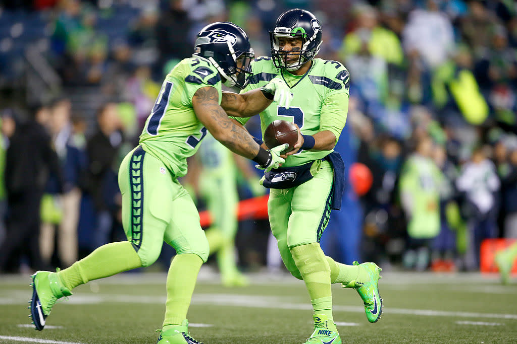
But if you're worried about the traditional Thanksgiving vibe, the evening game should feature teams in throwback uniforms. This year, the 49ers understood the assignment. The Seahawks very much did not.
-
3
-
-
12 minutes ago, the admiral said:
The Seahawks, the most "how to epically own your racist uncle back home with facts and logic" team getting a Thanksgiving game just shows that the nation is healing and the vibe is shifting. The all-green is still a bit much, though.
what does any of this mean
-
7
-
 1
1
-
6
-

/cdn.vox-cdn.com/uploads/chorus_asset/file/20087060/79574798.jpg.jpg)


:format(jpeg)/cdn.vox-cdn.com/uploads/chorus_image/image/55884233/630728632.0.jpg)
/cdn.vox-cdn.com/uploads/chorus_image/image/72761106/1738076760.0.jpg)
:no_upscale()/cdn.vox-cdn.com/uploads/chorus_image/image/72636316/usa_today_21390078.0.jpg)


2023 NFL Season week by week uniform match-up combos: From HOF Game to Super Bowl LVIII
in Sports Logo News
Posted
I don't have much of a problem with the Niners all white -- they only do it once a year.