


ruttep
-
Posts
1,283 -
Joined
-
Last visited
-
Days Won
41
Posts posted by ruttep
-
-
2 minutes ago, timjameskohler said:
the devastating hybrid of 2017-2019 (later). Blue and white helmet and pants with random gold on the jersey. Who approves these things?
Agree with you there -- the late-2010s Rams looked like a complete joke aesthetically.

That's laughably bad. At the very least, the new uniform set has consistent colors.
-
By the way, nhluniforms.com has been down for several days now -- if it's gone forever, does anyone know any other good NHL uniform databases?
-
I know he isn't actually a kicker, but
-
 2
2
-
-
The 49ers wore the red throwbacks three times and the white throwbacks twice in 2021, but they had to get special permission from the league to do so. They also apparently requested to wear all-white in Super Bowl LIV but were denied.
-
1
-
-
2 hours ago, BBTV said:
Eagles need to find a way to bring the kelly greens to Dallas. Just take the field in them - the league isn't going to cancel the game.
Do they have another alternate slot available? Have they worn black yet this season?
-
Here's what I found for Bears/Vikings with purple socks:
Here's a good one:
It's a shame, really. There were only a couple players on each side of the ball for the Vikings wearing white socks, I didn't think it would be this hard to find good pictures of the correct purple socks that the vast majority of the team wore.
Edit: Here's another really good one:
-
2
-
 3
3
-
-
Good classic Norris Division matchup earlier today.
-
4
-
4
-
-
17 minutes ago, AHcreative said:
Those colors were only dull because they were in St. Louis and played in a sub-par dome with terrible lighting. Plus, over the years the metallic gold slowly devolved into basically khaki.
Disagree. I've always found navy blue to be way more dull than royal blue. You do have a point about the metallic gold --> basically khaki.
To use the NHL's Pittsburgh Penguins as an example, around the mid-2000s they had a black/metallic gold color scheme:
I prefer their current colors with athletic gold, but you can clearly see the shiny fabric, and it looked decent.
In 2007, though, the NHL switched to the Reebok Edge template for their jerseys, and I guess shiny fabric was unavailable on the new template, so the gold basically turned into khaki:
It's one of the most drab colors out there.
In short, metallic gold is very difficult to produce on modern uniforms that don't have shiny fabric. I'd rather the Rams go for athletic gold, which we know for sure is possible to get right.
-
1
-
-
8 minutes ago, Rockstar Matt said:
When there’s an opportunity to clown on the Eagles, I never will turn that down. They got blown out by the Super Bowl favorite just like the Cowboys did in an equally embarrassing fashion.I'd argue it was worse because it was at home. And the 49ers actually scored their 42 points in only three quarters today. And we didn't even need any turnovers. From the second quarter onward, our possessions went TD, TD, TD, TD, TD, TD, kneeldowns.
-
1 minute ago, infrared41 said:
FWIW, the Niners got "the one for the thumb" in 1994.
-
1
-
-
Just now, tBBP said:
We'll revisit this again in February.
For as good as SF has been the past couple seasons—even making it to the SB twice—they haven't yet been able to finish the deal. Perhaps this is the season they get that elusive "one for the thumb" (and in so doing shut up the Puhlamalu Steelerheads at the same time), but until then, it is what it is.
BUT, as Chris Berman once used to say, "THAT'S why they play the games."
That's fair, but
The 49ers just hung 42 on Philly IN Philly. I'm going to enjoy this one and be a delusional homer for the next couple of days. I'm just going to remind you that Eagles fans would have been even more obnoxious about this if they had won.
-
3
-
-
The 49ers just came into Philly and beat the brakes off of the Eagles. After probably the worst offensive quarter of the season where we didn't manage a single play for positive yardage, we scored a touchdown on every single drive up until Sam Darnold's kneeldowns. This is the best I've felt after a Niners win in a while.
Brock Purdy > Jalen Hurts.
-
1
-
-
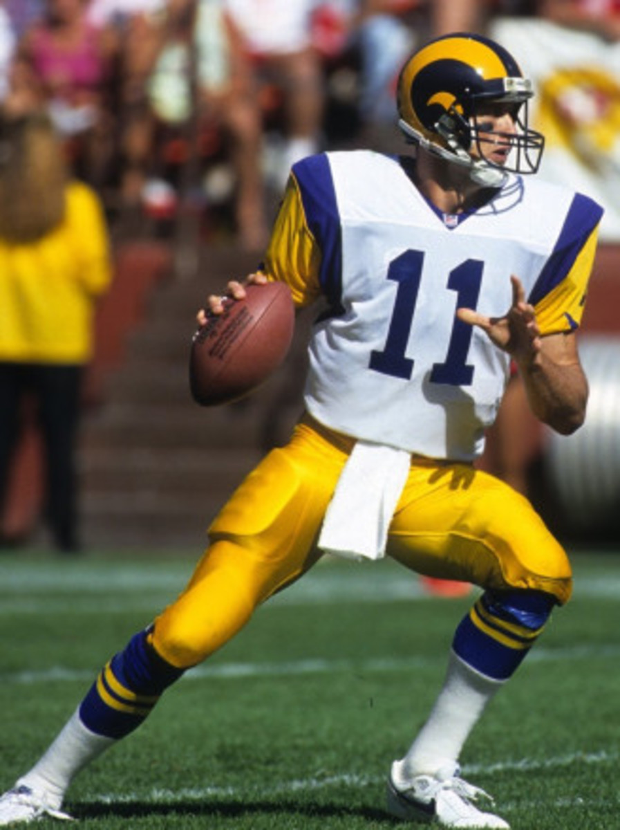
4 minutes ago, Cujo said:
Ya but the navy helmet with royal unis
I mean, yeah, a mismatched helmet isn't ideal, but overall the classic look is way more vibrant. A much better fit for sunny Los Angeles. Plus, the Giants had the same problem back then. The helmet isn't a deal-breaker for me.
-
2
-
-
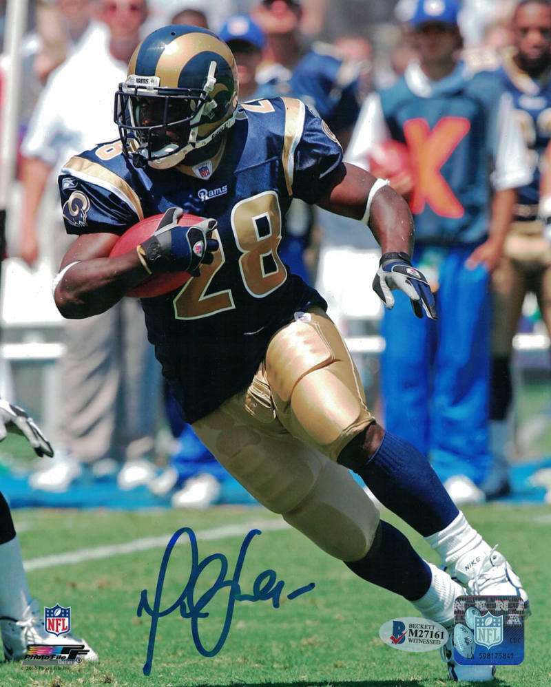
1 hour ago, Cujo said:
These are the ideal St Louis Rams uniforms. But for when the team is in Los Angeles, give me the classic royal blue/athletic gold look.
-
9
-
1
-
-
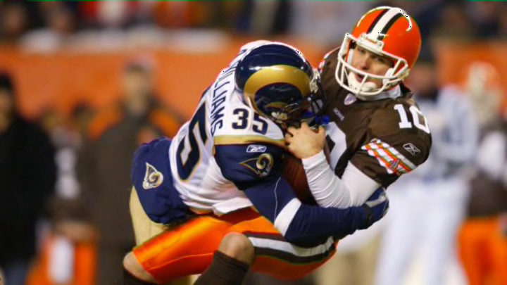
41 minutes ago, Cujo said:
Hard to find a better looking Rams-Browns match-up:
I mean...
-
9
-
1
-
-
18 hours ago, Lights Out said:
I actually love the neon green jerseys and if it were up to me, they'd be their primaries at home. They just shouldn't wear monochrome neon.
I'm surprised Seattle hasn't tried wearing the neon green pants with the navy jerseys yet.
No and no. The less neon green jerseys and pants, the better. Neon green being used as a primary color for any uniform element sickens me in a way that I don't think any other uniform color ever has.
-
 1
1
-
 1
1
-
 3
3
-
-
57 minutes ago, Old School Fool said:
1 hour ago, Cujo said:
People on this site have said that the Raiders still use shiny material for their uniforms, but just look at the massive difference between these two photos.
-
1
-
-
Just now, AstroCree said:
I don't see this lasting long. I'll be shocked if it goes past 2 seasons.
I really wonder if this lasts past this season. I know the NHL said that Fanatics will be using the same factories to make the on-ice jerseys, but I haven't heard anything on whether they're changing the template. The last two times they changed templates (2007-08 and 2017-18), they played a season without alternates before allowing them the season after.
-
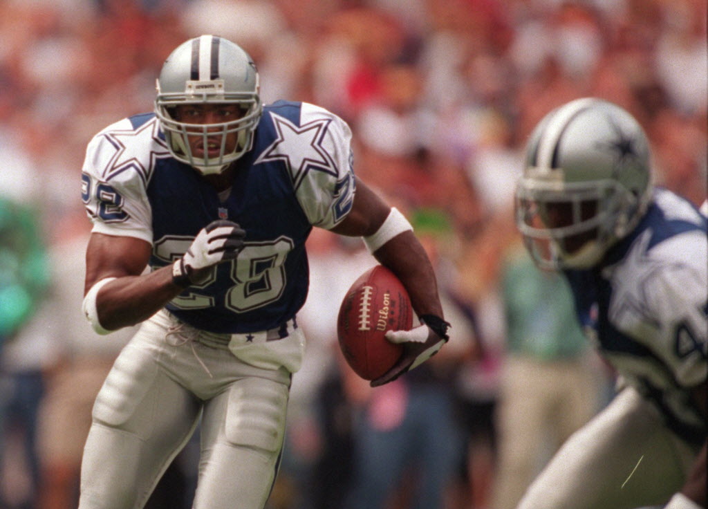
3 hours ago, Silver_Star said:
Yeah, it was silver helmets, with a pinch of blue. It did not match at all. I do remember when they Cowboys had those 1994 and 1995 season fauxback. I was hoping they switch to those instead and then 1996 with that lame double star on the stripe on the sleeves weirdness.
Yeah, I would much prefer royal blue, but if they really insist on navy blue then give me this set
-
5
-
-
4 hours ago, PERRIN said:
I'm also in agreement that the current uniform set and uniforms are a much better fit for the Seahawks, though the throwbacks are undeniably gorgeous. A darker blue, vibrant green, and gray, is a perfect color scheme for a Seattle team. Personally, the current set is just a bit too complex, with a bunch of details that I don't really see the point of, like the patterned numbers and the chest stripes. Heck, for the sake of compromise, I'd be super down to even tweak the shade of green to be closer to Kelly and less like battery acid. I'd also be absolutely down for them to fully replace white with grey, and wear a grey away jersey. Their wolf gray jerseys have always been a fan of mine.
Here's a concept idea I had for them a while back, mellows down some of the jersey elements and tweaks the coloring a little bit to feel more like a balance between modern and classic elements. Not super sure how well it works, but it was a fun exercise. The Seahawks are quite the tough team to redesign.
Needs. A. White. Jersey.
Sorry, can't get behind a non-white road jersey.
-
3
-
 1
1
-
-
Again, no complaints about the color scheme, just fire the neon green jerseys into the sun. No matter what pants they wear with them, those jerseys are painful to look at.
-
1 hour ago, the admiral said:
Putting the actual drop-shadowed and layered letters on the logo could be too busy, but what about single-layer white, like so?
Objectively it probably looks better, but it's just so jarring to see a new font on this logo that I really don't know what to think of this.
-
53 minutes ago, Frylock said:
I know my eyes are old, but, is the R in YORK structured differently than the two R’s in RANGERS? It looks like the open portion is smaller in YORK.
It's not just you - the lettering on the Rangers' shield logo has not been updated in half a century, and to me it looks like the logo (and its lettering) was likely hand-drawn. The "E" in "NEW" is also weird.
-
19 minutes ago, the admiral said:
Dark royal and silver-blue or silver-green (silver-teal?) for the Cowboys, yeah.
I still don't get the Seahawks thing, you guys. Navy blue/neon green is much more interesting, and unlike the majority of NFL teams, the Seahawks are under no obligation to be timeless.
Navy blue/neon green is an interesting color scheme, but I'd like the Seahawks to keep the throwback around as their alternate to replace the neon green jerseys. I really don't get why anyone likes those jerseys.
-
1
-


/cdn.vox-cdn.com/uploads/chorus_image/image/72921327/usa_today_21984556.0.jpg)


:format(jpeg)/cdn.vox-cdn.com/uploads/chorus_image/image/24137647/20131128_mje_se2_026.0.jpg)
:no_upscale()/cdn.vox-cdn.com/uploads/chorus_image/image/66647461/1155978661.jpg.0.jpg)


2023-24 NHL Jersey Changes
in Sports Logo News
Posted
Fair point.