


ruttep
-
Posts
1,272 -
Joined
-
Last visited
-
Days Won
41
Posts posted by ruttep
-
-
4 hours ago, TheBigFiz21 said:
Could have been just the use of the CR, but I wasn't a fan of the red helmet with the CR all-navy. However, I'd like to see in a future game how different it turns out with the standard navy jersey instead.
I feel the opposite, where the only part of today's look that was tolerable was that the red helmet matched up with the red numbers. I think it would've looked worse with the primary navy.
-
12 minutes ago, monkeypower said:
I bet a lot of you will just absolutely love what the Moose Jaw Warriors do for their helmets.

This is somehow even more gimmicky than the Carolina Hurricanes. But if a junior team wants to do that, go for it. Will be very displeased if someone in the NHL does this, though.
-
 1
1
-
-
1 hour ago, BBTV said:
LOL
I think this happens from time to time with side fights in huge line brawls, but I don't think I've ever seen that when it's the only fight going at that particular time.
-
1 hour ago, Chawls said:
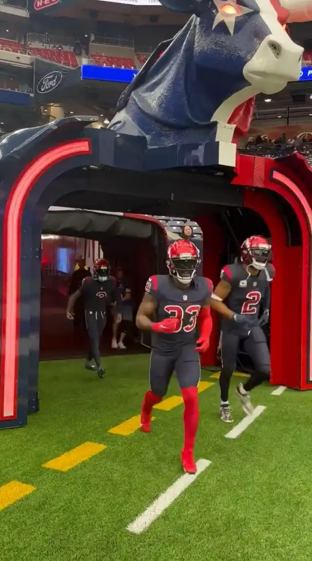
The bull head with the light up eyes is absolutely hilarious
-
 1
1
-
-
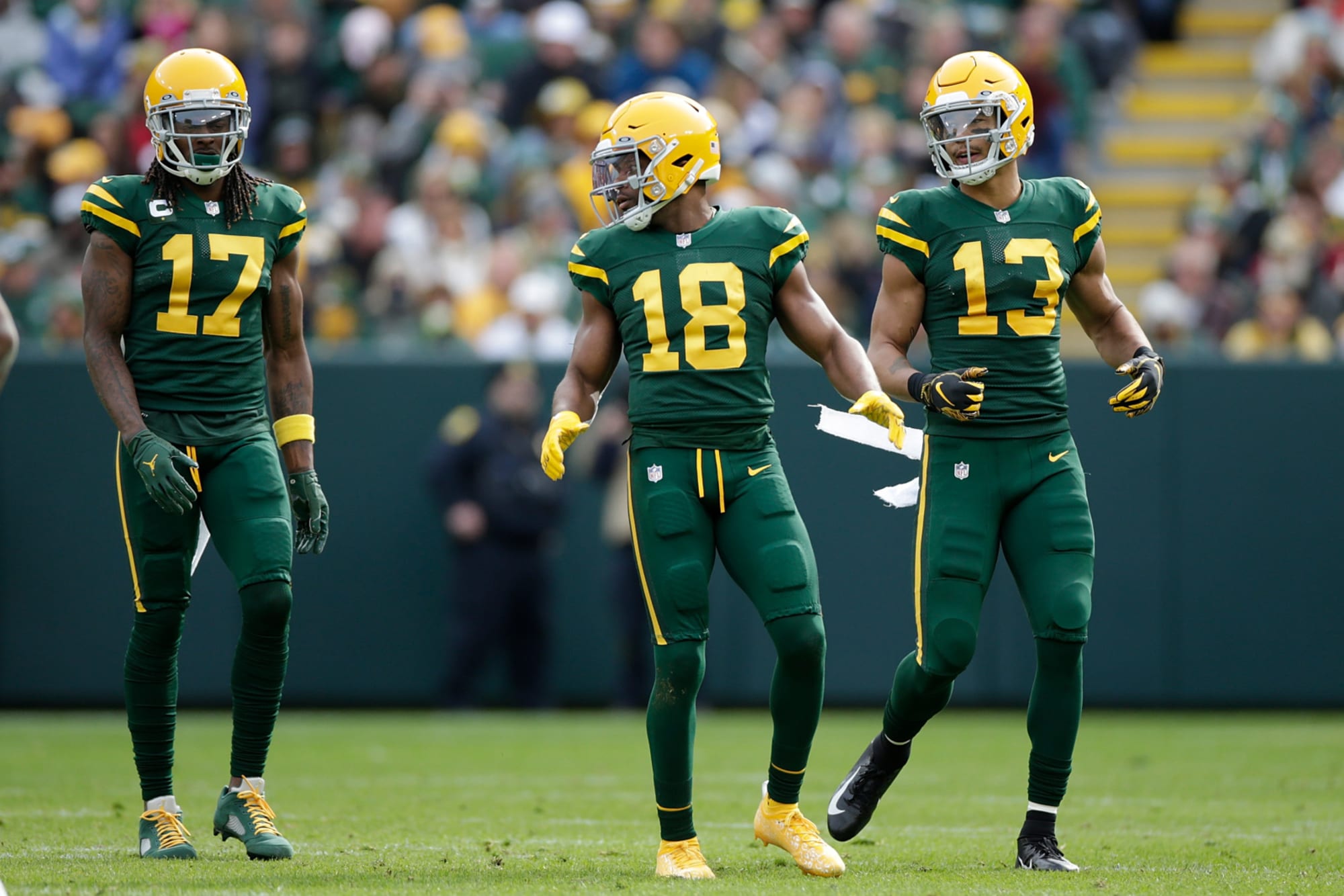
54 minutes ago, DustDevil61 said:
—Other than the green socks, I liked Green Bay’s throwbacks. Did those Packer uniforms use green sock with the green jerseys and pants, or were yellow socks used?
According to GUD, the socks were green, but they did have stripes. Not surprising to see that the throwback doesn't bother with that.
-
 1
1
-
-
47 minutes ago, Germanshepherd said:
Seahawks in the grey pants for the second week in a row! It’s a Christmas Miracle!
Please don't push the Christmas theme in November...-
 1
1
-
1
-
-
Rams wearing yellow pants against the Seahawks. Good looking matchup with the Seahawks in grey pants.
-
3
-
-
Thanks for showing us the superior pants color that you axed for no good reason
-
6
-
-
5 minutes ago, Brave-Bird 08 said:
1) A black helmet/black jersey + white pants/white socks looks like somebody was filling out a concept on a template and didn't get to anything below the belt (especially because JAX doesn't have any details on the pants). It looks SO BAD, I am genuinely amazed that a professional sports franchise would wear it without multiple people being like, "Hey, this looks goofy af."
Jaguars, this isn't hard.
Home
Road
Alt 1
Alt 2
-
10
-
 2
2
-
-
32 minutes ago, TenaciousG said:
3. I just want my light blue anchor logo third!!!!
I am wondering though, is there enough contrast between the seafoam color and white for it to be worn against regular road jerseys, or is every matchup featuring that color going to be color vs color? The RR last year worked as a dark jersey because of the abundance of navy striping.
-
7 minutes ago, Ridleylash said:
That's hardly a logo, though, that's a jersey design; the logo for those jerseys was the Flying Skate on the arms, not the V on the chest like the Vegas jersey.
Letters being used on the front of jerseys was extremely common in the PCHA, so I'd imagine Vegas designed their jersey to align with that style, color scheme and all, since Seattle was already headed in that direction.
Yeah I know what you're saying, I'm just providing context for what @BBTV meant when he said a big V meant Vancouver. I don't think anyone would confuse this for a Canucks jersey.
-
3
-
-
4 minutes ago, logo-maker said:
I don't know if this has been brought up, but it is interesting that the Diamondbacks chose to recolor their original D-Snake logo rather that use the updated version that came out during their last brand re-design:
THIS ('99-'06 alternate logo):
vs.
THIS ('06 to present alternate logo):
(Oop! Shout out to @FiddySicks for bring it up)
Good call by them. The original is more angular and more colorful than the oversimplified 2006 version.
-
7
-
-
1 hour ago, CreamSoda said:
This is a joke right?Their normal logo is a V…. and not sure how a C for the Canucks means they own a giant V… lol
Think he's referring to this
-
1
-
-
14 minutes ago, MCM0313 said:
That should not be allowed. A team should dress like a team.
By the way…are the Dolphins planning to wear their regular aqua jerseys at all this year? I see they’re going to wear the throwback aquas on Christmas Eve against Dallas (which should look fantastic), but when will they wear the regular ones? I’m sick of them in all-white.
We should see them for MNF against the Titans. Just hope and pray that that game doesn't turn into
 vs mono-aqua.
-
1
-
-
How did this
Turn into this
-
5
-
-
This Rangers team is insane. Came out of a five day break, ran the Devils out of their own building to go to 12-2-1. We're first place in the Metro by five points with two games in hand.
-
2
-
-
1 hour ago, RyanMcD29 said:
If they go all white it's going to look bad
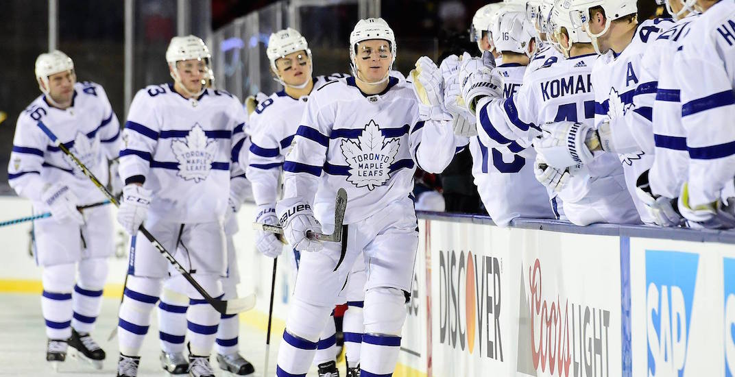
Never forget the stormtrooper Leafs. Thank goodness this game wasn't played in the daytime, or else our retinas might've been burned out.
-
5 minutes ago, gothedistance said:
I wish Cleveland wore white pants with the brown jersey against Pittsburgh for a turn. Not that brown/orange isn't nice. But I like the former more than the latter, when playing the Steelers.
Nah. The more orange pants the better. It's their best look.
-
6
-
-
1 minute ago, Lights Out said:
No, I'm talking about the Ravens.
Ok. I just read it wrong. The @kaleb_girod quote mentioned both teams, that's where I got confused. But regarding the Ravens, out of their three pants colors, you like black the best? Hard disagree. Even if there were stripes on the black pants, I'd prefer to keep white and purple over black.
-
3
-
-
25 minutes ago, M4One said:
The Vegas Golden Knights are All Elite. Winter Classic leaked by AEW?
Wow, the Vegas jersey looks plain. Hopefully it looks a lot better with the rest of the uniform. I've never been a big fan of revealing the jersey without the rest of the uniform, that was one of my main gripes with the Reverse Retro program. It's really hard to get a sense of what a uniform will look like on the ice when it's just a model wearing a jersey that's several sizes too large.
-
3
-
-
3 minutes ago, BBTV said:
What’s worse is when the Chiefs go full Heinz.
Yeah, when they played the Broncos on TNF someone in this thread mentioned that the sleeve stripes and pant stripes don't match, which makes it infinitely worse
-
56 minutes ago, henburg said:
Interesting insight, your points remind me a lot of some of the arguments I see surrounding grey facemasks in football. Some people prefer the neutral look almost like it's not a part of the uniform at all, whereas others see the grey having the opposite effect and sticking out. Speaking for myself here, I don't see the pieces of the uniform in the same way that you do, and I find that in many cases the white helmet actually sticks out more simply because it throws the uniform color balance off in many cases.
Looking at the Canes and Leafs specifically, to me the colored helmets paired with the white really just feel right, like the uniform could have looked that way all along if not for helmets being standardized in the way that they were initially.
I see helmets very simply.
White jersey ---> White helmet
Colored jersey ---> Either the jersey color or the pants color
-
5
-
-
1 hour ago, Pigskin12 said:
Monday night Super Bowl rematch ruined.
Sadly predictable
-
1
-
-
3 minutes ago, chcarlson23 said:
The dark helmets with the white jerseys are often way too top heavy, and it seems to pull your eyes away from the players hands, feet, and/or breezers, and up to the head.
And especially in the case of the Hurricanes and the Leafs (And even the Avs who have done it apparently) their looks are pretty balanced between the set, so the helmet just kinda needs to fade into the background. The bright cherry red of the Canes, and deep Royal blue really stand out, and not necessarily in a good way. Like I said, they just need to fade into the background, otherwise it blocks the uniform really oddly. I think it could work much better for both teams if their sweaters were a little different. A shoulder yoke for one, would be easier on the eyes for both, and I think even the Canes would need a darker, almost maroon/burgundy shade of red, so it wasn’t so jarring.
I think colored helmets can work, but they have to be planned for the design of the uniforms, otherwise they’re just a little tacky and too out there. It would be like players wearing team-colored skates. Sure it might match the team colors, but it certainly wouldn’t look good…
Regarding the Avs, you're talking about that one game in the 90s, right? I haven't seen any indication that they intend to wear their current blue helmets with their road jerseys.


/cdn.vox-cdn.com/uploads/chorus_image/image/61549963/1038439452.jpg.0.jpg)


/cdn.vox-cdn.com/uploads/chorus_image/image/72867541/usa_today_19793558.0.jpg)
2023 NFL Season week by week uniform match-up combos: From HOF Game to Super Bowl LVIII
in Sports Logo News
Posted
The 49ers have worn their white throwbacks in Seattle every season since 2019.
Not the greatest looking week overall:
- I have a sinking feeling that the Commies will ruin the Thanksgiving matchup with all-white
- Seahawks are in neon green
- Jets are wearing mono-BFBS
- Bucs are wearing pewter on the road to create a random color vs color
- Rams are wearing "bone" against the Cardinals in all-red
- Chargers are in all-navy to ruin what could have been a great matchup with the Ravens
At least we get the Eagles and Vikings in throwbacks, as well as a classic Chiefs vs Raiders matchup.