


ruttep
-
Posts
1,272 -
Joined
-
Last visited
-
Days Won
41
Posts posted by ruttep
-
-
Some other EDGE disasters that I would put at the bottom of the barrel (geez 2007-08 was trash):

(This was technically introduced the year before, but you can't tell me this wasn't designed for the EDGE template)
How to ruin a classic (darken the blue, introduce front numbers, add in unnecessary grey):
The worst of the three jerseys in this template (the other two were OTT and TB) because of the khaki "Vegas gold." Every game that featured the Penguins in these uniforms looked washed out. Just because they raised the Cup twice doesn't make them better:
-
 2
2
-
-
I think we'll all be able to agree that this is a bad monchrome look:
-
1
-
 4
4
-
 1
1
-
 2
2
-
-
Just now, Sec19Row53 said:
How are both of those white-color-white-color? I think that's the source of confusion. Is the one on the left white-color-white-white?
I think @DCarp1231 had a typo on the original post. I'm pretty sure what you just typed is what he meant.
-
1
-
-
1 minute ago, Sec19Row53 said:
They claim that seating. Have y'all forgotten the cluster that was seating for the Super Bowl at Jerry World? Seats just didn't exist even though tickets existed with those numbers.
I don't remember it (I was six at the time of that Super Bowl). What happened?
-
5 minutes ago, GoHawks said:
My far fetched dream is the Seahawks wear their royal blue throwbacks with the Eagles in kelly green throwbacks on Monday night.
I feel like the NFL would veto a blue vs green color vs color pretty quickly. Then again, they did give the ok for powder blue vs navy blue . . .
-
2
-
-
7 minutes ago, Unocal said:
I am surprised Jerryworld hasn't gotten another SB.
Like, can we give them a 2nd chance preferable withot snow?
Seriously, Jerryworld seems like the NFL's wet dream of a Super Bowl host. Over 100k capacity, huge market with a huge fanbase, indoor stadium. Plus Jerry Jones is one of the more influential owners in the NFL. Wonder why he hasn't forced their hand on this yet. (To be clear,
 the Cowboys, but a Super Bowl at Jerryworld would make sense for the NFL)
-
1 hour ago, Cujo said:
SBs are just gonna evolve into in a 4 year rotation between Los Angeles, Phoenix, Las Vegas and Miami
New Orleans as well, or is the Superdome too old now?
-
1
-
-
Not the biggest fan of the boneRam, but I'm still annoyed that they passed over it for the Super Bowl field for their other (horrible) logo:
-
28 minutes ago, fouhy12 said:
I've had a lot of exposure to both basketball and hockey where wearing all one color is the norm (at home in hockey for most teams), so maybe that's why I have a higher tolerance than others for monochrome. It isn't my preference usually, but it also doesn't really bother me as long as it is designed well.
I also watch a lot more hockey than I do any other sport, but I have different tastes for different sports. In hockey, all one color works because there's plenty of design elements to break up all the color, as well as how well it contrasts with a white ice surface. In football, though, the fact of the matter is that there's less uniform to work with (shorter sleeves), and striped socks are all but extinct apart from throwbacks, especially when it comes to wearing all one color.
In regards to your last sentence, I don't think monochrome NFL uniforms are designed well at all (or, if they are, the team decides to wear the uniform in a way that hinders that design).
-
1
-
-
5 hours ago, Old School Fool said:
Absolutely gorgeous game. Too bad the quality of play didn't come close to matching the quality of the uniforms.
7 minutes ago, fouhy12 said:
To me that's the most tolerable of the color rush sets, because of the giant yellow stripe on the pants that is so cartoonishly wide that there's no conceivable way to call it a black leggings look.
-
2
-
-
3 hours ago, TBGKon said:
Didnt that navy blue Preds alternate have subtle checkered flag pattern on the striping?
Edit: yeah, it did. Fond a good pic
The issue is that it's not visible unless you really look for it. The pattern is a little too subtle imo, and the jersey just looks way too plain and way too traditional for a team called the Nashville Predators that began play in the late 90s.
-
3
-
-
On 12/11/2023 at 7:03 AM, Carolingian Steamroller said:
Well to be honest, I'm not desperate for a Rams redo myself. I can see what this was supposed to look like and I think it's turned out better than it seemed in spring 2020. For example, the two original primary looks, when worn as intended, are quite good.
And this has worked out quite well indeed.
Out of the three looks that you listed, the only one that looks remotely good is the white on yellow that they wore in the Super Bowl.
The other two are two of the worst looks in the new set (all bone with bone socks is the worst by a mile). The only way I can find this set tolerable is if the Rams stick to only ever wearing blue over yellow and white over yellow, with the occasional white over blue if contrast is needed. Burn all bone uniform elements.
-
5
-
-
Raiders
Bengals
Steelers
Broncos
Giants
Browns
Falcons
Packers
Jets
Chiefs
Titans
49ers
Rams
Bills
Ravens
Eagles
I feel like almost all of these could go either way. You never know these days with the NFL.
-
56 minutes ago, Chewbacca said:
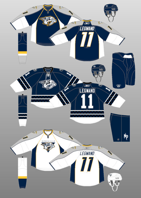
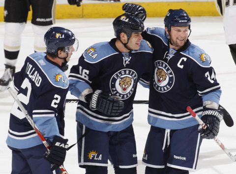
All this talk about the Nashville Predators uniforms and I’m really surprised no one has discussed their navy blue Reebok third jersey from the end of the 2000s. I still think they should’ve gone with that and the matching way they were planning on wearing it with.
This one? This is way too plain for the Nashville Predators. I love traditional uniform designs and single-color designs such as the Wings and Leafs are classics, but this jersey doesn't have much personality at all. It's the way too traditional jersey design that every expansion team releases at some point (Winter Classics notwithstanding), and it never really works.
For a few examples:
The Ducks:
The Coyotes:
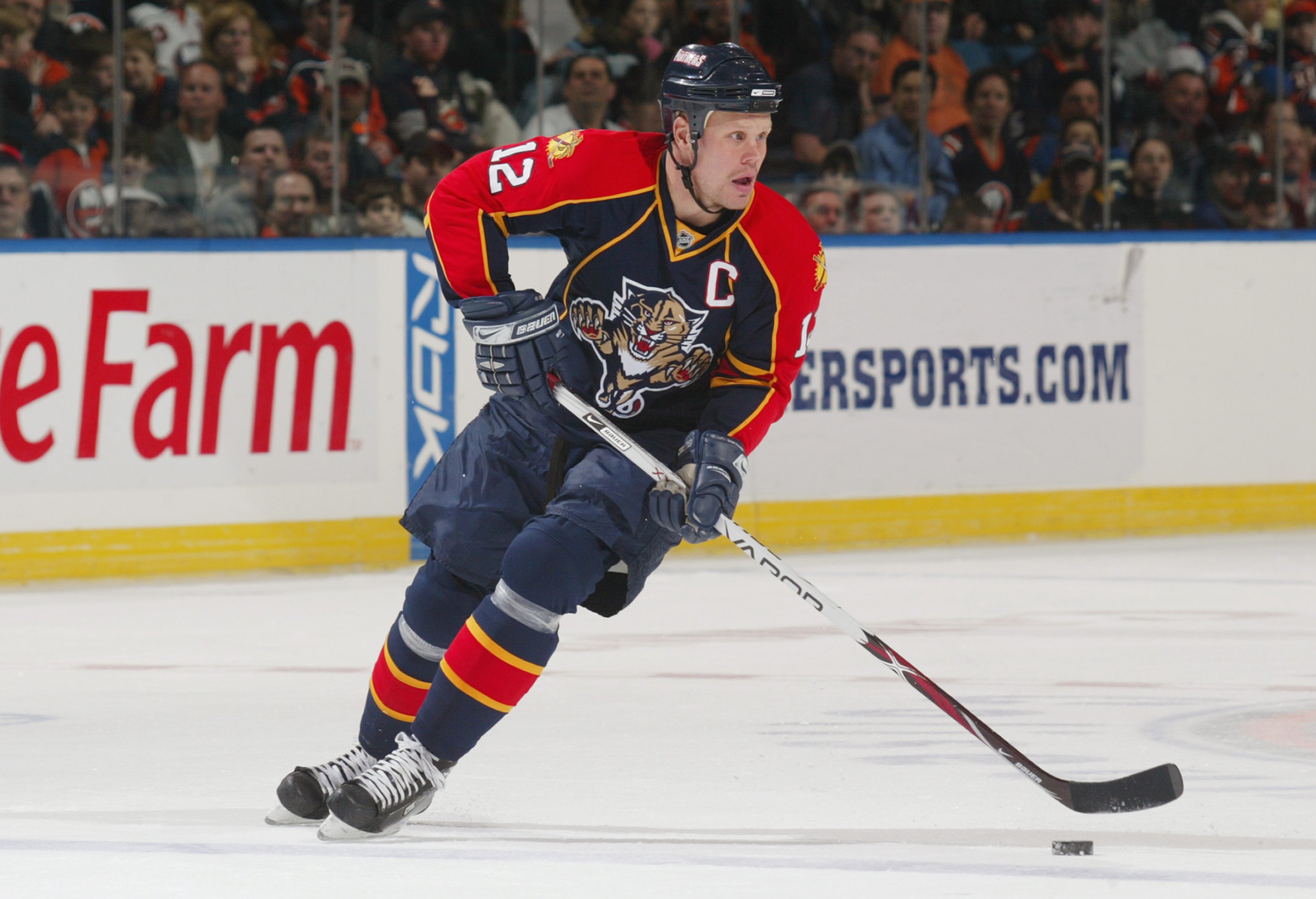
The Panthers:
The Hurricanes:
The Sharks:
I'd even argue the Lightning's current uniforms fit into this category, there's a reason that look was nicknamed the Maple Wings. But it's gonna be the one look out of this bunch that stands the test of time because the Lightning turned into a dynasty in them.
-
1
-
-
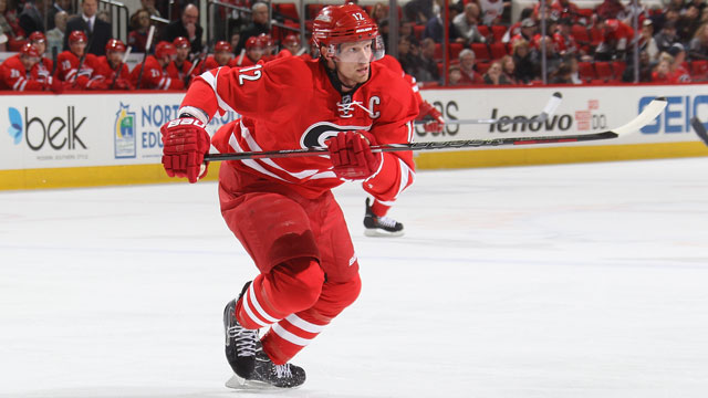
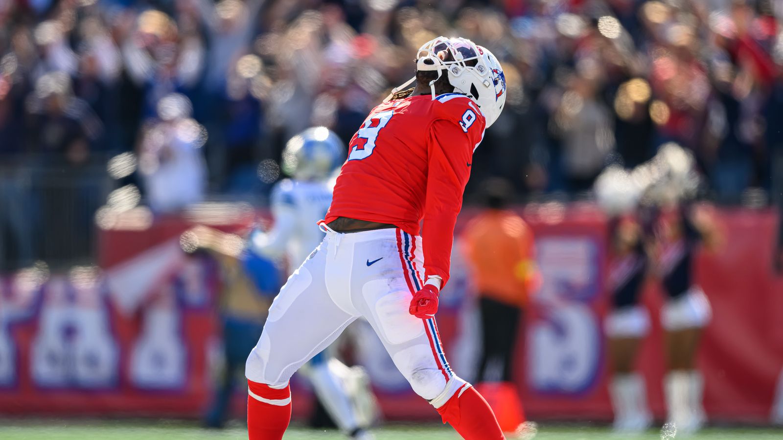
45 minutes ago, MJD7 said:
I’m also genuinely curious whether this uniform is part of that rule for you, or if it gets an exception because of the stripes on the socks:
It's not my favorite, it's probably the weakest look among the recent throwback trend, precisely because of the socks. I know the white striped socks are historically accurate, but I find this look to be very unbalanced. The main reason I don't like when the socks and pants are the same color is because it looks like the player's just wearing one long pair of leggings, even if there's stripes.
I thought that Matthew Judon massively improved the look by wearing red socks:
The balance of color is greatly improved with the red socks: White helmet and pants, red jersey and socks.
-
10
-
-
Just now, BBTV said:
If Ohtani were to move to Florida or one of the no-tax states in 2034, would he be exempt from tax for the deferred payments? He's not technically working in California at that point, and I'm not sure how the IRS treats situations like this.
I think they said he would be exempt, yeah. Smart by him, I just don't like what this contract means for the future of baseball. I'm all for players getting the bag, but this is just ridiculous.
-
35 minutes ago, Cujo said:
Happy now?
Farhan Zaidi to Giants fans:
-
 1
1
-
-
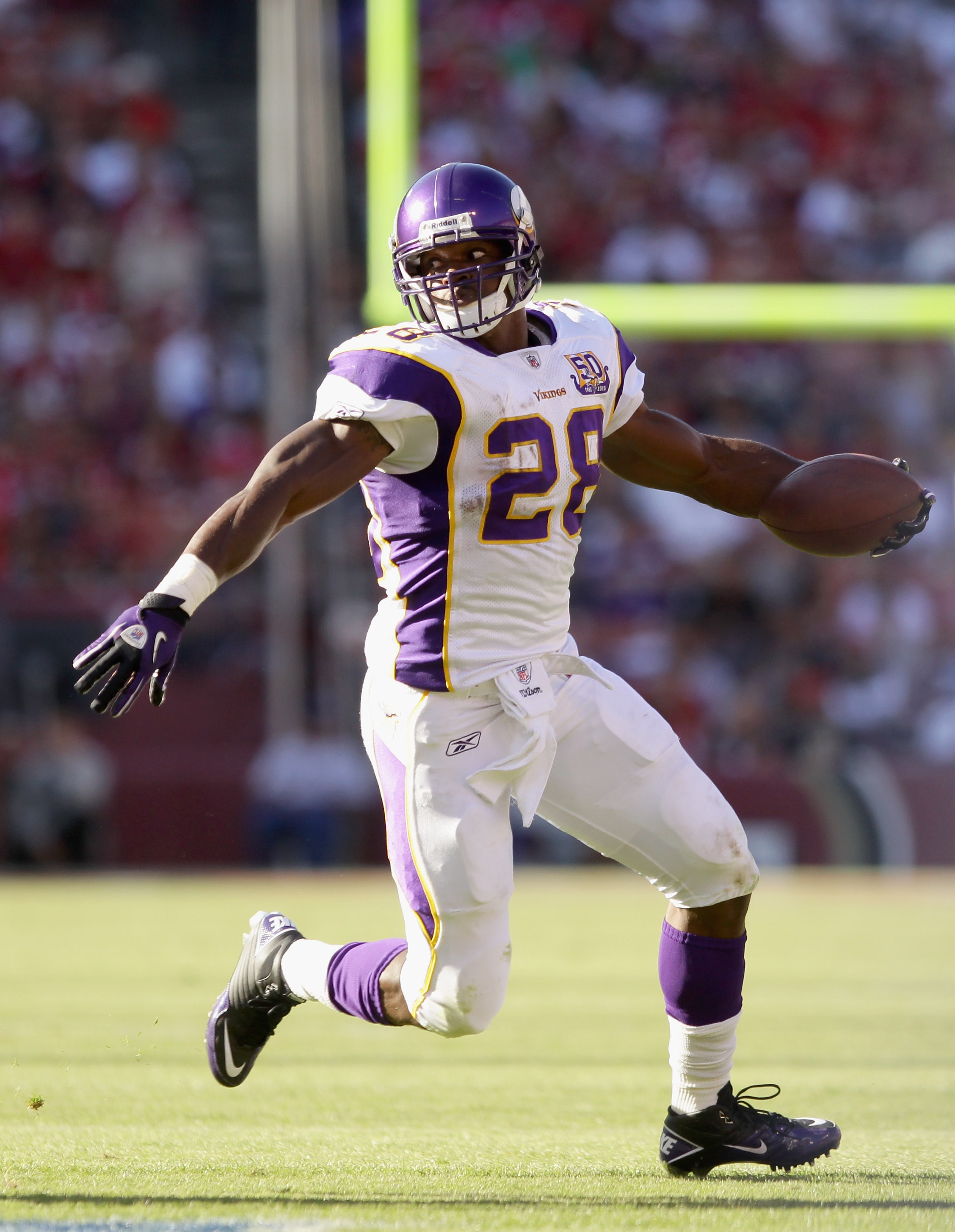
28 minutes ago, VikWings said:
You're going to be in for a rude awaking Christmas Eve when they wear all white from the neck down, and at home.
I actually like then in white on white, provided they wear purple socks, but they seem to only wear purple socks with the purple pants these days.
Vikings in white on white with purple socks looks good because it was the primary road look for decades and decades. The purple pants are decent (again, I'm not thrilled about the fact that they're always paired with purple socks), but white on white with purple socks is their true road look.
If the Vikings want to wear purple pants, they should wear them with striped white socks that match the sleeve striping.
-
15
-
-
41 minutes ago, MJD7 said:
I guess I disagree with the premise that all-black needs contrasting socks, as I seem to be in the minority for liking the Falcons’ all-black combo.
The reason it needs contrasting socks is because the pants color should never match the socks color. No exceptions.
-
3
-
-
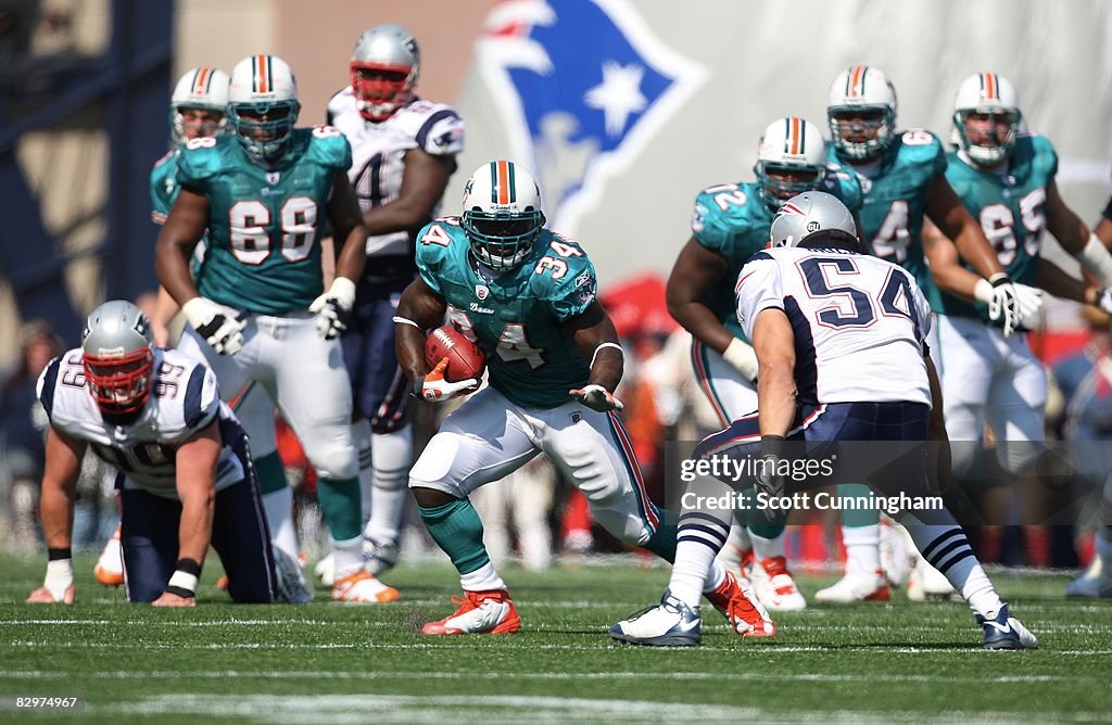
12 minutes ago, gothedistance said:
The current look, the regular aquas, are inferior to the aqua that was before it.
I'll take those over the current aqua, the regular ones.
And I'd take the throwbacks over both.
-
7
-
-
26 minutes ago, Ridleylash said:
Honestly, I don't think their current jersey is too far off from being legitimately good; the problem is that the yellow is overwhelming until you reach the bottom, where it just becomes a giant chunk of navy. If they, say, had a navy shoulder yoke and helmet, that would go a long way to balancing the jersey out more.
1 hour ago, ruttep said:
Yeah, the previous Reebok uniforms might've been a little overdesigned, but the little spots of navy on the jersey just above the logo on the front and the names on the back made a huge difference
-
1
-
-
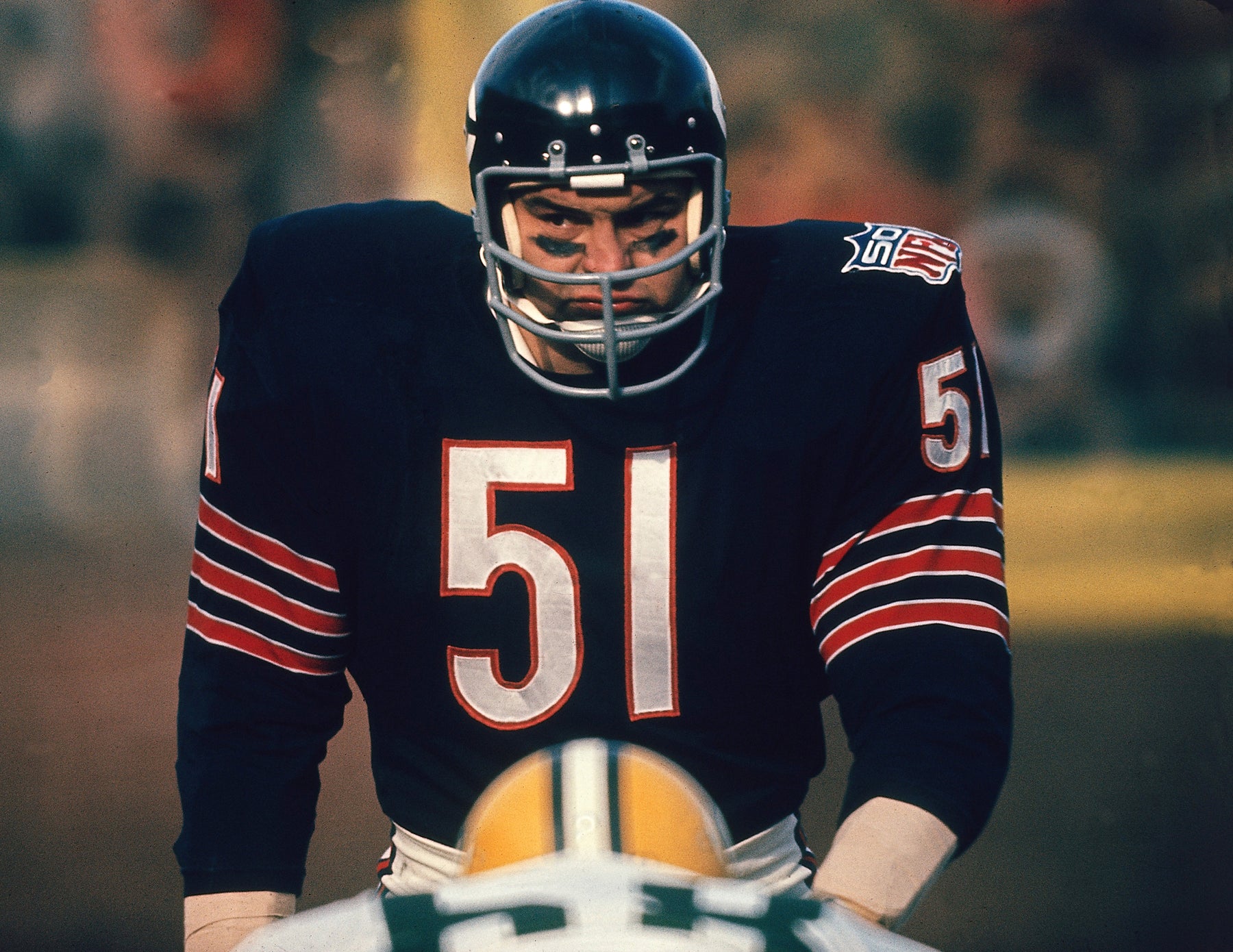
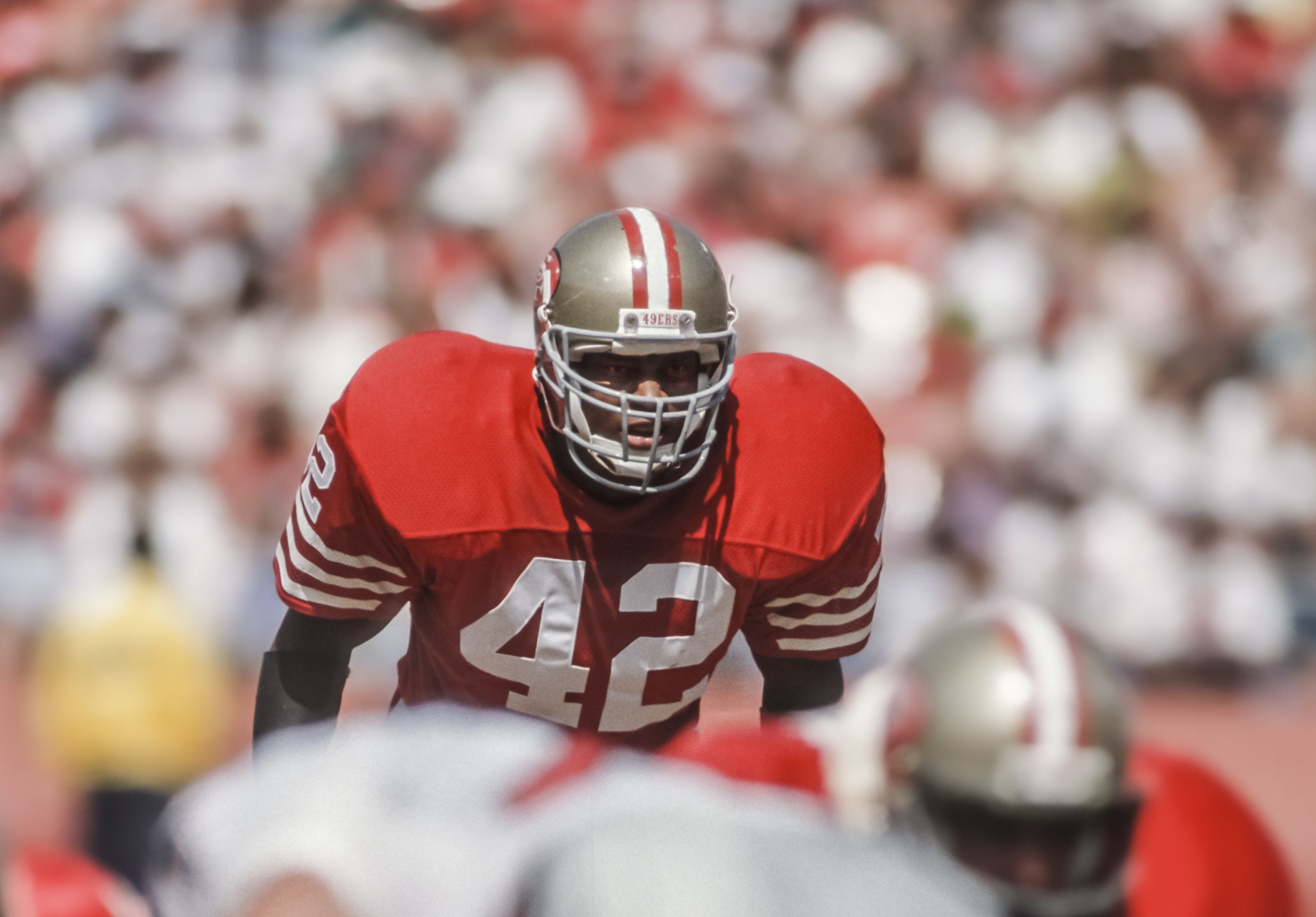
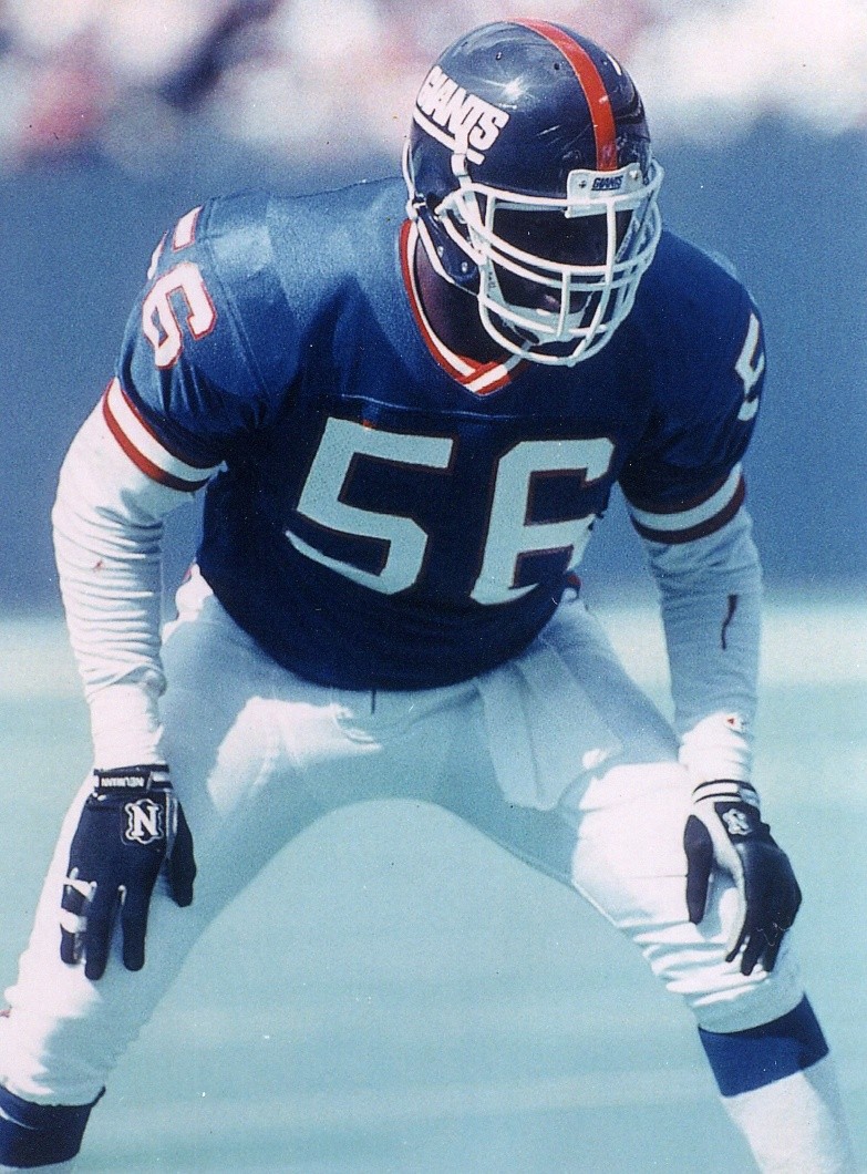
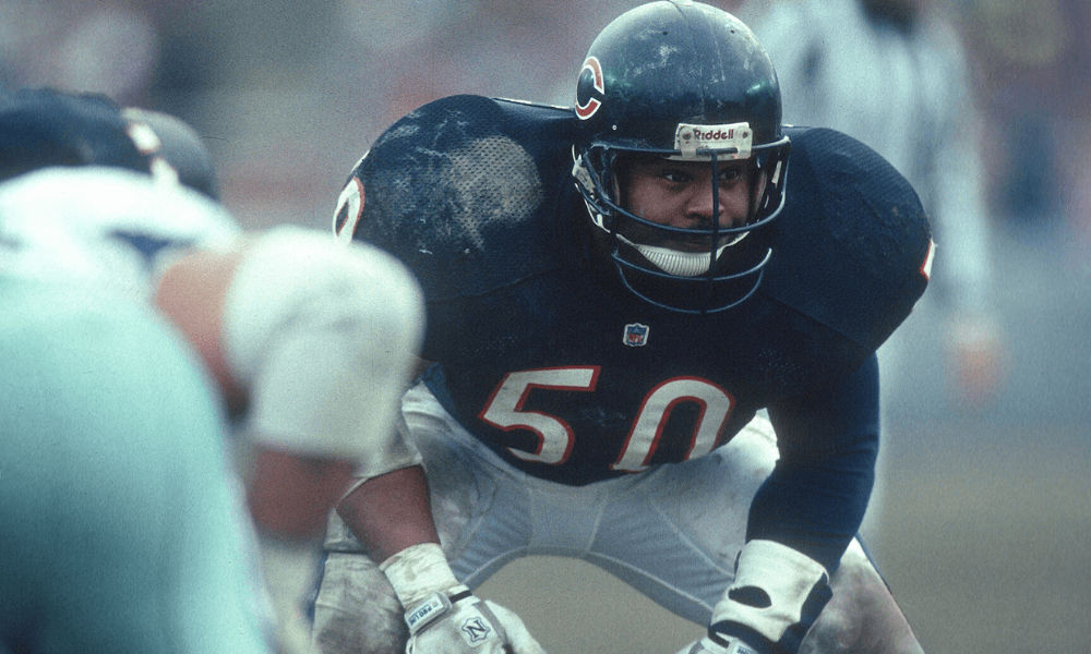
I will say, even though I know the current equipment is a lot safer and more effective, something about those huge pads in the 70s and 80s made the players (especially hard-hitting defenders) look TERRIFYING.
-
5
-
-
I'm sorry, Chargers fans. All six of you.
-
9 minutes ago, NOLAPelicans23 said:
The Bengals all-black is better with orange socks, but they are one of the few teams that can wear all black and it looks good because the helmet offers a nice balance.
All-black only looks good with teams that have black in their primary color scheme, and only when those teams wear contrasting colored socks (like the Bengals' orange socks or the Panthers' blue socks)
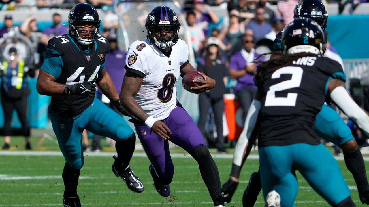
Not quite the same thing, but the Ravens and Jaguars have also broken up the all-black look in the past by wearing colored pants, which looked really good:
-
6
-

/cdn.vox-cdn.com/photo_images/5759977/20120228_ter_an4_470.jpg)


/cdn.vox-cdn.com/uploads/chorus_image/image/57738633/878080486.jpg.0.jpg)


:format(webp)/cdn.vox-cdn.com/uploads/chorus_image/image/70252511/1356312728.0.jpg)

/cdn.vox-cdn.com/uploads/chorus_asset/file/24035291/usa_today_19075627.jpg)

2023-24 NHL Jersey Changes
in Sports Logo News
Posted
Off-white works on throwback or fauxback uniforms because it gives off the appearance of age. The looks that those uniforms are "throwing back" to were originally designed with regular white, but whether through age or material limitations, the physical sweaters from that time period appear off-white to us now. It's a fun complementary color or alternate color, but I don't want it to become a primary look.