


ruttep
-
Posts
1,245 -
Joined
-
Last visited
-
Days Won
41
Posts posted by ruttep
-
-
3 minutes ago, Morgan33 said:
I'd rather they suit up in the Mooterus...
Seriously, that is far and away the worst uniform in their entire history.Same. These are all the same type of uniform and none of them work:

-
 5
5
-
-
16 minutes ago, Silver_Star said:
Hmmmmmm. Just, hmmmmm! Ummmmmmmm! I don't know!
-
3
-
 2
2
-
 14
14
-
-
23 minutes ago, DCarp1231 said:
Given the chance to update the throwbacks and bring them full time as well as a black alternate, should they consider a grey uniform as a 4th option?
No they shouldn't. Grey uniforms should only exist as baseball road uniforms.
-
4
-
 2
2
-
-
41 minutes ago, DJT said:
Figured i'd follow the rules and start its own thread.
I honestly think this is a great choice. The home set is perfect.
Oh great so they are gonna be wearing the blue pants as leggings. Again, A+ on the primary blue and white jerseys, helmets, and silver pants, F- on literally everything else.
-
4
-
-
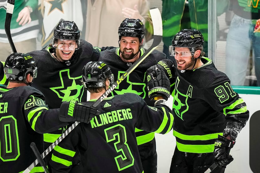
These graphics the Stars are using on Twitter seem to suggest they might be wearing the black/neon green jerseys in the playoffs. I hope that's not the case
-
 2
2
-
-
My main problem with the Broncos jersey is that my main gripe from the previous set is still unfixed: They have the most dull, uninspiring combo of orange and navy blue possible. I simply can't get excited for these uniforms with those colors. Those colors even managed to ruin their throwback uniform when they rendered it in the current colors. I hope that some of the leaks are correct and they properly brought the throwback back in its original colors. Those colors should've been the colors moving forward.
-
3
-
-
1 hour ago, henburg said:
The other 3 are good looking uniforms though, that's my point, and yet a lot of people are talking about them like they dropped another Buccaneers 2014 set on us.
They're gonna look like this most of the time.
Still significantly worse than the previous set
-
8
-
1
-
-
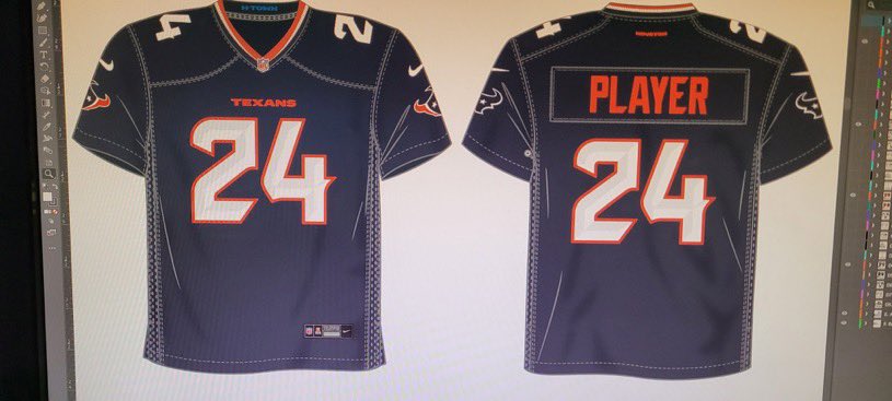
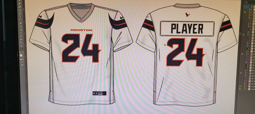
The leaked Denver and leaked Houston uniforms are both

-
1
-
 1
1
-
 1
1
-
-
Penguins wore the Vegas gold jerseys in Game 5 of the 2001 ECF - final playoff game of the Lemieux/Jagr era
-
40 minutes ago, aawagner011 said:
With all this talk about the sheen on the Lions silver pants, I did some digging. As a Georgia Bulldogs guy, I have been interested in this topic because it’s often a point of contention amongst fans who long for the “true” silver britches to return.
Lo and behold, according to the Detroit News:
Looks like I quickly got my answer.Edit - all blue still appears to be an option.
The improper sock wearing

-
3
-
-
31 minutes ago, infrared41 said:
As I was saying...
In other news, the sky is blue. Get ready for at least 10-12 of the 17 games to be monochrome.
-
2
-
1
-
-
The Lions were so close to the perfect new uniform set. All they needed to do was ditch BFBS and have only one pants/sock option: silver pants, blue socks. They really didn't need anything else. And I agree with others who've said that while mono-blue wasn't in the official reveal, it'll most likely be the most common home combo, with all white being the most common road combo. I think these uniforms likely join the club of great in a vacuum, but ruined by poor combo choices.
-
2
-
1
-
-
1 minute ago, tscuzzy said:
forgive my terrible photoshop skills but matte helmet + reducing the red trim does wonders IMO... it just looks so amateur in the leaked pic
Matte helmet looks worse to me. There's just no improving that Old English H logo.
-
7
-
-
5 minutes ago, ZapRowsdower8 said:
Reddit is a different universe. Morbid curiosity led me to the Coyotes Reddit this week to see their reaction to the move. 99% of the comments were blaming Gary Bettman for the move. A total disconnect from reality over there.
I don't blame Yotes fans for having an emotional reaction to their team leaving. But Reddit definitely shouldn't be designing uniforms.
-
I haven't liked a single thing about the Texans rebrand so far. This could end up being one of the worst looks in the NFL, a term I don't throw around lightly. Hate to be that guy, but every single non-traditional redesign in the NFL over the past few years has been horrible.
-
9
-
-
50 minutes ago, TBGKon said:
That's beautiful. Hopefully the pants don't ruin it.
Standard block numbers. Really didn't think we'd get them.
-
1
-
-
1 hour ago, infrared41 said:
Can you explain to me how a uniform looks better or worse based on its "glory days" or a team's performance while wearing it? I may be in the minority, but I've always believed that the aesthetic quality of uniform is based entirely on, you know, what it looks like.
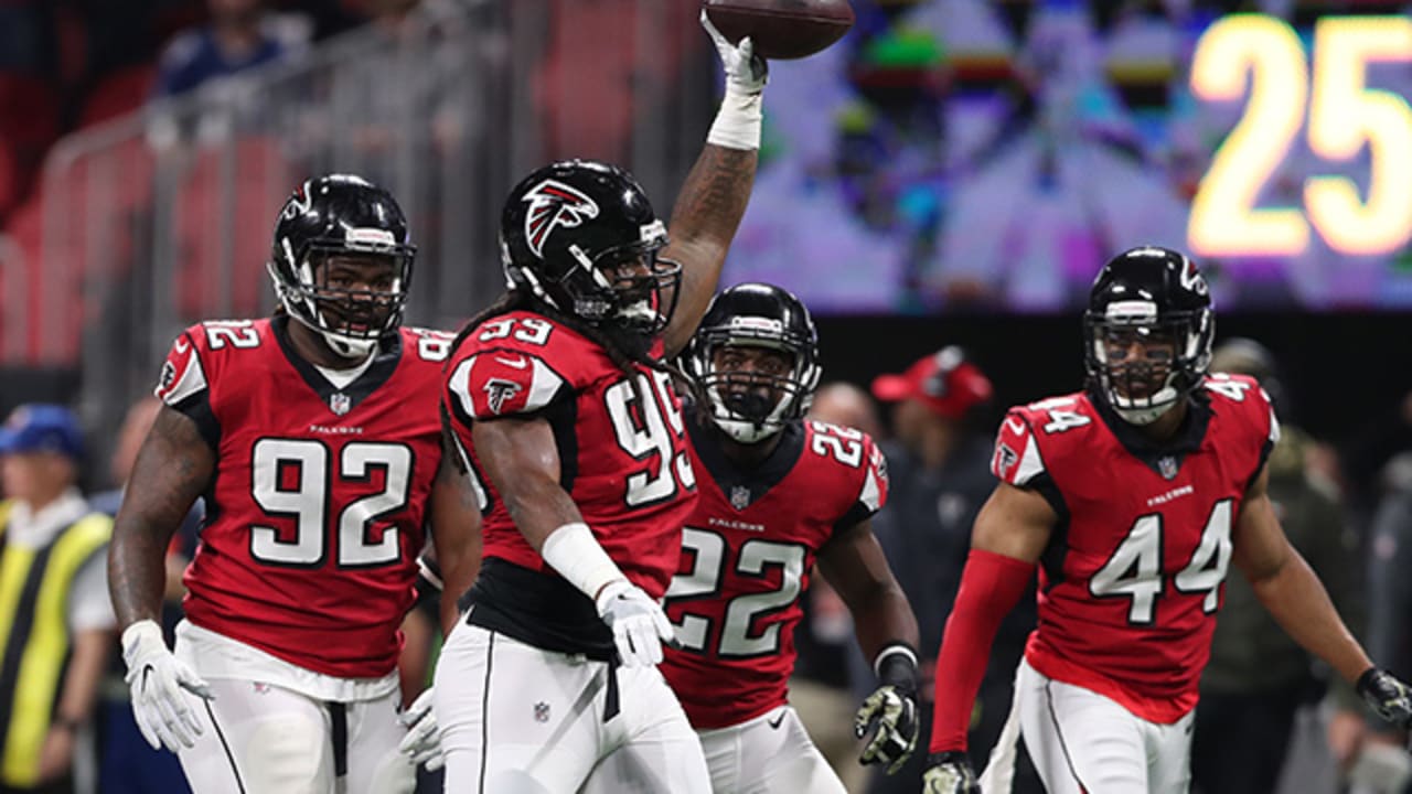
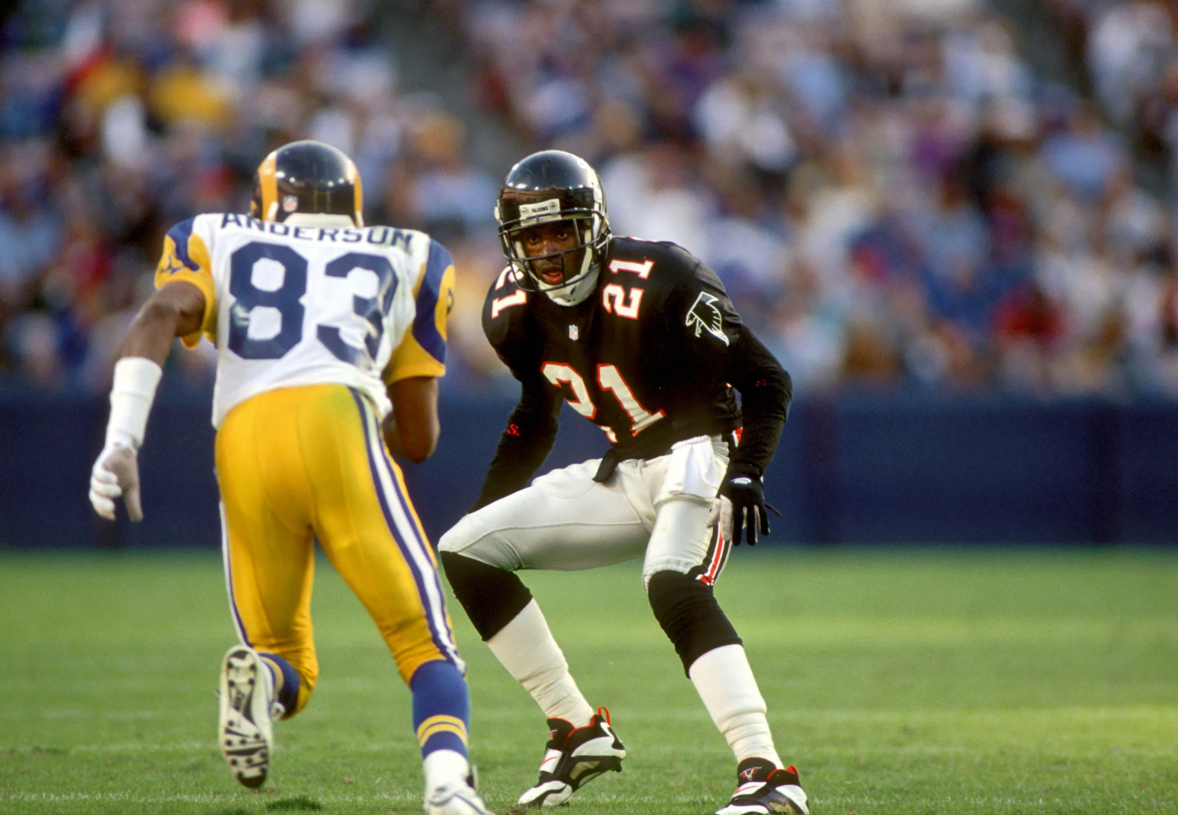
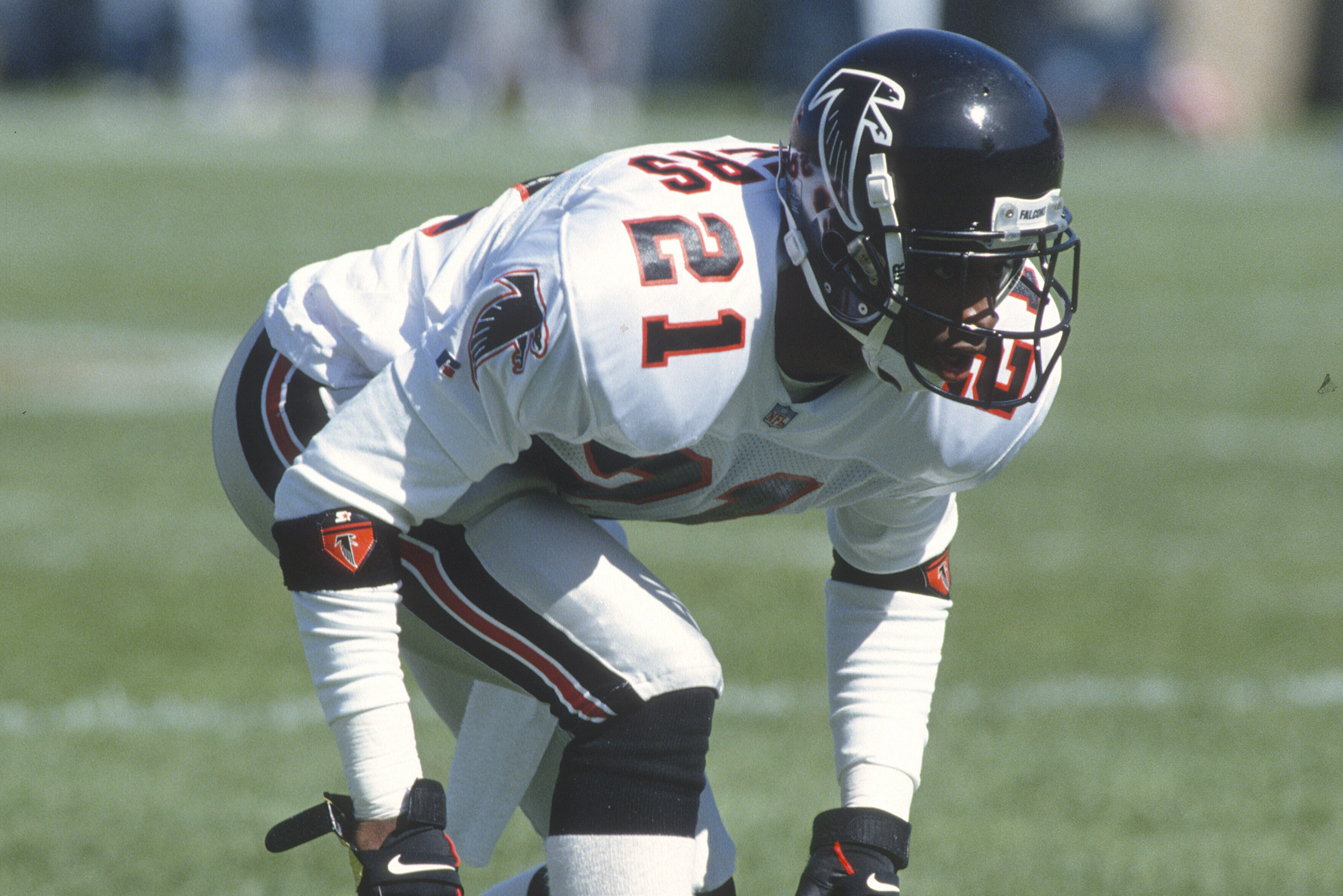
The Falcons got it right on the first try.
Right - if we're going strictly by on-field success, these would be the best uniforms in Falcons history
-
1
-
 2
2
-
-
Currently watching the final Arizona Coyotes game. Kinda surreal.
-
2 hours ago, HOOVER said:
Alright, since I've been talking about it forever, I ran a quick & dirty mock-up of my ideal Falcons uniform with Dark Silver helmet (sans Gold):
Add a Gold outline to the helmet stripe, logo, and the Swoosh & accessory details (like on cleats) if you wanted to go that route. Either way, this would do it.(I wouldn't even be completely heartbroken if they added a small 1" tall "ATLANTA" above the number in a clean new non-italic font.)
Cool in theory, but I think the black and "dark silver" would blend together too much in practice (this also happens with Tampa's pewter pants/black socks since the pants aren't dazzle fabric anymore). Would end up looking like mono-black.
-
7 hours ago, HOOVER said:
Bringing these back just in time for them to draft Shedeur and Shilo:
With the current logo and current helmet shell finish, maybe a slightly updated pant stripe.Would be a Top 10 uniform.
This but with red numbers on the road uniforms
-
9
-
 1
1
-
-
4 hours ago, BrySmalls said:
The Caps and Rangers split the regular season series this year, which might not mean anything in the playoffs. I hope the Caps make this a good series!
I'm expecting 7 lol. I don't trust the Rangers to win a quick series
-
1
-
-
The Rangers *should* win this series relatively easily. But they've never made things easy. I am nervous af.
-
1 hour ago, SportsFan12 said:
The internet will ruin the Jets for us. Don't worry.
Delete your account, Blake.
-
5
-
-
1 hour ago, CreamSoda said:
just noticed this. It looks like the Avalanche mountain stripping on that seam above the logo. Could that be the subtle Colorado landscape theming?
It could easily just be the standard seam on Nike's uniform template


2023-24 NHL Jersey Changes
in Sports Logo News
Posted
That's simply the most boring uniform I've ever seen. There's not really much else to say. No front logo, not even a logo that looks like the female reproductive system. The black/neon green, on the other hand, is horrendously ugly to me. I will never be a fan of that neon green color, in any sport.