


ruttep
-
Posts
1,258 -
Joined
-
Last visited
-
Days Won
41
Posts posted by ruttep
-
-
9 hours ago, HOOVER said:
Best they've ever looked.
They're really just a number font, helmet stripe, and wordmark update away from being excellent (especially if they'd commit full-time to the Purple pants). This Purple fill, Gold outline look is really nice.There would be massive visibility issues with wearing purple numbers on a black base
-
 4
4
-
-
23 minutes ago, Kevin W. said:
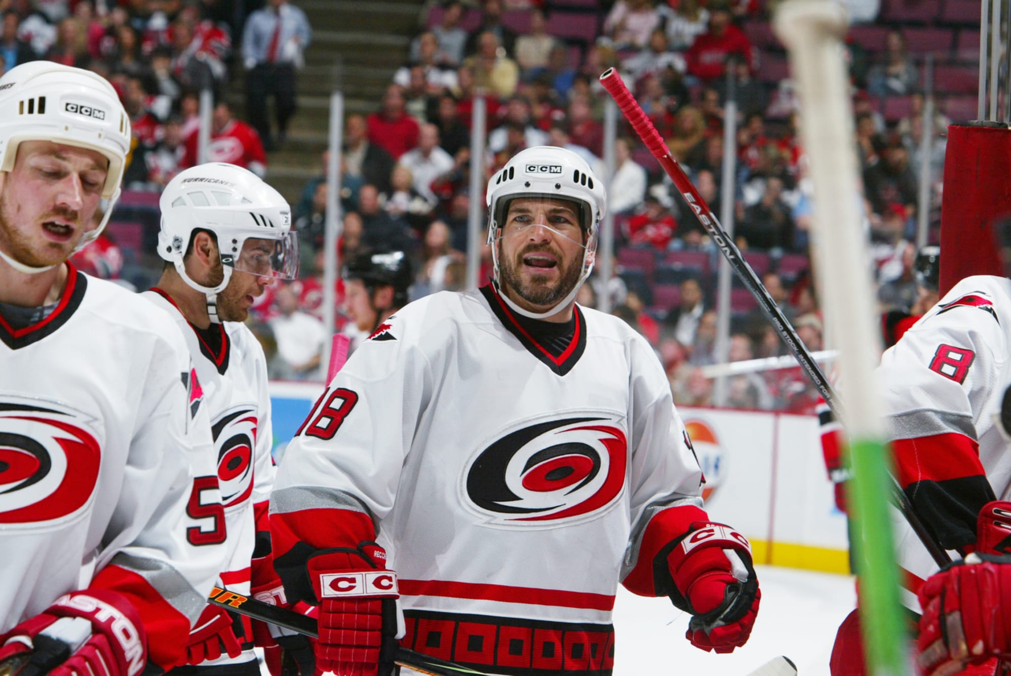
The Adidas red jersey is miles ahead of the pre-Edge or Edge reds and if they'd just used a matching white version, the Hurricanes would've had their best set by far with the caveat that they should've changed the font. A non-italic version of the original font would be best.

-
1
-
 1
1
-
-
1 hour ago, Morgan33 said:
Modern classic. This should have never been changed.
They eventually got changed because of the random shoulder yoke outline that they added for the Reebok Edge transition
-
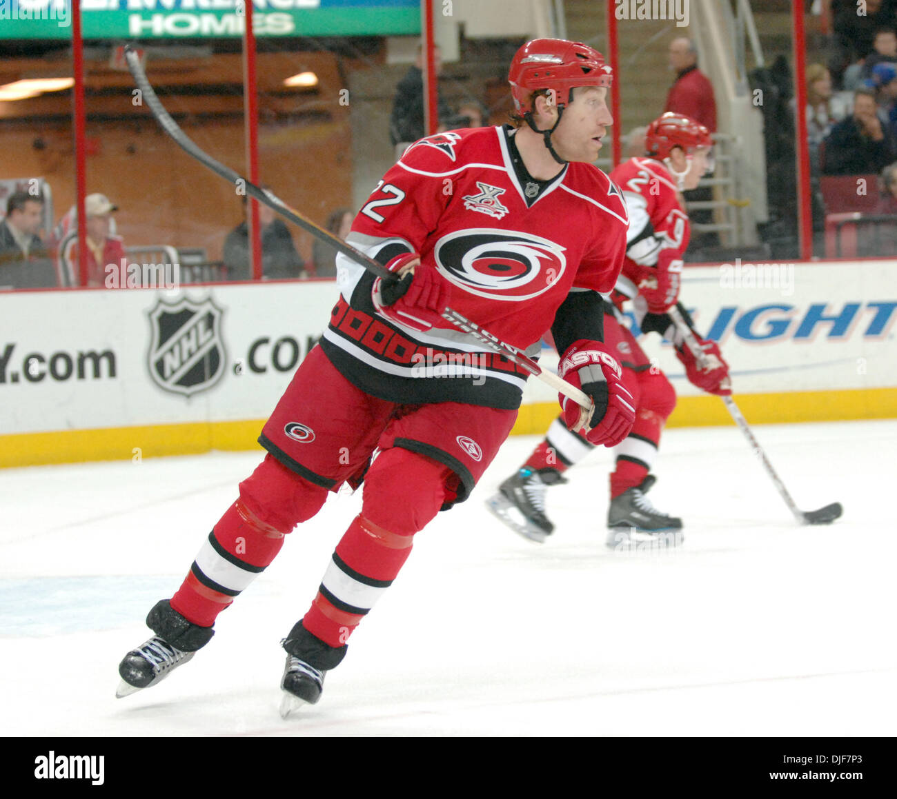
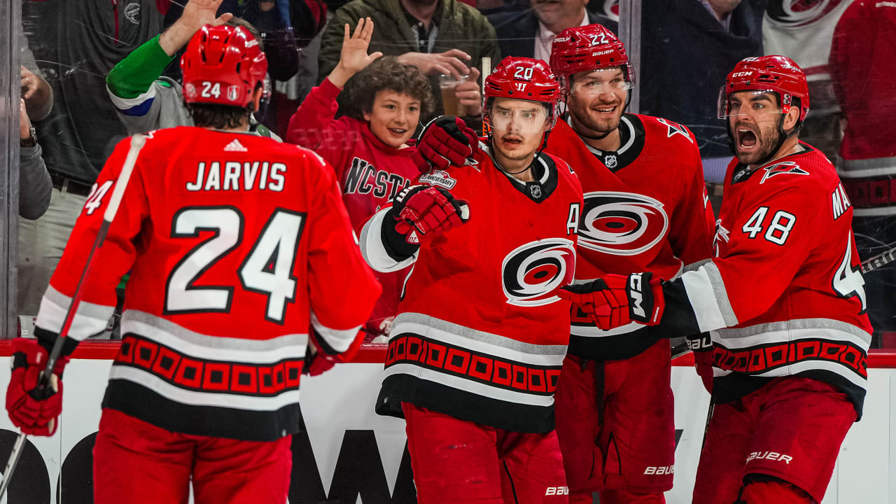
Carolina, this isn't hard. You brought back your best uniform ever as an alternate last year, wore it in the playoffs, and then inexplicably dumped them for the previous red jersey . . .
Just bring back the road version as well
-
10
-
 1
1
-
 5
5
-
-
3 hours ago, Morgan33 said:
These are laughably bad but fitting considering the trajectory their identity has been on these past 10 years.
Continuing that trajectory and choosing three of these logos (because no two Carolina jerseys can have the same logo) would be grounds for contracting the franchise. They're such an embarassment.
-
1 hour ago, M4One said:
Carolina Hurricanes are polling season ticket members about possible new logos. I know some people don't like their current primary, but none of these would be an upgrade.
The first three are trying way too hard to make the C the focus of the logo (top left is literally just a C). Top right is taking a page out of the Whalers' book with that negative space C, but it just doesn't work because it doesn't look natural. The last three belong on the front of a baseball jersey.
Also, the black portion of the top right logo is giving me these vibes:
-
8 hours ago, DCarp1231 said:
Jerry Jeudy wearing 3 in Cleveland
Don't see how this is news at this point. The sanctity of position-specific numbers is long dead and buried.
-
1
-
-
31 minutes ago, BadSeed84 said:
The Eagles jersey (Granted the replica) with the updated wordmark, I'll tag @BBTV since he's been anticipating it.
The new Eagles wordmark and the name/number fonts don't really match to me, especially if there's no outline around the white wordmark (they should do what they did with the Super Bowl LVII endzone with a black outline for the wordmark).
-
7
-
-
7 hours ago, spartacat_12 said:
Would a team like the 49ers look better with a red facemask instead of grey?
I would not like the 49ers to go with red facemasks, they remind me too much of the uniforms during the 00s dark ages.
-
2
-
-
6 minutes ago, SHaMROCK said:
If this is your belief I certainly hope you a against teams like the Cleveland Brown in the NFL wearing grey facemasks!!!
The Browns . . . don't? They wear brown facemasks, and their alternate/throwback facemasks are white.
-
5 hours ago, DTConcepts said:
I think the Avs would be better off doing the opposite and darkening their shade of blue, similar to the Nuggets. Would certainly solve their contrast problem. Here are some examples I hastily Photoshopped in 10 mins to illustrate.
I hate how much this works. I wouldn't do it, mostly because I don't want yet another team to abandon their lighter blue for navy blue, but at the very least, the color scheme would be unified between the three jerseys.
-
2 hours ago, jamesizzo said:
(probably not an unpopular opinion) I wish pants in the NFL still looked like that
-
1
-
-
42 minutes ago, spartacat_12 said:
Aside from Boston returning to their pre-centennial uniforms, there's no mention of any other teams changing their primary look
I don't mind this (their standard uniforms from last season were better overall), but I really do hope that they keep the simplified logo they rolled out for their centennial.
-
9
-
-
33 minutes ago, DCarp1231 said:
Since sock rules are a bit loosey goosey these days, some players (notably Matt Judon) have worn plain or striped red socks with the throwbacks
. . . in which case the throwbacks are better than the primaries. But unless the entire team goes white/red/white/red instead of white/red/white/white, I just can't bring myself to like those throwbacks.
-
4 hours ago, dont care said:
And? What’s significant about this game?
The score is funny
-
1
-
-
-
1 hour ago, NashConcepts said:
Interesting note-- Is this the throwback Jets logo or an altered logo on these jerseys?
Hard to tell since this is the only angle we're given. I think it's the throwback logo.
-
The Red Wings have now gone 0-5 since adding an ad patch to their jerseys, and Wings fans have been blaming the patch more and more with each successive loss. If you go to the comments of any tweet the Red Wings make, their fans are hurling insults at the team, Chris Illitch, and their ad partner (some local waste company). This has to be the most discourse I've ever heard about uniform advertisements in hockey, it's good to see that us uniform snobs aren't the only ones that care about ads being slapped on NHL jerseys.
-
2
-
2
-
2
-
-
42 minutes ago, throwuascenario said:
I think that the blue equipment looks much better with the aways. It adds some much needed blue to a very burgundy dominated uniform and let's them use both colors in their scheme.
The homes, on the other hand, already have a good amount of blue on the jersey and having the equipment be that color as well makes it compete with the burgundy too much. That and the issue of blurring the border between jersey and pants.
I always assumed that the blue equipment was meant to go with the white jerseys and that the homes were the afterthought.
What shows me that the aways were the afterthought is that the numbers weren't changed to blue until after the first season with blue equipment. If the equipment was planned to go with that jersey, wouldn't they have figured out the number color beforehand?
-
2 hours ago, tscuzzy said:
It's always been interesting to me that they didn't go with the official Texas flag colors, given the name and obvious logo connection to the flag.
Because navy blue was the trendiest shade of blue in the late 90s/00s. They probably thought it was "tougher" than the flag blue. Not sure about the red.
-
1
-
2
-
1
-
-
3 hours ago, gsn93 said:
I'm not ragging on you since you're not the only person who uses it, but I really dislike the notion of "team won a championship in 'XYZ' uniform" as the end all be all answer to anything uniform change related. Especially, since the Avalanche won twice wearing their original set.* What makes their current set untouchable compared the the 1996-2007 sets? It's a minor pet peeve but I see it all the time on the forums.
*I understand that the uniform changed slightly between the 1996 and 2001 cup wins. Whatever close enough.
I agree that it shouldn't be the end all, but it is how a lot of teams and fanbases base their perceptions of certain uniforms. It's one of those things that will be relevant in uniform decision-making, whether you like it or not (along with other top hits such as players or owners preferring a certain look).
-
1
-
-
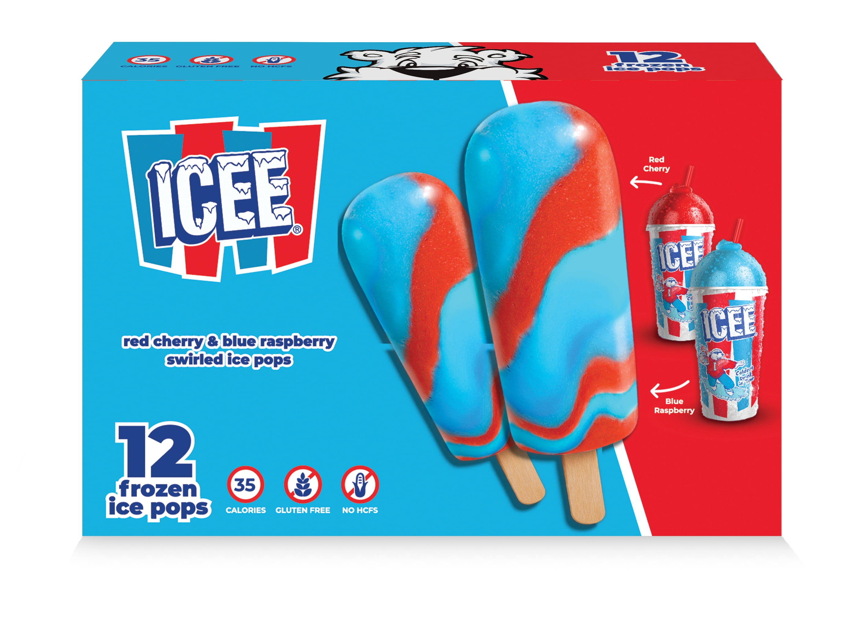
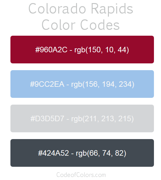
2 hours ago, henburg said:
The current Colorado Avalanche look just makes me think of an ICEE, especially when the red and blue flavors start to bleed together.
Would it be too derivative to do something like the Colorado Rapids and change the current denim blue to a sky blue? Would provide much better contrast at least.
The blue helmet, pants and gloves would look quite interesting in sky blue. I kinda wanna see a concept of that.
-
17 minutes ago, MCM0313 said:
A black Canucks sweater? I get that black-red-yellow used to be their scheme, but after so many years of the classic, lovely blue and green, the black Canucks sweater looks even more wrong than the Flames one.
I agree, so obviously the logical move would be for them to wear the black sweater in the playoffs as their home jersey (there were rumors of this a couple months ago)
-
3 hours ago, MCM0313 said:
A black Flames sweater looks more wrong to me than the helmet finish does.
That's a Canucks sweater.
THIS is a black Flames sweater.
-
1
-


/cdn.vox-cdn.com/uploads/chorus_image/image/29553777/129591595.0.jpg)


/cdn.vox-cdn.com/uploads/chorus_asset/file/24799651/1433627154.jpg)


2024 NFL Changes
in Sports Logo News
Posted
I'm just mentally preparing myself for the worst with every NFL uniform change these days (that doesn't involve throwbacks)
This league just looks worse and worse every year . . .