


Sec19Row53
-
Posts
6,159 -
Joined
-
Last visited
-
Days Won
13
Posts posted by Sec19Row53
-
-
9 minutes ago, HailGoldPants said:
I would like to see some additional looks at the orange pants
Orange pants? Admittedly I'm only seeing the pictures posted in this thread and not in any video, but I haven't seen those.
Thanks for the pics @DCarp12313 minutes ago, MCM0313 said:I do kind of like, despite myself, how they have brought back royal blue as a trim color.
I missed that as well. Where is it?
-
 1
1
-
-
6 minutes ago, SFGiants58 said:
We've had a few admit that they were dupe accounts, but none ever went as far as this guy did. Or have had as many dupes over such a long period (some overlapping!).
Why is it so important to him that he post on this forum?
And, assuming it's important, why drop that grenade, unless he thought he was about to he shown in his true colors?
-
1 minute ago, McCall said:
No one ever said it was. We were being critical of his saying that the Battlehawks dropoff was concerning, ignoring the context and the fact that they still drew more than twice the next highest attendance.
But is drawing twice the next highest figure, when THAT FIGURE isn't significant, in itself significant?
-
It IS possible to be critical of the league and NOT be hoping for its demise. Those are not exclusive positions.
-
4
-
-
I don't recall a similar [I don't want to use the phrase 'suicide by cop', but it is what it is] here. Has there ever been one?
-
On 4/19/2024 at 10:24 PM, GFB said:
Do people not realize the current stripe is made to look like an actual bronco mane? And the three sections of the stripes are taken from the three orange shapes making up the mane of the cyberhorse?

Sounds more like Nikespeak than anything else. I'll buy that it's based off of the three sections of the robohorse, but not that it's based on an actual mane.
-
1 hour ago, Fowler2 said:
I have violated all the terms of this board. Please ban me.
-
 1
1
-
-
Isn't that smudge a miniature snow covered mountain? That's what I get when I enlarge it.
-
1
-
 1
1
-
-
5280 triangles make up a stripe that is connected to skiing somehow
-
2
-
5
-
 1
1
-
-
Re: Houston
It blows hard (to turn a phrase).
-
1
-
4
-
-
1 hour ago, Old School Fool said:
No one is going to point out the Diamondbacks have a sick new helmet logo for the City Connect?
Chris pointed it out on Twitter. I assume it was on the Mothership as well.
-
1
-
-
Just now, Sodboy13 said:
Diamondbacks' City Connects are certifiably banana yellow.
That might be your tv. I'm not seeing it.
-
2
-
-
4 minutes ago, DCarp1231 said:
The gold-to-black gradient helmet made no sense for Jacksonville. If they insisted on the effect, why not teal-to-black to mimick the Jaguar coming out of tall grass? And why so much gradient anyway?
So little gradient. It was an abrupt shift, not a transition.
Plus it was stupid

-
5
-
 1
1
-
 1
1
-
-
7 hours ago, bbush24 said:
So technically this is a new version of the Browns helmet that's never been worn before. White facemask + shiny finish + oranger orange.
The brown remains unchanged.
6 hours ago, CitizenTino said:I’d like the Jets’ black alternate uniforms a lot more if the colors on the logo on the helmet were inverted so that “JETS” is white with a green outline to match the jersey numbers.
I'd like the Jets' black alternate uniforms a lot more if the colors on the logo on the helmet were changed so that what was black was made green .
-
3
-
1
-
2
-
-
1 minute ago, DCarp1231 said:
Reveal pending, I do applaud the Texans for getting fans so involved in the process. 30+ focus groups is plenty of input.
Devil's advocate - what do fans know about design? Do you end up throwing too much at the wall because of so much input?
-
7
-
-
10 minutes ago, DrunkKidCatholic said:
yes and we can have opinions on those opinions.
insert repeating Dolphin helmet graphic here
-
3
-
1
-
5
-
-
2 minutes ago, DCarp1231 said:
Meh - we're all allowed to have opinions.
-
3
-
-
7 minutes ago, SportsFan12 said:
Jaguars throwback is awesome news. Hopefully the black is reserved for London and we'll start seeing teal throwbacks in primetime in Duval rather than all-black.
Not sure if anyone saw this. Not sure how they are doing this before the schedule is even out:
Jets look good. I was a bit worried they wouldn't bother adding green pants with the white jersey, but they did, and I can tolerate the matching green socks. Black alts do have more green, which was badly needed, but a they're now likely gonna be worn three times with no other alternates, which is too much for me.
It's a 'bit' to tease the uniform unveil. That said, teams get the schedule earlier than when it is released, but unlikely this far in advance.
-
2
-
-
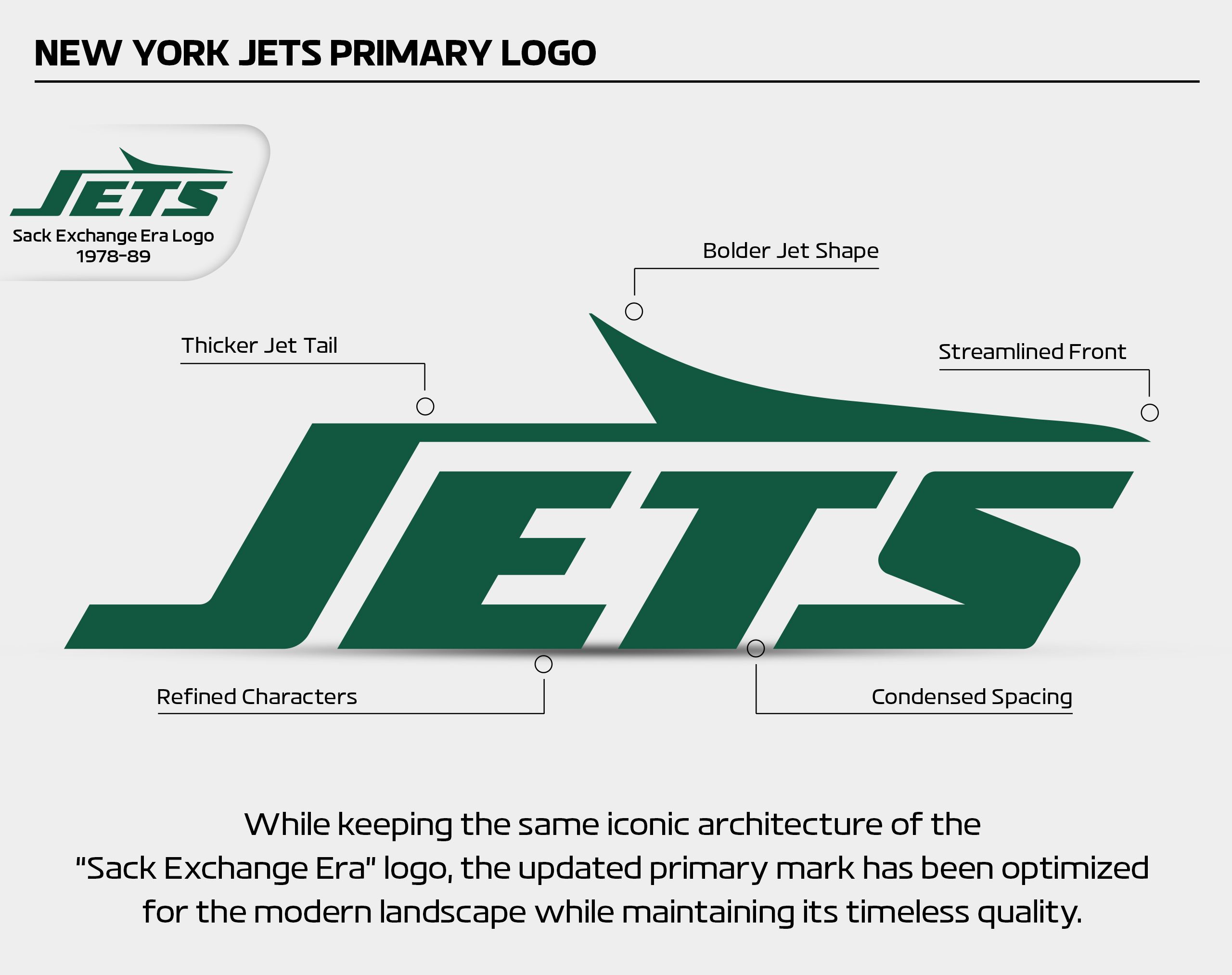
2 minutes ago, bowld said:
I know it isn't marketing speak, but they could have just said 'We made the logo look better'.
-
7
-
2
-
-
5 minutes ago, VDizzle12 said:
So how did the Jets get away with an all-black alternate uniform? As far as I can tell there's no black anywhere on the green or white set.
It's now a historical color, so they can use it?
-
11
-
-
7 minutes ago, Digby said:
It is Marathon weekend, so there's a plausible reason to deviate from the plan at the moment.
This outlines the local success of City Connect. People in Boston would understand this uniform selection, and if City Connect is supposed to do what its name says, this is how you do it.
-
3
-
-
22 minutes ago, MCM0313 said:
The black actually worked well in my opinion. They didn’t go overboard and do BFBS. They also used it consistently throughout the set - as a trim color. Had the most recent set been more consistent in using black trim on the white and green jerseys, then the black-heavy elements wouldn’t have been so out-of-place IMO - maybe they shouldn’t have had black pants, for example, at all (and I would prefer the color be trim-only), but they wouldn’t have been so egregious had the stripes on the green and white jerseys and pants been given black trim. I believe black should be almost always just a trim color for them, but it looks sharper when they apply it consistently to increase contrast than it does in just green and white IMO. (Obviously the white-helmet sets stand well on their own, without any black.)
Also…I know it isn’t the same meaning of the word, but…jet black is a color, right? So that makes it seem appropriate to include a small amount of it in the team’s scheme.
Understood - just going with opinions here. In my opinion, it was unnecessary because there's already good contrast between green and white without adding black. Agreed that they didn't go overboard, but disagree on whether or not it was BFBS.
-
2
-
-
40 minutes ago, MCM0313 said:
I actually like the 1990-97 set slightly better. Just a tiny bit less plain without being overwhelmingly flashy. I believe it isn’t remembered fondly primarily because of the fact that the team had zero winning seasons while wearing it.
I thought it was because they needlessly added black.
-
3
-
 1
1
-
-
40 minutes ago, GDAWG said:
At least give the fans in Arizona some hope, so yes.
So that he can get bagged when it's shown, maybe tomorrow, maybe Tuesday, that he was lying?
That's an odd take.
-
3
-
1
-


2024-25 NHL Changes
in Sports Logo News
Posted
Yeah, they're called seagulls, but are you saying you've never seen them by Lake Michigan, for example?