


oldschoolvikings
-
Posts
10,502 -
Joined
-
Last visited
-
Days Won
193
Posts posted by oldschoolvikings
-
-
4 minutes ago, Pigskin12 said:
I am disappointed in myself for not thinking of this one sooner:

The rainy weather did not help. I remember this was the weekend right before Sandy hit in 2012.
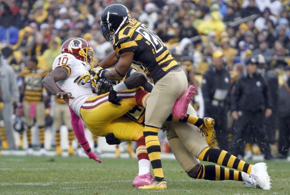
No no no …. We were discussing bad uniform matchups, not amazing ones.
-
 6
6
-
 1
1
-
 1
1
-
-
1 hour ago, ramsjetsthunder said:
This may go down as the worst looking game in NFL History
*cue people sending photos of Jags v Rams from 2018*
The one you’re looking for is Falcons gradient vs Lions dull gray mono.-
4
-
-
37 minutes ago, wentvoltage123 said:
NC State with new uniforms
Yawn.
-
6
-
-
16 hours ago, solvetica said:
Here they are. I would have to imagine a red alternate, red helmet and maybe a light blue mock throwback will be introduced later in the year.
The blue over blue is bad. The no stripes pants are bad. -
8 hours ago, HOOVER said:
I can’t take anyone seriously who thinks Reebok did a better job with NFL uniforms than Nike, in any capacity.I would say Nike does most things better than Reebok, but I can't take anyone seriously who drinks the Nike kool-aid this completely.
And as for the handful of things that were better pre-Nike, I would submit...
This...
Over this...
-
14
-
 1
1
-
 3
3
-
 1
1
-
-
20 minutes ago, Pigskin12 said:
Denver switched to orange when Nike took over in 2012, the same year Manning arrived. At the time, this was cool, but since their 2015 Super Bowl, it's been one mediocre QB after another and the team hasn't sniffed the playoffs once.
No one looks at this uniform anymore and associates it with winning, or any positive feelings for that matter. It's severely outdated and the orange jersey has never looked good under Nike. The only Broncos uniform matchups I enjoy anymore are those involving the navy jersey or Color Rush orange. Even if it's an underwhelming redesign, I can't imagine it being anything less appealing than what they have now.
Denver’s uniform is so old and tired i actually hear creaking noises when i look at a picture of it. When something that was once the very definition of cutting edge gets old, it gets startlingly old.-
6
-
 2
2
-
-
OK, so I was wrong. I thought the Browns finished it off, but I hadn't done the Texans. (Actually, I did the Texans, but as a speculative, what-if, luv ya blue concept. So in my head, it doesn't fit with all the others.)
So... Texans...
-
7
-
-
So, 2 months ago, I started to rework all my NFL concepts onto this new tweaked template I drew, just because I liked the way the pants stripes and socks looked so much. Now, with the Cleveland Browns, I got thru all 32 teams, Everybody got 4 uniforms and two helmets (although if I was magically given control of the NFL's uniforms, it's extremely doubtful I'd feel the need to do that). 24 of the teams got one alternate and one throwback. 5 teams (the Panthers, Cardinals, Commies, Ravens, and Dolphins) got two alternates uniforms, but no throwbacks. 3 teams (the Chargers, Packers, and Giants) got two throwbacks. Almost all the teams got vastly improved socks IMO.
It was fun to do. I hope anybody checking in liked looking at them. Feedback is always appreciated.
So, here are the Browns...
-
3
-
1
-
-
-
-
-
6 hours ago, Brave-Bird 08 said:
.
Speaking of, though -- I would like to see Pittsburgh go to grey facemasks. With the nickname "Steelers" it just makes sense, plus it would gel with the grey keyline on the logo. At least go with them when they wear their throwback uniform, which isn't any different other than the number font
-
1
-
1
-
-
1 hour ago, nuordr said:
There was nothing unique with their previous uniforms....plain and boring:
The Hilltoppers have worn them longer than most teams and for me, I've become accustomed to them wearing them. They are not amazing, but they are the best in the NCAA followed by the Kentucky Wildcats chrome.
Best chrome helmet in the NCAA = prettiest waitress at Denny’s-
4
-
2
-
8
-
-
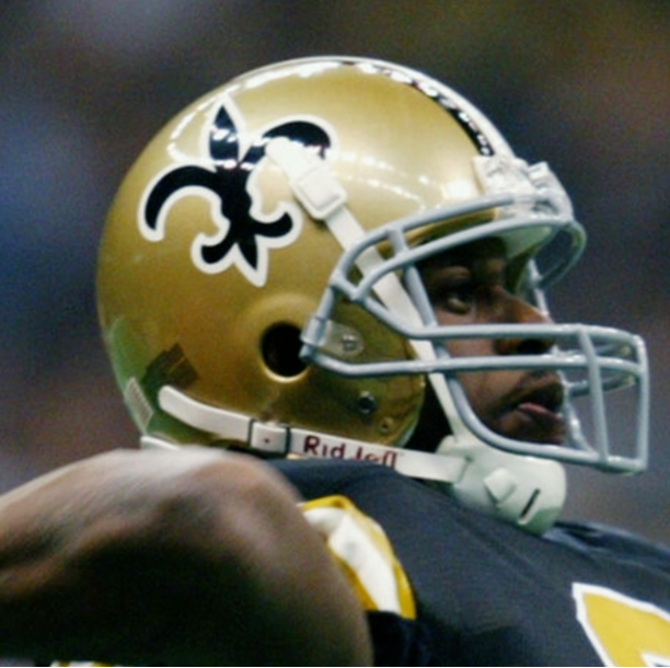
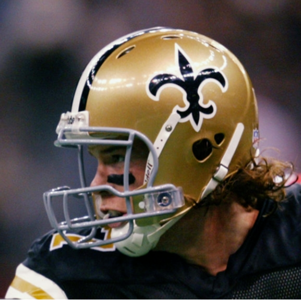
13 minutes ago, TruColor said:
Yeah, they can certainly do that, but the Saints' throwback helmet is actually depicted on a different color shell.
Interesting. Do they then have 3 helmets?
-
5 hours ago, Old School Fool said:
That graphic shows the Saints proper throwback helmet. That hasn't been worn since 2002 and most definitely won't be worn this year since you can only have one alternate helmet and they are committed to the black one.
Teams can only have one alternate shell. I believe you can swap out logos on the same color shell, creating more looks. The Cowboys did just that.
-
9
-
-
The chrome helmet is terrible.
-
6
-
6
-
-
4 hours ago, HOOVER said:
I feel like this complaint was overblown. It was improved on the Vapor Untouchable template, which the Colts only wore with their Color Rush set:
Not sure how anyone could complain about that.
Admit it... you said this just to get under everyone's skin.
This...
Will NEVER not look better than this...
-
12
-
3
-
 1
1
-
-
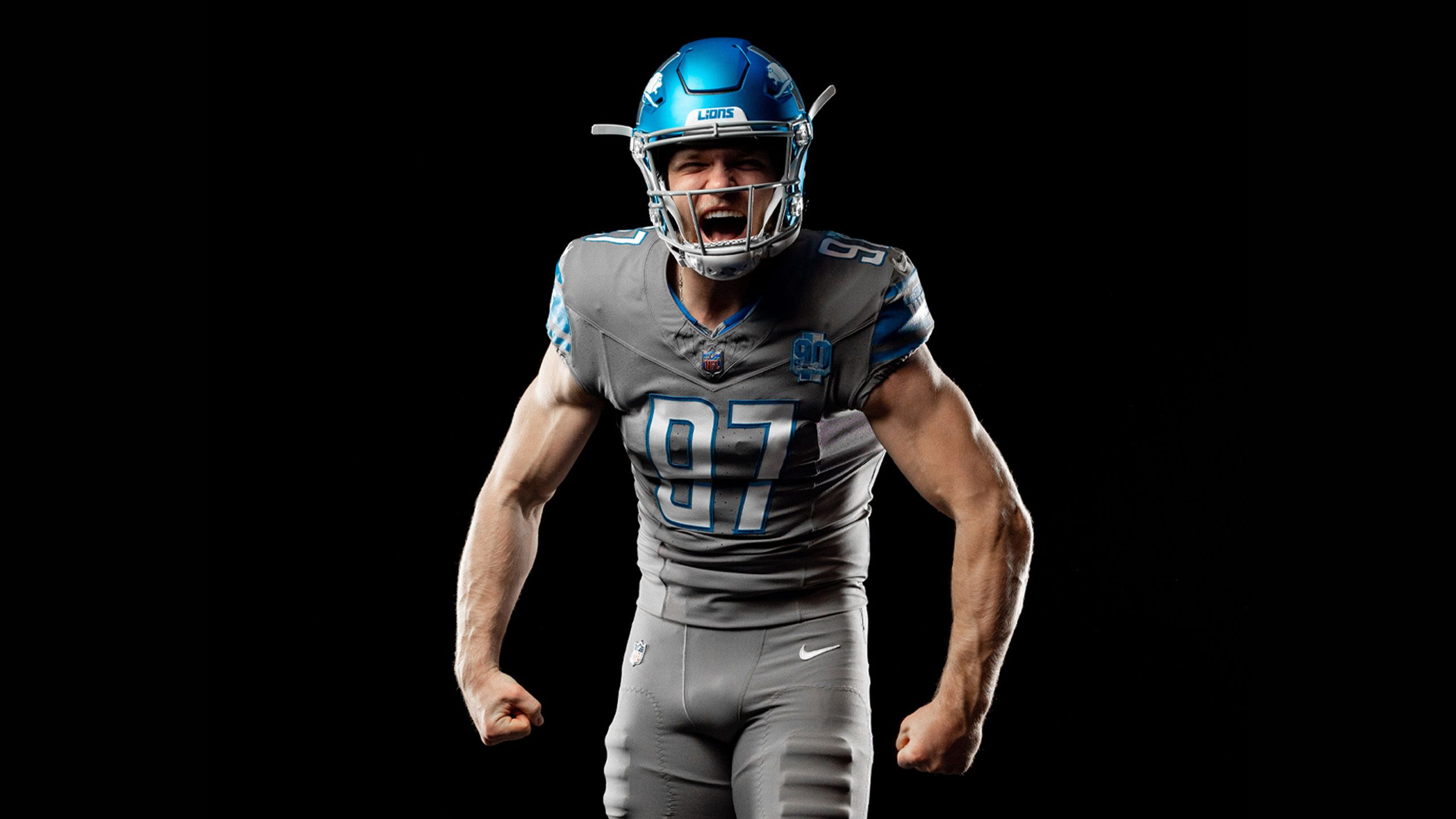
Interesting fact I heard today about that Lions alt helmet logo. Apparently, the Lion will be flipped so he's always facing forward, but the stripes will not. On both sides, the blue will be to the left of the gray.
-
8
-
-
47 minutes ago, leopard88 said:
Also, a few people posted they could do without the stripes on the helmet. In case there is anyone who doesn't know . . . the stripes are part of the logo.
Correct. It's a play on an old Ford Mustang logo... both the car and the football team being Ford products...
-
9
-
1
-
 1
1
-
-
1 hour ago, GFB said:
This is perhaps the ugliest uniform combination in football:
And yet, surprisingly, not as ugly as the one its replacing.
1 hour ago, NYCdog said:Someone’s gotta say it. This helmet makes me want an all Honolulu Blue look - head to toe. And yes to a Blue/White/Blue road look
Actually, no one had to say it. Honestly.
-
9
-
1
-
-
I mentioned a page or so back that its been mentioned here in Detroit that this helmet was designed with next year’s rebrand in mind.
Let the wreckless speculation begin.
-
2
-
1
-
-
I like that logo as a stand alone, but I feel like it fits awkwardly on a helmet.
And does every new helmet have to have some kind of unique finish? At some point (and we may already be there) unique becomes commonplace and you realize it wasn’t as cool as you thought.
-
10
-
-
6 minutes ago, Pigskin12 said:
What is there to overhaul? They have a good uniform. They just have some terrible combos they wear sometimes.
I would agree that an overhaul isn’t necessary. However, that’s what they’re doing.
-
 1
1
-
-
The helmet being discussed on local Detroit radio just now. Supposedly it’s being talked about in conjunction with a “complete overhaul” coming next year. It sounds like making guesses about what it might look like based on the current uniform are kind of useless. Instead, once we see it, it might carry some clues as to what next year’s changes will look like.


/cdn.vox-cdn.com/uploads/chorus_image/image/68797662/1278803974.0.jpg)


/cdn.vox-cdn.com/uploads/chorus_asset/file/13353885/usa_today_11510770.jpg)

College Football 2023
in Sports Logo News
Posted
I hate Florida’s font.