


oldschoolvikings
-
Posts
10,494 -
Joined
-
Last visited
-
Days Won
192
Posts posted by oldschoolvikings
-
-
7 hours ago, Unocal said:
Outside of PHI/SF, the rest of the NFC is meh. Who else are they going to pick- THE LIONS?
I would agree that outside of Philly and SF there’s not much to pick from in the NFC. I would just say that the mass of mediocrity certainly includes Dallas.
Let me make the safest prediction possible in the NFL. The Cowboys will make the playoffs and lose in the divisional round. It’s the only thing that always happens.
-
2 hours ago, Pigskin12 said:
I'll add that this is no different than people in the NFL Changes thread speculating what throwbacks and alternate helmets might look like.
Well, except that speculating what uniforms might look like is actually interesting.
-
 2
2
-
 2
2
-
-
Who’s picking Dallas? Did they get a new coach and QB?
-
1
-
1
-
-
1 hour ago, dont care said:
This is true, only the bitching mound would be removed, everything else just gets covered up, especially in those days where it was just glorified green carpet but harder.
Bitching mound.
-
1
-
4
-
-
This is going to be an unpopular opinion...
This is by no means a good uniform, is basically the definition of pointless, and it's a shame they chose this over an 80's throwback BUT...
I'm so tired of their played out current primary uniform that if they wore this alternate with the white socks like this...

I'd probably prefer it to this...
-
6
-
 1
1
-
 1
1
-
 6
6
-
-
If alternate helmets must be worn with alternate jerseys, the Broncos would be much better off wearing this helmet with the navy blue jerseys.
-
4
-
-
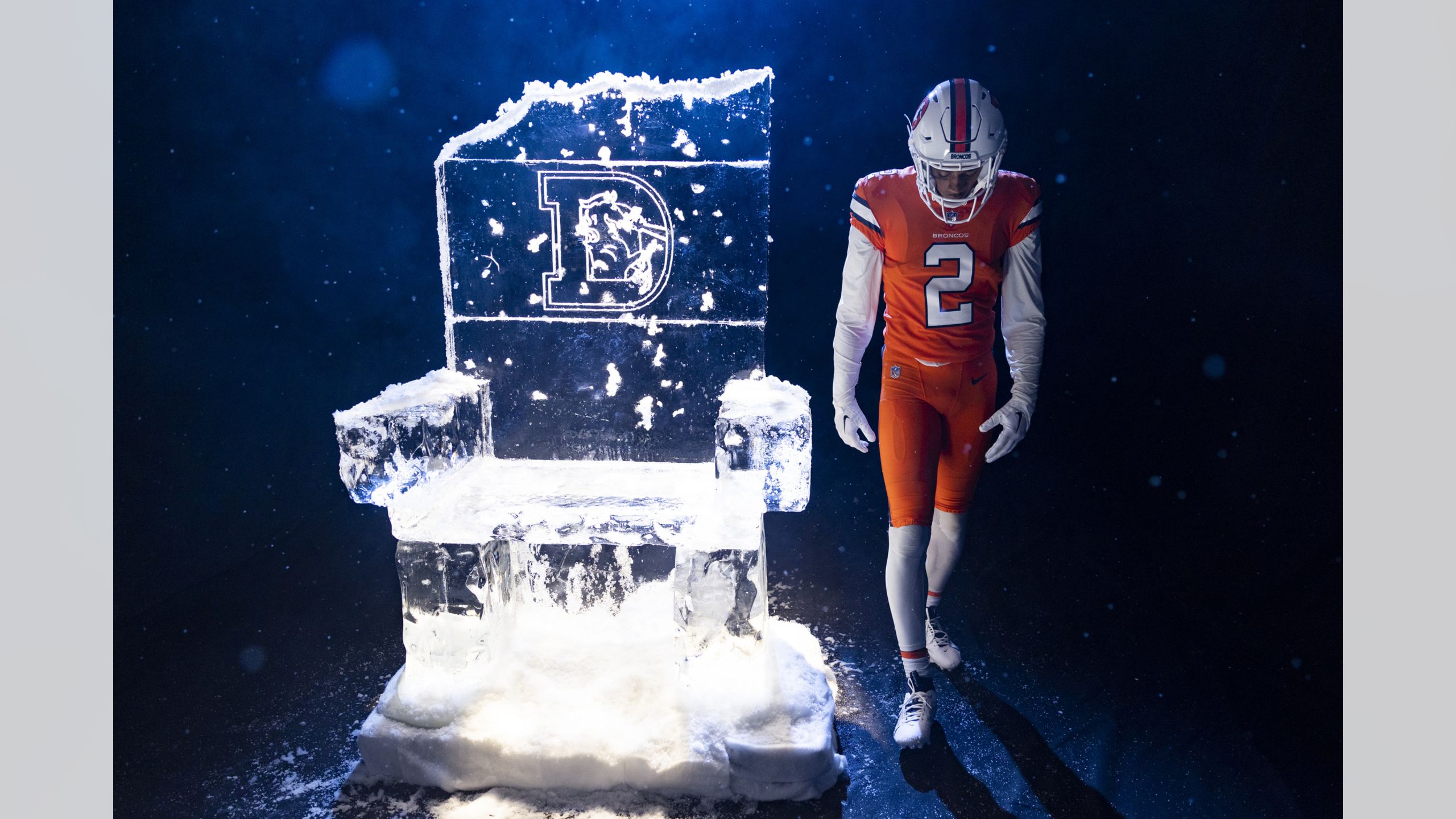
Pretty pointless. Especially considering they could’ve done a bright blue helmet for a throwback. An 80’s Broncos throwback is about the only one still missing from this offseason bonanza.
-
13
-
-
2 hours ago, Chromatic said:
I don't know if its the cycle of contrarianism on this board that has led to this inexplicable groundswell of appreciation for the current Seahawks uniforms, but this look was largely lambasted when it came out. It was seen as the apotheosis of nike-fying a uniform. If anything these are going to be carried by being associated with the best era in team history, not on the merits of the look itself.
This is it exactly. The Seahawks switched to this current uniform at the exact moment they became one of the NFL's "it" franchises. That gave it a lot more steam than it otherwise would've gotten on it's own merits.
Which is not to say you can't just honestly like this uniform. I don't, and have made that clear, but I'm not going to try to tell someone why they do or don't find something visually appealing. (I'm feeling especially sensitive after being told a handful of times in this very thread that I only like something because of nostalgia, which is an annoying crock.) Maybe you just feel like it's a good example of modern design, or that it's aged well... if you do, good on ya. But I think there's a bunch of elements that would normally be thought of as overly gimmicky (tiny tacked on patterns on the helmet and numbers, chest stripes, wing/feather/whatever motif embedded in the stripes), and the reason they've "aged well", at least in the eyes of the normie fans, is that they've been a part of a whole lot of wins. If this uniform had ushered in a lousy team, it would probably be on it's way out by now.
-
10
-
-
1 hour ago, MJWalker45 said:
They were on the cuffs by the time they switched over to the Titans though. The only difference is the size of the cuffs now from then.
Yeah, I remembered that... I just think the other version would look nicer.
-
8
-
-
1 hour ago, MJWalker45 said:
Looking at this, I feel like they should be playing everyone in the old AFC Central twice this year.
It's really nice, obviously, but I would've liked it better with the TV numbers on the shoulder and full stripes on the sleeves.
-
10
-
-
32 minutes ago, Cujo said:
Tennessee doesn't deserve the Oilers identity after changing their name, uniform and all likeness to the Oilers brand, having evolved into a team whose primary colors are now navy and silver.
Also, nothing's stopping the Texans from doing this:
I'm pretty sure there's a few things that are stopping them.
-
6
-
1
-
-
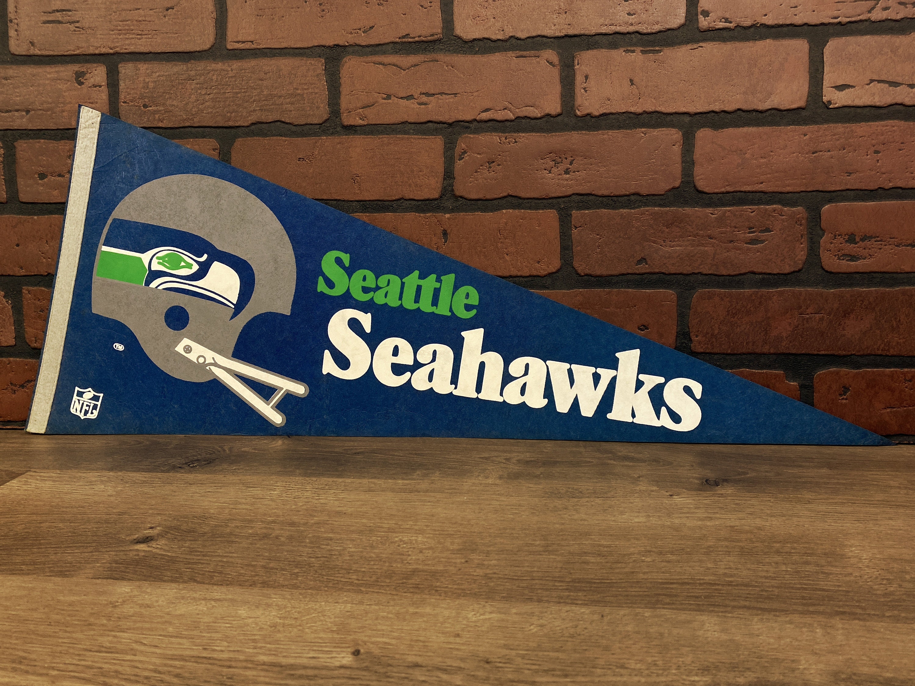
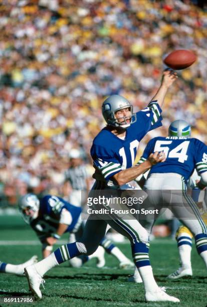
The late spring/early summer of 1976, I was 11 (yes, I’m f’n old, allright?) and my dad took me and my brother on a road trip from Columbus to Canton, OH. To the pro Football Hall of Fame. We got there about lunchtime, so before going in we stopped at a local McDonalds to eat. Being in the neighborhood of the HOF, it had an NFL theme, which included all the teams’ old fashioned felt pennants. Being a football obsessed little nerd, I was well familiar with all 26 teams, but hanging there on the wall were two extra pennants, which was the first time I even had a hint that teams were being added, or even that teams could be added. The Buccaneers’ one seemed cool, but the Seahawk one was enthralling to me… couldn’t stop looking at it.
First off, they had THREE colors in addition to white, which seemed daring at the time, and two of those colors were blue and green, which felt vaguely illegal. And that dour looking bird, which turned into a horizontal stripe? I was just staring at it, slack jawed. Having picked out the Vikings as a favorite team and already suffered thru three painful Superbowl losses, it was too late for me to jump to another team, but right then I knew I has a second favorite, just based on the colors and helmet logo. I know now that the California Golden Seals were wearing those colors in the late 60’s and the Vancouver Canucks in the early 70’s (I think the Hartford Whalers switched to blue and green about the same time as the Seahawks started) but I was unfamiliar with any of those teams at the time, so in my mind the Seahawks’ first color scheme was unique, original, and amazing. I still see it that way. Anytime I see a team in those colors, I immediately feel a connection to that team. When the Seahawks switched to that frankly terrible dull slate blue and nasty slime green, I was sorely disappointed. When they used that ugly uniform to usher in the monochrome era to the NFL, I turned on them… at that point they were more or less dead to me. And when the dropped the (at least unique) dull slate blue for the band-wagon navy blue, kept the nasty green and the dopey monochrome, not to mention added on an annoying coach, d-bag QB, and a pack of total jackasses on defense, I went to full on hating them. Sometimes its hard for me to even remember this is the same team with that once had the fabulous color scheme and amazing helmet. So, yeah, I’m kind of happy to see this throwback.
TLDR – Royal blue and Kelly green are quite possibly the greatest color scheme in sports, and all combinations of dull slate blue, average navy blue, and baby puke green suck.
Oh… IMO, as usual.
-
11
-
1
-
 1
1
-
-
Personally, I'm a bigger fan of the original Seahawks uniform, (Cue the crying, "wwaaahhhh, that team was even worse!)
As I stated earlier, I think the helmet logo reappearing on the sleeve is a clever reuse of the stripe, but ultimately kinda clunky and redundant, like every time the helmet logo repeats on the jersey. The slightly thinner pants stripe here are a little less visually jarring, and match up with the road jersey sleeves. And I'm always a sucker for matching sleeve stripes/sock stripes on home uniforms. Plus a gray mask to annoy grumpy posters for the win. And teams can always throwback to the first uniforms just because they are first uniforms.
-
5
-
 1
1
-
-
2 hours ago, the admiral said:
No, that's just it! On top of it all, they look bad! They look like the Lions from a distance, but cheaper and sadder. It was a bad uniform for a bad team. Okay, the logo looked slightly more like a totem pole than it does now. Still bad.
Well, yes, opinions vary. However this one seems to be fairly unpopular.-
1
-
-
50 minutes ago, the admiral said:
I guess the question, then, isn't how the Seahawks should honor the Seattle of the 1990s but whether they should at all. Not only is it something they didn't really factor into, finishing 7-9 every year and trying to move, but the Seahawks, whether they like it or not, are more emblematic of the new Seattle than the old one: they're not the team of the sleepy logging/aerospace town, they're the team of Amazon, Starbucks, and the PMCs who gathered from all around America to staff them. As a cultural institution, I think they belong to the present more than arguably any other NFL team. A throwback clangs.
Except for the fact that they look really nice, making all the rest of that stuff just fuzzy headed noise that isn’t really worth thinking about.-
11
-
1
-
-
I guess I'm interested in uniforms from a visual standpoint, and don't really care about the team's record when wearing it. I can see why the normie fans would get bent out of shape by a team wearing a uniform they played terrible in, but that's not my problem... I'm just here for the fabric. This "but that team was terrible" attitude is what's keeping us from seeing a Steelers batwing uniform.
-
18
-
 2
2
-
-
1 hour ago, BBTV said:
Also, those old Seahawks blue uniforms were mostly worn in the dull-sterile-soulless Kingdome, so they in turn also looked dull. You almost never saw them under bright-natural light, where admittedly they looked significantly better. I only rarely got to see them live on TV, because the Seahawks were practically never in any national game, but used to collect football cards in the '80s and remember thinking how dull they looked compared to some of the other teams that also wore a royal-ish blue.
Between the bad lighting of those old trash baggy-roof domes and the pre-HD televisions, a lot of people remember those old 80's and 90's uniforms as being darker/duller than the often were. The Viking message boards are full of people complaining about the new Vikings throwback because they aren't "the old darker purple", but if you look at the actual game jerseys from that time in person, and compare them to the current jerseys, the colors aren't that different... certainly not as different as they appear in old videos (or in peoples memories). Back then the Vikings helmets were definitely darker and bluer, but in person the jerseys were not much different from the current purple. Maybe not exactly the same, but closer than most people are probably picturing.
The Seahawks' 80's and 90's uniforms are suffering from the same phenomenon, I'm sure.
-
7
-
-
5 hours ago, Brave-Bird 08 said:
Also LOVE the Ohio State alternates, those are kind of a no-brainer and surprised it took them this long to roll them out, but I am annoyed they are wearing them against a team that will be in all-white.
I would prefer that alternate for them to be a road option, but I understand them wanting to wear it at home. Would have picked an opponent that was likely to be in colored pants and helmets though.
Or...
-
2
-
-
1 hour ago, HOOVER said:
That's your opinion, but the current colors rejuvenated this franchise, which came off the previously even duller Blue and minimal Lime Green. When Seattle retired this Throwback look in 2002, it was a very dated look.While I'd agree that this Throwback is great, and the colors certainly work, I think you'd find a great deal of other opinions that would disagree with you. The Seahawks brand has never been stronger since the 2012 refresh.
Nostalgia is great. But making permanent decisions from nostalgic sentiment isn't always the best choice.
Well, yes, that is just my opinion. That’s why I wrote IMO. I’m definitely not claiming any of it as fact. I just really love that particular color scheme and I always have. Hartford Whalers, original Timber Wolves, Vancouver Canucks. All look amazing.
But I’m going to take issue with the “nostalgia” business. A few pages back I was told that same basic thing about my excitement over the Vikings throwback. I think I speak for more than a few of us who get tired of being told that our opinions are based on nostalgia or hatred of anything new or just liking it cause it’s old, or whatever else gets trotted out as a way of dismissing someone else’s opinion. (I’m not saying you’re necessarily doing that here but it’s close enough to that particular put down that it makes me think of it.)
Honestly, unlike the Vikings’ spectacular throwback, I’m not even that crazy about the Seahawks overall design, which I think is a bit clunky. The pants stripes are awkward and I’m not a fan of the sleeve logo. I never really need to see the same logo repeated on both the helmet and the jersey. So it isn’t nostalgia for that design, it’s just the colors which are flat out beautiful. Because they are.
Also, I think you might get some arguments about how strong the current Seahawks brand is. Five or six years ago yes, but now a lot of people are feeling like it’s really showing its age. There’s a reason people are going crazy for this throwback, and it can’t just be dismissed as nostalgia.
-
8
-
2
-
-
26 minutes ago, walkerws said:
Nike has a good template, none of the teams wanted to use it.
Oh, sure. Nike has a good template, but no one wants to use it.
Makes sense.
-
1
-
-
18 minutes ago, j'villejags said:
I made that graphic. In my initial post, I had suggested royal as the primary and navy as an alternate, because I also prefer the throwback colors. However, I think navy has a place moving forward with the team given their Super Bowl runs in that color scheme. A navy alt would be better than a black or green alternate in my eyes. Or worse, a ‘throwback’ to the current set. Just my opinion.
Yeah, I remembered that you liked the throwback colors, I was just reacting to others coming in to say the new colors worked. Surprised me.-
1
-
-
1 hour ago, NH4 said:
Navy goes back to the Roger Staubach era for their new uniforms Very good choice
And once again UA pulls off the shoulder loops about 100 times better than Nike.-
11
-
2
-
-
I'm not sure why anybody would advocate for a uniform that combines the throwback template with the current colors. IMO, the current colors are pretty bad. That dull navy blue and that ugly slime green? No thanks. And the throwback colors are the best thing about the older uniforms. Royal blue and kelly green are gorgeous together. The colors are the best thing about the throwback.
-
12
-
2
-
1
-
-
This really does look like something a mid-level college team would do. Out nowhere black helmet, cheesy monochrome, pointless textured fabric… it feels like they raided Arizona State’s idea book.
Embarrassing.
-
11
-


/cdn.vox-cdn.com/uploads/chorus_image/image/71595632/usa_today_19369247.0.jpg)
2023 NFL Regular Season Through Super Bowl LVIII
in Sports In General
Posted
What’s amazing is they had this history of playoff exits and then went out and hired a coach who was basically known for that. Funny stuff.