


spartacat_12
-
Posts
2,657 -
Joined
-
Last visited
-
Days Won
4
Posts posted by spartacat_12
-
-
^ This. Historically speaking, Ottawa has contributed just as much to the sport of hockey as cities like Montreal & Toronto have. It's the birthplace of the Stanley Cup, and home to one of the league's founding 4 franchises, who just happened to be the sport's first ever dynasty. Canadian Tire Centre has streets surrounding it named Silver Seven Rd, Frank Nighbor Pl, Cyclone Taylor Blvd, and Frank Finnigan Way. It makes sense for them to have a simple, traditional brand.
-
15 hours ago, Ridleylash said:
I mean, the Leafs have had a century's worth of time to refine and tweak their look, where the Sens have had 30 or so years, a decent chunk of which was spent using a terrible Reebok template design. Obviously one's going to be better.

I just don't think the answer to solving the Sens' identity is "scrap everything, go Silver Seven" because there's now too much brand equity in the look the current franchise has generally kept to since it's inception, and I'd rather them not try to Browns things by taking another franchise's design for their own. I'd argue the best option would just be to split things down the middle; keep the Silver Seven look on as a permanent alternate while using the mid-late 90's jerseys full-time.
Maybe if the NHL decides to open a proper fourth jersey slot without a gimmick attached (which it feels like the Reverse Retro is a test platoon for), we could literally split the difference and have darks and whites for both. That way, both camps stay satisfied because both sides have home and away options.
As much as I would like to see a black & a white =O= set as permanent alternates, I can't imagine a situation where the team doesn't have some sort of red jersey in the rotation.
-
 2
2
-
-
On 4/6/2021 at 6:29 PM, clonewars2008 said:
In most cases in order to be a General or a Senator one must have served in the Roman army and most of them were at one point Centurions, The Roman astatic is better than the =O= one. It's good to throw back to on an alternate but the Centurion look is to project power and strength.
I'm kinda joking about the Leafs, but they are a husk of their former self and died when Conn Smythe did. Overreliance on history is terrible especially when you have done all since the Sgt. Pepper came out. Montreal is teetering on this too as we are nearing 30 years since their last cup. Oh you have 24 Cups? Cool, how many fans were actually live and remember seeing one?
But for the Sens they shouldn't rely on that history either, yes it's good to call back but it's shouldn't be the identity of the team. I like that they stuck to the Roman theme. I like it, I grew up with it, it's more than just nostalgic feelings either as 4 years ago we almost won a cup in that look. and yeah the 3D look is kind of goofy but this brand is still a good brand and with the switch back to the 2D era it shoots up in the brand standings (though I was also a big fan of the RBK Edge look just wish they didn't have the O logo there and added the updated 2D logo to the shoulders).I hate to break it to you, but liking the brand purely because you associate it with a deep playoff run, and not due to the actual merits of the design, is nostalgia. Also, I'm not sure exactly how young you are, but I'm pretty sure there are quite a few living people on the planet who can remember 1993.
-
3
-
-
Rams going with the head logo instead of the L@. Hopefully this is a sign of the monogram being relegated to secondary logo status.

-
2
-
-
The Bills uniforms are solid, but I still think they should be wearing a red helmet. Pretty crazy that the Chiefs are the only team in the league who use a red helmet.
-
4
-
-
On 3/24/2021 at 1:37 PM, clonewars2008 said:
The Connection to the name, so not much the cause of today's Senators (though one can argue that maybe it should still apply) but with the connection to the roman theme: In order to be a member of the Roman Senate one must have done service in the Roman army. Many of these Senators were Centurions, who were leaders on the battlefield, skilled warriors, so Bruce Firestone looked to the branding to not only call back to the Original Sens but to build it's own identity that would be fierce and fitting with a brutal and barbaric sport like hockey. I for one having grown up with this brand like it, and want the Sens to keep it as the old Sens are kinda bland and not fitting for today's market. It's good to throwback to terrible to use full time as there is no substance in it. TBH the Leafs, Habs and Yankees have boring looks that really are only associated with winning. Take away the championships and they are boring (Maybe not the Habs home) and lack luster two colour products of an earlier time. Also, can we add the Leafs to the same situation as the Sens? Unpopular opinion but the Leafs at this point are two different franchises with one that was only good cause they had less than 5 other teams to compete with most of the time and a 50 year old franchise marred with terrible ownership, over reliance on the past, inapt and overhyped teams and all intent and purpose the Toronto maple Leafs died and folded with Conn Smythe. The NHL record books should say Toronto Maple Leafs I (1927-1967) and Toronto Maple Leafs II (1967-present)
I'm pretty sure you're joking, but I'll address your Leafs take anyway. A franchise being terrible for decades isn't close to the same as one relocating, folding, then having an expansion team adopt their name & colours 60 years later. Despite their dysfunction, you can still draw a straight line from the current Leafs to the teams of the past. Morgan Rielly played with Phil Kessel, who played with Tomas Kaberle, who played with Wendel Clark, who played with Borje Salming, who played with Dave Keon, who was on the Leafs when they won their last Cup.
As for the Sens, the original plan was to use something like the Peace Tower wordmark they initially unveiled. After the massive success the Sharks had selling merchandise, there was pressure to come up with something "cooler" that kids would want to wear. This lead to the Canadian senators = Roman senators = Roman centurions stretch.
-
1
-
-
On 3/20/2021 at 1:25 AM, Kevin W. said:
They aren't the original Senators. Their current look and a modernized version of the pre-Edge alternate would both be superior looks to the barber pole.
The Cleveland Browns aren't the original Browns (despite the NFL's revisionist history). The Washington Nationals aren't the old Senators. When Seattle inevitably gets an NBA team back they won't be the original Sonics, but I can guarantee they'll look like them. Unless a franchise takes an identity with them when they move (i.e. Lakers, Colts, Flames), that identity belongs to the city.
As for the barber pole design, it's a unique feature that is associated with a number of Ottawa hockey teams at various levels. It's a great way to stand out in a league with multiple red & black teams.
On 3/20/2021 at 9:38 PM, Ridleylash said:I mean, what does barber pole sweaters and a big O logo have to do with "Senators", either, to be fair? If that look didn't have the Cup legacy (or the modern team had managed to win in 2007), would people really be pushing for it so hard as the main look? It feels more like people just pushing it because it's associated with a really good team from the 1800's and early 1900's rather than because they think it's a great look in the modern day.
The current look at least gives the team a real sense of identity beyond "we look like that old team that used to play here a long-ass time ago and was pretty good". Much as it may be maligned in certain circles, I think having the Roman theme makes more sense, simply because it has more visual icons to play with for branding purposes; the laurels and the armored warrior motif both make for more visually interesting iconography than the original team's logo.
An O and some barberpole stripes can only get you so far, branding-wise, and we know how important branding is to sports teams nowadays. I think that's why they decided to stick to the theme they have now instead of committing to the O; branding beyond the jerseys.
Except the identity of the latest rebrand is essentially "we look like that team you watched play in the '90s". Every attempt by the team to play up the Roman theme beyond the logo (the inaugural home opener ceremony, the dad-bod centurion with the bad mic connection giving a pre-game pep talk) have been ridiculed by the fans. I'm fine with the current look, but its success is due to a combination of '90s nostalgia & the loathing of the previous set.
-
3
-
-
1 hour ago, Gothamite said:
That’s such a huge improvement.
The only thing better would be swapping out the A for a T.
City initials > nickname initials.
I would normally agree with you, but the Argos have used an A for so long that there's no changing it at this point.
If it helps you there is a small T in the negative space at the bottom of the A.
-
4
-
-
2 hours ago, Roger Clemente said:
Better view of front and back of both jerseys...
We need an official moratorium on contrasting nameplates, especially on white jerseys.
-
6
-
-
Pretty unique colours, but yet another generic name. Also it was a missed opportunity to not incorporate the arch into the shape of the badge. The shape of the curve at the top doesn't even match the shape of the arch.
-
2
-
-
On 7/21/2020 at 2:17 AM, UnclearInitial said:
The only name I’ve liked so far is Olympique but that’s almost impossible due to the IOC.
They don't seem to have issues with the Gatineau Olympiques.
-
-
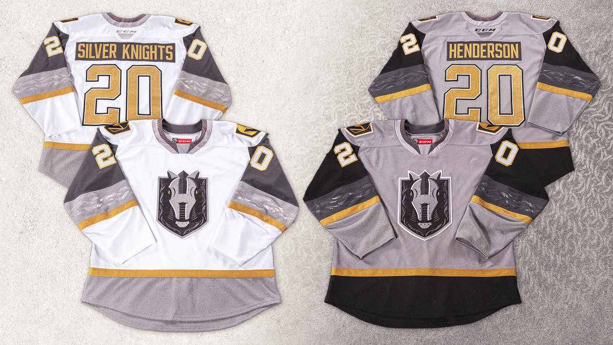
The Belleville Senators have unveiled a red version of their inaugural jerseys. Surprisingly the team's social media channels have been replying to people saying that these are actually the new home jerseys, with the black set demoted to alternate. I like this as a once in a while thing, but black should still be the primary look.
I also think they messed up with the numbers. They should be black outlined in white, then red, just like the B. It would continue the pattern of having the number colour match the bottom stripe on the chest.
-
The Raptors made all the right choices here. They didn't include any unnecessary gold in the banner other than the trophy itself, and they also were able to avoid the temptation of throwing the NORTH chevron on it like they did with the rings. The player names around the outside is a nice touch too.
-
3
-
-
On 10/8/2019 at 5:42 PM, Corvus said:
New BCHL team for next year, effectively replacing the Kootenay Ice.

So if you name your team the Bucks you aren't allowed to use green or have a deer in your logo?
I understand the tweet isn't supposed to be taken too seriously, but if you want to make jokes about junior hockey teams ripping off pro logos, there are dozens of better examples out there.
-
1
-
-
59 minutes ago, chcarlson23 said:
Did they change the font and socks as well?
Yes, those have both been changed. I couldn't remember if someone mentioned that earlier when the dark jerseys were first unveiled.
-
The Ottawa 67's made some changes to their white jerseys with the switch to the new template. The sleeve yoke has been straightened out so that it no longer overlaps with the longer nameplates, but for some reason the black piping along the yoke is now only on the front of the jersey. They've also switched from white to red numbers on the sleeves.
Last season:
This season:
-
This was a missed opportunity for Peterborough to return to their classic look:
Just throw the lift-lock logo on the shoulders instead of Pete.
-
17 hours ago, the admiral said:
Right, well, Cape Breton is far from a desert.
I believe he was referring to the Firebirds choice
As for the Eagles update, I actually liked the 'Screaming' prefix. Without it you have a much more generic identity, especially with the new logo looking like it was pulled from the create-a-team mode of a video game. I do really like the alternate logo though.
-
1
-
-
-
8 hours ago, GDAWG said:
A two city solution might work if the two cities are next to each other, but this solution involves another country.
I think if the MLB is actually serious about having a two city team (which I doubt they are), it would make the most sense to move the Rays to Montreal full time, and to have the Marlins split their home games between Miami & the Tampa Bay area.
These are the two worst markets when it comes to attendance, so in theory they'd both draw better with half as many games to sell, plus the logistics would be much simpler (players live in the same state all season, no tax/tv/radio complications).
They could either revert back to being the Florida Marlins, or come up with something new that would still appease both fanbases.
-
1
-
-
I'm always bothered seeing a pinstriped baseball jersey that uses a plain white nameplate. I don't believe any of the current MLB teams commit this offence, but the old Marlins & Mets are noticeable examples:
-
2
-
-
The Ottawa Champions of the independent minor Can-Am League have unveiled their logos.


And the cap logo...

Much like the Redblacks, this team has managed to take a very poor nickname and give them a great logo. I especially like the cap logo.
-
Ottawa's new Can-Am League franchise held a press conference today to announce the team's name and, in my mind, have committed a bit of a sports faux pas. The team will be known as the Ottawa Champions.
http://ottawacitizen.com/sports/baseball/pro-baseball-is-back-in-ottawa-and-theyre-already-champions
There's a reason that you don't see teams named the Champions, Winners, Scorers, Great Ones, etc. You aren't going to always be champions so you're just giving fuel to the fire of anyone looking to make fun of the team. Baseball in Ottawa has already become something of a joke. They really aren't making things easy on themselves.

 all since the Sgt. Pepper came out. Montreal is teetering on this too as we are nearing 30 years since their last cup. Oh you have 24 Cups? Cool, how many fans were actually live and remember seeing one?


NFL Changes 2021
in Sports Logo News
Posted
It also works as a tribute to a mediocre family comedy from 2007.