


spartacat_12
-
Posts
2,657 -
Joined
-
Last visited
-
Days Won
4
Posts posted by spartacat_12
-
-
1 hour ago, DTConcepts said:
As much as I like the kachina identity, I'm tired of teams going back to full-time throwbacks. It'd be better to evolve the identity forward using elements of the old branding rather than being unoriginal and just copy/pasting it onto the Adizero template.
That sounds good in theory, but that's how we ended up with the Sabres in navy with silver armpits, the Ducks wearing Frankenstein jerseys for their 25th anniversary, or the LA Rams trying to make "bone" a thing.
In most cases it's better to just not overthink these things and give the fans what they want.
-
 22
22
-
-
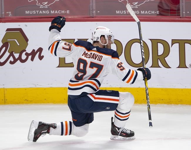
3 minutes ago, Crabcake said:
Is this confirmed? I remember a lot of Oilers discussion on this thread not too long ago, which may have been prompted by this news, but if it's real I've completely erased it from my memory. Which is probably a coping mechanism, cause that's easily the worst and most bland Oilers uniform since the initial Edge navy/copper piping disaster.
-
3
-
-
19 hours ago, AFirestormToPurify said:
Not only is it unusual, novel and unpractical like others have said, but it also means your uniform is poorly balanced if you need two different sets of pants for your home and away jerseys. It just creates a different problem instead of fixing anything imo
I don't think this is necessarily true. Plenty of NFL teams with strong brands use multiple pants for their primary home & away uniforms (Chiefs, Browns, Bills). Often a team will choose contrasting pants at home to avoid a monochrome look, but it sticks out when used with the white jersey.
We only saw it briefly last season, but I wonder if Columbus will keep the navy pants with red trim around to use on the road. It helps balance the uniform better, and keeps them from looking too much like the Rangers:

Also, with the Oilers promoting their navy alternate to primary home status, I wonder how they handle the pants. Their primary uniform has stripes on the pants, but the alternate is solid navy:
-
1 hour ago, Sport said:
Blue and burgundy shouldn't touch (except where they have to, like where the hem stripes meet the pants). The obvious solution was take the black numbers with the gray outlines and replace the black with blue and leave the gray outlines. Also this blue is far too bright. I know it's hard to match colors across different materials, but come on.
I agree that they should have kept the silver outline on the blue numbers, but the away jersey sleeve numbers have always had blue outlines touching the burgundy background. It's a weird inconsistency that they use white outlined in blue on the burgundy sleeves, but white outlined in silver on the burgundy jersey. It's a bit like the Bruins' pre-Edge set that had yellow numbers on the black jersey, but white numbers on the black sleeve.
-
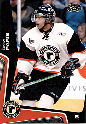
On 9/11/2021 at 3:47 PM, Chromatic said:
Vintage white works great as trim but shouldn't be the base of the jersey. The only example I can think off the top of my head where it works is the San Francisco Giants, and thats because they have a history with it rather than just using it on a fauxback to make it look old.
I think the Quebec Remparts' best look was when they went with the Minnesota Wild-inspired roundel set, complete with a cream jersey to match the red.
-
1
-
-
18 hours ago, ddub53 said:
The jersey is going to be a fauxback to the 1930s. Below is a photo from the STL Authentics Twitter page. The crest will have some sort of twill logo with chain stitching. Based on the other photo, the jersey will most likely be gold based. It might be based on a 1931-32 St. Louis Flyers sweater.
You might be overthinking things here. The rumours have always been that the Blues will bring back their inaugural white jerseys, and the teasers we've gotten so far match up with that look.
The first teaser is clearly a close-up of the hem/sleeve stripe, and the other is a closeup of the logo or maybe the numbers.
-
1
-
-
15 hours ago, DG_ThenNowForever said:
I heard that today. I thought it was unnecessarily :censored:ty. Simmons could benefit from having an actual producer who points those things out to him. He could also benefit from being a decent human.
I guess they've already taken down the episode and edited out the ad read.
Bill has been dismissive of pretty much all Marvel movies, and comic book movies in general. I think he was trying to make a pretentious point like, "I'm so above superhero movies that I don't even know what the name of this one is".
I don't think he is an intentional, overt racist, but maybe all of his time living in Boston has given him a bit of a blind spot when it comes to casually offensive comments like this. You'd think he'd know better during a season where multiple members of the media have already had to place their feet directly in their mouths in regards to comments they made about Ohtani.
-
4
-
-
On 8/31/2021 at 11:18 AM, Chromatic said:
I definitely remember that. That was at the time when everybody was trying to wear double-blue. Thankfully it seems Winnipeg and now Seattle have essentially staked their claim on it and we can move on.
I think Winnipeg & Columbus need to sit down and have a conversation about their respective brands. The Blue Jackets are a navy & red team with a double-blue fauxback alternate that most of the fanbase seems to prefer. The Jets are a double-blue team with a navy & red fauxback alternate that most of the fanbase seems to prefer.
-
2
-
-
16 hours ago, monkeypower said:
Maybe, but whenever the Wild colours have come up, it's always been referred to "wheat" and not "gold". So saying how they used to use gold conjured up a different image for me, especially with the use of "athletic gold"/yellow in their logos.
TruColor lists a "Harvest Gold" which is the yellow in the logo and then a "Minnesota Wheat" which is the wheat. There is an alternate colour under "Embroidery Usage" called "Gold Metallic" which is the shiny fabric.
I don't think the Wild ever intended for the Minnesota Wheat and Gold Metallic to be two different colours, along with a third similar colour in the Harvest Gold of the logo, it's just that they went with the shiny fabric in the early jerseys while the logo crest had colours closer to the print version.
It appears the shiny fabric went away with the switch to EDGE and now the wheat crest outline is the same as the wheat striping.
...
I don't know if the logo colours have changed over the years or if it has just been the fabric changes on the jerseys. It doesn't really look like it based on the pictures, but I wouldn't know entirely for sure.
All of this confusion is exactly why it was smart of them to just narrow the colours on their uniform to green, red, and wheat. Before they replaced the original pants, they really clashed with the fauxback red jerseys.
-
1
-
-
12 minutes ago, monkeypower said:
...they've never used gold anywhere, much less everywhere else, outside of the logo(s) at any point in their history. The jerseys have always been wheat, it just used to be metallic.
Unless we're talking "gold" in the sense that the wheat striping used to be metallic and not "gold" as in Vegas or Athletic Gold or the yellow used in the sun of the logo.
Saying that "metallic wheat" and "Vegas gold" are different colours seems like splitting hairs.
While the moon in print versions of the logos is shown as
athletic goldyellow, on the actual jerseys it's a metallic gold. The stripes & font on the original jerseys is much closer to the moon than it is to the wheat used on the outline/river mouth. -
It looks like the state outline with an MN abbreviation on it. Kind of like this patch from the Rangers Winter Classic jersey:
-
3
-
-
49 minutes ago, MinnyHockey said:
I really wish there was some gold accents in the Wild uni. Not sure why they're opting out of gold.
I think they've realized it's redundant to use both gold & wheat together in a set. The original uniforms only used wheat as the outline of the logo, and used gold everywhere else. The first fauxback alternate swapped this, with gold only being featured in the logo and wheat being used everywhere else.
-
3
-
-
Back to some actual uniform news for this season, Minnesota has just released a teaser for their upcoming Winter Classic jerseys. Looks like I was wrong when I assumed it would be a green version of their reverse retro:
-
6
-
-
15 hours ago, WSU151 said:
These all look better with double outlines (though the Panthers' double-outlined NOB wasn't good):
I guess I should clarify, my opinions regarding double outlines only applies when the middle outline matches the base colour of the jersey (like Montreal). I don't have a problem with teams like St. Louis using 2 outlines that stand out from the jersey.
The NOB should be kept simple though. I don't mind a single outline if it matches the numbers (Calgary, NYI, Washington, etc.), but double outline's just turn into a mess. On Dallas's old set you could barely read the name unless you got a super close-up.
-
1
-
-
10 minutes ago, AFirestormToPurify said:
Anyway, this is a pointless discussion, I feel like people only prefer single outlines because they're more traditional and not because they objectively look better, because they don't
Well there must be a reason that there hasn't been a single rebrand since the Preds 10 years ago that introduced double-outlined numbers. We've also seen teams like Colorado, Edmonton, Dallas, and San Jose switch to single outlines. Vegas & Seattle both could've used multiple outlines considering they both use 4 colours in their scheme, but they kept it simple and look much better in the process.
Exceptions do exist, but I think they're few and far between. This is the only one I could think of:
-
1
-
-
This:
...is much better than this:
This:
...is better than this:
And this:
...is better than this:
-
5
-
-
31 minutes ago, AFirestormToPurify said:
True, and like I said, I prefer the current version of the collar. Also, you can't really compare those two jerseys as they're not based on the same template and the colors are not used in the same proportions. What works on the home jersey doesn't necessarily work on the red jersey and vice versa. Could you imagine white shoulder yokes on the home jersey for example?
The numbers have nothing to do with the template. You said the red & blue look like purple when they touch, so why isn't it a concern on the home numbers?
The Blackhawks jerseys avoid having black & red touch on the striping, but I wouldn't want to see a white inner outline on the away numbers.
-
2
-
-
13 minutes ago, AFirestormToPurify said:
It just stand outs in a bad way. Red and blue don't touch anywhere else on the jersey, why should they on the numbers?
Except that when they first introduced these numbers the blue on the collar touched the red shoulder yokes.
Also no one seems to have a problem with blue & red touching on the home uniform.
-
1
-
-
On 8/28/2021 at 1:03 PM, AFirestormToPurify said:
Hard NO
Care to elaborate? The away numbers were blue outlined in red for 55 years. It matches the home uniform better, and almost all of the team's championships were won with that look.
-
2
-
-
16 hours ago, Point1 said:
I think double strokes in general look very 90s-2000s now. A lot of teams like the Avs, Bruins, Oilers, and Pens have moved away from them because they muddle the look of the jerseys on TV and generally are a lot messier looking.
Montreal really needs to go back to the single-outline numbers on the road. I'd also like to see Nashville use white/gold as the base for their numbers with thick navy outlines.
-
4
-
-
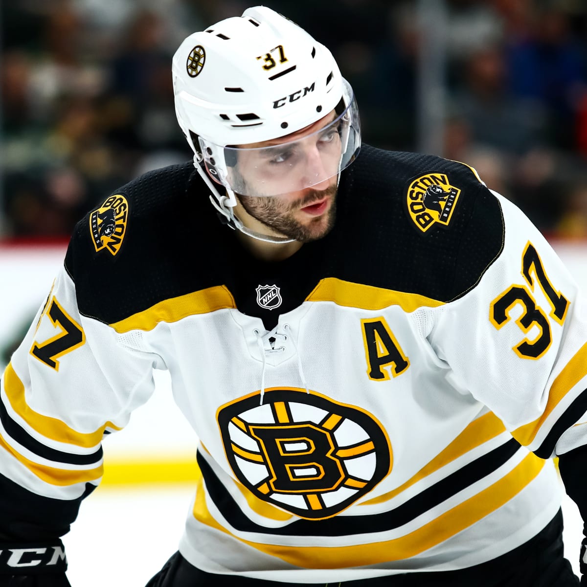
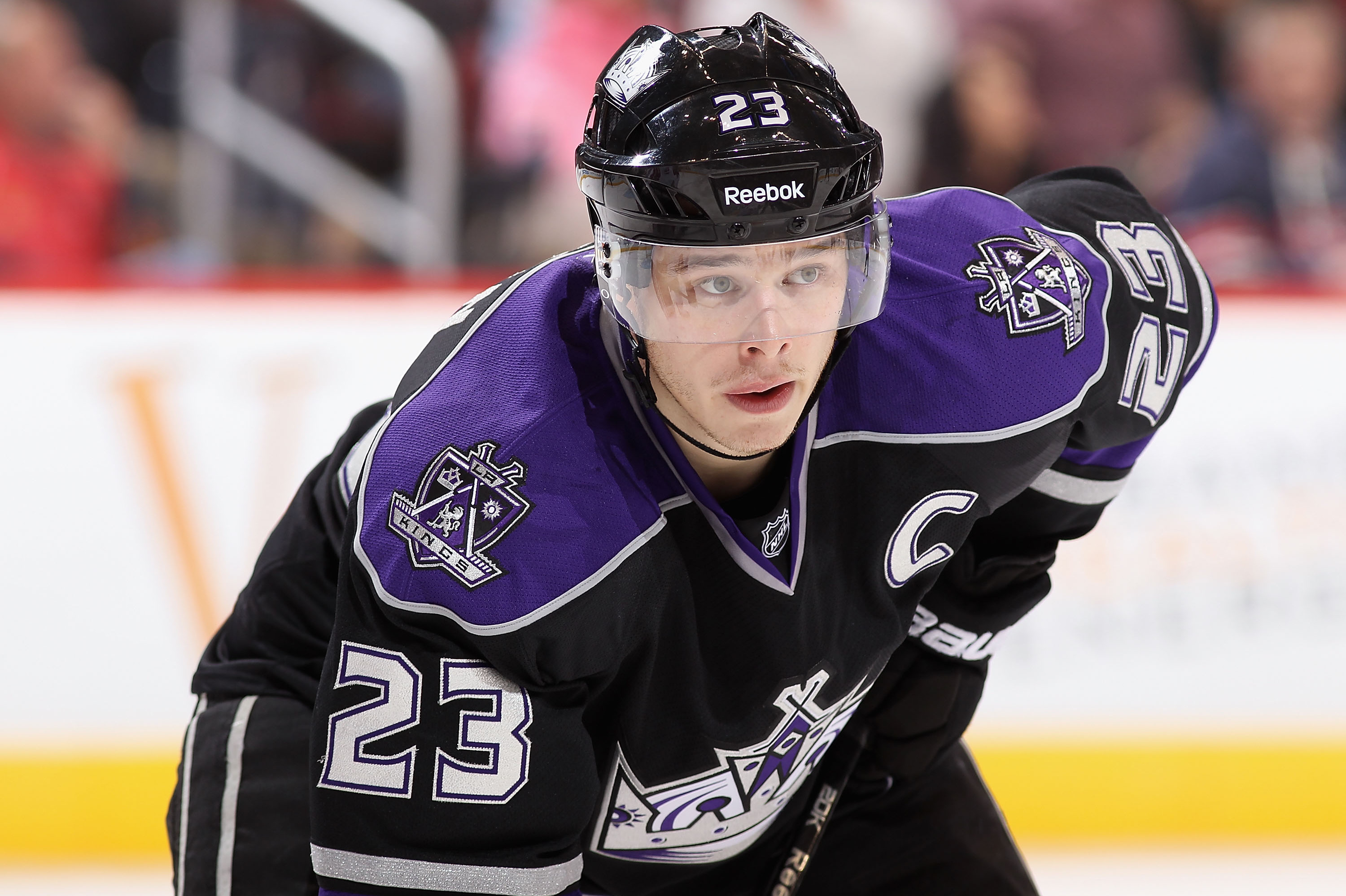
On 1/5/2021 at 12:37 PM, AFirestormToPurify said:
He was a big part of the Battle of Ontario in the early 2000s as a Senator. Maybe you're too young to remember? Either way, he played 8 (EIGHT) seasons with those two teams and he has always been the tallest player in the NHL so it's not like he was a complete unknown on those teams, and by the time he got to Ottawa he was a very solid D-man. He doesn't really belong in this thread, sorry.
Sorry for quoting an 8 month old post, but Chara was my favourite player when he was in Ottawa, and the first jersey I ever owned was the original red 3D jersey with his name & number on the back, so I figured I should give my two cents.
At the time he was traded, Chara was starting to develop into a decent shut-down defenseman, but nobody was projecting him to become a 40-50 point Norris caliber player. If you ask most casual fans, they wouldn't even realize that he played for the Islanders.
Yes, he definitely had a lot of success during his time in Ottawa, but he played over 1000 games in Boston, was the captain for every single one of them, won the Cup, and got his Norris while he was there. It's just a matter of time before 33 hangs in the roster of TD Garden.
So yes, he does belong in this thread.
-
1
-
-
22 hours ago, Jer15 said:
I want to like the new Cambridge blue pants…I just don’t.
It just feels weird and I can’t explain why.The Cambridge blue pants & numbers clash with the helmet. The updated boat logo is mostly Oxford & white, so the lack of white numbers and/or pants is jarring.
Maybe if they added a stripe to the helmet or used Cambridge blue facemasks that would make the set more cohesive.
-
On 4/29/2021 at 6:14 PM, Ridleylash said:
I still think they should've done a 90's Jets jersey in either their current colors or with red and blue flipped. The grey is so boring.
Their aviator blue jersey was essentially a recolour of their '90s jersey, so a '90s themed RR would've been redundant.
-
4 hours ago, KittSmith_95 said:
Not sure if anyone here knows anything about this, but I noticed that in the NHL 22 teaser reel, the Islanders were presented with Barzal sporting the Navy Reverse Retro jersey. Is that just EA being EA, or could this be a leak that they're returning to Navy full-time?
They were just recreating this goal he scored against the Sabres:
-
3
-


2021-2022 NHL Jersey Changes
in Sports Logo News
Posted
How exactly did Ottawa get it wrong?
I've actually come around on the white lines. I think it matches better with the white outlines on the numbers and the white in the logo.