


spartacat_12
-
Posts
2,645 -
Joined
-
Last visited
-
Days Won
4
Posts posted by spartacat_12
-
-
2 hours ago, NYRFan said:
Love the jersey, in a vacuum. I'm just hoping they look unique on the ice and not like a pseudo-Jets.
Similar to the VGK going gold, it seems obvious this team will eventually go with the pale seafoam/blue over the dark navy. Wonder if thought was given to going that route.
The lack of white anywhere in the home jersey should help them stand apart from the Jets. As for a future alternate, I have a feeling they'd try to incorporate some sort of barberpole design to honour the Metropolitans.
16 minutes ago, BeerGuyJordan said:I agree that it does look pretty good, in a vacuum. My main gripe is that there's enough blue in this league. I would have preferred to see them be a bit more adventurous, avoiding primaries that leaned too heavily into blue, red, or black.
Nine teams have home jerseys in some shade of blue (BUF, CBJ, NYI, NYR, STL, TBL, TOR, VAN, WPG). Depending on how close you consider teal, maybe you can lump SJS in there.
Three more have an alt (COL, EDM, WSH)If you want to throw the RRs onto the pile, we can add FLA and MTL.
There's just nothing about them that sets them apart from the pack. For all their other issues, Vegas knows how to stand out and their home set is sharp.I agree that I would've liked to see them incorporate some green or purple into the brand to stand out a bit more. Having said that, navy blue seems to be getting phased out for most teams. The Sabres, Islanders, and Canucks all switched to royal when they rebranded last, the Blues ditched their navy alternate in favour of the throwback, and there are rumblings that the Oilers are going back to royal. At this point Winnipeg & Columbus are the only navy primary teams.
-
 1
1
-
-
46 minutes ago, VDizzle12 said:
Probably one of the laziest logos and most uninspired identities ever created.
EDIT: Actually the Belleville Senators, Iowa Wild and Ontario Reign are up there too. Man I never realized the AHL was this bad. I'm never going to complain about minor league baseball branding again.
Except the Belleville Sens actually look better than their parent club. Or at least they did before they promoted the red jersey to primary status.

-
5
-
-
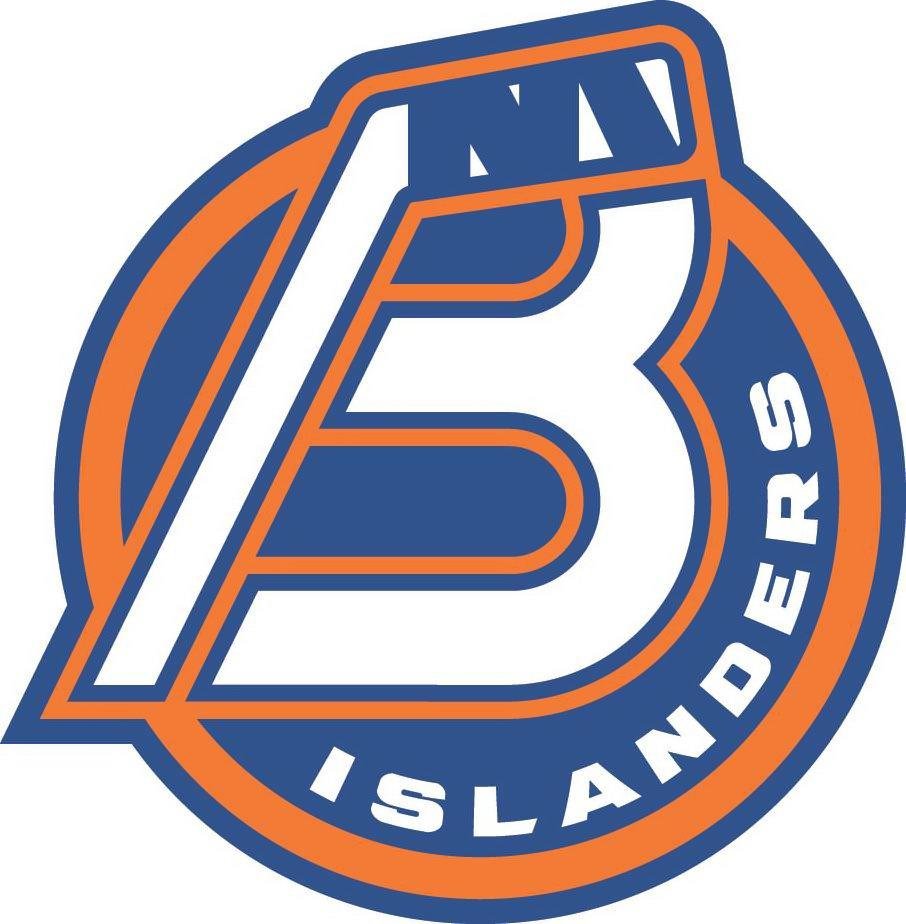
1 hour ago, Ridleylash said:
Evidently someone decided that the AHL needed another "B-major club", because the Sound Tigers are now the Bridgeport Islanders;
I always thought that Bridgeport Sound was the geographic indicator for the team, and Tigers was the nickname. Now I'm trying to wonder what a Sound Tiger is supposed to be.
Also, love to see a team not playing on an island called the Islanders.
-
3
-
-
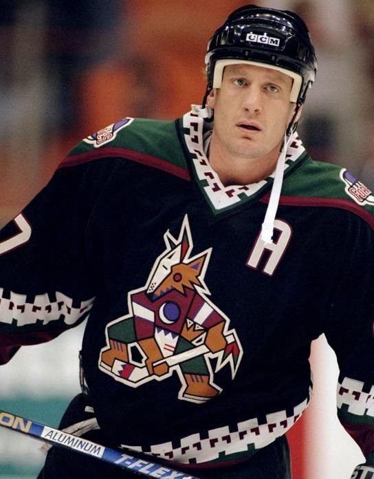
19 hours ago, Chromatic said:
I really hope they fix the collars.
I actually think this is one of the rare cases where the Adidas collar actually looks better than the previous one. I always loved the Kachinas, but this collar is waaaayyyyy too thick:
17 hours ago, habsfan1 said:For the record, orange always comes off as more popular than the dynasty jerseys:
I'm pretty sure that those orange alternates being released coincided with the opening of Rogers Place. I remember hearing that almost every season ticket holder was given a free one, which would explain why it's so prominent.
-
2
-
-
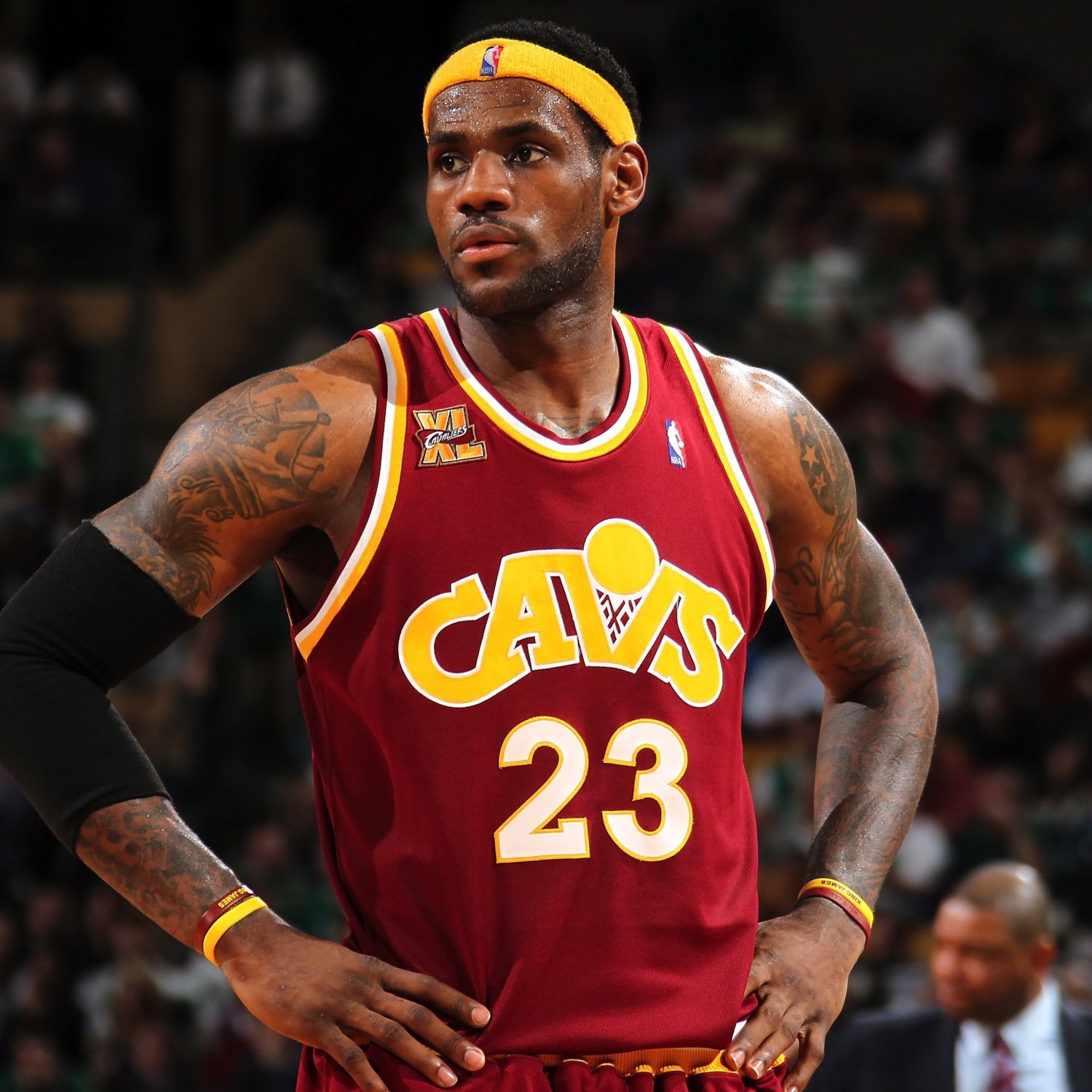
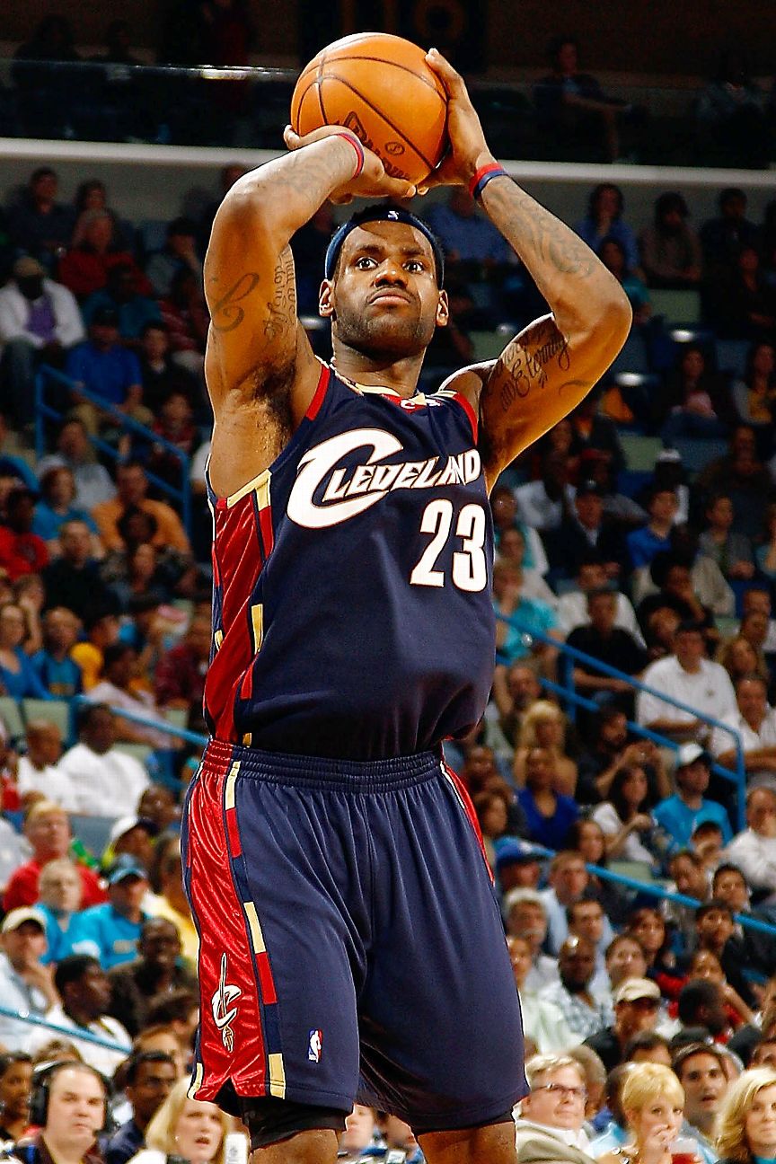
On 3/20/2021 at 1:12 AM, DG_ThenNowForever said:
On 3/20/2021 at 1:03 PM, LA Fakers+ LA Snippers said:
This. The perfect blend of past and present. Get a modernized logo and they should be set for the next 20 years.
Cavaliers is a great nickname with some terrific design possibilities. Not sure why you'd want them wearing a generic wordmark that could be used by any team, especially when there's another team in the league literally called the Nets. Not to mention abbreviated nicknames on uniforms almost never works better than the full name.
Between them & the Sabres, what was it with sword-themed brands ditching anything that actually represented their name in the '90s. As a kid I never realized what a Cavalier actually was until the initial Lebron rebrand brought a sword back into the logo.
I'm surprised no one has mentioned these alternates, which might be my favourite Cavs uniforms of all time:
-
4
-
-
The OJHL has announced that a new team called the Haliburton County Huskies will begin playing next season in Minden, ON. No uniforms have been unveiled, but they did release their logo.
-
16 hours ago, DNAsports said:
Leonard Fournette is going to wear 7 this year
I'm not really a stickler for the whole positional number thing, but I'm not a big fan of established players changing numbers while playing with the same team. Even Kobe doing it was a little annoying to me. Fournette hasn't been in Tampa for long, but I'm sure plenty of people bought his jersey with the old number.
-
2
-
-
4 hours ago, GoHawks said:
Bengals for some reason are still using their old uniforms for the draft this year. Also looks like the Browns are making the orange pants the primary ones now
Those uniforms probably got shipped over a while ago, and I'm guessing Cincy was worried about a potential leak so they just sent over the old one.
-
9
-
-
39 minutes ago, GoHawks said:
I'm hoping it's an all white uniform and they mix in the white jerseys and pants with the normal blue and gold jerseys/pants so we don't have to see that dumb "bone" color as much
Unless they're wearing a yellow jersey, the Rams should always wear yellow pants.
-
12
-
 1
1
-
-
15 hours ago, GoHawks said:
Didn't the Rams say they would be unveiling an alternate uniform this year?
Yes, the plan announced last year was to unveil an alternate this year & a 4th next season.
I'm guessing this year's will be a sol jersey paired with the blue pants. Depending on the one-helmet rule decision they might do a navy & white throwback next season.
-
2
-
-
On 4/18/2021 at 7:30 PM, NicDB said:
Hogs became associated with the franchise so organically, and how often do you see a swine related identity in sports? The Arkansas Razorbacks and Nippon Ham Fighters are the only two I can come up with off the top of my head.
Nippon-Ham is the company that owns the team. The nickname is just the Fighters, and their identity has nothing to do with swine.
When WFT first announced the name change, Pigskins was the first one that I thought would work. Keeping the 'Skins' suffix seems like it would cause less potential problems than keeping 'Red' in the name.
-
4
-
-
On 4/4/2020 at 5:22 PM, pressstart66 said:
In my eyes these were some of the worst jerseys the Bruins ever had, and it doesn't help that the Winnie the Pooh jerseys coincided with them
One thing that's always bothered me about this set is that the numbers on the back of the black jersey were gold, but the numbers on the black sleeves were white.
-
22 hours ago, Ridleylash said:
Toronto and Montreal have the benefit of being the Dodgers and Yankees of the NHL; franchises with vast, storied histories. Ottawa is more akin to the Rockies; a team that has been around for a while and has been consistent in their brand identity since their first season in 1992.
The Washington Nationals are a more apt comparison for Ottawa. A new team based in the nation's capital that chose a name that honoured the city's past team. People don't seem to have a problem with the Nats using the old Washington Senators' logo as their primary, so I don't understand why people have such an issue with Ottawa bringing back the barberpole stripes.
1 hour ago, Lights Out said:The Habs' and Leafs' logos aren't nearly as boring as a plain Times New Roman O. Unlike the Senators, those teams also never came up with more appealing alternatives to their classic brands.
Member hockey week did a great series of concepts on here a few years back on what the Sens would've hypothetically looked like today if they never moved/folded. The logo below is a great way to add a little more substance to the O without too many drastic changes. I'd be a proponent of them going the Rangers route, by having a more detailed primary logo, but still just using the standalone O on the jerseys.
-
4
-
-
1 hour ago, SSmith48 said:
I like Wild Hogs as a dark horse. I'm not usually into wacky/wild names, but I think this one works as a nice fan tribute.
It also works as a tribute to a mediocre family comedy from 2007.
-
6
-
-
^ This. Historically speaking, Ottawa has contributed just as much to the sport of hockey as cities like Montreal & Toronto have. It's the birthplace of the Stanley Cup, and home to one of the league's founding 4 franchises, who just happened to be the sport's first ever dynasty. Canadian Tire Centre has streets surrounding it named Silver Seven Rd, Frank Nighbor Pl, Cyclone Taylor Blvd, and Frank Finnigan Way. It makes sense for them to have a simple, traditional brand.
-
15 hours ago, Ridleylash said:
I mean, the Leafs have had a century's worth of time to refine and tweak their look, where the Sens have had 30 or so years, a decent chunk of which was spent using a terrible Reebok template design. Obviously one's going to be better.

I just don't think the answer to solving the Sens' identity is "scrap everything, go Silver Seven" because there's now too much brand equity in the look the current franchise has generally kept to since it's inception, and I'd rather them not try to Browns things by taking another franchise's design for their own. I'd argue the best option would just be to split things down the middle; keep the Silver Seven look on as a permanent alternate while using the mid-late 90's jerseys full-time.
Maybe if the NHL decides to open a proper fourth jersey slot without a gimmick attached (which it feels like the Reverse Retro is a test platoon for), we could literally split the difference and have darks and whites for both. That way, both camps stay satisfied because both sides have home and away options.
As much as I would like to see a black & a white =O= set as permanent alternates, I can't imagine a situation where the team doesn't have some sort of red jersey in the rotation.
-
2
-
-
On 4/6/2021 at 6:29 PM, clonewars2008 said:
In most cases in order to be a General or a Senator one must have served in the Roman army and most of them were at one point Centurions, The Roman astatic is better than the =O= one. It's good to throw back to on an alternate but the Centurion look is to project power and strength.
I'm kinda joking about the Leafs, but they are a husk of their former self and died when Conn Smythe did. Overreliance on history is terrible especially when you have done all since the Sgt. Pepper came out. Montreal is teetering on this too as we are nearing 30 years since their last cup. Oh you have 24 Cups? Cool, how many fans were actually live and remember seeing one?
But for the Sens they shouldn't rely on that history either, yes it's good to call back but it's shouldn't be the identity of the team. I like that they stuck to the Roman theme. I like it, I grew up with it, it's more than just nostalgic feelings either as 4 years ago we almost won a cup in that look. and yeah the 3D look is kind of goofy but this brand is still a good brand and with the switch back to the 2D era it shoots up in the brand standings (though I was also a big fan of the RBK Edge look just wish they didn't have the O logo there and added the updated 2D logo to the shoulders).I hate to break it to you, but liking the brand purely because you associate it with a deep playoff run, and not due to the actual merits of the design, is nostalgia. Also, I'm not sure exactly how young you are, but I'm pretty sure there are quite a few living people on the planet who can remember 1993.
-
3
-
-
Rams going with the head logo instead of the L@. Hopefully this is a sign of the monogram being relegated to secondary logo status.
-
2
-
-
The Bills uniforms are solid, but I still think they should be wearing a red helmet. Pretty crazy that the Chiefs are the only team in the league who use a red helmet.
-
4
-
-
On 3/24/2021 at 1:37 PM, clonewars2008 said:
The Connection to the name, so not much the cause of today's Senators (though one can argue that maybe it should still apply) but with the connection to the roman theme: In order to be a member of the Roman Senate one must have done service in the Roman army. Many of these Senators were Centurions, who were leaders on the battlefield, skilled warriors, so Bruce Firestone looked to the branding to not only call back to the Original Sens but to build it's own identity that would be fierce and fitting with a brutal and barbaric sport like hockey. I for one having grown up with this brand like it, and want the Sens to keep it as the old Sens are kinda bland and not fitting for today's market. It's good to throwback to terrible to use full time as there is no substance in it. TBH the Leafs, Habs and Yankees have boring looks that really are only associated with winning. Take away the championships and they are boring (Maybe not the Habs home) and lack luster two colour products of an earlier time. Also, can we add the Leafs to the same situation as the Sens? Unpopular opinion but the Leafs at this point are two different franchises with one that was only good cause they had less than 5 other teams to compete with most of the time and a 50 year old franchise marred with terrible ownership, over reliance on the past, inapt and overhyped teams and all intent and purpose the Toronto maple Leafs died and folded with Conn Smythe. The NHL record books should say Toronto Maple Leafs I (1927-1967) and Toronto Maple Leafs II (1967-present)
I'm pretty sure you're joking, but I'll address your Leafs take anyway. A franchise being terrible for decades isn't close to the same as one relocating, folding, then having an expansion team adopt their name & colours 60 years later. Despite their dysfunction, you can still draw a straight line from the current Leafs to the teams of the past. Morgan Rielly played with Phil Kessel, who played with Tomas Kaberle, who played with Wendel Clark, who played with Borje Salming, who played with Dave Keon, who was on the Leafs when they won their last Cup.
As for the Sens, the original plan was to use something like the Peace Tower wordmark they initially unveiled. After the massive success the Sharks had selling merchandise, there was pressure to come up with something "cooler" that kids would want to wear. This lead to the Canadian senators = Roman senators = Roman centurions stretch.
-
1
-
-
On 3/20/2021 at 1:25 AM, Kevin W. said:
They aren't the original Senators. Their current look and a modernized version of the pre-Edge alternate would both be superior looks to the barber pole.
The Cleveland Browns aren't the original Browns (despite the NFL's revisionist history). The Washington Nationals aren't the old Senators. When Seattle inevitably gets an NBA team back they won't be the original Sonics, but I can guarantee they'll look like them. Unless a franchise takes an identity with them when they move (i.e. Lakers, Colts, Flames), that identity belongs to the city.
As for the barber pole design, it's a unique feature that is associated with a number of Ottawa hockey teams at various levels. It's a great way to stand out in a league with multiple red & black teams.
On 3/20/2021 at 9:38 PM, Ridleylash said:I mean, what does barber pole sweaters and a big O logo have to do with "Senators", either, to be fair? If that look didn't have the Cup legacy (or the modern team had managed to win in 2007), would people really be pushing for it so hard as the main look? It feels more like people just pushing it because it's associated with a really good team from the 1800's and early 1900's rather than because they think it's a great look in the modern day.
The current look at least gives the team a real sense of identity beyond "we look like that old team that used to play here a long-ass time ago and was pretty good". Much as it may be maligned in certain circles, I think having the Roman theme makes more sense, simply because it has more visual icons to play with for branding purposes; the laurels and the armored warrior motif both make for more visually interesting iconography than the original team's logo.
An O and some barberpole stripes can only get you so far, branding-wise, and we know how important branding is to sports teams nowadays. I think that's why they decided to stick to the theme they have now instead of committing to the O; branding beyond the jerseys.
Except the identity of the latest rebrand is essentially "we look like that team you watched play in the '90s". Every attempt by the team to play up the Roman theme beyond the logo (the inaugural home opener ceremony, the dad-bod centurion with the bad mic connection giving a pre-game pep talk) have been ridiculed by the fans. I'm fine with the current look, but its success is due to a combination of '90s nostalgia & the loathing of the previous set.
-
3
-
-
1 hour ago, Gothamite said:
That’s such a huge improvement.
The only thing better would be swapping out the A for a T.
City initials > nickname initials.
I would normally agree with you, but the Argos have used an A for so long that there's no changing it at this point.
If it helps you there is a small T in the negative space at the bottom of the A.
-
4
-
-
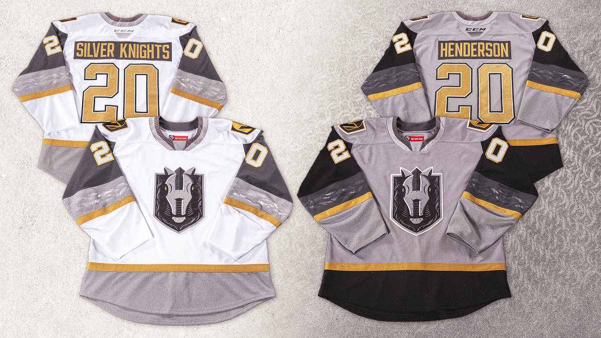
2 hours ago, Roger Clemente said:
Better view of front and back of both jerseys...
We need an official moratorium on contrasting nameplates, especially on white jerseys.
-
6
-
-
Pretty unique colours, but yet another generic name. Also it was a missed opportunity to not incorporate the arch into the shape of the badge. The shape of the curve at the top doesn't even match the shape of the arch.
-
2
-


 all since the Sgt. Pepper came out. Montreal is teetering on this too as we are nearing 30 years since their last cup. Oh you have 24 Cups? Cool, how many fans were actually live and remember seeing one?
2021-2022 NHL Jersey Changes
in Sports Logo News
Posted
This might have been a decent option for the Winter Classic. One thing I'll never understand about the previous Stars brand is why they always kept the A at the top of the star even when it wasn't part of the wordmark. How hard was it to extend the outline to connect it to the rest of the star?