


spartacat_12
-
Posts
2,659 -
Joined
-
Last visited
-
Days Won
4
Posts posted by spartacat_12
-
-
I think it's just a matter of time before this is promoted to primary status:

-
 16
16
-
-
23 hours ago, B-Rich said:
"If you build it, they will come"
Places this worked:
1. Minnesota (Metropolitan Stadium)
2. Indianapolis (Hoosier/RCA Dome)
3. Orlando (Orlando/Amway Arena)
4. St. Petersburg (Suncoast Dome/Tropicana Field)
5. St. Louis (TransWorld/ Edward Jones Dome)
6. Memphis (kinda/sorta, with The Pyramid as a temporary home, but they had to agree to build the FedEx Forum to actually get a team).
7. New Orleans (New Orleans Arena/Smoothie King Center)
8. Oklahoma City (Ford Center/Chesapeake Energy Arena)
9. Las Vegas (T-Mobile Arena)
Places this didn't work:
1. San Antonio (Alamodome - never got an NFL franchise)
2. Kansas City (Sprint/T-Mobile Center - hasn't got an NBA or NHL franchise yet)
3. Quebec City (Videotron Centre)
It also worked for Winnipeg getting the Jets back. Canada Life Centre was built for the AHL, but they made sure it was made to NHL standards just in case they got the chance to bring in another team.
-
On 10/17/2021 at 12:32 AM, kimball said:
Granted they kept the navy blue, but they returned to the note logo even before the Canucks and Padres returned to their classic colors.
Well the Canucks used the stick-in-rink as a shoulder patch on the West Coast Express set, and the Padres used the swinging friar when they were still in navy.
-
5
-
-
On 10/14/2021 at 12:41 AM, DustDevil61 said:
Second, does this make the Utah Jazz the NBA’s Vancouver Canucks and San Diego Padres, or does this make the San Diego Padres and Vancouver Canucks MLB’s and the NHL’s Utah Jazz?
The Canucks & Padres at least were smart enough to eventually realize that the best way to rebrand was to return to their classic colour scheme, not unveil another, completely different colour scheme that you’ve never used before.
Hopefully there’s enough backlash this season that they reconsider, but it sounds like the wheels may be a little to far in motion.
-
6
-
-
I hope they incorporate the Knights’ colour scheme into the uniforms, instead of sticking with the greyscale/single-colour team logo ones they’ve used the last couple ASGs.
Assuming they keep the divisional format, you could have one division in gold, one in white, one in red, and one in black/grey. There would be enough contrast between any potential matchup.
-
1
-
-
This year’s All Star Weekend logo has been released
-
51 minutes ago, CaliforniaGlowin said:
Twitter already leaked it. Here are some more pics.
The only thing about these that’s an improvement over the throwbacks is the thick black outline around the logo.-
3
-
-
3 hours ago, pepis21 said:
Correct me if I'm wrong but Kings used dazzle fabric on their 90's throwback which was before Vegas alternate.
They did, but I believe it was something that Reebok/Adidas had claimed they couldn't replicate. The Knights had originally planned on releasing the gold jersey a year earlier, but Foley didn't like the way the shade of gold turned out, so they waited until Adidas could figure out the dazzle fabric.
-
1
-
-
23 hours ago, Chromatic said:
Whatever the Cowboys do I'd like to see them actually wear their navy jerseys. They're so much better than the whites its a shame they're never seen due to a really dumb superstition. I can understand opting for white in the playoffs due to a tradition (though I still think its silly) but once you opt to exclusively wear one uniform as much as possible, you're throwing out whatever jinx you may believe exists because now all your losses are in the uniform you believe to be good luck.
I don't have a problem with them wearing white as much as possible, but they just need to change the shade of blue in the jersey & the silver pants to match the helmet. Also change the weird black trim on the sleeves to silver.
-
2
-
-
5 hours ago, NYRFan said:
Still a dull look, but at least I can now notice some contrast between the silver and white!
I guess they made the change after seeing Vegas pull off the dazzle fabric on their gold alternates. It's too bad though, this would've been a perfect opportunity to add a proper hem stripe to the home jerseys.
-
5
-
-
1 hour ago, Red Comet said:
SNL has sucked ass since Chris Farley died. The wrong late night sketch show got cancelled IMO. RIP MadTV.
And I'm sure in the '90s (which I think is the best period for SNL), you probably had older people who had to constantly bring up how John Belushi was better than Farley, and that the show hasn't been watchable since The Not Ready for Primetime Players.
-
6
-
-
19 hours ago, Red Comet said:
Seems like the Super Bowl halftime show is more of a confirmation that it’s only downhill from here when it comes to musicians. Last time I remember a decent halftime show was Prince.
These halftime shows seem a bit like SNL. People look back so fondly at a couple shows from the past that they refuse to acknowledge that anything since then is any good. Prince's performance is often labelled the best halftime show of all time, so I don't think much is going to top that, but that doesn't mean we won't get some other great performances.
It was pretty clear after the Janet Jackson incident that the producers decided to play it safe for a while by going with some conservative, classic rock musicians with a catalogue of hits that most people would be familiar with (McCartney, Springsteen, Tom Petty). Then they course corrected a bit too much, which is how we ended up with the Black Eyed Peas.
This seems like the best possible option. You've got a genre that has more relevance with younger audiences than rock does, but the focus is on the legends of that genre that'll be familiar to the older generation.
-
2
-
-
Obviously bringing back that jersey was a terrible idea, and that should have been clear to at least one high ranking executive with the Raiders, but I found it funny seeing how many of the outrage police on social media didn't realize that this was a throwback jersey and thought this was a brand new design the team came up with.
-
18 hours ago, QCS said:
I agree, and I'll take it a step further: I can only think of three (maybe four) teams that should be wearing gray pants: Lions, Raiders, Cowboys, and maybe the Patriots. I prefer the Pat Patriot look with white pants, but if they keep the silver helmet, then gray pants would be nice. No other team should be wearing gray pants, not the Giants, not the Panthers, not the Falcons. White just looks better.
I agree with all of those except the Panthers. I think a silver helmet should always be paired with silver pants.
-
7
-
-
I've only realized this is an unpopular opinion after reading through the NFL 2021 thread, but I am not a fan of the New York Giants wearing grey pants. I understand the historical context, but the white just looks a lot better to me.
I think the LT era set is a bit too similar to the Bills' look, but I think there's a nice middle ground to be found between that set and the current look.
-
4
-
-
On 9/3/2021 at 1:20 AM, GDAWG said:
And if Tempe does say yes, it would open in three-four years. They have no place to play for a few years.
I feel like they'll be able to work out some sort of deal with Glendale to stay in Gila River until a new arena is ready.
-
On 9/15/2021 at 2:20 PM, Sport said:
I'm joking about Paul Bissonnette being the worst player in NHL history. There's loads of guys who played fewer games and scored fewer points. As a personality I think Biznasty is tiresome. He wasn't that good on the few episodes I listened to of the Spittin' Chiclets podcast (which is a mess all around and I don't understand the popularity). Maybe he's better in a polished studio show?
Agreed about Gretzky. That guy's famously dull and a lot of people have reported that he's kind of an a$$hole behind the scenes.
I've seen a bit of Biz's work on the Coyotes' regional broadcasts, and he's much more professional & polished there compared to the podcast, although he still has his trademark self deprecatory humour. I actually think the contrast between him & Gretzky could make for an interesting dynamic.
As for Chiclets, I think the appeal is pretty obvious. People constantly complain that NHL players have no personality, and the podcast is one of the few public forums where players genuinely feel comfortable opening up. You also get former players who can come on and tell stories that wouldn't fly on am radio. I'm not sure how long ago you listened, but it feels like they have toned down a lot of the frat boy-type stuff that helped them blow up. Maybe Roenick getting fired for his comments on the show caused them to re-evaluate the brand.
-
14 hours ago, dont care said:
The raised outline counts as texture. Just shows that this is mostly just a way to stop counterfeiters. Which is dumb because they will be able to figure out how to add some embroidery very easily.
Yes, it's definitely a tool to help battle counterfeiters, but that doesn't mean it isn't also a nice, subtle touch that improves the logos. Most counterfeiters don't even bother to get the number fonts right, so I doubt their going to be putting money into barely noticeable embroidery.
Some of the posters on here seem to be overreacting. Unless you're getting a close up shot of a player, or you're standing 2 feet away from a jersey, you won't notice a difference.
-
2
-
-
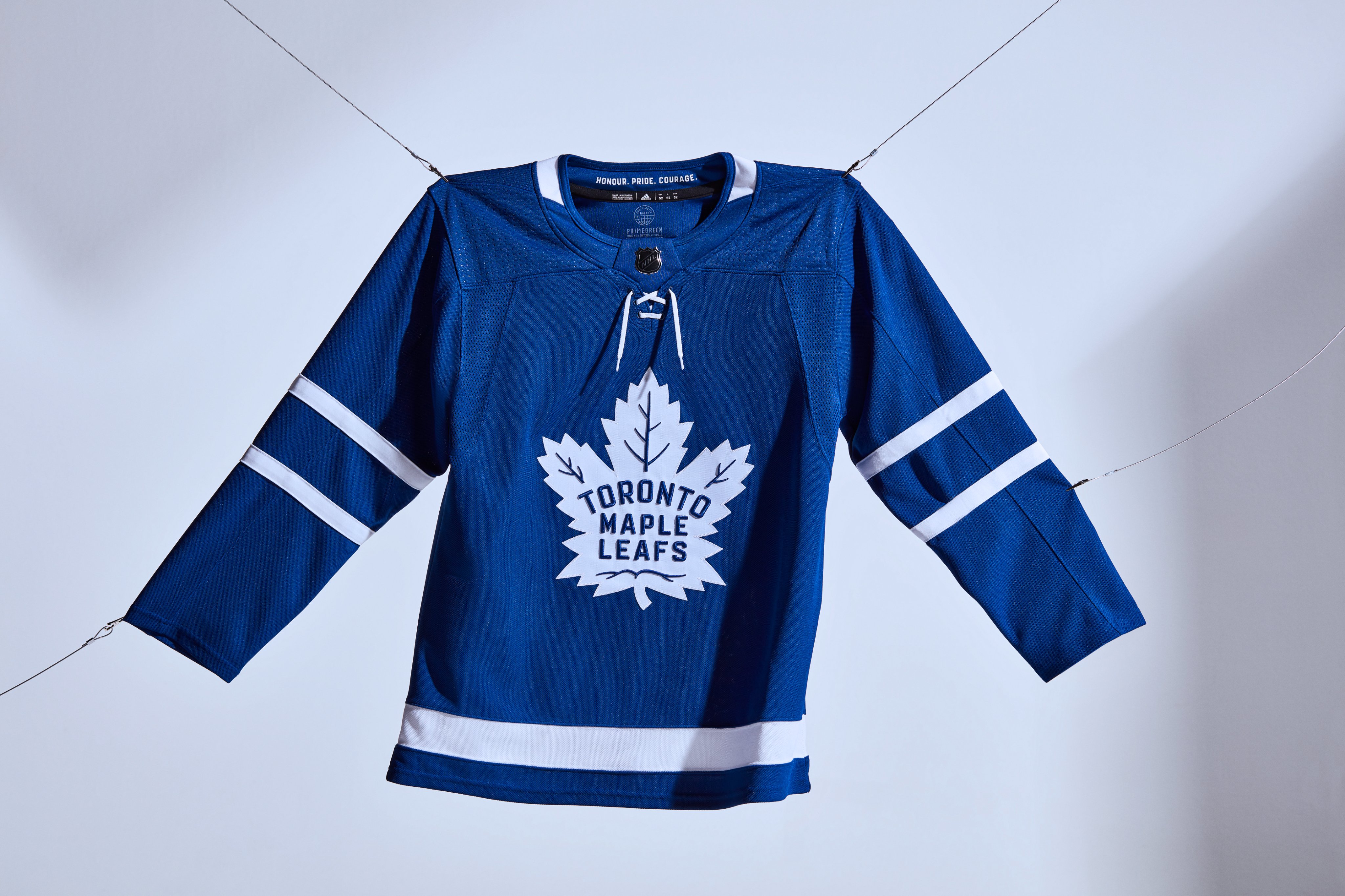
Yeah it looks like a lot of teams have updated their logos to have a sort of 3D embroidery effect. The wordmark & veins in the Leafs logo pop a lot more now:
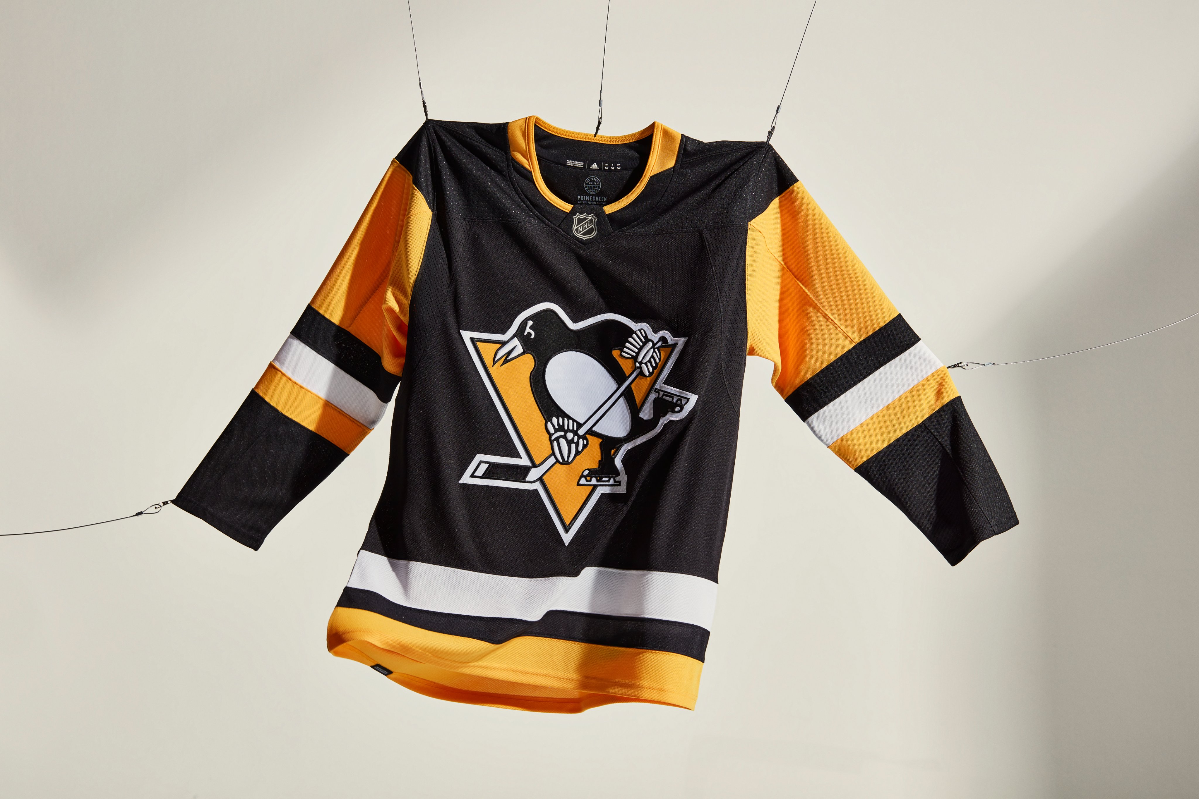
It's quite noticeable on the gloves of the Penguins logo:
And the Oilers have added highlights to the oil drop & along the bottom of the wordmark:
-
4
-
-
1 hour ago, monkeypower said:
I think you might be reading too much into it. I think they were just going for a b/w or grey scale logo just to have a more muted logo on the pants. The Flames had the white flaming-C from the pedestal jerseys on their pants for over 20 years, even long after that white flaming-C was retired, and they never had a black jersey with the white flaming-C.
But at least that version of the Flames logo had some precedence of being used on a previous jersey of theirs. The Devils' NJ monogram has been red for the entire existence of the franchise, so I'm not sure what other explanation there could be.
The Devils had nearly 3 decades of Lou's ultra conservativism when it came to uniforms, so it wouldn't surprise me if they get too excited about finally being able to introduce an alternate, and come up with something gaudy/trendy. It's like when a kid who grew up with strict parents moves away for school and is finally able to drink. They usually end up passed out next to the toilet.
-
2
-
-
13 minutes ago, CreamSoda said:
Could be a cool look for Ottawa and they could own this color combo. Set themselves apart from New Jersey, Chicago, Carolina:
...
Being a black-first team is enough to have them stand out from the rest of the red/black teams in the league.
-
2
-
-
18 minutes ago, DG_ThenNowForever said:
Can I ask why?
Just look through some of his previous posts in this topic and you'll quickly figure it out.
-
3
-
-
16 hours ago, MNtwins3 said:
Is the Suns' arena not suitable for hockey, or am I missing why they can't play downtown for a few seasons?
I have a feeling they'll work some sort of deal out with Glendale that will allow them to keep playing there for a few years while a new rink gets built in Tempe.
11 hours ago, WSU151 said:The Sens had the same jersey in NHL 94 and it's really just the Blackhawks RR jersey.
To be fair, the Sens almost did look like that when they first re-entered the league.
-
4
-
-
3 hours ago, Nordiks_19 said:
New pants for the Devils. But it seems for now it's only for training camp.
I don't think it's only for training camp. Hughes is wearing them in the NHL media day photoshoot.
If it was the actual team logo it would be fine, but the fact that it's a grayscale has me a bit concerned. I'm worried this could mean they're planning on introducing some sort of black & grey 'stealth' alternate like Tampa.
-
9
-


/cdn.vox-cdn.com/uploads/chorus_image/image/67983256/50892528.0.jpg)


Alternate Jerseys That Should Be Primaries
in Sports Logo General Discussion
Posted
I think you have to wait 5 years to do another redesign, but I don't think swapping a primary & alternate counts. Pretty sure when the Jags did their redesign they had black as the primary dark jersey, but now teal has become the primary jersey.