


spartacat_12
-
Posts
2,664 -
Joined
-
Last visited
-
Days Won
4
Posts posted by spartacat_12
-
-
1 hour ago, Sport said:
I was going off the first shared tweet, which used the words "NEW ARENA" and IF they're building a new arena then don't put the new arena in a suburb is all I was saying.
Yeah, the wording was a little confusing. I guess they just meant it would be a new arena for the NHL to be in.
15 minutes ago, gosioux76 said:Wouldn't this, however, be the same formula that got us the Atlanta Thrashers?
The Thrashers were never set up for success considering their expansion process. If the Houston got the Coyotes they'd basically be inheriting Clayton Keller, Jakob Chychrun, 8 draft picks in the first 2 rounds, and $50 million in cap space.
If the ownership brought in the right front office staff & was willing to spend money they could easily turn this into a good team.
-
 2
2
-
-
1 minute ago, Sport said:
Not unless the rumored buyer is the owner of the Rockets. The tweet says "the Arizona Coyotes are "for sale again with idea of buyer eventually moving team to a new arena in Houston."
-
1 hour ago, Sport said:
Houston Aeros or we riot.
I think Houston would be an okay hockey market just on sheer volume of residents. Just don't put the new arena in a suburb that's hard to reach and they'll be fine.
If Houston gets a team they would just play out of the Toyota Center.
-
Nashville is going to be releasing their Stadium Series jersey tomorrow. It'll be the first time they've worn navy since switching to yellow at home 10 years ago.
-
2
-
-
10 minutes ago, BJ Sands said:
Am I one of the few who hates the current Penguins set because of the messy striping patterns?
It's not terrible, but definitely could use some tweaks. They need to have the hem striping on the black jersey match how it is on the white, update the sock striping to match the jerseys, and maybe get rid of the stripes on the side of the pants.
-
2
-
-
So I somehow completely missed the news earlier this year that the Rock have moved to Hamilton, but they've just released a Ti-Cats/Bulldogs themed 3rd jersey:

This seems like they're doing everything they can to attract Hamilton fans, except you know, actually calling the team 'Hamilton'. And with there being a decent amount of overlap in the Argos/Rock fanbase, I can't imagine the GTA fans are thrilled about this.
They really should have just called them the Ontario Rock.
-
18 minutes ago, GT Designs said:
Sweden just released their jerseys. They look great.
At least one country realizes that if it ain't broke, don't fix it. I like that they've removed the white outlines around the crowns, but the blue seems a little too dark.
Canada isn't great, but somehow I was expecting worse. They've unfortunately doubled down on black when they should be minimizing it or eliminating it altogether. The white jersey is the best one by far.
I saw a comment on the USA jerseys saying they look like a goalie soccer jersey, and that pretty much sums it up.
-
2
-
-
The one positive of this whole situation is that even the casual Instagram/Twitter/Reddit fans who's base instinct is to call every new uniform "fire" or "cold" hate these. It's refreshing.
-
6
-
-
https://www.nhl.com/devils/news/a-new-era-dressed-in-black--feature/c-328227424
I can tolerate a certain amount of marketing-speak, but this explanation is just way too much. Do people in NJ really care that there are 21 stripes for 21 counties, or that they're gonna wear it 13 times in honour of Nico Hischier?
Somehow they have been working on it since 2018, and this is the best they could come up with. The VP of Marketing even says this:
Quote"Our fans were potentially expecting something a little different, but they were longing for black. For us as a brand, and as a team, it's the ability to pay homage to our past but take this bold step forward as a brand. And I think that's the most critical piece."
When you start off by saying, "our fans didn't necessarily want this", maybe you didn't go into this with the right attitude.
-
3
-
-
On 11/21/2021 at 11:43 AM, the admiral said:
Love that script, never should have deviated from it. Wordmarks should have more prominence in the NHL than they do.
It always makes me think of those old collectible mini mugs that had the logo on one side & the team's wordmark on the other.
-
8
-
-
52 minutes ago, lgbaseball8 said:
- I’m glad they chose to stop focusing on gold. Gold accents didn’t look bad, it was just hard to fit it in with their already full color scheme. I think they would look fine if they went with a royal, gold, and, white scheme, but I’m glad they stuck with royal, powder, and white.
Except powder blue is barely a part of their colour scheme. It has never been anywhere in their primary logo or home uniform, and the KC chest jersey was the first time they incorporated powder blue into a royal jersey (not counting the bp jersey from the '80s).
The powder blue road set was chosen because it was trendy in the '70s, and they brought it back as an alternate when two-tone blue came back as a design trend. It's really not that different than when black was added in the early '00s. Gold has at least been part of the logo from the beginning.
-
On 11/17/2021 at 12:53 PM, CreamSoda said:
The homes are almost identical, minus the name/logos. Look at this photo of the back of the home uniform....
Up close the Rockies don't look bad, but the issue is that from even a bit of a distance the purple pinstripes just look black. Simply swapping all the purple & black elements would make a huge difference.
2 hours ago, coco1997 said:It's quite maddening that the Royals are the one MLB team (with the exception of Toronto) who really should commit to a solid powder blue road look more than anyone--certainly more so than teams like the Cardinals and Rangers--and yet they continue to do this half measure thing.
Why exactly is that? Powder blue isn't one of their actual colours, and their name is literally "Royals". Why would you want a road uniform with almost no actual royal blue?
The whole PBFPBS started because teams wanted to capitalize on the emergence of colour TV, and none of them even bothered trying to incorporate it into their scheme. The Rays are the only team in baseball who actually uses the colour properly.
If the Royals want to differentiate themselves they should add a little metallic gold to their uniforms. Just a thin outline similar to the special uniforms they wore after winning the WS.
-
4
-
-
On 11/15/2021 at 9:48 AM, Sport said:
What's the sentiment around Boston for those uniforms?
I think they look like a generic approximation of a Bruins look for a movie or commercial who couldn't get the rights to the actual Bruins uniforms. This is just a completely statement-absent, third jersey for third jersey's sake look here.
I think if Boston is incessant about having a black third jersey, this is the best possible version of that. I like the consistency of the logo matching the numbers perfectly, similar to Calgary's jerseys. The striping style is also very underutilized.
I do agree that they would be better off going with a yellow third jersey though. The 2010 Winter Classic set is one of my all time favourite looks.
-
26 minutes ago, CaliforniaGlowin said:
Best uniforms in the league to me!!!
...too bad the team sucks...
They flew too close to the sun with these ones, but I guess that was probably inevitable. The fiesta colours only work as an accent/compliment to the black/white/grey, not as the primary focus of the uniform. These look like they took a rejected Miami Heat Vice design, then lazily slapped their main wordmark on the chest.
-
9
-
-
21 hours ago, Digby said:
Yeah, this is perfectly on-brand for Barstool as aspirational lifestyle brand for its audience, is it not? The only thing at risk here is probably the Penn National investment, which is hilarious but inconsequential.
I doubt sports gamblers care too much about this sort of thing. It's caused the stock to plunge, but I'd expect it to bounce back.
This whole thing feels a lot like the recent Dave Chappelle situation. Short of actual legal action being taken, some people are just too big to cancel. And if the Netflix employee walkout shows us anything, it's that usually the degree of outrage online is a highly exaggerated version of how the real world feels.
-
3 hours ago, AFirestormToPurify said:
Your Sens have gold on the logo but nowhere else on the uniform. The Blackhawks and Wild have like 32 combined colors on theirs logos that aren't found anywhere else on the jersey and they're routinely considered some of the best logos in hockey. The 90s Ducks, Sharks, Coyotes and Panthers are all uniforms that a LOT of people like and have the same "problem". You can probably even include the original Thrashers jerseys on that list, I think a fair amount of people would say they were nice uniforms
Why does it not make sense exactly? I think the gray triangle in particular makes perfect sense. I've seen plenty of Starter jerseys from the 90s that had the jade triangle and it didn't look all that good. Again, the Leafs and Flames flip their logo colours on their jerseys and nobody seems to mind?
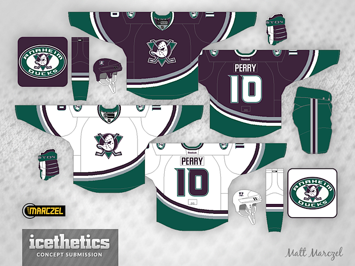
The Mighty Ducks jerseys from 1996-97 and 2000-03 were absolutely perfect and I will die on that hill lol
Yes, the Sens & Hawks have some extra colours in their logo, but they still have black & red in there. The gold/green/blue/etc. are there to compliment the primary colour scheme, not compete with it. As for the Panthers, I think the best thing about the reverse retro was that the shade of gold they used actually matched the logo.
The Mighty Ducks logo was missing the team's primary & tertiary colours altogether, on top of including two colours that weren't used anywhere else on the uniform (not counting the brief black equipment period). It felt like the logo & uniform were designed separately, then got thrown together.
The Leafs & Flames flip the logos because the primary one matches the colour of the home jersey. The jade triangle doesn't get lost on an eggplant background the way a red flaming C gets lost on a red background.
This concept shows what I'm thinking of, and imo it looks much more coherent.
-
9
-
-
15 hours ago, DTConcepts said:
Yeesh. Those Nike jerseys are rough.
The Ducks got it right the first time.
This was my favourite uniform in sports growing up, but if they were to go back to this they should really update the logo colours. Doesn't make sense to have a black, jade, and yellow logo on a eggplant, jade, and silver jersey. Change the black to eggplant, and make the sticks silver, and it would be perfect. Also the triangle should stay jade on the dark jersey.
-
3
-
-
14 hours ago, AFirestormToPurify said:
Are you telling me the stealth jersey trend isn't actually a trend and that it takes a lot of effort and skill to just come up with a dark jersey with minimal or no white on it?
Objectively speaking, in a way that is not influenced by personal feelings or opinions, it's clearly a trend and it probably won't last much longer, as with all trendy things that come and go. This has nothing to do with my own belief that these jerseys often suck
Well based on your definition, the Kraken home jersey falls under the 'stealth' category. They put a lot of time into the design, and I'd expect it to stick around for a while.
-
2
-
-
The Kraken's new AHL affiliate is going to be announcing their name next Friday, November 5.
It looks like they're going to be using Coachella Valley as the name instead of Palm Springs, and it's clear from the video that they're gonna be called something like the Firebirds or Phoenix. Makes sense to go with some sort of mythological creature to match Seattle.
-
30 minutes ago, WSU151 said:
I don't know if this makes sense.
If Melnyk wouldn't pass up extra cash, then there's no price that's too high, and I don't think the ads were on there for free last year.
They technically weren't free, but they didn't bring in any extra money to the franchise.
The team's sponsorship agreement with Canadian Tire is contingent on there being 41 home games in the building with their name on it. Because they had to cancel games last season, the team would have had to pay a portion of the sponsorship revenue back to Canadian Tire. In order to avoid paying them back, they offered complimentary helmet ads to even things out.
-
3
-
-
13 hours ago, habsfan9 said:
Did anyone notice that the sens are not using the stupid ads? good for them!!
This wasn't done intentionally to preserve the integrity of the uniform. Not a chance Melnyk would pass up some extra cash in his wallet.
I'm sure the asking price for the helmet ads was too high for a lot of sponsors. Most of them got the helmet real estate for free last year as a make-good for all the cancelled games.
-
1
-
-
It looks like we may have a sneak peek at Canada's jersey for the upcoming Olympics:
https://www.instagram.com/p/CVV0fPehr5P/
I don't hate the design of the maple leaf, but this is way too much black. In my perfect world the Canadian hockey teams would never wear black at all, but if they feel the need to include it, it should be nothing more than a tertiary colour. The recent 'Heritage' jerseys they used & the WCH set from a few years ago were close to ideal.
-
2
-
-
18 hours ago, DNAsports said:
The way the rules work, this wouldn’t break any before the five years is up, correct?
I think you have to wait 5 years to do another redesign, but I don't think swapping a primary & alternate counts. Pretty sure when the Jags did their redesign they had black as the primary dark jersey, but now teal has become the primary jersey.
-
6
-
-
I think it's just a matter of time before this is promoted to primary status:
-
16
-


:no_upscale()/cdn.vox-cdn.com/uploads/chorus_asset/file/2901502/Anaheim-1.0.jpg)

NHL Anti-Thread: Bad Business Decision Aggregator
in Sports In General
Posted
Other than the arena, Quebec doesn't have anything else that the league is looking for in a market.