


spartacat_12
-
Posts
2,659 -
Joined
-
Last visited
-
Days Won
4
Posts posted by spartacat_12
-
-
4 hours ago, KittSmith_95 said:
Not sure if anyone here knows anything about this, but I noticed that in the NHL 22 teaser reel, the Islanders were presented with Barzal sporting the Navy Reverse Retro jersey. Is that just EA being EA, or could this be a leak that they're returning to Navy full-time?
They were just recreating this goal he scored against the Sabres:
-
 3
3
-
-
17 hours ago, Gary said:
I’m not defending the Coyotes in anyway. But Veterans Memorial is built for hockey and basketball. Soot is feasible that they play a couple years there
https://azcoyotesinsider.substack.com/p/long-expected-breakup-with-glendale
This article does a good job of breaking down the direness of the temporary arena situation in Phoenix:
QuoteFootprint Center housed the Coyotes from the time of their move to the Valley in 1996 until 2003 when they moved west to Glendale, but it may lack the proper ice plant to service an NHL team (it has some infrastructure for Disney on Ice), and it is highly unlikely that owner Robert Sarver would take the Coyotes in. He has rebuffed previous attempts by the team to strike a deal in the building, and he won’t likely be anxious to help a team that wants to build an arena that would compete with his venue for events.
Arizona Veterans Memorial Coliseum also lacks an ice plant, luxury boxes, the requisite fan capacity (listed at 13,730) and numerous other amenities. It would require a significant investment just to make the arena operable, and the team would lose a lot of money playing there.
-
45 minutes ago, Gary said:
I’ve been hearing they’ll be going to the Veterans Memorial Colosseum for a couple years while they negotiate with Tempe for a new arena is built. I really don’t think they’ll ever leave.
Pretty tough to negotiate a real estate deal when you are essentially homeless.
After the mess the Islanders went through for the past 5-10 years I'm not sure the league wants another team playing in a temporary home not fit for hockey while they buy time on getting a new arena built.
-
1
-
-
17 hours ago, Chromatic said:
Yes?
You were saying that some people must be in favour of ads because they like having brands plastered all over their clothes. My point is that plenty of people like displaying athletic/lifestyle brands, but I doubt any of them are rushing to buy a jersey with a Scotiabank logo slapped on the chest.
In situations like this there's generally two camps: one that hates the decision with a passion, and the other that doesn't care that much and hates people complaining about something that won't change. I have yet to see anyone who's actually happy with the ads.
-
3
-
-
2 hours ago, GFB said:
On a semi-relevant sidebar, there's been a subtle belief that has crept into the public over the last few decades with taxpayer-funded stadiums and CBA lockouts that owning a professional sports team is supposed to be a profitable endeavor. If you're wealthy enough to own a sports team, the benefit to ownership should be in the joy and perks of owning the team, just like the joy of having your name on a building at your alma mater, having a fleet Lamborghinis in your garage, or owning a villa in Ibiza would be. But like all of these things, owning a professional team should be treated like owning a very expensive toy, not like owning a very expensive business.
I feel like a more apt metaphor is when a celebrity/public figure buys a restaurant/bar/club. They aren't buying it because it's a wise, safe investment, they want to have a fun place where they can hang out with their friends and enjoy all the perks that come with being the owner. Most of them aren't using it as their primary income source, but at the same time they won't want to sink their money into it for too long.
1 hour ago, Chromatic said:I personally avoid any clothing with the brand's label front and centre on it. I see people wearing a giant 'NIKE' on their T-Shirt and I think they look absolutely ridiculous, but they think they look awesome. I've got a friend who loves Nike and wears nike stuff everywhere he goes and thinks he looks awesome having that logo plastered 23 times across his clothing.
I think it might be like that. To each their own.
There's a difference between people wanting to wear apparel from an athletic/lifestyle brand that displays the logo and people wanting to wear apparel with the logo of a bank or airline slapped on it.
-
5
-
-
55 minutes ago, AFirestormToPurify said:
There were all over social media posting stuff like "who cares, we can't see helmets most of the time" and my favorite "they'll remove the ads once people are allowed back in the rinks".
Now those same people are already saying stuff like "It's just a small patch, the rest of the jersey will still look fine", "There won't be ads on the retail jerseys", and "People barely noticed the helmet ads, so no one is going to care".
Then in 5-10 years when another uniform ad patch is announced they'll be saying "We got used to the first ads on the jersey, so this isn't a big deal".
18 minutes ago, AFirestormToPurify said:IIRC, helmet ads didn't bring much more than $1M in revenue per team. This is a joke. $1M to a billionaire is peanuts. It's not worth making the product look awful for what amounts to pocket change for these owners. I'm willing to bet a LOT of these owners didn't even lose money because of the lockdown. You think the Habs owner Geoff Molson didn't sell any beer during the lockdown? Just an example but you get the point. Amazon made a killing. So did ebay. The pandemic didn't hurt the upper-upper class
The helmet ads didn't even bring in any new revenue, they just allowed the league to retain ~$100 million in sponsorship dollars that the teams would have needed to return due to the missing games/lack of fans. Meanwhile, the Seattle expansion fee & the new ESPN deal will bring over $1 billion to the owners this season.
This decision is doing absolutely nothing for fans. Ticket prices won't go down because of jersey ads. Team apparel/merchandise won't be getting cheaper. Beer & popcorn prices at the arenas won't go down.
The only tangible benefit for the fans people on twitter seem to come up with is that the salary cap will go up, which doesn't mean much. Most of the teams in the league don't even spend to the cap, and player salaries will just inflate as the cap rises. It's not like the Lightning or Leafs will suddenly be able to sign another star player because of a slight rise in the cap.
-
7
-
-
1 minute ago, BBTV said:
The article noticeably didn't mention whether they're putting them on the sleeves or right on the front.
Not sure how accurate it is, but the picture posted with the article placed the ads at the top left of the chest, where the C/A is usually placed. At least the NBA picked real estate that wasn't really being used already.
I can't wait until we get a team wearing an anniversary patch then making a Cup Final. The captains will end up looking like this:

-
I really liked the aviator blue jersey. The striping & font was a nice nod to the '90s era jerseys, but it still felt like it fit with the Jets 2.0 identity.
Based on the online reaction the fans seem to be overwhelmingly in support of this decision, so I can't fault them for making the change. I'm also seeing a lot of calls for them to go with the heritage look full time. That feels like a mistake considering they're basically playing Rangers dress-up, and we also have Columbus wearing navy jerseys with red pants.
-
9
-
-
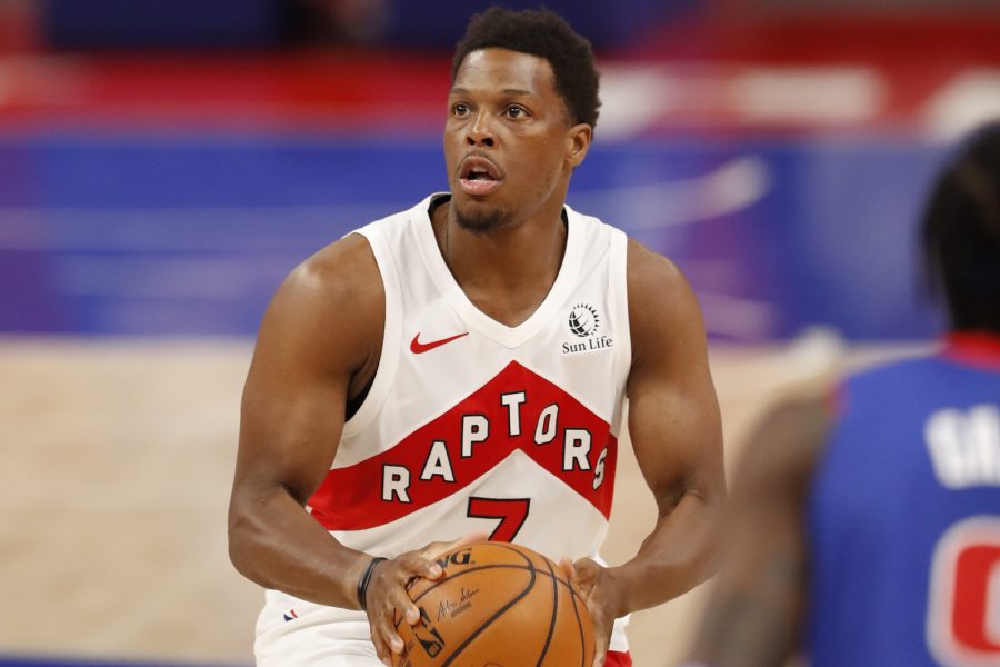
18 hours ago, flyersfan said:
In the greater Philadelphia area, probably over half the jerseys I see have the Stubhub logo. even if it's not the base retail model, they're everywhere.
I think those must be counterfeit. I got gifted a Raptors jersey from my dad that he got from a random site online that is clearly a fake (at least clearly to me). It has a Sun Life patch on it, which my dad thought made it seem authentic.
-
1 hour ago, flyersfan said:
To be fair, they are the LA Lakers, and their team has LeBron James (who is also switching to a new number this year).
Lots of jersey sales coming, and each one comes with a forever advertisement patch. I'm not surprised to see a number this high, I think Man U's Chevy deal was $130 mil a year, but I could be wrong as this number is just off the top of my head
Pretty sure there aren't ad patches on any retail jerseys.
-
On 8/7/2021 at 9:52 PM, ManillaToad said:
This is the sloppiest looking pro uniform I've ever seen. I would have guessed this photo was taken during practice
The Argos should've thrown the boat logo on these helmets and left the rest untouched.
-
12
-
-
18 hours ago, mcj882000 said:
I guess mine's the unpopular opinion but I think they look worse now. The jersey itself needs more blue on it, not the numbers! Now IMO the numbers look as out of place as the pants did last season.
I'm sure it will look better when we see the full set. It's like the Montreal away jerseys. They're mostly red & white, but the blue numbers make the blue pants look less out of place.
-
3
-
-
With the Kyle Lowry era officially done in Toronto, we only got one season of Kyle in this set, and he never even wore it in his home arena.
-
6
-
-
3 hours ago, CreamSoda said:
Colorado is switching to blue numbers on the aways. And changing the name to burgundy. Finally ditched the unnecessary black on the uniform!
I wouldn't have minded if they kept the silver outline on the numbers instead of burgundy, but this should improve the road set a lot.
I wonder if they'll also update the home numbers to be outlined in blue (matching the sleeve numbers on the road).
-
4
-
-
20 hours ago, ldconcepts said:Quote
New branding will debut with a "soft launch" in September, with a complete rebranding scheduled for October. Some of the rebranding will include a redefined color palette and modern twists on classic logos and wordmarks.
While the Coyotes' draft hat makes me doubt that anything but a black and white Kachina set will be worn in the fall, I like the sound of this.
I'd be surprised if they don't just bring back a white Kachina to go with the black, but the marketing blurb scares me a bit. It sounds like the thinking the Rams were using when they ignored the calls from fans to just bring back the throwback look and tried way too hard to make it "modern".
-
1
-
-
1 hour ago, habsfan1 said:
It's a bit underwhelming though that the team designers didn't try to come up with something new for the kachina, something better than the concepts that didn't work.
The Canes re-did the warning flags. Something along those lines.
At this point it is pretty standard for teams to not make too many changes when bringing back an old look, as that would kind of defeat the purpose of returning to a design the fans wanted back. The Flames, Penguins, & Islanders made no changes, and the Sabres, Sens, & Avs made subtle tweaks that aren't really noticeable to people outside these boards.
-
4
-
-
On 7/24/2021 at 11:43 PM, GDAWG said:
This will likely be the NHL on ESPN Studio crew:
Which likely means we'll see Kevin Weeks and Jeff Gorton on Sportscenter every week during the NHL season.
Bucci did a great job, but the rest of them felt like a B team. Hopefully they can include Ray Ferraro in as much content as possible.
-
12 hours ago, habsfan1 said:
Their minor league affiliate did the kachina better. The new pattern is more attractive and up-to-date, in a way.
Arizona should have used their template, change the colors up a bit, and make this the new Coyote jersey with a matching road. I get that borrowing templates is usually the other way around. But at least they'd have better jerseys.
I'm sorry but that looks like a cheap knockoff of the Kachina jersey. The sleeves/hem & the shoulders have no cohesion and look like they were taken from two different jerseys. The round yoke clashes with the triangular pattern in the stripes.
Every time the Kachina jerseys come up on these boards people try to suggest ways to tweak or incorporate the howler branding into the design, but I have yet to see any suggestions or concepts that are actually an improvement over the real thing.
-
7
-
-
11 hours ago, habsfan1 said:
It looks absolutely magnifiscent! I remember they put the 3 stripes on the pants because the waist was removed, the next jersey after that was a horrendously bad template.
Maybe they wanted something more desert-themed. A disconnect occured when they wanted something other than ultra traditional, single-colored hockey stripes. I would have prefered a mix of both, best of both worlds blending organically into one if that's possible.
The logo isn't traditional enough to match the jersey design, which makes it look a little beer league-y, I think adding some black into the jersey made the logo fit a bit more.
-
2 hours ago, Ricky_Roby said:
Yeah, even the graphics from the official NHL social feeds have the kachina coyote for Arizona. This is the worst-kept secret in NHL branding right now, I'd expect something official from Arizona soon.
Hopefully they keep the howling head as an alternate, as rumoured, so the fans who do enjoy that one will still get to see it as part of the overall brand - and it does look nice as a third jersey.
https://twitter.com/NHL/status/1418027447325532162/photo/1The red howler jersey had already been demoted to third jersey status last season, and they only ended up wearing it for 2 games, both on the road. I think it's safe to say they're done with it.
The logo isn't terrible, but it just feels like a generic EA Sports create-a-team design that could be used for any team named the Coyotes. The Kachina has the right amount of Southwestern flair, and the purple RR would be a much better third jersey.
-
6
-
-
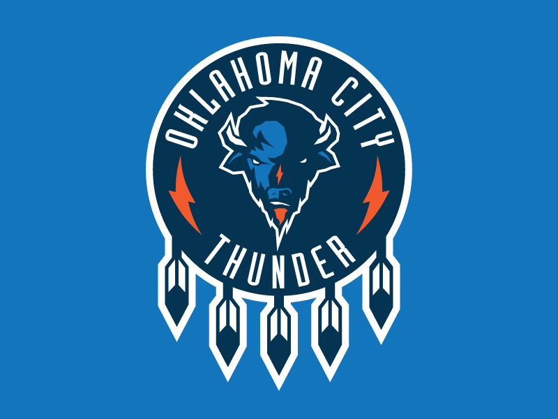
On 7/20/2021 at 2:29 PM, LA Fakers+ LA Snippers said:
Native American imagery is kinda a no-no these days, I doubt OKC would be able to get away with this.
On 7/20/2021 at 3:31 PM, dont care said:Remove the feathers and it works
It's based on the Oklahoma state flag.
-
5
-
-
4 hours ago, PaleVermilion81 said:
I'm explaining why I think this font works well for a football uniform by comparing it to other football uniform numbers that have flaws that this font does not have. From an aesthetic standpoint, I think this font is a perfect fit for an NFL uniform.
Just because "it's a perfect fit for an NFL uniform" doesn't mean it's a perfect fit for a Rams uniform. They played for nearly 50 years in LA before moving to St. Louis, and never used anything but a block font. Is this as gimmicky as the Bucs alarm clock numbers? No. Does that mean it was a good choice for the Rams to use? Also no.
-
2
-
-
On 7/17/2021 at 12:50 AM, Berlin Wall said:
The Thunder really just took the old Warriors lightning identity and threw some sky blue in it.
It's funny that only one of these teams has used lightning iconography in their brand, and it isn't the one named the Thunder.
I don't mind the colours, but I think they dropped the ball by not including any sort of bison logos in their set. This concept by Sean McCarthy is pretty much perfect, and wouldn't require a complete rebrand.
-
2
-
-
11 hours ago, QCS said:
I'd love to see the Stars acknowledge their true history and wear a Seals or Barons sweater.
Except technically the Seals/Barons franchise de-merged from the North Stars in 1991 and became the Sharks.
-
4
-

/arc-anglerfish-tgam-prod-tgam.s3.amazonaws.com/public/I6M3IQAWTNPHHJCOGFU6IIB6FM.jpg)


Unpopular Opinions
in Sports Logo General Discussion
Posted
Their aviator blue jersey was essentially a recolour of their '90s jersey, so a '90s themed RR would've been redundant.