


spartacat_12
-
Posts
2,660 -
Joined
-
Last visited
-
Days Won
4
Posts posted by spartacat_12
-
-
22 hours ago, henburg said:
Yeah, I'm not sure that I understand what's supposed to be weird about the Rams' number font aside from the shiny outline texture. It's one of the most legible typefaces in the league and is only slightly stylized. I think that was one of the things that they got right with the update.
6 hours ago, JayMac said:The number font is probably the least offensive part of the jersey.
It looks like they made the numbers out of fruit roll ups. Much like every other aspect of this rebrand, they were overthinking when it came to the font.

-
 10
10
-
-
"We are distancing ourselves from the Blackhawks brand," they said right before unveiling jerseys using the identical template they used before.
I get that the Chicago jerseys are some of the most beloved in pro sports, but some junior teams need to be a little more original. Niagara & Red Deer also use a similar design.
-
21 hours ago, bosrs1 said:
Contrasted with the Rams who should have just reverted back to their classic 80's-90's look, one that is heavily associated with both LA and their only Super Bowl win during the early St. Louis years... and instead they came out with the disjointed horns, plastic gradient numbers, brighter yellow, and the bone... This year's uniform starts to fix that, but really it's a no brainer what they need to do. They need look no further than their rivals to the north in Santa Clara to know what needs to be done.
The Rams clearly had different intentions than the Chargers. They definitely knew a large portion of their fanbase just wanted the throwbacks to come back, but they also knew that those hardcore fans wouldn't bail on the team just because they didn't like the uniforms.
It seems like they were targeting the lost generation of LA football fans who grew up without the same attachment to the old Rams look.
-
1
-
-
11 hours ago, philly97flyer said:
So from what I can gather, other than Seattle and special event uniforms, the only new jersey we’re getting next year is Arizona switching to white kachina on the road?
There have been rumours that the Canes will be unveiling a new home jersey.
-
1 hour ago, DG_ThenNowForever said:
I don't remember anything Ichiro ever said. He's also one of the greatest baseball players of the 2000s, both in talent and charisma.
Sure, but he never transcended the sport and became part of the zeitgeist the way guys like Bonds, Jeter, or A-rod did. That's the point Stephen A was trying to make, although he didn't do the greatest job presenting his argument.
Ohtani might be like Trout, in that he is content letting his play on the field speak for him, but that is going to be limiting any reach his brand could have beyond the baseball community.
-
17 hours ago, QCS said:
With the exception of the crest, this is the best jersey the Senators will ever wear.
15 hours ago, DTConcepts said:Not even. Throw the effectively unused alternate logo on there and it's one of the best jerseys in league history.
I have not heard anyone in the fanbase pushing for either of these things. Prior to the recent rebrand, most people were adamantly against the updated 2D logo, and the black laurel striped jerseys are probably the 2nd least popular ones that the team has ever worn (after the SENS alternate).
Vegas already uses metallic gold striping with a sublimated floral pattern. Leave it to them.
-
1 hour ago, -kj said:
Except that the best Sens jerseys to date were the laurel alts and the gold stripes were terrific.
-
35 minutes ago, jp1409 said:
Can anyone try an updated 2D Senators logo on these?
The Sens don't need gold stripes anywhere on the jersey. You don't see the Blackhawks using green, yellow, or orange outside of their logos.
-
42 minutes ago, Seadragon76 said:
Not yet. There is supposed to be a big unveiling today for this new logo.
This article explains everything going on with the Winterhawks.
They actually announced the logo a couple minutes before your post:
-
1
-
-
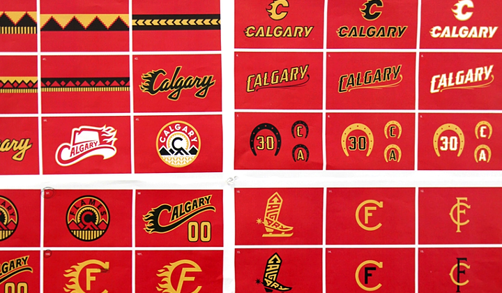
15 hours ago, Eastport76 said:
Speaking of Flames, I don't understand why kept their old primary homes by using as their alternates.
I'd rather them had a WHA Cowboys-inspired jersey than a outdated piping jersey.
Replace both the shoulder logos with flaming "C" and give a "Western" font for numbers, swap the white with cream.
And you now had a jersey which is a tribute to the Cowboys and the Stampede.
I liked the leaked prototype logo from a few years back that included the flaming cowboy hat. Maybe they could revisit something like that for a Cowboys-inspired fauxback/RR.
-
12
-
-
21 hours ago, CS85 said:
Yeah, nothing he said there was a clarification at all. It was just a quieter, mildly insulting double-down on baseball's audience and American sports fans in general.
His point seems pretty clear to me, and I'm not exactly sure why it has people so offended. It's difficult to get a sense of a player's personality when their media appearances are done through a translator.
No one is expecting a foreign-born player's English to be perfect, but I think people appreciate when an effort is made. Munenori Kawasaki quickly became a fan favourite in Toronto because of his enthusiasm with the media. This wouldn't have happened if he had a translator with him all the time.
What if the player in question wasn't a visible minority? Imagine what people around the NBA would be saying if Luka Doncic didn't speak English well and required a translator?
-
2 hours ago, WideRight said:
If you ask me, the Rams should not have shown us the new look alongside the inspiration.
Is there anyone who really believes the look on the right is better than the look on the left? It just reinforces how good the original was and how the new look is just not as tight. The pant stripes, socks, larger shoulder horns, no stupid name patch, it is all better. Sorry Rams, you tried, but just returning to the earlier look would have been a better option.
Change the colour of the helmet on the left to match the one on the right and you've got the perfect Rams uniform.
-
3
-
-
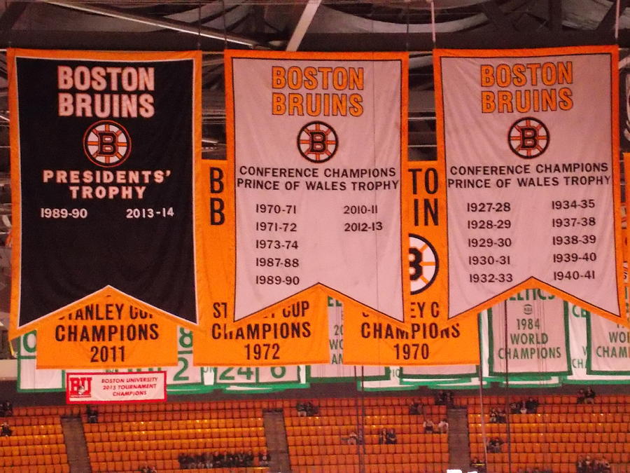
30 minutes ago, Brass said:
I looked quick and thought the Prince of Wales banners were the Division Championship ones, which I believe they have/did have. The President Trophy and Division Winner banners are dumb.
Well when the Campbell & Wales trophies were introduced they were originally awarded to the regular season division winners. It wasn't until the '80s that they began awarding it to the playoff conference champs.
-
10 hours ago, TheOatsMustFlow said:
Weird that the Canes use the striping from their previous away jersey instead of the current one.
Also, the Coyotes change has been known for a long time by anyone paying attention. They already presented their new head coach with a Kachina jersey at his introduction, and we've seen plenty of marketing material using the logo.
-
2
-
-
16 hours ago, oldschoolvikings said:
I guess as an outside observer I can see why you might wish that there was more contrast in these match-ups, but would you really expect either team to change based on what the other team is wearing?
Well here are some quick changes that would fix each example I provided: The Cardinals should completely remove black from their uniforms (although the Falcons recent changes removed some of the similarities). One of the Wolves or Mavs needs to bring green back into the fold. Minny seemed like they were going to, but for some reason only use it on one uniform. The Lightning & Canes need to incorporate more black & silver into their sets, which would make a huge difference.
16 hours ago, AFirestormToPurify said:I don't. They're the same knee jerk reactions without any explanations as to why they're "fire" or "garbage", except on here the people are just being negative and whiny
Just because you don't agree with people, it doesn't mean they are being whiny. The majority of people on these boards are able to provide intelligent arguments to back up their opinions, and aren't just suckers for anything shiny & new that teams throw against the wall.
6 minutes ago, Crabcake said:Make a home uniform based on that, drop the gradient, and you’re good. It’s not hard, Rams.
It is literally a white version of the current home uniform, minus the gradient numbers.
At this point they need to ditch the bone jerseys, along with every pair of pants that isn't yellow.
-
9
-
-
22 minutes ago, _DietDrPepper_ said:
I mean, the obvious logos and wordmark differences show otherwise. Maybe with the Lightning and Maple Leafs I could see it, but again the giant chest logos are pretty dead give aways.
Well when you're in the stands or put the game on TV mid-broadcast you usually don't get a close look at the logos right away. The colours & striping are typically the first indication you get of who's playing. Obviously none of those looks are identical, but they're close enough that it is confusing to a casual observer.
-
3
-
-
10 minutes ago, _DietDrPepper_ said:
What’s wrong with these matchups?
They look like intra-squad scrimmages. I thought that point was obvious.
-
16
-
-
On 7/9/2021 at 5:17 PM, Brass said:
Damn, I hate those banners. They look incredibly stupid next to the Stanley Cup banners and the iconic retired number ones. Just silly to need to recognize those mediocre accomplishments.
Calling conference championships & Presidents Trophies mediocre accomplishments is a pretty bold statement considering the Bruins have 1 Stanley Cup in the last 50 years.
On 7/9/2021 at 6:03 PM, ManillaToad said:Breaking the tradition of only putting up banners for Cup wins seems like an admission that they've sucked for 30 years and are desperate
Well they can either commemorate the most successful campaign in nearly 3 decades, or they can maintain the delusion that they're the league's marquee franchise & that they're better than everyone else.
Other than a Carey Price number retirement, they could go another 20+ years without raising another banner.
-
On 7/10/2021 at 4:57 PM, oldschoolvikings said:
If I was in charge of what a particular team was wearing, my only concern would be making that team look as good as possible. What another team was wearing wouldn't enter into it.
That logic is fine if you are designing uniforms in a vacuum, but you're not. Yes you want the team to look good, but a major part of branding is standing out and offering something unique compared to your competitors. Your way of thinking is what has lead to matchups like these:
-
9
-
-
It will be interesting to see what Montreal decides to do. Currently the Bell Centre only has banners for Stanley Cups & retired numbers, but considering that this was their most successful run in nearly 30 years I'm sure they'll want to do something to acknowledge it. Unless I'm mistaken, every team that has lost in the finals since Montreal last did in '89 has a banner commemorating it
Maybe they take a page out of the Bruins books and add one banner highlighting every season when they were a Cup finalist but didn't win. The Bruins include the seasons they won, but this would be a bit redundant for the Habs.
-
18 hours ago, PlayGloria said:
God, I would love to see this for the blues:
-
12
-
-
20 hours ago, AFirestormToPurify said:
I dunno, sometimes I feel like this forum should rise above the typical takes you read in other places on the internet...Just tired of seeing knee jerk reactions like "bone is ugly" or "two helmets is bad"
I prefer the reactions on here to the inevitable "so clean", or
 responses that you see from the general public whenever a new uniform is unveiled.
You can complain all you want, but there's a reason teams like the Packers, Colts, Raiders, etc. uniforms have stood the test of time, meanwhile teams like the Bucs & Jags have immediately backpedaled to traditional looks the first chance they got.
-
5
-
-
22 hours ago, DNAsports said:
It can be done with pants on whim, so why not go ahead with a different helmet color?
Because it is completely unnecessary. Just because the NFL is going to allow secondary helmets doesn't mean every team HAS to come up with one.
If a team organically comes up with an idea for a uniform that would benefit from an alternate helmet, or has a throwback that requires one, that's fine.
Earlier in this thread you commented that the Bears don't need another helmet, so I'm not sure why you are insisting on Baltimore having one just for the sake of it. There was a ton of backlash from the fans when the gold pants were worn, so I think that is working more against your argument than for it. The Ravens have been around for 25 years, have been one of the league's most successful franchises over that period of time, and have basically kept the same brand. I don't think they have much to gain from another helmet.
-
11
-
-
On 7/2/2021 at 6:14 PM, DNAsports said:
More power to them, honestly. Some may look fine, some may look like :censored:.
You can’t bar a team from using a main color to its fullest capacity.
Nobody is saying there has to be some sort of rule in place banning the Ravens from using a purple helmet. I'm just saying that when it comes to branding, it's generally a good idea to try and stand out from your competitors.
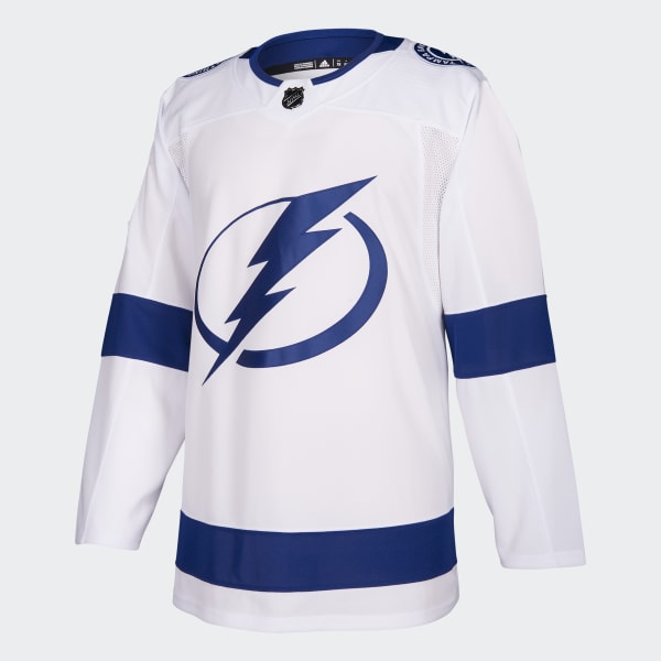
Blue has always been one of the Tampa Bay Lightning's colours, but that doesn't change the fact that switching to a blue & white set made them look like Leaf knock-offs.
-
2
-


/cdn.vox-cdn.com/uploads/chorus_image/image/56390055/usa_today_10241445.0.jpg)

/cdn.vox-cdn.com/uploads/chorus_image/image/68912730/1297249906.0.jpg)
/cdn.vox-cdn.com/uploads/chorus_image/image/63220190/1072887328.jpg.0.jpg)

2021-2022 NHL Jersey Changes
in Sports Logo News
Posted
Except technically the Seals/Barons franchise de-merged from the North Stars in 1991 and became the Sharks.