


Survival79
-
Posts
2,757 -
Joined
-
Last visited
-
Days Won
1
Posts posted by Survival79
-
-
3 hours ago, Zachary15 said:

I can't believe that the standardized captaincy patch has persisted since 2007.
-
 1
1
-
-
1 hour ago, Dante_X said:
-
5 hours ago, BC985 said:
Missed opportunity by Nike to create a faux flannel jersey.
Under Armour goes back to the future
-
 4
4
-
 2
2
-
-
9 hours ago, aawagner011 said:
Rays - no differences besides relocating the trim within the cuff. The trim looks too thick, compared to the headspoon.
So :censored:ing sloppy. It looks like a cheap knockoff.
But on the bright side, at least the eeve patches are heat applied.
9 hours ago, aawagner011 said:Braves - sleeve trim is moved to the cuff, whereas before it was offset with white visible beneath the trim like the O’s. This is one of the most disappointing changes to me, because the Braves have worn that sleeve trim dating back to the Boston days.
I'm not a Braves fan (although I am a huge fan of their ad patch—hands down the greatest in the history of sports), but that is an abomination.
-
1
-
-
7 minutes ago, spartacat_12 said:
Just look at the responses to this Luongo tweet
-
 2
2
-
1
-
 1
1
-
-
-
2 minutes ago, oldschoolvikings said:
I know I shouldn't even ask, but what the hell is an 5280?
5280 is the number of feet in a mile.
-
2
-
-
That collar. They can't be serious.
-
7
-
-
3 hours ago, CaliforniaGlowin said:
I just listened to this. The way he worded it, there's going to be a "tribute" to the H-Town blue on the "tough" looking uniform. So maybe they're keeping the red and navy but also having a black and light blue alt?

This is not the greatest uniform in the world, no
This is just a tribute
Couldn't get the rights to the greatest uniform in the world, no
No, this is a tribute, oh
To the greatest uniform in the world, alright
It was the greatest uniform in the world, alright
Yeah, it was the best mother:censored:ing uniform
The greatest uniform in the world
-
3
-
4
-
-
19 minutes ago, Ark said:
I want reverse pinstripes
-
1
-
3
-
-
2 hours ago, BBTV said:
I assume he's referring to how the MLB logo is now under the placket stitching, forcing the NOB (and number) to be lower by a couple of inches.
Correct.
-
 1
1
-
-
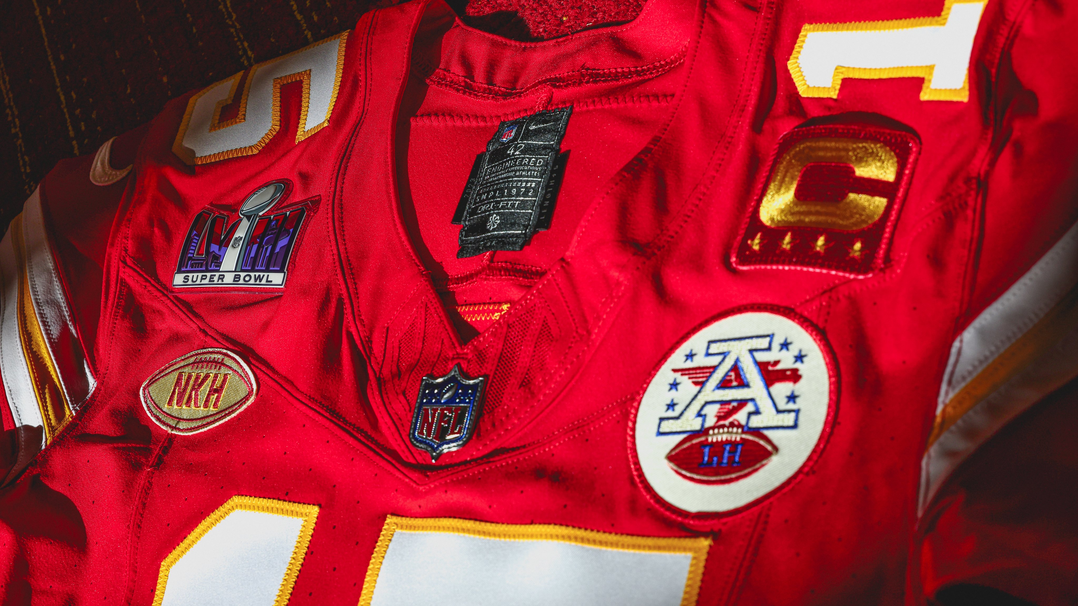
20 hours ago, Survival79 said:
That placket piping... YIKES.
That NOB... YIKES.
-
20 minutes ago, coco1997 said:
That placket piping... YIKES.
-
2
-
-
On 11/29/2023 at 10:26 PM, dont care said:
They still do hand paint them
-
3
-
1
-
-
On 11/17/2023 at 7:29 PM, FiddySicks said:
One thing I just noticed. That’s the old D Snake logo. Not sure I like that part of it, as the updated one from 07 is better imo.
The shadow puppet was the right choice.
-
1
-
1
-
-
Tampa Bay Rays pitches new stadium plans to St. Pete City Council
QuoteOne other new detail coming from Thursday's meeting: under the deal, the Rays would be required to don "St. Petersburg Rays" jerseys for at least one game in the new stadium, pending MLB approval.
-
5
-
-
5 hours ago, Cujo said:
Q: Do we know if the Dolphins changes shades of aqua between 93 and 94?
According to TruColor, they did not.
Also, the three shades of aqua that the Dolphins have worn throughout the years.
-
4
-
-
-
1
-
1
-
 4
4
-
-
San Diego FC logo revealed; team to start play in MLS in 2025
QuoteThe club’s official colors were labeled in the explainer as “chrome and azul,” while the crest is said to center around four “principal virtues” that define San Diego: “Gratitude, proud, not loud, diversity and a state of flow.”
That flow motif is evident in the central portion of the crest, which the club points out consists of “18 lines representing the 18 communities of San Diego County.”
“The flow,” the club says, “symbolizes how we perform at a peak level while embracing San Diego’s unique rhythm of life.”
The curvature of the “San Diego” at the top of the crest is said to be a nod to the the arches woven into the city’s architecture. -
-
On 9/13/2023 at 7:44 PM, 29texan said:
What took so long...?
This is interesting...
"The Athletic Frog and the arched TCU logo can only appear together on football helmets."
-
13 hours ago, Sec19Row53 said:
Is it? It's not the old flat green.
I think it's their regular helmet with different logo and mask, not a completely different shell.
This is correct according to their logo slick.
-
2
-
-
New end zones for FSU (old on top, new on bottom).
The tribal pattern was also added to the sidelines from the end zones to the 20-yard lines.
-
2
-
-
1 hour ago, BandaBassotti said:
for whatever reason I can't find any logo slicks if I google them, it may be cause I'm currently in the EU? Can you post a link to all the slicks please ?
Edit: the only slicks google finds here are on usteamcolors.com , but they're all dated, I'd say 2015-ish
The current logo slicks are not publicly available. Access to them is restricted.
-
1
-


2023 - 2024 NBA changes
in Sports Logo News
Posted
California Clippers