


Bmac
-
Posts
4,306 -
Joined
-
Last visited
Posts posted by Bmac
-
-
One thing I've never really gotten a good sense of - is Oakland even a good MLB market to begin with?
I don't doubt that the Bay Area in general is capable of hosting two teams, but I get the vibe that Oakland is kind of just an extension of San Francisco in a way. I didn't pay too much attention when I was there, but going from SF to Oakland seemed like going to a suburb of SF. That's not to say Oakland isn't it's own city, but it felt more like how the Rays play in St Pete as opposed to Tampa proper because that's where the stadium is.
There seems to be a good deal of civic pride in Oakland (or at least territorial pride of some sort), but is the city of Oakland itself a worthy MLB market? Is it distinct from the rest of the Bay Area? If the Athletics had been in San Jose all this time would that satisfy the Bay Area market? And if the team leaves the Bay Area completely, will the market feel the need for another team? I don't ask these questions so much out of reality (I know they're not moving to SJ), but more out of curiosity about the market. Like, has it been worth trying to keep the team there this long in the first place?
-
On 2/16/2021 at 11:13 AM, charliehustle said:
The B kinda looks like its on a sled.
I think its supposed the cow catcher on the front of a engine?
I see it as a section of track, seen from the side view. Kind of an odd way to render it in my opinion.
-
The Edmonton Oilers identity is bad. It's so painfully stuck in the past. At least the current color combo is sharp and interesting, and the orange jersey is bold and fun. But the rest is garbage. The identity was born out of an era in which hockey uniforms were just random stripes and blocks of color. The trend of colored shoulders was overdone, and the striping patterns were way off when it came to sizing and color balance. Hell, they didn't even leave room for sleeve numbers at first (the Oilers originally used shoulder numbers was a member of the WHA). And don't even get me started on the outdated groovy logo...

The Oilers jerseys from the 80's look like they're counterfeit. I know that's more about the production style and quality of hockey uniforms at that time, but that's kind of my point. The whole era looked awful, and the Oilers are the poster child for the awfulness.
It's too bad they were so damn successful during that era...
-
 3
3
-
-
Not sure if the is the best place to post this, but I'm out of ideas...
What happened to the pinned thread of logo/uniform unveilings throughout the years? Did it get lost when the forum split of the sports logos news section took place? I can't seem to find it anywhere and thought it was of great value.
(I tried searching for it, but was unable to locate the thread.)
-
17 hours ago, _RH_ said:
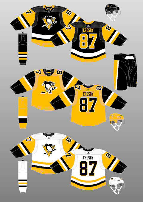
Out of curiosity, is it unpopular to really dislike the current Penguins unis?
The striping patterns are just so disjointed every game I end up thinking this is probably one of my least favorite sets in the league. The colors and logo are great (even though I personally loved the gold), but the other templates they have used would be vastly superior:
I completely agree with you. I was disappointed when the throwback jersey was being elevated to full time because it meant they'd never fix the random striping design. I'm glad they ditched the Vegas gold that ended up becoming beige, but the actual design of the jerseys is bad. It's always struck me as a holdover from the era when hockey teams seemed to have just randomly picked a bunch of stripes without rhyme or reason. They had a perfect opportunity to update the design. Start with the yellow sleeve caps and then come up with a consistent striping pattern.
-
I miss stadiums without giant video boards. They take away from the experience of being present at the event. So many people end up watching the game on the big screen rather than the action on the field below. To me this is all about the concept of being in the present moment, rather than a distaste of technology. I understand that people want the best view or whatever, but I like the idea of just being present in the moment.
I miss the days when simply being at a game was the whole experience. Now we have a giant screen to distract us momentarily from the little screens in our hands, all while the action is taking place right in front of us. I know it's way too late to ever return to such a time, but I wish we could just appreciate experiencing a live game without giant video boards.
-
4
-
-
-
On 1/16/2020 at 5:54 PM, DiePerske said:
I think there's room for both. I LOVE the cartoon bird, and think it should be full time cap/social media logo. That said? I like realistic bird and like it on an alt cap and as the primary logo.
I once proposed the Orioles use the cartoon logo on the cap while wearing the realistic bird as a sleeve patch and I thought I was going to be killed. People hated the concept because they couldn't accept two different representations of the same thing. I still think it's a fantastic idea. It has that old-timey baseball aesthetic of using a very detailed logo as the sleeve patch and a different logo on the cap.
-
4
-
-
The split color word mark on the road jersey makes it seem like they literally couldn't decide if they wanted to be red or black. Red lettering carries over from the home, but could leave a black cap feeling out of place. The sock and undershirt pairings are also odd, but perhaps that'll be different on the field.
-
1
-
-
Todd Radom is handling the branding so we can forget the ridiculous Brandiose themes.
-
1
-
-
12 hours ago, Seadragon76 said:
I find that hard to believe that Omaha wants to separate from old rivals. What would they gain in the Summit? They would be the outlier in that league... yes, you would be able to go to cities that are as big as, if not bigger then, Omaha itself.
They've spent the last 7 years trying to rebrand the athletic department and become and established D1 school, the last thing they want is to be in a conference with opponents from pre-D1 days.
Omaha is looking at the Horizon or the Valley, but it's more likely the Horizon makes an offer of the two conferences.
-
On 12/18/2018 at 7:41 AM, Seadragon76 said:
That makes no sense to me... I would think that Omaha would be happy to see a fellow NCC alum in the same league.
As for Denver... Where the hell would they go? The Mountain West wouldn't want them, they're a little far off for the West Coast, and the WAC is one good move from implosion.
Omaha wants nothing to do with their pre-D1 days. Rumor has it they've been looking to join a more metropolitan conference and this move could set off a chain reaction.
Denver and Seattle are rumored to be headed to the WCC potentially.
-
On 12/16/2018 at 4:30 PM, Seadragon76 said:
Eh... that's not going to happen. All of those teams are pretty happy where they are... except for New Mexico State.
The WAC is under constant pressure of possible implosion at any time. Chicago State is a freaking mess, Kansas City isn't happy with what they wanted from the WAC, Seattle and Grand Canyon probably wouldn't mind finding greener pastures like Cal State Bakersfield did... and there are rumors that the WAC may be looking at another Division II school in Dixie State (Utah). The Trailblazers are set to possibly make that move here. This means the WAC would have only 7 counting members (this is, of course, before Bakersfield leaves for the Big West). New Mexico State wouldn't mind finding a new home if it all goes to hell.
Another D-II school that might be set for a move is Augustana (SD). The Vikings would be a perfect fit for the Summit League alongside a good chunk of their old North Central Conference rivals (The Dakota schools and Omaha)
It's been rumored that if Augustana joins, Omaha and Denver are leaving the Summit. Omaha to Horizon, Denver to a western based conference.
-
During the Islanders' return to Nassau Coliseum the other day the broadcasters said the banners were replacements for the originals, which had been moved to Barclays and will be moved to Belmont eventually. So they have an entire second set of banners (it's like 30 banners at least) for their second arena.
-
I didn't really mind the Baby Cakes or Yard Goats or Jumbo Shrimp. But this latest batch is horrible. They're just putting random words together now. It has become a contest to see who can come up with the most ridiculous name.
-
Navy and orange is the better color scheme for the Edmonton Oilers, not royal blue and orange.
Oilers - navy and orange
Islanders - royal blue and orange
-
29 minutes ago, hjwii said:
Riddle me this:
Are more and more minor league jerseys using sublimated graphics as opposed to traditional tackle twill/stitches/sewn on letters and patches?
Or is it an illusion due to using lighter weight materials and lighting?
Many, if not most, use sublimated graphics now. It was a big push from some of the uniform suppliers, namely Wilson, in recent years.
-
1
-
-
Not that this has any chance of happening, but would a second team in Boston or Philadelphia ever survive?
-
Minnesota announces affiliation with the Rapid City Rush.
-
I just want pinstripes to return. I don't hate the new primary jersey but the Twins need to be wearing pinstripes at home.
-
1
-
-
A deleted tweet from the Quad City Mallards says they'll be the affiliate of Vegas this season.
So Vegas > Chicago (Wolves) > Quad City
-
On 4/26/2017 at 9:35 PM, BigZuDaddy said:
According to WTMJ, UW-Milwaukee has started preliminary discussions about a possible move to the Missouri Valley Conference. Article also says that MVC has met with Murray State and has strong interest in adding Valparaiso.
http://www.wtmj.com/sports/college/report-uwm-could-move-to-missouri-valley-conference
MVC has also visited Omaha, who may jump to the Horizon League if not offered a spot in the MVC.
-
My unpopular opinion? I love high top baseball cleats.

But, I will only accept the long socks look. I'm in the camp that feels baseball socks should always be visible.
-
7 hours ago, Bmac said:
mod edit
@Ice_Cap the image is posted wasn't exactly a concept, just FYI. It was an unused proposed uniform set made by a designer working directly for the NHL. Can be found in the "Unused Logo and Uinforms" thread.
-
1
-


2021-22 NBA Changes
in Sports Logo News
Posted
Which jersey was that?