


WSU151
-
Posts
14,812 -
Joined
-
Last visited
-
Days Won
26
Posts posted by WSU151
-
-
11 hours ago, Shumway said:
Thankfully, I don't think it'll just be about soda this time
Lions wore blank light blue helmets from 1950-55. My guess is that will be the shell but not sure as what the logo will be, if any. (ALT HMT is blue…Lions trying to be clever)
edit: Metallic blue helmet, silver stripes, silver logo, and a metallic blue facemask is my guess. Essentially an inverse of the current helmet, to go with the gray jersey set.
-
 3
3
-
-
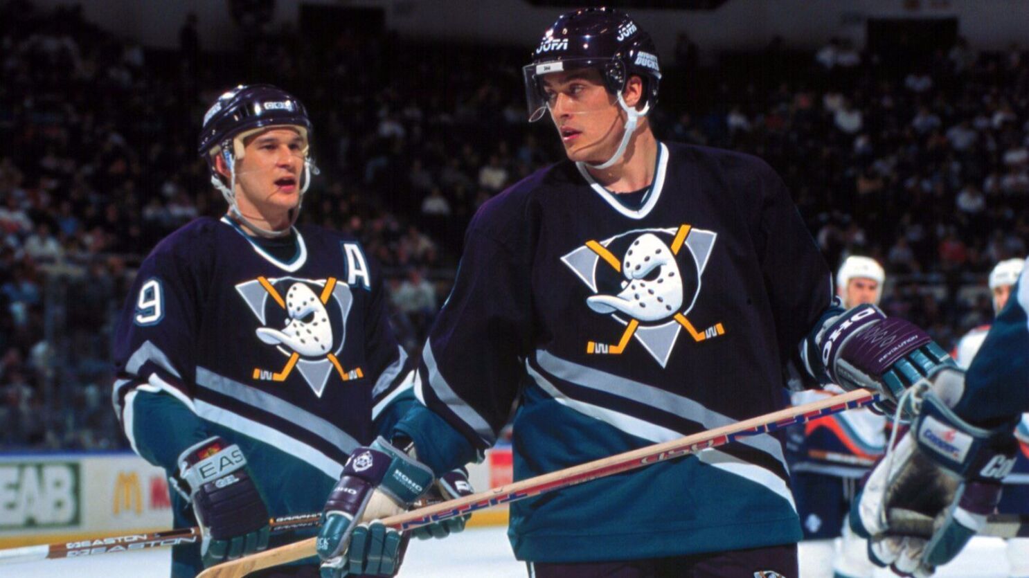
1 hour ago, dont care said:
The helmets were always eggplant
No, no they weren't. They had black helmets only in 1997-99, and also wore them with the jade alts. Apparently they only had black pants for those two years too, which looked okay for the alts but was a downgrade for the regular set. (The helmet and pants on Paul Kariya in the pic below are clearly black).

-
3
-
-
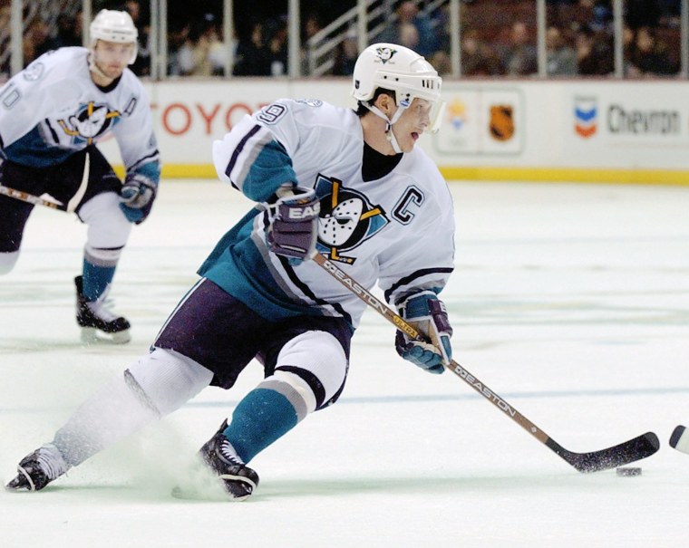
On 6/15/2023 at 4:58 PM, neo_prankster said:
This is the best that the Anaheim Ducks have ever looked.
Just because sports purists treated the Ducks worse than the Harlem Globetrotters all because of the Disney connections early on was a silly reason for Henry Samueli or Brian Burke to get rid of the original look IMHO.
The set with shoulder patches was an upgrade from the original, and the dark jerseys looked better with eggplant helmets rather than black.
-
3
-
-
8 hours ago, VampyrRabbit said:
They'll keep the A's name, colours and most of the branding that isn't Oakland specific, not just because of brand equity, but because Fisher and Kaval are too cheap to change anything.
Oakland has been trying to get a stadium deal done, the major sticking point is that Fisher and Kaval want the city to pay for it and Oakland hasn't got the money to do it. Not that the A's owners wanted to stay in Oakland - if they did, they wouldn't have been sandbagging for the last two seasons in order to kill the fanbase in the city.
This just isn’t accurate. No proposal so far has the City of Oakland paying for the stadium, only the infrastructure. The A’s would have privately financed the stadium and business/residential areas (everything privately financed would have been about $12bn). Oakland found infrastructure money through BIL and state grants (to the tune of ~$375M, which will be spent by city no matter if there’s a stadium or not). Schnitzer Steeel’s hazardous waste and numerous special interest groups blocked most progress into getting a deal done.
Anyway, I see the A’s changing to a Vegas gold once they move but keeping most everything else the same.
-
19 minutes ago, TBGKon said:
Oh crap, this might be a real possibility. I have never seen those prototypes before, but it definitely checks out with Lavonte David's comments.
Lol they’re not gonna wear prototypes.
-
2
-
-
29 minutes ago, _RH_ said:
Will Vegas' gold jerseys be the ugliest to ever hoist the cup? Off the top of my head, yes!
Anaheim's tiny wordmark crest sweaters in 2007 are far worse than the Knights.
Pittsburgh's black and khaki paint-by-number color block set is a close second.
-
15
-
-
14 minutes ago, Brave-Bird 08 said:
Also, the shoulder loop going all the way around on the old template was 10x better than the way it is on the jersey Chark is wearing
I think it looks better as a USC/Texans style stripe than as a full loop. It's got more of a clawed feel to it.
-
4
-
-
1 hour ago, tBBP said:
For what I have to say about it, their entire identity, save for the typeface of their *primary* uniforms, is about as forgettable as it gets. That said, those 2023 city sets are probably a decent base to build from—or would be if either the Nuggets organization or the NBA/Nike cared anything about building/preserving brand equity.
Anyway, I've never really paid much mind to the City sets to know what was going on with them, so I went back and looked again at their "story" and, well...
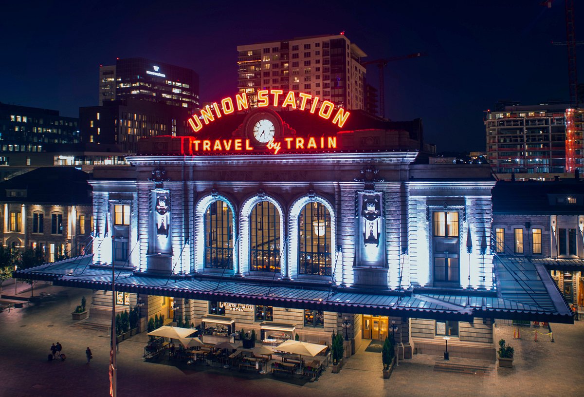
The Denver Nuggets 22-23 City Edition uniform is inspired by our hometown of Denver which continues to evolve and change: a city proud of its past but always driving forward. This uniform derives its design from the city’s iconic architecture including Union Station. The Nuggets will dedicate this season’s City Edition uniform to recognize civic organizations that contribute to making our city an even better place to call home.
Elements of Union Station are embodied in this season’s City Edition uniform. “Denver” displayed on the chest, represents the iconic “Union Station” font and arc. The uniform color of pure platinum and unique burgundy side trim on the jersey and shorts is inspired by the color and design of Union Station’s stonework. Lastly, the strings of lights that adorn many restaurants and streets in our fair city are reflected in the burgundy trim that includes gold dots on the collar and arm trim of the jersey.
This season, every time the Nuggets wear their 2022-23 City Edition uniform, Kroenke Sports Charities Signature Community Partners will be honored. Each of these organizations works to provide Colorado citizens with opportunities to use sports as a platform to enhance education, recreation, inclusion, and fitness. Please see below the Nuggets 2022-23 City Edition schedule and community partners to who we will pay tribute.
First of all, teams/organizations throw the word "iconic" around WAY too much. I've been to Denver's Union Station several times and I don't think even Denverites think of that signage as "iconic". That said, regarding the actual inspiration, let's let the pictorial comparison do the talking here:
I'd say that's a pretty great match...specifically in how the gradient effect of the side panels mimics both the color and the lighting effects on the brick facades of Union Station as pictured above.
Now, I want someone to explain that random black swatch off-centered to the right on that waistband...and that little random "NUGGETS" wordmark on the side panels is completely unnecessary (and yet a recent hallmark of Nike "modern" design language—reference the same type of thing on the new Cardinals uniforms). That to the side, it seems as if this set's design inspiration was based around and extrapolated from the railroad station itself/railroads in general...which I can actually get with considering the history of gold mining (or any kind of mining for that matter) involving rail cars. I like the overall idea, and if they were to base a new *primary* set on this idea, with the current *primary* font and a navy/dark blue base with the same burgundy trim—which by the way would sync nicely with the Avalanche, by the way—I think the Nuggets might be close to establishing a present-day (ahem *cough*) "iconic" and at any rate distinguishing look of their own.
The black swatch off-centered is the inside of the waistband...it's been a thing the last five years or so in NBA and college where players fold over the waistband. Normally, the strings are on the inside of the shorts, not the outside. The size tag on the back side is also folded over and on the outside when it should be hidden from view.
I never made the connection of the Nuggets' City unis to Union Station...but with your post, I think they're far better than I thought (and I really liked them). I waited to buy one in April and May and missed out.
-
3
-
-
7 hours ago, HOOVER said:
RE: THROWBACKSTo avoid games that will feature a clash of modern vs throwback uniforms, the NFL should’ve mandated a throwback look league-wide so that each team had an option to wear in these games.
For this matchup in particular, you’re going to have a 70’s-80’s look up against a current look, and it’ll be wonky; if the Lions were to wear a Throwback uniform, even if the periods didn’t exactly match, they’d at least have two old looks in the matchup, rather than a new vs old.
Imagine the Commanders facing off against the Bucs in this game, or the current Jets, Seahawks or Titans. Now, imagine throwbacks for each of those 3 teams vs the Creamsicles.
I believe the NFL used to do this, and they were full-on “Throwback Games”. I wish they’d bring that back.
The Lions’ current unis aren’t super modern. If they wear silver pants it’ll look similar to the 70s and if they wear blue pants it’ll look similar to the 90s.
6 hours ago, HOOVER said:
No. That’s not what I’m advocating, because I’m specifically talking about Throwback alternates, not standard home & away uniforms. I’m not sure that wasn’t clear.When the Raiders wear their current jerseys against a team like the Jets or Seahawks, it’s mismatched eras, right?
With the Seahawks wearing throwbacks against the Browns, I’d rather have the Browns wear their current unis than wear the 1946 throwbacks with presumably a white helmet.
-
2
-
-
The league can definitely do a league-wide throwback - hell, that’s what 1994 (and 2009 for the AFL teams) was all about, and now in the 2020s it’d be silly if teams had fauxback shells. I wouldn’t save them for only Thursdays because throwbacks look great in the sun.
-
2
-
-
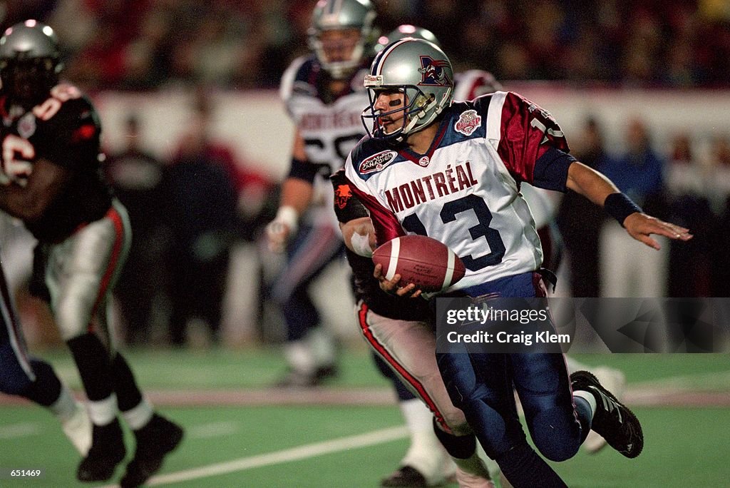
11 minutes ago, monkeypower said:
I don't think I see the Bills in those. Those jerseys to me always stuck out to me as the CFL's answer to the Patriots, but looking it up now, these Als jerseys and the Pats jerseys came out in the same year.
I would say the squared blue shoulders are closer to the Bills’ 2002 set than anything the Patriots wore. That silver/white/navy does bear a resemblance to the Pats but like you said, these debuted a few months prior.
-
2 hours ago, monkeypower said:
Here's the thing, and you're not the only person to kind of make this comment here, these Bills jerseys predate the CFL look by three years. Reebok didn't take over the CFL and do their thing until 2005. So if anything, the CFL redesign had some major Bills feeling to it.
2002
2005
I think it was just what Reebok was doing at the time. They did the Bills and then did the entire CFL a few years later.
This was the Als' jersey in 2000, which seems like what Buffalo was trying to emulate in 2002.
I think ESPN personalities were joking about how the Bilks looked like Montreal in preseason 2002…for some reason I remember Chris Berman saying something about the similarity.
-
4
-
-
3 hours ago, JustABallCoach said:
I think Texans will be announcing JJ Watt as a 1 day contract and ring of honor guy.
This is the best bet, not sure why they need a mysterious teaser for it
-
1 hour ago, DJT said:
is this supposed to be black on black for the jazz? Kinda looks like a weird blue for the font.
Yeah it’s black on black. Every draft hat has the wordmark in thread that matches the hat color. Other black hats (Heat, Blazers, Magic) have the same black outlines.
-
Though we saw a preview of the Kings' new script, it's not reflected in the draft hat (can't tell if this is a black hat or a dark gray hat...guessing black).
Surprisingly, the Lakers' hat will be yellow (they usually go with purple or black)
-
44 minutes ago, Chromatic said:
The Canucks released the logo for the 2023 Penticton Young Stars Classic (prospect game for the Western Canadian teams).
I think it's pretty good.
This seems to negate any rumors of the Canucks changing, right?
-
30 minutes ago, RoughRiders99 said:
I always love looking at MLB team logos, especially on this website.
But I was wondering if I could find the official team branding style guide (any team) anywhere so I can read through it? Or even just a one big chart of their logos and when certain logos can be used or not.
Like this for the Big 12 - http://ncdadodgeball.com/media/teams/resources/Big12StyleGuide.pdf
I think it used to be accessible on pressbox.mlb.com but now one needs to log in for that kind of info.
Leagues heavily restrict access to the style guides.
-
4 hours ago, sayahh said:
Miami looked like it wore its regular home jersey and not its white hot jersey (white letters) or am I getting the names confused?
Miami hasn’t had a white hot jersey since the adidas days, I don’t think.
Normal white and black jerseys, reds, the ransom notes and the HWCs are all they had this year.
-
3
-
-
51 minutes ago, infrared41 said:
Let me preface this by saying that I'm as much of a laissez-faire capitalist as you're going to find on these here boards. I have no issue with billionaires or corporations (or anyone else, for that matter) making as much money as they possibly can. That being said, I do not like ads on uniforms. Why? They're ugly. Simple as that. Point being, my criticism isn't based on "corporate greed" bull
 , it's based entirely on aesthetics. I'm willing to bet that I'm not the only one who sees it that way.
Sounds agreeable to me, sounds like that was the general sentiment in 2021. IMO, I don’t need constant reminders every time a tweet with a new jersey ad is posted that ads are ugly. I got it.
-
 1
1
-
 1
1
-
-
1 hour ago, Chromatic said:
Mate if anyone here needs therapy it’s you, you’re the only one going off the deep end about it.
Because it’s become really really really old. If played 3 Blind Mice on a recorder all the time for years you’d tell me to find another song. If I told you the same knock knock joke 50 times in a row you’d be hard pressed to laugh on the last one.
I look forward to reading news about new uni updates. I’ve been on here 18+ years. Seeing the same “I hate corporation” posts doesn’t add any value to the sports logos section. We all agree to an extent already so not sure as to the need to constantly push the point other than to fish for an argument. Oh well, I’ll learn to ignore it.
-
30 minutes ago, IceCap said:
We discuss sports aesthetics here. The idea that we're not going to discuss part of that because it annoys some people is baffling to me.
I had no idea complaining about third party corporate greed was sports aesthetics. Two different buckets in my view.
Oh well I’m definitely looking forward to the same bored people having the same complaints about corporations and billionaires while avoiding discussions about actual jersey aesthetics over and over again. I didn’t know this was a group therapy board.
-
1
-
-
34 minutes ago, IceCap said:
This is a board meant to discuss sports logo and uniform aesthetics. Uniform ads fall under that and are fair game. Don't like it? Don't like it? Sorry

Counterproposal: The design of ads are fair game, the changing of the sponsors are fair game…the endless bashing of the entities seems out of scope in terms of “uniform aesthetics” (especially when it’s just echo chamber discussion for the most part as we all would rather not have ads) and better suited for a another thread or category on the board. The sponsor logo, and the people on the BoG and in the C-Suite, are two different things.
Examples:
“That Rakuten logo on the Warriors jerseys is too big and looks awful, just like all the other ads this year” - perfect for Logos/Uniforms
”Rakuten is just another greedy business and billionaires are terrible and ruining the game and my life for introducing even more ads in the game.” - perfect for Sports in General/The Lounge
-
1
-
3
-
4
-
-
nm Ridley covered it.
I had no idea though that “I just want to talk uniform aesthetics” was code for “I want to bash corporations at every turn and pretend like I want to boycott the league”.
My bad guys.
-
2
-
-
Quote
The commissioner also said the Big 12 will announce a "brand refresh" next year that could include "different colors and applications," but the conference won't change its logo or name.


 , it's based entirely on aesthetics. I'm willing to bet that I'm not the only one who sees it that way.


NFL 2023 Changes
in Sports Logo News
Posted
The alternate helmet can’t be worn with regular home and road unis.