


WSU151
-
Posts
14,812 -
Joined
-
Last visited
-
Days Won
26
Posts posted by WSU151
-
-
1 hour ago, Bmac said:
The Sens could definitely pursue something closer to an old time hockey club aesthetic with hints of the current identity. According to Icethetics, this idea was at last explored:

Has anyone done a Peace Tower inside the O? Would it work?
-
 2
2
-
-
1 minute ago, solvetica said:
Nice job, Louisville. Hopefully Adidas gives them a very minimal uniform now to compliment this retro vibe. If only more college teams realized the value of matching fonts across all fronts - endzones, unis, field numbers, etc.... i.e. brand cohesion. I just don't understand how so many marketing departments at that level of play think a bunch of mismatched typefaces look acceptable in this day and age.
I’ve always liked cohesion between football and basketball (most of the time), but it’s cool when the baseball teams have something a bit different.
-
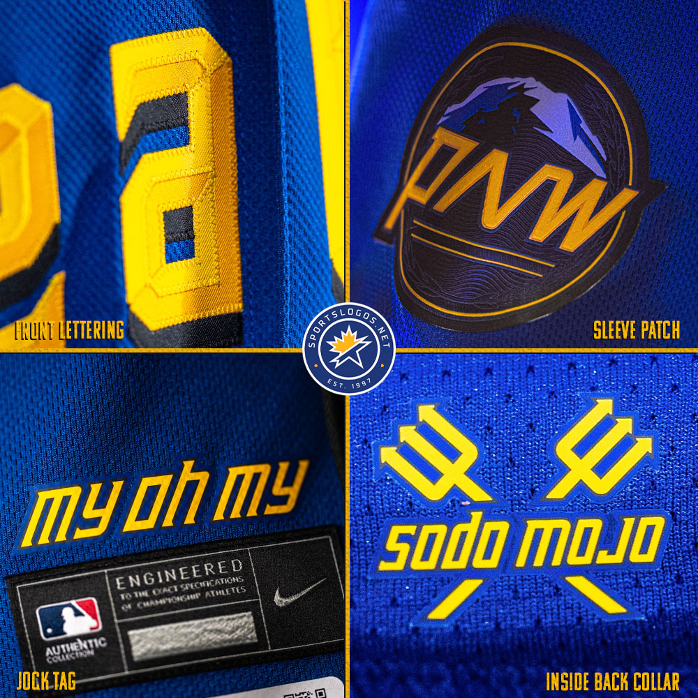
6 hours ago, adsarebad said:
The sleeve patch looks to be plastic/rubber like and not embroidered .... not something i would pay $475 for!
-
-
The sleeve patch looks stitched to me. You can see the directional changes of the thread
-
3
-
-
51 minutes ago, Ark said:
I hate how the helmet plume is turned into a circle/roundel element. It doesn’t look right.
Designed that way to form an O for Ottawa (as nash61 said above)
-
1 hour ago, Ridleylash said:
Eh, I think the black pants are fine. It dodges monocolor while keeping the pants dark so that they blend better into the overall uniform; and I really don't think yellow or white would have worked here, since those colors (especially white) aren't abundant enough to not come off kinda like the Avs' black equipment did after Adidas rid of the black stripes on their jerseys.
White pants work amazingly well for all alternate baseball unis. A lot of teams wear white pants with jerseys that have very little white in them (Mariners current alts come to mind)
The blue, yellow, and black remind me of San Jose State when they really went all in with BFBS in the early 2000s. No real similarity, but just the same vibe:
-
5
-
-
Amy Adams Strunk wearing an Oilers hat tonight lol
-
2
-
 1
1
-
-
ESPN is still using the pre-2022 Eagles wordmark…I still think it looks better than the new one.
ESPN’s 3D logos they’ve used for the last 5-10 years are still pretty awesome IMO lol
-
5
-
-
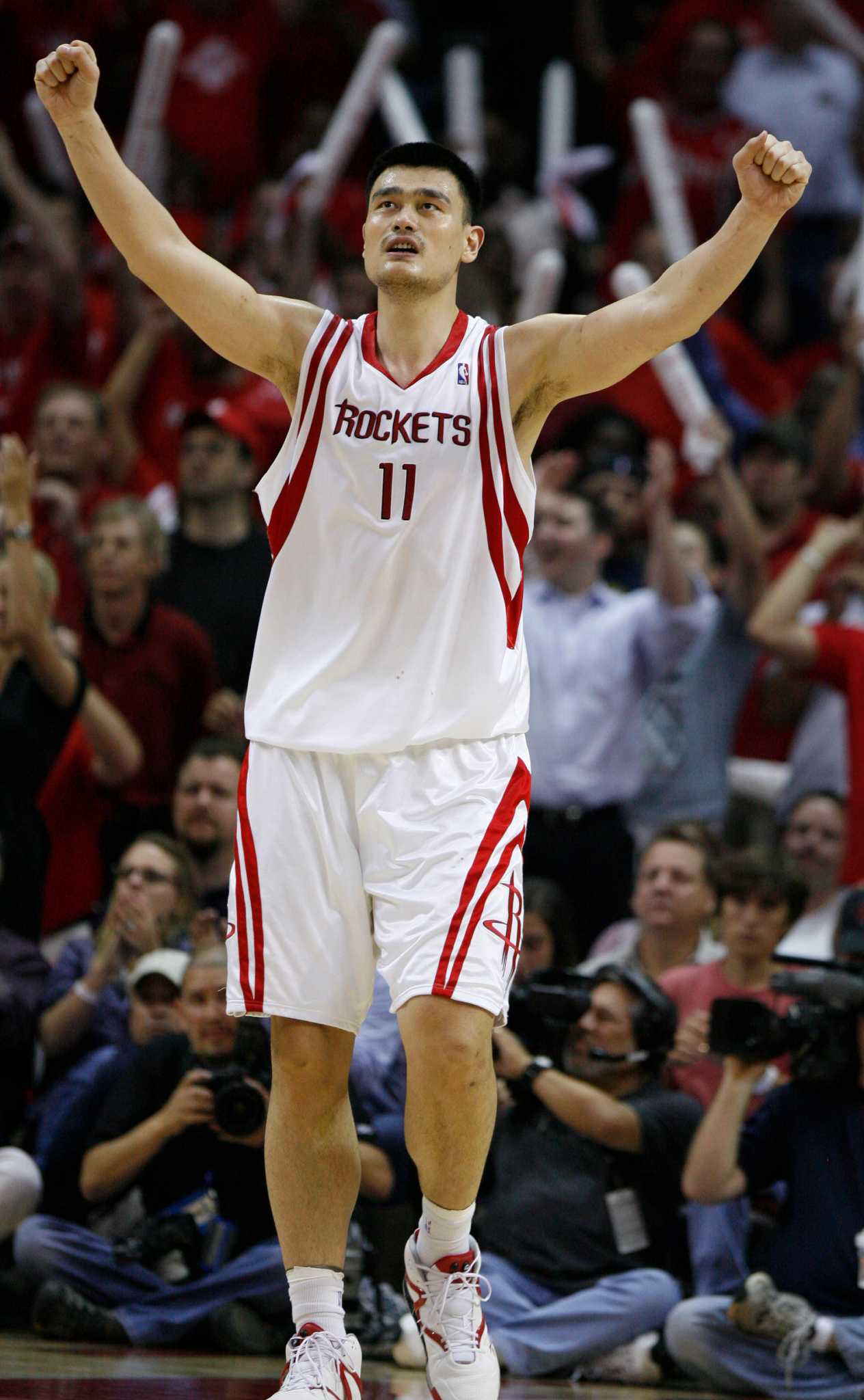
28 minutes ago, 8BW14 said:
I’ve always thought the Rockets should roll with red and white. No black, no silver/gray, just red and white. Probably an unpopular opinion but I think these:
without the black drop shadow and modern tailoring would be really sharp. I love the shorts.
Shorts would probably have worked with a jersey that didn’t have as much going on. Bigger wordmark was definitely needed.
-
2
-
-
8 hours ago, ltjets21 said:
Where did you see this? Not doubting you just curious
On a retail site that sells a lot of mini and full size hemets. Five new alternate helmets and two tribute helmets are available for pre-order. No images yet though, just “coming soon” place holder graphics. The alternates are for the Broncos (confirmed), Eagles (confirmed), Lions (confirmed), and Browns and Colts (confirmed by Andrew Lind).
The other helmets labeled “tribute” are the Bears’ striped helmet (current shell with throwback stripe decals) and the Dolphins throwback helmet (current shell with throwback decals).
Sounds like there will be more than seven new alternate/throwback/tribute helmets, as the “coming soon” selection doesn’t include Buccaneers, Seahawks, and Titans/Oilers, and maybe others.
-
3
-
-
54 minutes ago, SSmith48 said:
I don't know exactly how popular/unpopular this opinion is, but I would prefer the Broncos to stay away from royal/powder blue when getting new uniforms for a couple of reasons:
1- Our division rivals in the Chargers already own powder blue, so just bringing it back would make us too similar to them, even if it used in a minimal capacity. The connection will be made.
I would disagree with this…if the Broncos bring back royal and orange full time (and not just a throwback), they’ll probably use a true royal metallic or satin finish on the helmets. The Broncos helmets will never look similar to the Chargers nor will their jerseys.
The only reason the Broncos wore lighter blue helmets (which are quite darker than the current Chargers’ blue) in the 80s and 90s was due to equipment restrictions…they had a choice of lighter blue shells or navy shells (which the Rams and Giants and even the Chargers wore). Everything else in the Broncos’ identity was true royal.
The Chargers wore royal blue in the 80s for a bit and no one ever said “Are those the Seahawks?” Similarly, no one ever was pissed the Chargers and Broncos wore navy for 20+ years.
-
5
-
-
12 minutes ago, Brave-Bird 08 said:
I thought I read somewhere that the Eagles have permission to wear both the kelly green throwback helmets and their black alternate helmets in 2023
They don’t have permission yet. The two alternate helmet rule has not been voted on by the owners.
-
22 minutes ago, canzman said:
Have not heard anything specific on the Vikings but my sources have said the Jets will be going with white lids and for a Namath Era "tribute".
Is the black helmet retired then?
-
1 minute ago, oldschoolvikings said:
I guess?I’m not sure that if you’re not a uniform nut like all the members of this community, would your first reaction team announcements like this really be “hey, must be a new uniform coming!”?
Most fan’s’ thoughts probably don’t go straight to that assumption.
Most of the replies on Twitter went straight to a new uniform assumption.
-
1
-
-
1 minute ago, sisdog said:
What is this? What is the checkerboard? Is that supposed to be the Calvert part of the Maryland Flag? You cannot have Calvert without Crossland.
The Baltimore city flag is just the Calvert pattern.
-
6
-
 1
1
-
-
13 minutes ago, DCarp1231 said:
Rams teasing something for tomorrow. Most people in the comments believe it’s a new uniform
“We’re proud to announce Sweet Baby Ray’s will be the official barbecue sauce at SoFi”
The best reply in the comments is “Meth?” lol
Most are talking about blue and white unis…but the yellow smoke means something, right?
-
12
-
-
1 minute ago, Whitesox572 said:
I apologize if this has already been covered. Chalk this up to something completely annoying:
The White Sox, as of yet, do not have a sleeve sponsorship. For years on their road grey jerseys and their alternate black jerseys, the diamond-sock logo has been on the right sleeve of the jersey (as you're looking at it), or on the players' left sleeve. (Sidebar- about 12 years ago, they replaced the diamond sock on the road greys with the old English SOX logo).
So, just noticed that on the alternate blacks that they've moved the sleeve logo diamond sock to the left sleeve of the jersey (right sleeve for the player) if they bat right handed so that the other sleeve is more visible to the CF camera when they're batting. This is obviously setting the jerseys up for eventual sponsor logo.
For someone who's watched thousands of games, the change is glaring.
It’s the same for most every other team, with or without sponsor.
-
1
-
-
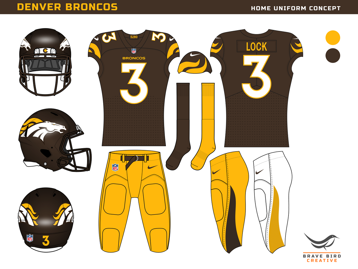
6 hours ago, Brave-Bird 08 said:
This is a nice design, but would look better in blue (or navy) and orange. Leave an awful era of Denver football behind (even 2009 was a huge bust) and let Cleveland remain the only brown jerseyed team in the league.
-
11 minutes ago, DCarp1231 said:
You had made a point of Denver needing a more unique color scheme within the league. Brown and Yellow just about does it.
An orange and royal blue combo is pretty unique in the NFL.
-
1
-
 1
1
-
-
On 4/9/2023 at 9:02 PM, Cujo said:
I'm just finding out about this.

Anyone know if any logos/merch were produced?
They made the choice with Hornets.
-
On 4/22/2023 at 9:56 AM, maz said:
The whole changing-names-when-relocating thing just got more interesting considering we are going to have a "Las Vegas Athletics" eventually. That's gonna sound really weird, but the Athletics have been around for over 120 years, wearing that name in three different cities. Do we keep that 120 years of history alive into city number four, or find a name to fit Vegas better? (I think "Athletics" is generic enough you can put that anywhere, personally)
I say Las Vegas Athletics should work.
La’s Vega’s? No?
-
1
-
-
1 hour ago, IceCap said:
Denver feels like our Cowboys. They have a fanbase that's annoyingly larger than their home base. They're always promoted as a top team in prime time. It seems like people won't shut up about them even when they suck (Teebow anyone?) and they're an older, more traditional team in a western locale.
This likely stems from overall competitiveness and success… I wouldn’t have guessed this but from 1977-2016 (40 seasons and doesn’t include a pretty good 9-5 ‘76 season), the Broncos had more regular season wins than any other team. They were 8-8 or better for around 80% of those seasons. Since then they’ve been awful but that’s another yarn lol
-
3
-
-
12 minutes ago, Cujo said:
Again, not a full uniform rehaul like we're talking about Denver doing. The Pats' helmet is unchanged. Colors remain the same. Flying elvis is still around. Lmk when they go back to their 1985 unis/logo full time. (Hint: they won't)
At the very least the Broncos should bring back the 80s orange unis as a permanent throwback. They’ll sell a billion of them (especially in that pesky 20-40 year old demo…blech what do they know) and allow the Broncos to keep the modern logo around for the regular set.
-
1
-
-
Just now, Cujo said:
Let's not pretend that had Denver won 3 Lombardis in the "D", that Bowlen wouldn't have told Nike to kick rocks.
Winning championships matters. That's why the cyberhorse is still here. That's why the ugly Raven head is still around. That's why the Steelers have kept one side of their helmet blank. That's why Dallas wears 39752 shades of blue and silver.
The Steelers changed their number font despite winning 4 SBs in the block.
The 49ers thought a dark cardinal was a great change after winning 4 SBs in the scarlet and gold.
The Cowboys changed blue jerseys three or four times since winning their first SB in the 70s.
-
6
-
-
10 minutes ago, Cujo said:
Had Dan Reeves won JUST ONE championship this would be a totally different conversation.
I'm not saying there isn't solid tradition behind the D, but there's an even larger tradition behind the cyberhorse. You don't throw away unis you win three titles in. There was a reason they switched things up in '97. If the D meant anything at the time, Bowlen would've kept it. He didn't.

Coincidentally, the change to navy was in the works before the Jacksonville game, as all the coaches' apparel in '96 was navy and they had the one-year-wonder wordmark. Nike was going to make a change because they were Nike and it was the 90s.
The Dolphins have changed uniforms multiple times despite winning multiple Super Bowls with the leaping dolphin. Hell even the 49ers made significant changes after winning 4 Super Bowls.
But based on free-agency and upgrades in talent, the Broncos would have won Super Bowls in 97 and 98 even if they hadn't changed unis.
-
7
-


2023-24 NHL Jersey Changes
in Sports Logo News
Posted
Why would the Sabres be wearing the Buffaslug and not the Goat?