


WSU151
-
Posts
14,812 -
Joined
-
Last visited
-
Days Won
26
Posts posted by WSU151
-
-
18 minutes ago, coco1997 said:
Hunter green and powder/sky blue is the way to go for the Rays.
I’d say a lighter green would work too.
The women’s Final Four in Tampa a few years ago had navy, light blue, soft lime green, and yellow and it was a pretty phenomenal palette.
-
1 hour ago, AndrewMLind said:
It is hidden in the release, but the Hornets are getting a new Classic Edition uniform next season. They previously wore a teal classic uniform in 2017-18, white classic uniform in 2018-19 and purple classic uniform in 2019-20.
So the four HWC teams next year are:
Utah
Charlotte
Orlando
Philadelphia
??
-
 4
4
-
-
10 minutes ago, CaliforniaGlowin said:
35th anniversary logo

This feels like "The Heat had a 35th logo...um...whoops...we should probably do one too...". Nice logo though.
-
1
-
-
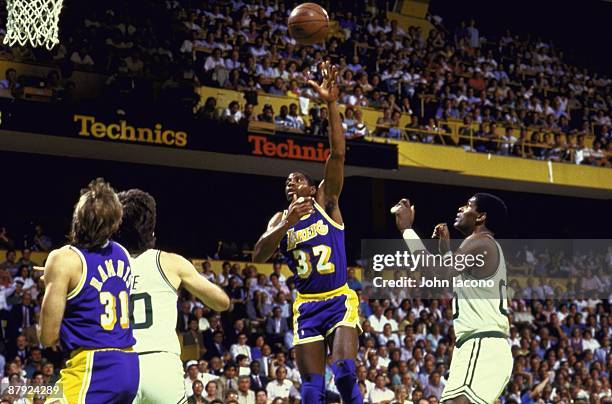
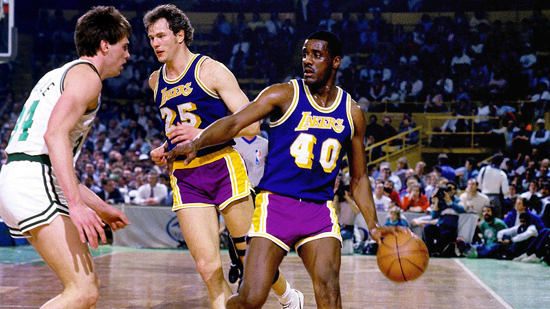
9 hours ago, sayahh said:
BTW I prefer these unis even if the jersey and the shorts had mismatched purple (Forum blue) colors.
Huh? The shades match in that picture of Magic.
edit: This photo from the 1980s looks like the team has consistent shades:
but older photos show two shades
-
On 5/10/2023 at 6:14 PM, TheBigFiz21 said:
As far as forced 3-letter team abbreviations go, we need to point the finger at WB Discovery. TNT started using NOP for the Pelicans, GSW for the Warriors with the 2015 graphics, and eventually NYK for the Knicks some years later on if I recall. Then, last season, TNT starts covering NHL games and continues the same mistakes with teams like the Golden Knights, Rangers, and Kings to name a few.
Thankfully, TBS doesn't do this with MLB as it's just team/cap logos to represent teams instead of abbreviations.
The Knicks themselves used “NYK” in the subway token logo which was introduced in 1995.
-
Lol
-
5
-
 10
10
-
-
1 hour ago, HOOVER said:
I’ll remember that the next time we get 3 pages of a random topic because of a tweet or Reddit post.You’re confusing tweets that mention likely changes (and are substantive) with bored reporters’ personal wishes, and for some reason you posted unsubstantiated opinion in the 2023 thread.
-
5
-
 1
1
-
-
1 minute ago, HOOVER said:
The reason the topic resurfaced. Not just a random threadjacking.Random sports reporters wondering if there will be a name change is nothing of significance.
-
6
-
 1
1
-
-
I don’t understand why this board gets off on the exact same topics every few months.
Last year’s discussion got so tired and unimaginative at the end, so
 it “let’s run it back because we’re bored as :censored:”
There’s no need to pretend like the team is actually looking to change the name, especially in the 2023 thread.
-
5
-
-
6 minutes ago, HOOVER said:
Natives. Originals. Americans.
All would have been better than Commanders.
Lol wut no
-
6
-
-
3 hours ago, fortunat1 said:
We've covered that HWC is keeping teams from adopting throwbacks full time, but can they shoot down any new designs for being too similar to throwbacks?
Part of me wonders if the new sunbursts are white/purple as to avoid looking too similar to throwbacks. Orange sunbursts seem like an obvious decision, but may spark pushback from HWC for looking too close to the throwbacks. This is all speculation though - it's entirely possible that a pro sports team could see a seemingly obvious decision for their uniforms and decide to ignore it.
Seems like proximity to the HWCs isn’t an issue…the Pistons’ 2002 unis were just a font change from the 80s/90s classic set. The Jazz brought back an old logo and used navy instead of purple.
-
5 minutes ago, HOOVER said:
RE: Commanders Rebrand
Washington Post writer lobbies Harris group to move on from Snyder legacy:
https://www.washingtonpost.com/sports/2023/05/04/washington-commanders-name-josh-harris/
Radio host agrees:
https://www.audacy.com/thefandc/sports/washington-commanders/danny-rouhiers-impassioned-plea-for-a-commanders-re-brand?utm_campaign=www.audacy.com%2Fthefandc&utm_content=1683333140&utm_medium=social&utm_source=twitter&utm_term=WJFK-FM
Will this gain momentum? Harris has the money and the NFL would get to sell all new merch again.
Personally, seems like a no-brainer to me, as long as they get it right.The NFL thought they got it right last year. The name’s not going anywhere IMO. Maybe the jerseys get updated.
-
8
-
 1
1
-
-
Is Edmonton’s center ice logo dark navy, or black? Certainly isn’t royal like the bluelines…
-
1 minute ago, Cujo said:
I guess, but still doesn't explain why he was prompted to give away the Jackets pick before the card was shown.
Director/producer probably mistakenly said something in his ear. It was just a bad timing issue. The cards that are unveiled aren’t stacked at random, and Weekes didn’t say anything inaccurate.
-
1
-
-
51 minutes ago, Cujo said:
Did anyone else catch that ESPN announced Columbus got the #3 pick before going to commercial, then came back from break and revealed them to have the #3 card?
I was always under the impression these lottery shows were live. And since now we know it's probably not live, why didn't ESPN go back and edit the error? Either way, that was a complete slap in the face to C-bus fans.
ESPN knows the order before it’s announced on live TV. It’s how Kevin Weekes has his historical notes lined up.
The “lottery” (and the NHL’s business decisions associated with it) is done well before they go on live TV. The TV show is just the results.
Chicago getting the first pick was definitely a Bettman decision. Generational talents in the Winter Classic era will always go to the bluebloods, and Bettman knows ESPN and TNT personalities will never question it.
-
2 minutes ago, TrueYankee26 said:
Blackhawks draft lottery winners.
Whoa I’m shocked I tell ya, just shocked. Not rigged at all.
-
1
-
-
1 hour ago, jdukie said:
Why not just go back to the Barkley era full time? Is there some rule that prevents this - I mean the NFL and MLB go back to old brands all the time.
Yeah the NBA doesn’t allow teams to go back to old unis full time.
-
2
-
-
1 hour ago, TheOatsMustFlow said:
The jerseys could use minor fixes but those prototype shorts are cool.
The jerseys in the tweets look to be size 50, and Nike doesn’t make a size 50 Swingman (good way to spot a fake), nor do Nike Swingmans have preforated numbers. However, it doesn’t mean the design is far off.
The 90s Suns set, esp with warmups, are Top 5 in NBA history for me. They were great.
-
1
-
-
42 minutes ago, CreamSoda said:
Jets going back to their old school look? Replacing home with alternate sweater next year?
Did you hear this somewhere?
-
1 hour ago, Pigskin12 said:
Oh look, it's the Cardinals uniform but with black instead of red.
Oh look it’s the Raiders uniform without silver.
-
3
-
2
-
-
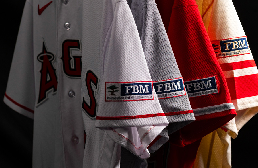
23 minutes ago, VampyrRabbit said:The Halos recoloured parts of their logo to match the base for the Rome, Road and CC. It still sticks out and is majority navy when their wordmarks are majority red.
FBM’s regular logo is navy with a red/dark red outline though.
-
9 minutes ago, JTernup said:
I mean there has definitely been some infringement (Dallas skyline alternate comes to mind as well) but as the basis for an identity it would still be pretty unique. The red rocks and valley uniforms read as much more of a gradient than a rainbow to me.
I totally believe that. It was honestly pretty far ahead of its time and the 90’s aesthetic was so dark and drab compared to the rainbows. FWIW I do think the recent black and white rainbow city jerseys of recent years nailed the color balance needed to really let the rainbow shine. The old school gold cuffs and Royal base were very busy alongside the rainbow.
The recent white jerseys used navy as the main accent color, then for whetever reason they switched to black the next year. Not sure they should have white and black unis now.
The rainbow “Atari Breakout” look was definitely not ahead of its time. It was definitely a product of the 80s and extremely dated in the 1990s
Everyone knows the navy gold and crimson were dripped because of awful basketball after 1995 and Kiki wanted UCLA colors.
-
7 hours ago, JTernup said:
As a Nuggets fan, I think that this idea that the powder blue was beloved is a bit wrong though. To a lot of Nuggets fans that almost feels like an era of Nuggets basketball rather than the basis of our core identity. The real issue is that they refuse to embrace the rainbows fully, which would really solve all of their identity problems in my opinion.
As someone who lived in Denver in the 90s, damn near the whole city was ecstatic that the Nuggets finally had three main colors in 1993 rather than six colors. Royal, yellow and red can work while going back to a classic skyline-mountain look. Then again, nothing wrong with turning the current navy Jerseys to royal with a yellow wordmark outlined in red.
-
6
-
-
The Webber/Bibby/Peja era unis were so good…wish NBA teams could just bring back past-era unis. Would save us a lot of trouble.
-
3
-


 it “let’s run it back because we’re bored as :censored:”

Arizona Cardinals new uniform extravaganza
in Sports Logo News
Posted
The bigger decal was mentioned in the unveil