


WSU151
-
Posts
14,812 -
Joined
-
Last visited
-
Days Won
26
Posts posted by WSU151
-
-
1 minute ago, BBTV said:
I had to fact check this because it sounds completely made up, but holy balls - it's true. It's probably not possible to look up, but I wonder if there's any other comp in terms of coach/qb turnover in such a relatively-short period of time.
I think the Browns had the most turnover...that one guy's jersey with all the names crossed out sticks out.
-
 2
2
-
-
8 minutes ago, Cujo said:
WHUT

SB50 was five head coaches and
seventen QBs ago bro. Maybe you have great recent memories of Paxton Lynch, Trever Simien, Case Keenum, et al but I sure don't.Again, a lot of people who grew up in the 70s and 80s and 90s have fond memories of other games outside of the Super Bowl.
After last year's just complete dysfunction, SB 50 seems like forever ago.
-
3
-
 1
1
-
-
28 minutes ago, Cujo said:
Oh, but it goes further than just aesthetics.
Growing up in Colorado in the 80s and 90s, the "D" logo evolved into a symbol of embarrassment. Broncos teams that were good, but in the end nobody wanted to remember. Squads laden with players (outside of Elway) who were good but not great. There came the Super Bowl 21 blowout. The Super Bowl 22 blowout. The Super Bowl 24 blowout. The cherry on top (in their final game in the "D") was after locking up home-field, crapping the bed vs the 2nd year expansion Jaguars. Now compound that with the introduction of the cyberhorse and immediately winning a Super Bowl that year. Then going nearly undefeated the following year and winning their second Supe. At the time, it almost felt like the "D" logo was holding the Broncos down.
Denver fans who clamor for the throwback D are mostly 20-30somethings who weren't around during the Dan Reeves days. I also suppose, for many, winning 3 titles since makes it easer to forget all those Super Bowl failures.
All my friends and I are over 40 and want to see the old uniforms come back. A lot of great memories on The Drive, The Fumble, the great comeback against Houston, the Orange Crush defense, Steve Atwater' s (HOF) hit against Okoye, the Three Amigos, Tom Jackson (HOF), Simon Fletcher, Karl Mecklenberg, and the 95-96 teams that really built the foundation for the 97-98 teams, such as Terrell Davis's just incredible rookie year. To only see the Orange Crush in terms of Super Bowl losses is a shame, and it's like only thinking about the Bills K-Gun or the VIkings' Purple People Eaters as only horrible Super Bowl losses. It's really not fair to the history of the era. I, mean, if you only judge the '98 Vikings season based on the NFCC, you probably would hate the 90s Vikings set but I guarantee more people have fond memories of Cunningham-to-Moss just because they were crazy good. Thus, for most Broncos fans alive in the 70, 80s, and 90s, there were many successes outside of the Super Bowls.
Right now the current set is nothing but QB failures and a carousel of head coaches.
-
1 hour ago, FiddySicks said:
I don’t think I’ll ever understand the love that old Broncos D horse logo gets. The D kinda just made the whole thing look awkward, and the rendering on the horse itself was ATROCIOUS. I get now that the horse is blowing air/snot out of its nose, but when I was a kid I absolutely did not understand what was happening there. I always thought it looked like someone was trying to tickle the horse with a feather. Now it looks like one of those weird S&M/bondage feathers someone is bothering the horse with. Not a good look. Especially considering that their current helmet logo is MILES better. I don’t like the Broncos at all, but their current helmet logo is one of the best helmet logos in the entire league. People really want to ditch it for that dumb, outdated D logo? Weird.
A lot of pro logos could be rendered a lot better tbh but a lot of people probably prefer they aren’t. The ‘97 Bucs logo was pretty cool and then someone thought it could be rendered better and it lost all the charm.
The 70s-90s logo was always one of my favorites and how it mirrors the horse on top of the scoreboard is pretty cool.
-
nm already covered
-
7 hours ago, Lights Out said:
It doesn't look as good as having the horse always face forward. Just because they got it wrong for 30 years doesn't mean they have to repeat their mistake in the future.
It's not any different than these which don't seem to bother most people:
-
5
-
-
Looks like CU might have black satin or matte helmets with metallic gold logos (and it looks like the logo has increased in size a bit). IIRC this is the first time since 2014 they used the metallic decals on black (normally use the flat gold/tan color). Looks sharp.
-
1 minute ago, HOOVER said:
They could make a lot of fans really happy by introducing Tillman-era Throwbacks…but it’d be worn with that sparkly shell, which would make the whole thing silly.Odds are better, sadly, that they’ll run out a Grey alternate set. I won’t hate it, but I’d have loved some Tillman t-backs.
I think the issue is Tillman throwbacks would look too similar to the regular set. I might be wrong on that reasoning though…
-
2
-
-
2 hours ago, Bathysphere said:
I consider my prediction post to be at least half correct until the Panthers inevitably announce all-black full time. (You thought this was a wishlist??)
Alternative heading should be ”Presented without any context”
Your post really doesn’t say if it’s a “should wear” or “will wear” prediction.
Were you expecting everyone to read your mind?
I’m not really sure what the statement about the Panthers was…that they should continue wearing the all black alternate they wore in 2022?
-
1
-
-
1 hour ago, DCarp1231 said:
Technically speaking, the Cardinals could eventually unveil a grey/silver alternate uniform
Would have to deemed a “color rush” wouldn’t it? The fourth alt is either throwback or color rush, right?
-
6 hours ago, Bathysphere said:
It sure is brave to tell everyone you definitely knew the rumors were false after the unveiling. Wish you had posted something/anything that definitively quashed the rumors the last few weeks, but you didn’t.
-
4
-
-
30 minutes ago, Survival79 said:
Has this been discussed yet?
Someone mentioned that the C and bear are interchangeable as primary logos. Defeats the purpose of "primary" but c'est la vie.
-
7
-
-
5 hours ago, Bathysphere said:
With all due respect, this all utterly perplexes me. Youre a connected guy who has provided invaluable information, whether archival or new and noteworthy, to these boards across decades. Youre so deep in that, of course, you already saw the actual helmet that was to be unveiled: white with silver speckle, a silver face mask and the airbrushed normal Cardinal logo from the alt helmets in the normal Cardinal logo color scheme. All of which is very plausible based on what they’ve done before and recently. That’s just the TruColor power at work.Then, along comes Some Guy From Reddit, or, in this case, u/ISniffButts50. No credentials, no established credibility, hardly so much as an internet footprint whatsoever; just a guy who likes smelling rears and made a post telling Cardinals fans to wait to buy jerseys. He then goes on to describe then render the most schizo idea possible for the Cardinals to try to revive their tired brand: change their 100 year old color scheme that theyre literally named after to maroon, orange, and silver. Basically a rejected Virginia Tech pro combat alt from 2009. Probably the dumbest idea of all time.
It was enough for you to go investigate, and somehow in this interaction, he relayed to you enough specific information for you to feel confident coming back here and saying “Yeah this might happen.” Even though youve already seen the real helmet which completely contradicted the entirety of what u/ISniffButts50 was telling you, yet those hex codes and “regional” color names that he gave were enough to make you consider that they could possibly put that helmet with a red and yellow cardinal on it with uniforms that look like that. That was all we knew before that he gave you, hex codes that anyone can look up to specific colors and color names that anyone with a little sly creativity could come up with. The gradient pants is news to us, which drives the idea even further into stupid hole.
Which is just the thing: the whole idea was just so incomprehensibly stupid that I refused to believe for a second that an NFL team would destroy their brand on such a caliber. Nike has done some weird things, but there are some things that if you’ve been paying attention, you know they won’t mess with till the end of time. The Cardinals are a red and white team and they proved that final last night by committing to that for at least another five goes round the sun. It was absolutely surreal to just watch 100+ pages of pure discussion fly by assuming that the Cardinals were really going to do that, just because of your credibility when you took the plunge and semi-verified them.
What’s truly crazy is that I’ve only posted here for ten years, and already I’ve seen a million incidents, like @IceCap said, of Some Guy On Reddit turning out to be full of complete horse:censored:. It just feels like it should’ve been a no brainer to dismiss him swiftly and completely for no other reason than that his credential was Reddit. I’ve felt that this entire time, yet felt like I was going insane reading page after page of maroon and orange fantasies when it was so obviously false. Just exhausting to even think about engaging with from what ultimately turned out to be the sane standpoint. Its like nobody’s been paying attention to how NFL teams actually carry their brands; all they can do is say “Nike bad” as though that justifies that they could actually do something as bad as what u/ISniffButts50 proposed. Guess what: they haven’t to date and they probably never will.
I really don’t want to grill you for something like this since the difference in our legacies here speaks for itself. I just wanted to provide some context to this being probably the most bizarre two weeks I’ve experienced on here, and as a cautionary tale about the responsibility that comes with credibility. There is a lot that could have been avoided here by simply never ever believing “leaks” from Reddit.
This is a totally unhinged and bizarre post.
The first ISniffButts50 post about the helmet (your first linked post) turned out to be true...the helmet indeed is a white and silver version of the black helmet, and silver did feature more prominently in the new set. If I was Tru, and saw that that particular description matched what I'd seen, I'd believe other posts from the same guy.
The fact that you think people had low reading comprehension because we put out trust in a guy who has been incredibly reliable is just asinine. Tru had doubts...but he also said everything he was told was believable. He had details that seemed far more credible than the average leak. We believed him. We were tricked by a reddit user.
In 2005 I would have thought a Cardinals uniform with piping and random shapes and cardinal shoulder yokes would have seemed completely schizo...yet that's actually what they went with. We really didn't know what path the team was going to take...I mean there are hundreds of concepts of "What the team should do" and none of them were close.
Were there things that reduced credibility along the way? Sure...the bad claim about the hats, the guy suddenly disappearing after the bad soft reveal...but I (and maybe others) was pretty sure if the team wasn't changing to maroon and orange, then they were going with cardinal, copper, navy, (more) yellow and/or sand...which is still way off and nothing close to what was revealed.
I don't fault Tru at all...and the 20/20 hindsight in this particular post filled with "all of you should have known better" is just laughable
-
4
-
-
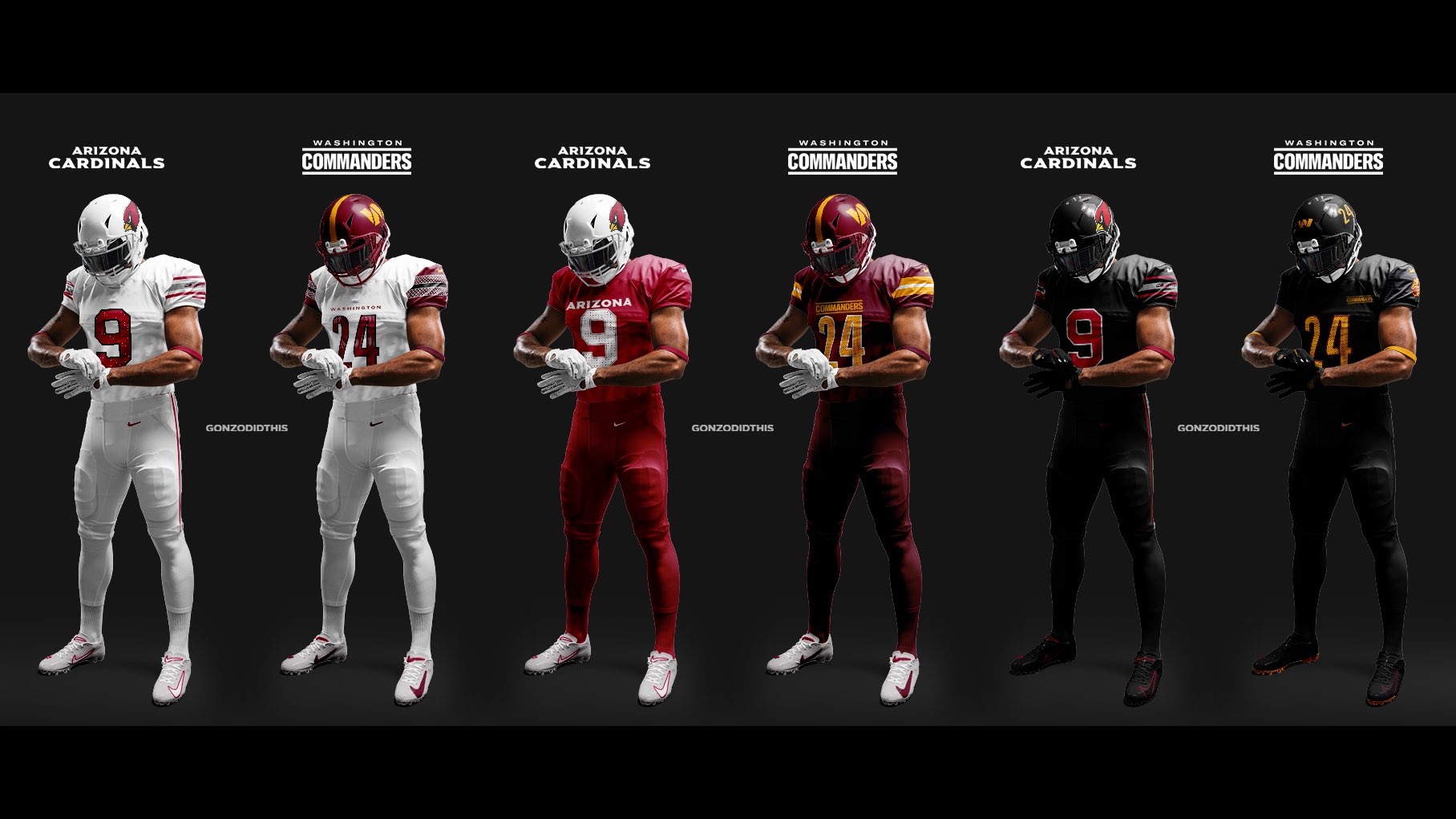
1 minute ago, Sec19Row53 said:
Just curious - why?
Well the Commanders set is garbage.
But the Cards’ home and roads are sharp (save for the huge Arizona, which should have been scaled down), and as meaningless as this word is…they’re “clean”. IMO
-
3
-
-
1 hour ago, MJWalker45 said:
You can see the tiny specks in there. But unless you're watching up close on TV, it probably won't stand out.
They’ll have to figure out decal placement, this bird ^^^ will be looking nearly straight down when worn.
-
4
-
-
16 minutes ago, DCarp1231 said:
To save a click-
This comparison makes me like the Cards’ red and white uniforms even more.
-
4
-
-
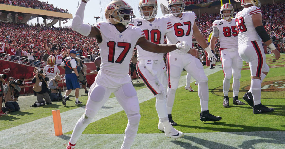
18 minutes ago, DCarp1231 said:
“Hey guys, can I copy your homework real quick?”
”Yeah sure, just don’t make it obvious.”
The homework being copied-
I don’t get the comparison to the 49ers…the Cardinals don’t have a drop shadow (pretty big difference) and the Cardinals historically wore red numbers with black outlines and sleeve stripes. The new white jerseys look more like the Timm Rosenbach than anything the 49ers have worn.
And I’d say, if anything, WSU copied the Cardinals’ classic home look. The Cards were wearing white helmets with cardinal jerseys/pants 20 years ago.
-
6
-
-
3 minutes ago, Pigskin12 said:
Who in their right mind would spend money on one of these?
For $130+, the silver just doesn’t do it for me…would be more inclined if they had blue and/or copper accents and trim.
-
22 minutes ago, aawagner011 said:
Side note - I find it interesting in this day and age of hyper merchandising and marketing that I have not seen one single mention of when fans would be able to buy the new jerseys. It’s nowhere to be found in the articles on their website, on their social channels, nor are they for sale on NFL Shop.
The article on the Cardinals website says jerseys will go on sale at 9pm
First paragraph: https://www.azcardinals.com/news/longform/new-uniforms-for-the-arizona-cardinals-2023
-
Last thoughts - the red pants need stripes...whether it be double white or white/silver/white...they need something.
The white jerseys look so much better without the red yoke on the shoulders…look how clean it is without it. The black outlines on the numbers do give it a solid look throwbackish look.
The silver accents make sense when they say they tried to incorporate the exterior of the stadium...but these uniforms really feel like a Super Bowl champ uni (a la the gold MLB champ unis) but with silver to pay homage to the trophy.
With so much silver in the uni I’m still baffled why New Era used so much yellow in the draft hat.
-
11 minutes ago, MJD7 said:
The most interesting part now, for me at least, will be hearing more about @TruColor’s rumors he heard & the helmet he saw, even though they clearly turned out to be untrue. I would love to hear as much about that as possible since, as expected, it seems more intriguing than the design we got.
Tru’s description of the helmet was on point, white (check), metallic flakes later implied to be silver (check), non-flat gray, silver metallic mask (check).
-
7
-
-
After seeing more photos, they’re just so underwhelming. Quite a few concepts with copper and navy and sunrays that I would take over these.
At first i thought the white jersey sleeve stripes were red and blue like the 90s then I became hugely disappointed when i saw they were silver.
-
These were pretty much leaked on Twitter as a concept, weren’t they? I know someone had the “Arizona” on the cardinal jersey and the Buckeye concept wasn’t far off.
Should have gone with copper instead of silver.
-
5
-
-
12 minutes ago, coco1997 said:
This picture makes the blue look similar to those 2018-19 Warriors city uniform from a few years ago…that indigo/slate color


NFL 2023 Changes
in Sports Logo News
Posted
The 97-98 seasons were great for Shanahan. Any other trips to the playoffs under Shanahan were just utter failures according to your own rules....and the funny thing is you were this site's biggest New York Jets fan during the 2000s Shanahan era!!