


WSU151
-
Posts
14,812 -
Joined
-
Last visited
-
Days Won
26
Posts posted by WSU151
-
-
4 hours ago, tBBP said:
And exactly why again is the NBA doing this in-season tournament thing??
To get viewers interested in November/December basketball (because who really cares about NBA games until Christmas?), take eyes away from late-season NFL, if possible, and thus, juice the new media contract coming up in a couple years.
Looking down the road, college football playoff expansion will happen sooner and will be much bigger if the NBA's tournament is successful, as TV networks will have to make business case decisions on those corporate write offs known as low-level bowl games. The NCAA will be chasing that TV money and they don't want it all to go to the NBA.
Gary Bettman will also probably try to do something similar, by having the Bruins/Rangers/Penguins/Red Wings participate in a four-team, triple-elimination mid-season round robin tournament for the next 40 years.
-
 2
2
-
-
14 minutes ago, AdobeDesignBG said:
Buddy this style guide is nowhere on the internet
Even if it was, i’d still have no use for it.
Why would I need it?
It's weird to see people jumping into an NFL thread talking about secret Oregon style guides as if they're selling watches outside a subway station.
-
2
-
 4
4
-
-
39 minutes ago, Survival79 said:

Those don’t make for good wishcasting message board posts like copper and bronze and sand and navy and gold and clay and
-
1
-
-
Throwback looks are trending up in college sports (and it’s fine by me)…Florida State with a more classic look, Maryland with this update, Arizona and Indiana in the last couple years. Same in college basketball too (UConn won a title essentially wearing a 90s uniform).
This Maryland set will last a few years and they’ll come up with something new…but they’ll look great before then.
-
12 hours ago, Ridleylash said:
Again, that runs into the NHL; who would likely say "no, you have to wear a home or alternate jersey", because each team's jerseys need to contrast as per the league rules under Rule 9.1;
And both teams wearing white simply wouldn't be contrasting unless you force literally every team in the playoffs to pack both home and road jerseys just in case they have a series with the Jets; so that's why they don't do it.
Besides, it's not like the Whiteout has faded in popularity, even with the team wearing dark at home for a decade now; it won't hurt to just let the fans do the Whiteout and leave the team in their dark jerseys, since logistically that's much easier.
If the Jets wear white at home and tells the other team to bring dark jerseys, why would both teams wear white in Winnipeg?
Seems like any series against the Jets would work like this: Winnipeg wears white for all 7 games, the opponent wears dark jerseys all 7 games.
-
9 minutes ago, Germanshepherd said:
First round is up on LockerVision!
Saturday’s games:
Philly (red statements) vs. Brooklyn (Black with white outlines)
Cleveland (white) vs. New York (unnecessary navy statements)
Sacramento (black) vs. Golden State (white)
Boston (city) vs. Atlanta (white)
Sunday’s games:
Phoenix (black statements) vs. Clippers (white)Memphis (Navy icons) vs. Lakers (white)
On Monday, Kings vs. Warriors is the same and Philly and Brooklyn will be blue icon vs white association.
Boston will flip back to white for their Game 2 against Atlanta in black, New York will wear black vs Cleveland in white and PHX/LAC will be same as G1.
Memphis flips to city editions vs. Lakers yellow in Game 2.
Warriors going city at home for G3, but thankfully Brooklyn and the Clippers will be icon vs association.
Knicks in white for their home games vs. Cavs in black.
Atlanta in Black vs. Boston in Green when the Hawks are at home.
Warriors thankfully back to white in G4, with Sacramento returning in black.
Lakers/Grizz have a Yellow/City and a Yellow/White game planned.
Clippers will wear black for Game 4 against Suns in white.
This just shows why home whites (plus yellow Lakers) vs color aways needs to come back as soon as possible.
-
7
-
-
Minnesota really needs a rebrand. The association and icon unis are meh, and the navy court is just lifeless (of course, the lower corner placement of the baseline wordmarks for all teams is just stupid). Late 90s blue, lime green, and black would work in their statement style; or home/road mixtape unis would be fine with me.
-
2
-
-
22 minutes ago, tBBP said:
I think it's navy.
Hmmm....hiding things in plain sight???
Anyone else check the colors on that chopper? They look very similar to that flyer/invitation that @TruColor posted earlier: darker-ish red, some shade of gray, and what looks like desert sand/tan (of course the color filter kinda messes with the clarity). And I don't think it's any accident at all ol' boy picked up a copper-colored watch (though @TruColor mentioned they're not adding [I presume metallic] copper), dressed in all black, then headed out to the desert in a black-on-black vehicle (with one more quick shot of the copper-colored watch on his wrist for good measure). I have zero doubt all those details were DELIBERATELY planned into the video; otherwise, why do it (and/or focus on them) at all?
I do find it hilarious that the chopper literally says "Rise Up"--you know, the same slogan used by the other bird team on the other side of the continent that wears its own shade of red. And I wonder if that stripe running down the bottom of the chopper might in some way be a clue as to the striping that might appear on the uniform...
-
Mizzou unveiled new home black unis...biggest change is the numbers are now white outlined in gold (they used to be gold outlined in white). The Mizzou mark on the chest of the black jersey now matches the design of the white jersey.
Though the helmets are shown with the tiger logos, the new unis also work far better with their M logo helmets (white M with gold outline).
It still looks like they don't know what shade of gold to use...it looks really yellow here compared to the mustard color used in their Twitter profile.
-
7
-
 1
1
-
-
15 minutes ago, dont care said:
What do you mean when you say “sparkly white helmet” most teams add a slight silver flake to their white shells because it looks more white and doesn’t end up looking yellow on camera
This is somewhat true...the Dolphins have used sparkly paint for at least the last 20 years.
______________________
It seems like whatever will be unveiled will be completely different than what 98% of this board wants/thinks/convinced themselves will happen.
-
20 minutes ago, TruColor said:
And you'd lose.
Kinda joking/kinda not:
Does the maroon color have a name such as Phoeniceus red (defined as purple-red, aka maroon) as some clever tie-in to Phoenix?
-
8 minutes ago, Sec19Row53 said:
No. Seriously.
I liked both the Wranglers and Rattlers helmets.
I asked because one of Tru’s first insights was white helmets will still be the primary helmets, with metallic flakes, and then guesses started to really deviate from that.
I, too, liked the Rattlers and Wranglers helmets.
-
2 minutes ago, Sec19Row53 said:
This continues to make me cautiously optimistic of a copper colored helmet.
Sarcasm?
-
30 minutes ago, dont care said:
Yes helmets were painted that way, but it wasn’t so they wouldn’t chip, it’s just the shells came from the manufacturer clear
They were painted on the inside? Why?
-
2 minutes ago, Gary said:
He’s being hypocritical, what he would do.
It would still make much more sense to unveil them before the draft and then have new jerseys at the draft. Cardinals fans aren’t going to skip the draft just because they know what the jersey looks like.
-
1
-
-
1 minute ago, WBeltz said:
But what about an alternate? Is it still black? Or different?
Fair point...
Though if maroon, orange, and gray are the colors...they may go with dark gray helmets like ASU did some years ago (when they tried gray and copper)
-
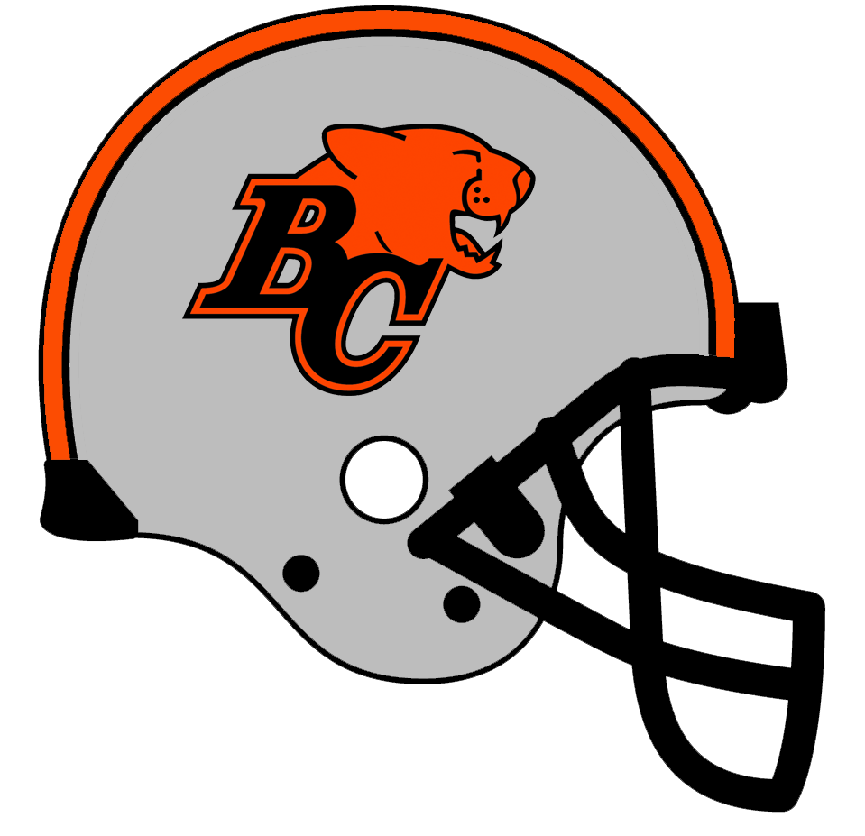
22 minutes ago, DCarp1231 said:
BC Lions new set-
Might as well bring back silver helmets for that away set.
-
4
-
-
They're not going desert camo lol
Been said multiple times that the helmets will be white.
-
8 minutes ago, Old School Fool said:
Someone mentioned it but I have a strong feeling the Kings are going to get new uniforms and put black in more prominently. It's been an alternate only which has stood out like a sore thumb.
Also for some dumb reason their main court has been black for the last few seasons, I don't know why they do that when their main logo has no black in it, it looks stupid on the court.
This isn't the only time the Kings have had a dumb decision regarding their court, remember in 2013 they had a 3D logo at center court. I've never seen a team do that before and once you see it you understand why.
I kinda liked the 3d logo at center court…one of my favorite 5 courts ever is the 3d/shaded Lakers logo court used in the early days of Staples Center.
-
4
-
 1
1
-
-
1 hour ago, pelicanfan said:
i think the leaked design is almost perfect honestly. its kinda got everything you need in a suns jersey honestly. good color balance (especially if you like black ) and a great callback to their iconic 90s design without being too busy. putting the suns wordmark inside the stripe is a really smart choice and good way to save space. my only thing though that the white jerseys should have the sun stripe filled in like the purple ones and that the numbers shouldnt be crooked. and im hoping the the shorts also look good
Found this mockup too on reddit (from 2022, so nothing confirmed - it even has the diamond swoosh so it's clearly photoshopped)..it looks good except for the number font, which I think is the Cavs' old font. The heavy base serif just doesn't work.
-
34 minutes ago, Conrad. said:
as expected, the people on this board are top-notch when talking out predictions...so i'll say that all 3 teams that are changing new main uniforms have been mentioned since i made my original post. well done, all.

as a (sad) freebie, i reluctantly report that my local Mavs are yet again not redesigning uniforms. sad times here in the DFW.
For HWC...I have a weird feeling the Nuggets are on there...
") I don't think they've had a HWC jersey in the Nike era yet.
I don't think they've had a HWC jersey in the Nike era yet.
30 years since 93/94 8th seed miracle, 15 years since 2008/09 WCF. The navy 90s look seems ripe for a HWC.
Speaking of 93/94, I wouldn't be surprised to see the Rockets' 90s red jerseys yet again for HWC even though they just wore them in 19/20.
-
29 minutes ago, spartacat_12 said:
Meh, the blue outlines on the helmet/pant stripes, the numbers, and the blue shoulder stripes do enough to separate them from the Raiders.
More blue rather than less blue better differentiates the two.
-
I think these would be just fine with out the gradient number on the back of the whites and grays. Would be cool if the batterman were light green and light blue.
-
1
-
-
34 minutes ago, spartacat_12 said:
I think the opposite would look better. Change the silver pants stripes to match the helmet.
A silver helmet with black stripes, a black jersey, and silver pants with a black stripe?
The Raiders would have won that lawsuit.
-
2
-


/cdn.vox-cdn.com/uploads/chorus_asset/file/23172427/1237733497.jpg)


/cdn.vox-cdn.com/uploads/chorus_asset/file/23522170/2023_Suns.png)

MLB 2023 Uniform/Logo Changes
in Sports Logo News
Posted
You’d think Stance would have made teal socks for the throwback.
Speaking of which, Stance has been a pretty big disappointment in the MLB space.