


Shumway
-
Posts
12,602 -
Joined
-
Last visited
-
Days Won
1
Posts posted by Shumway
-
-

Any help on what the 'YES-FM' part is written in would be much appreciated. Thanks in advance!
don't know what it is, but i gotta say that font should never, in any capacity, be used ever again.
Agreed. But it actually looks like someone might've bastardized the hell out of another somewhat decent font.
-
can anyone help me with this one?
thanks
just bumping this up because I don't think anyone say it on the other page all the way on the bottom.
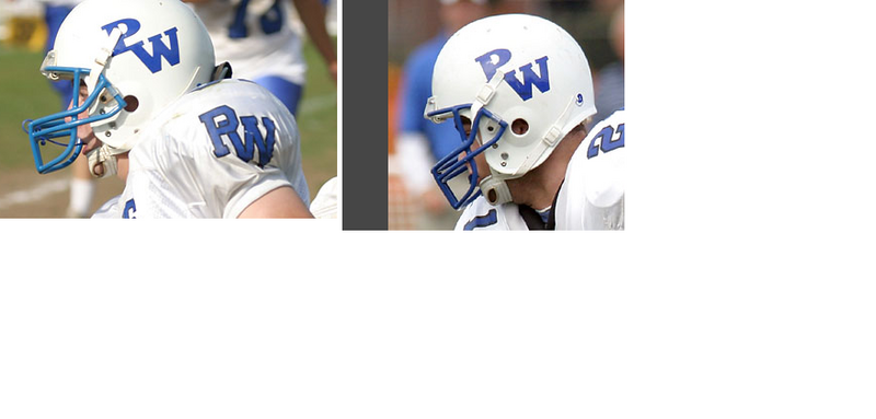
To me, it looks like some sort of Bookman, more than likely bold. You do mean the helmet, correct?
-
Helvetica Black Condensed Oblique
Futura, Helvetica Black Condensed Oblique...same thing....
...except for those tiny differences that make each font unique

What can I say, I tried.
-
Anyone have an idea what the font is that is use for the book now for 2006 bit

Looks kinda like Futura to me, but I'm not exactly an expert like some of the guys we've got on here.
-
I'm looking for the font on this jersey logo or one that is close so I can modify it.

I am making a custom McFarlane figure of a pitcher on this team and creating this logo is really frustrating me.
Thanks,
Kevin
It's the Angels wordmark font...if it's the same as the back of their jerseys, look up eriqjaffe and click the link in his sig...it'll be there.
-
Nevermind, my professor's sending my the fonts I need.
-
I think you're right...it looks awful close(close enough) to Deftone Stylus. The only difference is that it looks like they made the "z" more "z-like", rather than a backwards "s".
The Panama, after looking at it again, looks a lot like the old Rangers font, like Nolan Ryan era.
-
I'm assuming they're both custom, but I figure I'll give it a shot:
 and/or
If they are custom, does anyone know a good script font for use on a jersey?
-
Thanks, I thought I've seen the "Charlotte" font before. Thanks.
-
I'm not sure if it's a custom or not, but does anyone know the font for the Charlotte Bobcats wordmark? Thanks for any help.
-
Anyone know this one(Audioslave, not the sizes), if it isn't a custom font?

-
Does anyone know how to do a text wrap in Adobe Indesign? I'm sure it's the same as illustrator, but I don't even know how to do it in there.
Edit: Nevermind, I figured it out. For anyone else wondering, there's a Text Wrap pallette under Window, and you just select the object you want the text to wrap around and choose how you want it to wrap. Simple.
-
Ah, there we go. Thanks a lot.
-
I'm having a bit of trouble arching text. I can get it to go one way, but not the other. I think I need to make the...umm...cap line?...be the direction in which I'm typing. Obviously my explanation's not helping...I'll show you:
It's a crappy drawing, but it gets my question across:
I an get it to go like it is on top, but not the bottom. When I try to do it that way, it types it upside-down, which is not how I want it. Does anyone know how to make it arch like that, but reading normally? Kind of like the old Penguins logo. Any help is appreciated.

-
Oh, I thought there was some special thing needed to make a watermark. Wow, haha, well, now I know that my idea for a "half-[rear-ended]" watermark is the actual way to make it.
-
How do you make a watermark? Do you even use illustrator to do it? Thanks, and sorry if this was already asked somewhere.
Name That Font!
in General Design
Posted
Although I've got a feeling it's custom, the "Propel"