


Shumway
-
Posts
12,605 -
Joined
-
Last visited
-
Days Won
1
Posts posted by Shumway
-
-
There was a recent NHL game in which the Capitals white jerseys were paired with blue helmets. I'm guessing it was the first year of the current unis, but I'm not positive. I just remember it bothering me.EA Sports NHL 2002 had blue helmets with the Leafs' white third jerseys. Not only was it inaccurate, but being a white jersey, that's kinda the NHL rule.
-
 1
1
-
-
ki jana carter


Let's be honest here...any NFL uniform is a wrong one for Ki-Jana.
(For what it's worth, I had no idea he played for any one of these teams)
-
1
-
-
Kerry Collins, New Orleans Saints

What is Kerry's "right" uniform, anyway? My initial thought is Carolina, but he spent a good bit of time in New York and Tennessee.
-
Another actor with Minor League experience; The Macho Man.

"Has improved his swing by dropping his elbow. "
Hell. Yes.
-
2
-
-
Hahahaha...speaking of things I see on a daily basis...Also the "My Rewards" font

I'm just about positive Pilot's font (the "myrewards" font) was custom created--I may be wrong about that, though. I'm actually curious about that myself.
As for the rest of that advert...Museo Slab [italic]. No freeware version exists that I know of.
I think you can get certain weights of Museo for free....at least I did, but that could've been a limited time deal.
-
I like the BumbleYinzer Steelers uniforms. I mean, they're ugly, but I like them.
-
SEVEN teams already for Quinn? Cripes!Brady Quinn, Miami Dolphins
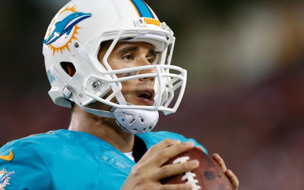


.jpg/175px-Brady_Quinn_(cropped).jpg)


Which of these is right?
(I had no idea he was in Seattle, St. Louis, New York or Miami.)
-
Unfortunately, when they were on the same team, Bo's career was winding down.
Damn, did not know that. Different time periods, but him and Bo would have been a hell of a heart of the order.Bringing this one back... Baseball HOF inductee Frank Thomas, Auburn Tigers.

-
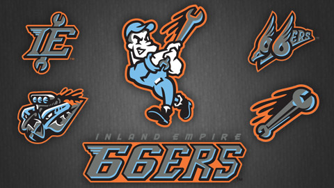
1. The motor on the lower left...does it have an eye, or am I seeing things?
2. What's the significance of the bird (or whatever it is) and wings on the top right?
I will admit that I like the color combo and the two secondary wrench logos.
-
I'm not entirely sure how unpopular this is, but I really, really dig this red jersey for the Tribe. I'm not a fan of the red pants that went along with it, but I love this script.

-
2
-
-

Vladimir Guerrero
Is he still around? He turned into quite the jobber.
Signed with the Long Island Ducks and hasn't appeared yet for the team. I think he's dealing woth some sort of "personal matters" if I remember the article I read correctly.
I have tickets to see them on Saturday, which I bought specifically because Vlad is one of my favorite players of all time. They also have Dontrelle Willis and Bill Hall, so it's not a total waste.
-
I'm not entirely sure just how unpopular it is, but I love Chief Wahoo. I'm by no means an Indians fan, but I used to draw him on my notes all the time as a kid. I remember buying an Indians hat and toy helmet at Camden Yards when I was probably 9 or 10.
(Camden Yards isn't a typo. They used to sell other teams' merchandise back then. I have a bunch of old toy helmets from Orioles games)
-
I like gray facemasks....or I guess, I don't mind them. I view them like black cleats. Sure, they could be another color, but they're not hurting anything the way they are.
-
Yes the point of this thread was the company failing, not the logo's failing.
Like here are some logo's that I think are a possibility if these stores go under since they were changed to them recently.


The current Sears logo is actually slightly bolder than the one you posted...it changed a few months after that thinner one was introduced with the new branding.
The off-mall stores finally switched to this look this past fall. Until then, they still used the inlined type.
-
There really should be some type of guideline as to who should be posted. Rasheed is fine, Wilkins, although before my time is fine. Frank Robinson as well in a Brewers uni.....
that Giants player, I dont know who the hell that is.
If someone can't tell or recognize the player at all---then he shoudn't be in this thread.
That should be our guideline.
Otherwise I'm inclined to start posting pictures of Hee Sop Choi and Jorge Cantu with the Marlins and Rays respectively.
This thread jumped the mediocre player shark years ago. I'm sure Cantu's been covered already.
Also, the Giants player is Ryan Vogelsong. I didn't realize Vogelsong went to high school near where I did. My brother might've actually played against him.
-
I'm pretty sure the Suns' number font is City.
-
If I recall, Getsy backed up Palko in high school...not sure why going to the same college even crossed his mind.
I remember Getsy being there then transferring (I guess I didnt pay attention to the 3rd guy lol), but him and Palko went to different high schools.
Maybe he was his backup in the Big 33 (Ohio vs. PA high school all-star game) game or something then. I remember reading that he backed him up somewhere prior to Pitt.
...or I'm making stuff up.
-
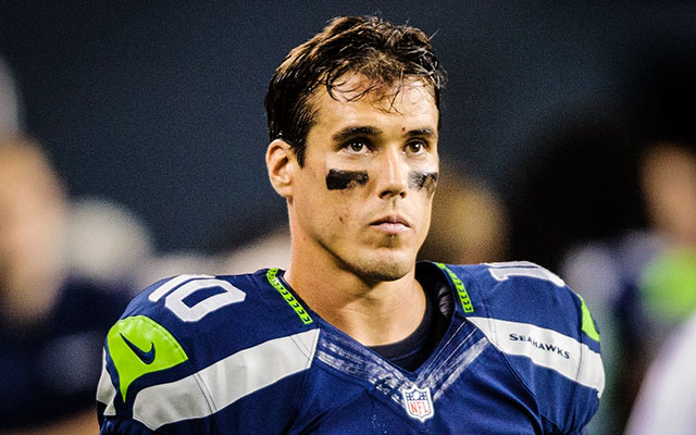
I didnt even know he initially went to Pitt, so its definitely weird to see Flacco wearing this.....

Flacco was third on Pitt's depth chart, behind Tyler
 Palko and Luke Getsy. Both Flacco (Delaware) and Getsy (Akron) transferred.
If I recall, Getsy backed up Palko in high school...not sure why going to the same college even crossed his mind.
-
Anyone know this font? More of the same font found on their website at www.erbertandgerberts.com
Thanks!

This one looks to be Public Gothic.
-
I have never understood why some people consider this to be Oregon's best set.
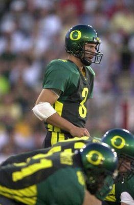
The set after these (Kellen Clemens era) was solid.
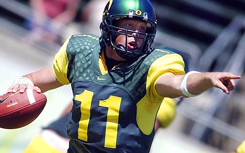
These uniforms? They were ok. Not bad, but not good.
Oregon's uniforms are always so close to being good, for me. All of their uniforms for the last decade or so have been a few tweaks away from being good. It's always close, but no cigar.
I didn't remember these having the patterned shoulders. I take back my comment.
-
I have never understood why some people consider this to be Oregon's best set.
The set after these (Kellen Clemens era) was solid.
-


It's also truly the wrong jersey, but ironically what most would say is the right look for the Stars.
Not sure what you mean by "truly," but I really think he looks good in this.
Wrong brand. Wrong design. Wrong logo (on the front of the jersey, anyway)
-
The Blue Jays will do anything to start "WINNING" again.

They should try to hire his brother to coach. I hear he works miracles.
-
I need some fontologist assistance, please....specifically, the word "SCOTS":

This appears to be the same font the Philadelphia Union use (which is really what I'm looking for)...and three different times in the past two weeks I've seen "PLEASE PLACE ORDER HERE" signs hanging above the counter at Subway typed out in the same font.
Anyone in the world know what this is? I've been searching for a while now.
Many thanks in advance to whoever knows!
So...any takers on this one here??
Not 100% sure here, Buc, but it looks close to Stag.

 Palko and Luke Getsy. Both Flacco (Delaware) and Getsy (Akron) transferred.
Players in the "wrong" uniforms
in Sports Logo General Discussion
Posted