


monkeypower
-
Posts
4,726 -
Joined
-
Last visited
-
Days Won
5
Posts posted by monkeypower
-
-
15 minutes ago, me4afl said:
It is a rebrand/jersey release. Ryan Popowich (director of marketing for the flames) confirmed it with me. The article had said 10 am MT (noon ET) so I’m not sure if it will be then or 4pm.
So it is a rebrand then. Interesting.
This new tweet says 10 am, but the website countdown is definitely for 3:52 pm.
Something never seen before is foreboding to me if it's related to the rebrand. The NLL has had some wild identities, so something never before seen doesn't give me good vibes. However, since the release says it's a two-part announcement and it's the year of Our Lord 2021, it might just be an NFT.
-
 1
1
-
-
The Roughnecks put out a release yesterday saying that they had a two-part major announcement to make Wednesday. I missed the article, so I don't know what it says, and now when you go to their website, an under construction splash screen shows up with a countdown timer set to Wednesday at 3:52 pm MT (which seems like an odd time choice, unless it's set up for a press conference at 4:00?).
The Twitter responses feel it could be a rebranding. Apparently the jerseys have been on sale for most of this past year and some guy responded to the Roughnecks announcement tweet with his tweet from November of last year saying he had knowledge the Roughnecks were going to rebrand for 2021.
-
3 hours ago, MJWalker45 said:
Calgary's black jerseys had big New Era logos on the sleeves. Maybe they switch to that next year?
No, I don't think so, that's just a Stamps black jersey thing. The black jerseys have the horse logo on the back of the neck where the New Era logo usually is, a hold over from the Reebok days (when this version of the Stamps black jersey was unveiled, remember it was part of the Reebok "Signature Series" rollout in 2013 and 2014) when Reebok had its logo on the sleeves and the black jerseys still had the crossed guns logo on the shoulders.
When Adidas took over, they put the Adidas logo on the back of the neck of all CFL jerseys except for the Stamps black jerseys where the horse logo placement stayed the same and the Adidas logo went on the sleeves instead. The gun logo was covered during the 2016 season and then removed for 2017, still with Adidas, but the horse logo was kept on the neck leaving the shoulders blank. Then when New Era took over, all the logo placements stayed the same as they were with Adidas.
On 9/3/2021 at 11:02 AM, HailGoldPants said:On 9/3/2021 at 12:16 PM, Chromatic said:The barbed wire stripe is so unbelievably trashy, especially for a 75 year old club. It belongs on an arena football team named the Bulldawgs.
FWIW, I was at the game and the barbed wire was impossible to make out from the stands so it didn't really look all that trashy because you couldn't make out what it was. It just looked like a thin chrome line that reflected in the sun. If someone didn't know beforehand that it was barbed wire, they would have no idea.
(I don't know if that makes it better or worse that it wasn't able to be seen)
-
2
-
-
21 minutes ago, Ridleylash said:
Not every WC logo has to incorporate local landmarks just to get across the locale, really; Dallas' WC logo didn't, and neither did Boston's the year before then, and both were perfectly serviceable.
The Dallas one was a belt buckle, that's pretty Texas.
Though you are right about Boston's the year before. However, that is because the logo was a shamrock since it was held at Notre Dame. Plus the Blackhawks were the designated home team, so it makes sense not having a Boston themed logo (though the shamrock is kind of a symbol of Boston, or at least some Bostonians would claim it as such).
-
1
-
-
I think it's a fine enough jersey and I'm not getting a lot of the extreme distaste the jersey is getting online, it's fine.
I don't like the floating chest stripe though, especially paired with a shoulder yoke. Either remove the chest stripe or move the stripe to be a part of/ be the the shoulder yoke, similar to Chicago's black and white ones from the Notre Dame outdoor game.

That would also fix the little baby captain's C issue from the Spurgeon pics.
-
5
-
-
-
1 minute ago, ebod39 said:
How can it be the sun if the north star is present ?
I always thought it was the moon for that reason, that you can see the star. I also always took the red sky to be signifying night for whatever reason, I can't explain it, it just gives off a night vibe in the logo. Combine that with yellow moon and it just seemed to be colour choices that weren't based in reality, they were just matching the team colours they picked (but the moon can sort of be yellow-ish too sometimes, right?).
It definitely makes more sense colourwise to be the yellow sun and red sky either being the setting or rising of the sun, but I never see it that way.
-
2
-
-
53 minutes ago, spartacat_12 said:
Saying that "metallic wheat" and "Vegas gold" are different colours seems like splitting hairs.
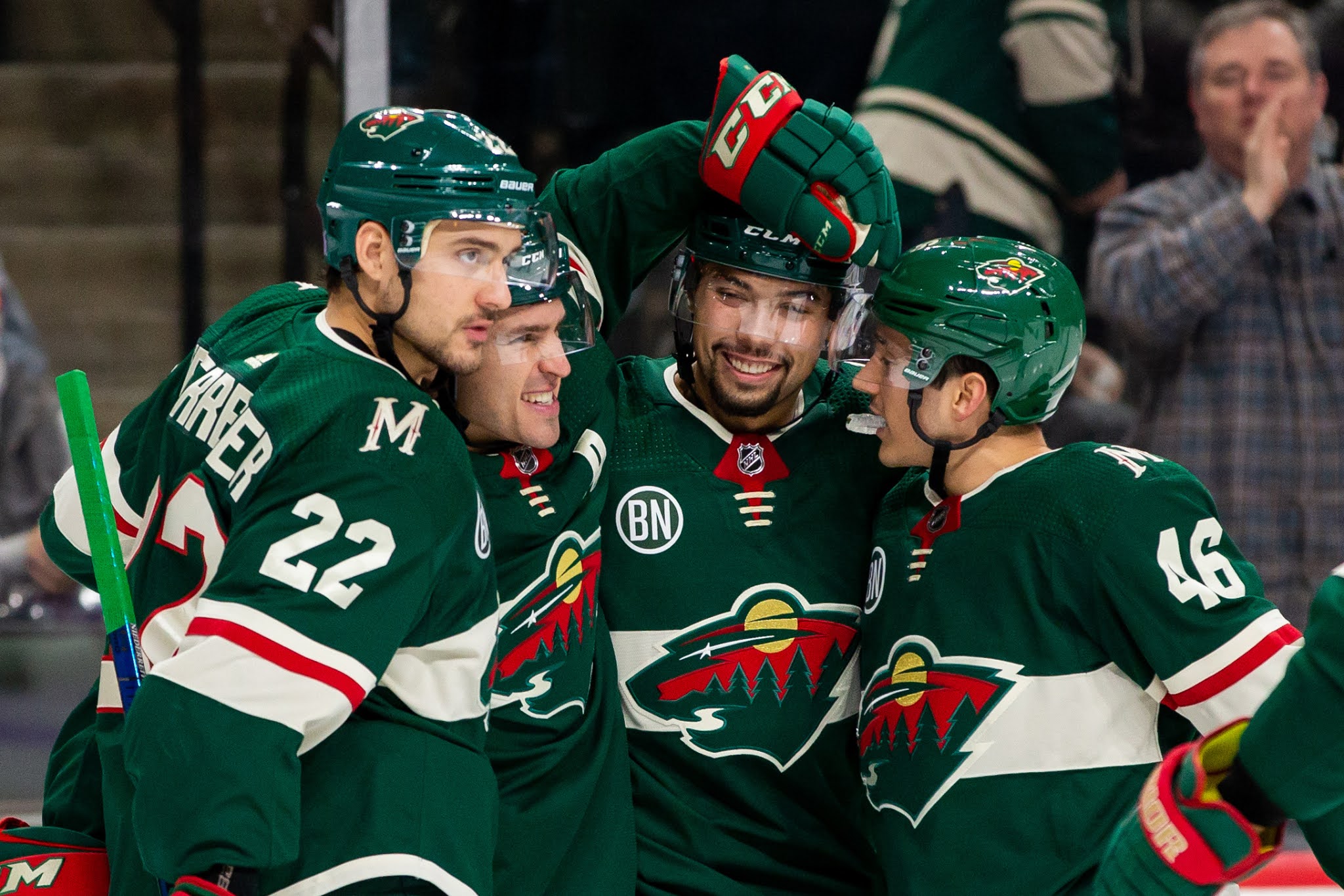
Maybe, but whenever the Wild colours have come up, it's always been referred to "wheat" and not "gold". So saying how they used to use gold conjured up a different image for me, especially with the use of "athletic gold"/yellow in their logos.
TruColor lists a "Harvest Gold" which is the yellow in the logo and then a "Minnesota Wheat" which is the wheat. There is an alternate colour under "Embroidery Usage" called "Gold Metallic" which is the shiny fabric.
I don't think the Wild ever intended for the Minnesota Wheat and Gold Metallic to be two different colours, along with a third similar colour in the Harvest Gold of the logo, it's just that they went with the shiny fabric in the early jerseys while the logo crest had colours closer to the print version.
53 minutes ago, spartacat_12 said:While the moon in print versions of the logos is shown as
athletic goldyellow, on the actual jerseys it's a metallic gold. The stripes & font on the original jerseys is much closer to the moon than it is to the wheat used on the outline/river mouth.I think it might just be the different fabrics and a lighting thing. The picture you posted seems fairly washed out. This picture is from the 2003 playoffs, two years before the jersey in your picture, and you can see the moon being a different colour than the striping and different from the crest outline.
It's not nearly as yellow as in print, but it's a different colour than the striping.
It appears the shiny fabric went away with the switch to EDGE and now the wheat crest outline is the same as the wheat striping.
You can see the texture and colouring of the moon in this picture. Looking through pictures right now, the yellowness varies from picture to picture depending on lighting (and probably picture touching up as well).
I don't know if the logo colours have changed over the years or if it has just been the fabric changes on the jerseys. It doesn't really look like it based on the pictures, but I wouldn't know entirely for sure.
-
3 hours ago, spartacat_12 said:
I think they've realized it's redundant to use both gold & wheat together in a set. The original uniforms only used wheat as the outline of the logo, and used gold everywhere else. The first fauxback alternate swapped this, with gold only being featured in the logo and wheat being used everywhere else.
...they've never used gold anywhere, much less everywhere else, outside of the logo(s) at any point in their history. The jerseys have always used wheat, it just used to be metallic.
Unless we're talking "gold" in the sense that the wheat striping used to be metallic and not "gold" as in Vegas or Athletic Gold or the yellow used in the sun of the logo.
-
2
-
-
I've always viewed the NOB and the numbers as different entities. Sure, it's cool when the NOB and the numbers follow the same outlining, but for a lot, it just doesn't work and I don't think has to for legibility's sake. As long as the NOB isn't some sort of huge deviation from the number font, I think it's fine if it's a simple single-outline or a basic one colour non-outline thing.
My caveat being that if a team is going to go with a different NOB colour than what is used as the number colour on the dark jerseys, as the old Flames, the only acceptable colour for that is white.
-
2
-
-
If you've got a secondary colour to use, going non-outline stinks. I'll always maintain that Dallas looks like a beer league screen print job.
-
6
-
-
It's just not a one size fits all approach. It depends on how many colours the team has, what those colours are, the number font, the design of the jersey, etc.
What works for one team isn't necessarily going to work for the next and then definitely won't for the team after that.
-
7
-
-
14 minutes ago, AFirestormToPurify said:
Alright now that's just a lie. I'm not a mod but let's not start a debate on that
6 minutes ago, IceCap said:Well you're both right

I mean to say that they're both "French", but it's not the same exact language. There are differences as language evolves and places grow up, so to speak, especially when that language is in two different countries separated by a large body of water.
Just like how I would imagine the French of Ivory Coast, err Côte d'Ivoire, is going to be different than in Québec and in France. (I don't know that for a fact, I'm just assuming).
-
4
-
-
1 minute ago, IceCap said:
French Canadian culture isn't tied so much to the French flag because the separation of Quebec from France occurred decades prior to the French Revolution, where the French flag comes from.
Québécois French identity is a mix of local-born aspects and elements of Ancien Régime France. Hence why the symbols of Quebec's French population are the old Royalist fluer-de-lis and crosses, rather than republican French tricolours and Phrygian caps. Check out the logo of Quebec's legislator. It's VERY Bourbon.
All of this is to say that the status of the Canadiens as the team of French Canada and their colours of red, white, and blue have nothing to do with the present day French flag. It's a coincidence.
I was going to say... there's not really much of a Quebec-(modern and current)France connection.
Heck, Québécois/French Canadian French isn't even the same language as France French.
-
3
-
-
2 hours ago, SCL said:
They don't need to go back to the Mighty Duck mask but they do need to lose the current exurban high school on the edge of a cornfield identity from circa 2009.
We're just throwing out things here now? What does that even mean?
Find me a an 2009 identity from exurban high school on the edge of a cornfield that is similar to the Ducks. Find me an exurban high school on the edge of a cornfield for that matter.
I guess I might take that creativity over someone here saying something that has lost all meaning, or never really had a meaning in the first place, like "generic".
-
4
-
-
2 hours ago, SCL said:
Ok Ducks, you're next.
After this long, and the success the Ducks have had in the non-Mighty era, I don't think it'll ever fully happen.
This is from the Athletic when Ducks writer Eric Stephens (at least I presume it was Stephens) did a Q&A a couple weeks ago. Includes a shoutout to the mothership.
Per Icethetics Jersey Watch 2021, there was nothing from/for the Ducks for this upcoming season.
-
2
-
-
Go to their website, the Kachina is plastered everywhere. The only places on the homepage of the site where it's the Howling Head are on the standings to the side, which may be hardwired to NHL.com, and then in the Arizona Coyotes Foundation logo, which is something that would be changed later.
Look at the branding of the rookie tournament they are hosting.
The Kachina doesn't appear to be a matter of if, it's when.
-
3
-
-
22 hours ago, the admiral said:
I know it's different because they bought a rival organization in this case,
? (unless you're talking about when the Flames bought the Hitmen back in 1997)
22 hours ago, the admiral said:but with the Flames turning back the clock to give the people what they want, one would think they'd do the same with their junior club. Doesn't the pink stuff always sell well when they break it out?
The pink stuff is fairly popular when it comes out and their are still people with the originals (both Starburst and Jason logo-ed version), but I don't think it's a case of giving the people what they want as with the Flames. People like the pink, but it's not like the Flames retro or the Mighty Ducks (which as a fan of both teams, I find many similarities between the Ducks branding situation and the Hitmen branding situation) where it flies off the shelves and the fans have been clamouring for a return to pink. I think most people are "fine" to "happy" with the current colours.
22 hours ago, Wade Heidt said:I 100% support this, would like to see it, but I think realistically the Hitmen won't do it. We've seen their current colour scheme for so many years and feeling I get is they won't be changing it.
Where the Ducks similarities come in.
22 hours ago, the admiral said:From a branding perspective, you can't argue with it. Talk about standing out from the crowd. What are the Hitmen now, dark red, black, and beige?
Black, copper and red. They have a bit of a colour balance issue on some merch and graphics here the copper and red seem to battle it out for the secondary colour and the red wins out more often than not, whereas I feel, looking at the jerseys throughout their history, that the copper is the secondary.
But yes, going with pink would be a lane the Hitmen would alone occupy.
-
15 hours ago, Wade Heidt said:
The Hitmen should be wearing black with pink and silver trim for a regular alternate jersey.
The Hitmen have never really been an alternate jersey team.
They had one alternate during the early to mid-00's that lasted a couple years and then they've had four anniversary jerseys (one throwback, three non-throwback) of which two lasted a couple years as an alternate past the anniversary (the throwback and one of the non-throwbacks) and then the jersey they wore for the outdoor game back in 2011 also lasted a season or two after as well.
So in their 26 years, they've only had one alternate jersey that was strictly an alternate.
-
1
-
-
15 hours ago, Wade Heidt said:
Wow. They are going to wear that every Sunday? Something that looks like that should be a one-off at the most. I really don't like it.
Yeah, that's my thought process. It's fine for a one-off kind of thing, but to ostensibly make it the alternate jersey, which the Hitmen don't currently have one, is a lot.
The Hitmen usually play a decent amount of Sunday matinees and in recent years have been marketing them as "Sunday Funday" games, for more families to come to a game that's not starting at 7 pm. The release says those jerseys will be worn for the Sunday Funday home games, which according to the schedule is 17 out of 34 games (side note: that seems to be way more Sunday games than usual).
Maybe it might not survive the jersey colour flip and maybe not all the Sunday games are Sunday Fundays (but I think they are), but right now according to the release, those are going to be worn for 50%(!) of the home games.
-
2
-
-
The Hitmen unveiled what they're calling their "Great Neighbour Jersey" that they are going to be wearing for Sunday games.
The text on the jersey are the neighbourhoods of Calgary, the bottom of the jersey has the skyline and then different Calgary landmarks/imagery. The patterns of the numbers and the sleeve striping, as mentioned in the tweet, come from the two local First Nations who the Hitmen has done more stuff with in recent years.
Quote“This jersey is meant to be gifted to someone as a thank you,” explained Hitmen Manager of Business Operations Rob Kerr. “It’s for that neighbour who takes care of the old couple down the block, for the coach who spends a few extra minutes helping a youngster throw that perfect pitch or for the nurse who always has a smile on their face no matter how many patients they have seen. Calgary is a tremendous city but it’s the people, our Great Neighbours, that make it a special home. Our hope is that when you see someone wearing this jersey, you will know that you’re seeing a great neighbour, a person who has made our community better with no thought of acknowledgment or compensation. You will also know the person inside that jersey is a Great Neighbour.”
I mean... I guess?
-
1
-
-
6 hours ago, neo_prankster said:
Can someone explain why MLB is partnering with that cesspool of misogyny known as Barstool?
Pretty much this.
On 8/6/2021 at 8:04 PM, the admiral said:Barstool's crap is orders of magnitude more popular than Drew Magary scolding people for insufficient moral rectitude or Bill Simmons doing an eight-part podcast series about the Denise Richards/Neve Campbell movie Wild Things
They got the reach and the young audience (and the advertiser connections?) for something like the MLB to throw a Tuesday night Rays-Royals game on.
Also, I don't think very few people outside of the internet a) know much about Barstool one way or the other or) give a concerted hoot about Barstool one way or the other. Also Also, the MLB has games on ESPN, Facebook and YouTube, who all have just the most squeakiest, cleanest histories and definitely haven't done worse things than Barstool with more actual real life impacts.
-
2
-
-
From being at the game, the Stampeders look really nice in just red and white.
The anniversary helmet with the mismatching decals is kind of dumb, but whatever.
-
6
-
-
Portnoy says Barstool is in talks with one of the Big 4 to air games.
Quote“Do you know we’re talking with major leagues? When I say major leagues, like the four major sports. Ever since we announced the Arizona Bowl, major leagues are like, ‘We can give you the rights. We can give you the rights to call one of the major four leagues games.’ Not gonna say which one. We’re looking at it.”
Now this being Portnoy, "talks" could be anything, but still something.
It's got to be the NHL right? Hoo boy, I can't wait to see the storm on Hockey/Blue Checkmark/Hockey Blue Checkmark Twitter if this does happen.


Professional Lacrosse Changes
in Sports Logo News
Posted
I was just making a joke about it being an NFT...