


monkeypower
-
Posts
4,728 -
Joined
-
Last visited
-
Days Won
5
Posts posted by monkeypower
-
-
4 hours ago, Kevin W. said:
I don't see what you're saying here. They're already color swaps of each other. They used the exact same design.
2 hours ago, dont care said:Maybe he just wants the stripes to be r/w/b/w/r instead of b/w/r/w/b but that would be way too small of a change for most people.
No, I was just being difficult and a little troll attempt that didn't really get the play I hoped for. If you look at my list, they're all me trying to pick the worst/dumbest (or at least the worst/dumbest that I thought was funny in my mind) possible choices.
I'm just kind of surprised that people only jumped on me wanting the Blackhawks to wear their away jerseys and how Dallas has let the Wild take the North Stars stuff (and not the fact that I had the Wild wearing the jerseys Dallas actually wore for a couple seasons).
Look at my list again with that in mind. The Flames in a black pedestal with the script logo and the flags. The Canadiens in the closest I could make them to Leafs jerseys. The Ducks in the EDGE set. The Rangers and Jets wearing the same jerseys. The Oilers wearing royal and orange and navy and copper. The Red Wings not wearing any red.
-
 1
1
-
-
35 minutes ago, Kevin W. said:
You mean the white jerseys they already wear?
No, I mean the 96-09 black alt in white.
32 minutes ago, Ridleylash said:I don't see that happening, honestly. Dallas' previous RR was entirely Dallas-themed, and this one would 100% be in that vein; seems like they're content to let the Wild have the North Stars imagery for Reverse Retros.
I also said I want to see the Wild in North Stars jerseys too, so there's no problem there.
6 minutes ago, WSU151 said:None of the RRs in the first edition were straight throwbacks so I’d assume that will be the same next year.
Straight throwbacks are Classics.
Yes, because that's the problem you noticed with my list.
-
Since it's all but been officially confirmed the Reverse Retros are coming back, here's my wishlist:
ANA: 07-14 in eggplant/jade
ARI: 07-15 in kachina
BOS: 96-07 in brown/yellow
BUF: EDGE Buffaslug in Goathead coloursCGY: Pedestal in black with 13-16 script logo and flags on shoulders
CAR: Whalers in Hurricanes colours
CHI: The 96-09 black alt in white
COL: 01-07 script alt but in Nordiques colours and spelling "NORDIQUES"
CBJ: Columbus Chill jerseys but in Blue Jackers colours
DAL: Straight 1991 Minnesota North Stars throwbacks
DET: 2016 Stadium series jerseys but with silver instead of red
EDM: 1996-97 white jerseys in navy/royal/copper/orange
FLA: 09-12 JetBlue alts in white
LA: Burger King in forum blue/yellow
MIN: Straight 1991-93 Minnesota North Stars throwbacks
MON: 1909-1910 blue jersey in white with the 1912-1913 CAC leaf logo
NSH: Mustard alt in current colours
NJ: Just add black to the Christmas jerseys
NYI: 02-07 alts swapping blue and orange
NYR: Straight 76-78 throwbacks
OTT: 97-07 red jerseys in black
PHI: 02-07 alts in black
PIT: Robo Pen in Vegas gold
SJ: 01-07 alts in teal
SEA: Metros jerseys in current colours
STL: The Mike Keenan Trumpet jerseys finally see the light of day
TBL: Storm alt but with current logo and colours
TOR: St. Pats but in blue
VAN: Flying V in 97-07 colours
VGS: Wranglers jerseys in Golden Knights colours
WSH: Original jerseys in black/blue/copper
WIN: Straight 79-90 throwbacks
-
16 hours ago, the admiral said:
Gus Johnson really seemed like he was going to be the next big thing back around 2008 but it never totally happened for him. Did people realize a little goes a long way there?
I think the tide kind of turned on him, a bit like what's starting to happen with Romo, where what people liked about him to begin with became just too much. Like you don't need to be hootin' and hollerin' on a four yard handoff.
-
 2
2
-
-
On 3/8/2022 at 10:39 AM, wildwing64 said:

The Ducks have been pushing orange as their secondary colour for years and yet the NHL style guides continue to be weirdly insistent on beige-gold for them.
On 3/8/2022 at 2:04 PM, MEANS said:it doesn't help that their logo has only a small sliver of orange in the drop shadow. When designing graphics for them it is always a tough balance. They are a black/ orange team but sometimes adding orange to a design doesn't look right for them. They need to pick either the orange or the gold, and I'd say go with the orange. Go ahead an be the west coast Flyers....
I think MEANS is entirely right and it's something I've noticed about the 2014(ish)-Pres. Ducks.
In jerseys, branding and the whole entire identity package, orange is the clear secondary colour. But in instances where it is just the logo on its own, such as this playoffs logo, it is hard to go with orange (especially since I would assume the gold would still be higher in the style guide colour hierarchy and I doubt they asked the teams what colours they wanted).
Here's the Ducks one in orange. I don't think it looks that out of place, but is that just because we are so used to the Ducks using so much orange?
-
The PA Raiders wore (non-problematic) throwbacks two weeks ago.
-
28 minutes ago, officeglenn said:
They always planned to keep an EE logo around in some form no matter the name, so while I understand the thought it's pandering to those who don't like the change (I honestly had the same thought initially), I don't think it truly is.
They came out with a new EE logo with the rebrand too; having more rounded off spaces in between the prongs.
-
2 hours ago, gosioux76 said:
I don't love that they moved on so quickly from the antlers, but I also don't think the antlers worked as well as we'd have hoped they would. As much as I loved the idea, they just weren't substantial enough visually to carry the look. I think they'd work perfectly as a sleeve detail, though.
I'll give them this: Removing the EE from the confines of the oval at least feels like a modest, fresh evolution of the brand.
I saw the Elks play once in Calgary and the antlers were just not visually striking. Even as someone who was in seats not too far up from the away bench, the antlers just looked weak. They needed to be larger or maybe outlined in white or something.
I'm not surprised they went back to the Double-E because it's been their entire (modern) helmet history up until last year.
-
4
-
-
Weird to (maybe) have a uniform change after only one season following a rebrand, unless last year's jerseys were just a rush job to have "new" jerseys for the season (which they did kind of seem that way a bit).
-
The Coyotes, their players and the NHLPA met to discuss the move.
QuoteElliotte Friedman explained what was discussed in the meeting during Saturday's 32 Thoughts segment on Hockey Night in Canada and said Mathieu Schneider, special assistant to NHLPA executive director Donald Fehr, was also in attendance.
"I was told by a couple of people that it was a really blunt meeting," Friedman said. "The players asked a lot of pointed questions about how we’ve gotten to this point and how the future is going to work for the Coyotes.
"Xavier Gutierrez, who is the team’s president and CEO, answered the questions, and I heard he was pretty honest. As much as he could answer the questions — because I still think there are still a lot of unknowns — he answered them and tried to address the players’ questions as much as he could, but the bottom line here is they still don’t have a lot of answers."
Although Friedman doesn't believe the NHLPA could block the team's move to ASU's arena, which is a much smaller venue with a capacity of only 5,000 seats, the lack of transparency between the team and players about the situation has Schneider concerned.
"One of the things Schneider indicated was, look, 90 per cent of these players aren’t going to be in the Coyotes lineup when the new building is ready, should it get built," Friedman said. "Secondly, the thing he said was, look, they feel really in the dark, and if you don’t build a rapport with these players now, it won’t matter if you get a new building built because the reputation will be out that you keep your players in the dark.
"I heard Gutierrez got the message and I think that he’s going to answer all the questions that he possibly can, but it was really just a tough meeting between the Coyotes and the players, and it’s pretty clear the players feel that they don’t like the situation and they just wish there were a lot of better answers they can get towards it."
-
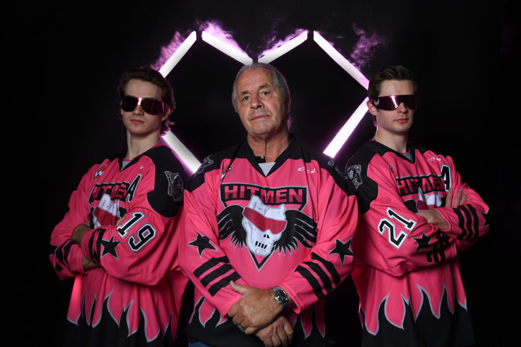
Hitmen jerseys for the second Bret Hart Night.
Essentially just swapped the black and pink from the previous Bret Hart Night.
-
5
-
-
Reading through all this after, I don't really understand what Morgan was arguing for or against... I definitely think he lost the plot but even then, where did the Detroit thing come from? Also, the Detroit jersey is like a platonic ideal of a two colour hockey jersey, so yeah, obviously something similar is going to happen if a team is rocking two colours and wants a classic striping look.
Also also, taking a look at that 1991 image he posted where every team has a traditional look and only one team is using that Detroit template, so nobody is using the same templates back in 1991 like they are in 2022 with the Adidas overlords (just don't look too close at the 1991 Oilers/Sabres/sort of Rangers/sort of Blackhawks and then the 1991 Flames/Blues/Bruins).
4 hours ago, Sport said:These jerseys seem designed for collecting completists and nobody else. I wouldn't buy a jersey I know the team is only going to wear once, maybe twice. If I know that's my team's designated special event jersey that they'd likely wear several times, however, then I would probably drop the money.
This is all just imagination for me, though. They'll play an outdoor game on the moon before they play one in Columbus.
Honestly for me, it's the opposite. I kind of like the one-offness of the special event jerseys. I have a Ducks RR which will probably be my primary Ducks jersey moving forward (even though it's white) and they aren't ever going to wear that again. Switching sports, my Stampeders jersey is their 75th anniversary jersey from this previous season which they aren't going to wear again either.
I do have to like the jersey though (which is why I don't have the Ducks Stadium Series jersey) and I can see Blackhawks and Bruins and Penguins fans having a different reaction when they get a new one-off every year, but I personally like the time capsule nature of the one-off jerseys.
-
4
-
-
Or they keep the sublimation/split colour train rolling with these in blue and green?
-
3
-
-
19 hours ago, who do you think said:
>ownership group that can't/doesn't pay its bills is "committed to the market"
Ownership group is committed to the market because that's how he can run a gambling business under Arizona state law.
-
3
-
 1
1
-
-
Please, somebody also see the similarities between these jerseys. Please, I need it for my sanity.
-
 1
1
-
 1
1
-
-
3 hours ago, Sport said:
It came out today that The Seattle Times fired Marisa Ingemi as one of their Kraken beat reporters in late January. Can't find a reason for her firing online other than s***head stoolies calling her a liar for something she wrote about Dave Portnoy last year.
I actually don't think Barstool had anything to do with it, despite what the mouth breathing Stoolies on Twitter might think.
She at best misremembered, at worst blatantly lied (and I can't really give her much of a benefit of a doubt considering how easily disprovable the thing she said was) about Portnoy/Barstool in that article she wrote about the whole Barstool-NWHL fallout, but that was before she was hired for the Kraken role and everybody on either side just kind of moved on, so I can't see a way that the Portnoy/Barstool thing had any impact this late in the game.
I see that she was fired two weeks short of her six month probationary period, so she could have been let go for a myriad of reasons. It does seem odd though. She did post this tweet on the same day she was told she was fired, which may have played a part?
Per the Defector article from the petition from other Seattle Times staff members.
QuoteShe was told, however, by her editor and managing editor Lynn Jacobson, that she was being fired, claiming issues with her writing. She was given no notice.
Seems vague enough?
-
1
-
-
4 minutes ago, Sodboy13 said:
Something seems a little off about the woodchuck - my mind keeps reading it as "too flat."
I think it's because the woodchuck is "too flat". The way the legs and body are positioned makes it looks like it's been startled or scared and is about the scurry away.
Also the body and legs are positioned in a way that makes it seem like there should be a foreground and background, but they are standing on a bat that is a single plane.
-
3
-
-
3 hours ago, Ridleylash said:
A black RR design for Dallas, eh? Hm. Could be a redux on the star, or maybe....juuuuuuust maybe.....it's a Mooterus in modern colors?

Or we're going to play all the Stars hits at once with a black Minnesota Golden Barons jersey.
-
2
-
-
9 hours ago, IceCap said:
My guess is that the pedestal striping just wasn't popular, and the black alternate was (it was the height of BFBS) so they ran with that and made a white version.
Then they decided to go back to a red primary look but they wanted to keep the striping. The chevron stripes meant that white or gold as the main secondary colour would be "too much," so they opted for black.
And once you've committed to large black stripes on red you might as well go with a flaming black C and numbers?
That's the progression of ideas that makes sense to me anyway.
I think your progression of ideas makes sense to me too. I think going with the black chevrons means going with the black flaming C and black numbers because I think going with white for those would look "off". Remember, they even went with black NOB originally too.
I seem to recall hearing, keep in mind I was 7 at the time, that the introduction of the red primary was a result of the NHL switching to darks at home and the Flames wanting a red home jersey. I would also wager that while they were okay with Blasty on the road, they didn't want it to be the primary home look. I can't speak to the popularity of the Blasty alternate and the lack of popularity of the pedestals at the time the switch was made in 2000 (because I was even younger), but I wouldn't be surprised it was the reason for going with the Blasty as the base back then.
What else I think might be interesting is that the Flames switched the Hitmen to a (slightly different) chevron jersey (with a slightly different number and NOB font) for the same 1998-99 season they introduced the Blasty alternate in, which was the second season of Hitmen ownership for the Flames. That switch was also the switch to the current black/bronze/red look for the Hitmen from the original black/pink/grey Bret Hart look, which could be indicative of the Flames branding ideals at the time and the future promotion of the black Blasty to primary.
Now here's a wild thought, what if the Flames were to have gone with the chevron template, spoilered below, they gave the Hitmen? Switch the black to red, the bronze to yellow and then the red to black? I think they could have stuck with the white flaming C/numbers and red equipment with that jersey. I not good enough at editing to attempt to make that jersey with a picture nor do I think that Hitmen jersey has a editable template anywhere, so it's more of a thought exercise.
Spoiler-
1
-
-
OITGDNHL I guess, but how can the other owners and the league think having a NHL team play in a rink with capacity that would fit it more with Jr. A arenas is a good plan? The Coyotes average attendance so far this season is over double 5000. HRR in the tank.
That ASU arena, if sold out every game, would be sixth in ECHL attendance this season, seventh in attendance last season and tenth in attendance for 2018-19. The Coyotes will be out attended by multiple ECHL teams if they move there. Heck, the Coyotes AHL (Tuscon, 8962) and ECHL (Rapid City, 7500) affiliates will be playing in bigger arenas.
-
5
-
-
8 minutes ago, habsfan1 said:
However, this alternate that they unveiled a few years back is beautiful, incredibly fitting for Calgary, and imo much superior to the 80s throwbacks. The western style cut of the shoulder yokes was a very creative element. The roundel was a solid alternate logo. They just needed to replace the script with the black Flaming C, get a matching road white, and call it a night.
FWIW, as I look at this picture right now and think of going to games at the Saddledome, I can't recall seeing many, if any, fans wearing these jerseys. There's people in the current/previous retros, EDGE and '04s, but none really wearing these. Heck, I can picture more people in pedestals than these.
The number font is atrocious and that sleeve striping is dumb. What's also dumb is that the socks they wore for these jerseys matched the jersey striping of the EDGE set and the socks they wore for these EDGE set more or less matched the striping here.
-
3
-
-
On 1/21/2022 at 4:45 PM, hormone said:
I may be on the minority, but I hate the fact that Buffalo uses more images of buffaloes than sabres.
(Pedantic guy who worked at a zoo over last summer) Ackchyually, they use more images of sabres than buffaloes because they don't use any images of buffaloes. Their imagery is bison, not buffalo.-
6
-
-
Yeah, not a huge fan of that Space Cowboy.
Googling space cowboy, I saw this and something like this aesthetic would be cooler to me.
-
9
-
-
I got kind of flamed for my take a while back in the 21-22 thread (at least I think it was that thread) for not being too super hot about a second go-around at the Reverse Retros because I was questioning where some teams would be able to go with a second jersey that would still fit under the "Reverse Retro" banner.
I'm still interested in what will come of RR 2.0, but my hot take is that I think it'll be worse/less well received for the majority of teams.
-
1
-


MLB 2022 Uniform/Logo Changes
in Sports Logo News
Posted
I really hope the Angels is this season because I am very interested to see what they go with for the "City" in City Connect. I do recall seeing a Reddit comment last season saying there was initial discussions about it being beach themed.