


monkeypower
-
Posts
4,726 -
Joined
-
Last visited
-
Days Won
5
Posts posted by monkeypower
-
-
15 minutes ago, M4One said:
 42 minutes ago, monkeypower said:
Based on those other jerseys, I would guess that the socks would match the sleeves, but I don't know.
Oh, I was wrong.
-
(double post, but different topic)
I didn't think I saw this discussed earlier, but crisis avoided. I saw this Icethetics tweet earlier today and then went to the team's website to confirm.
Despite what rumors went around, the Oilers did not promote the navy alternate to primary. Their website has an alternate jersey schedule up for the navy.-
 1
1
-
-
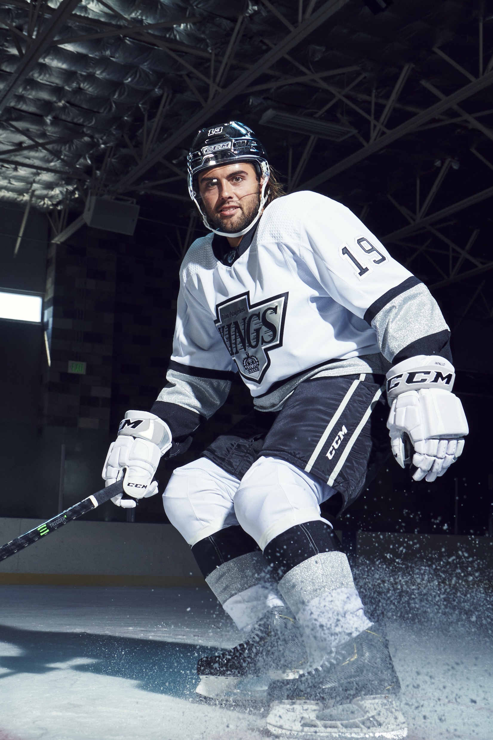
I don't like how different the sleeve stripes and the hem stripes are on that Kings jersey because I find it looks like they're competing.
With something like the Ducks orange alts, the Kraken jerseys and the Coyotes old jerseys, the sleeves and hem are different, but the arm striping is the basis of the uniform and the hem is just simple striping, so it's fairly obvious which is supposed to draw the eye. This Kings jersey is hard to tell which set of striping is the basis for the uniform because the striping is so different, plus the sleeves give off a black-based jersey while the hem looks like a silver-based jersey, yet both so prominent so neither set of striping seems to be the focus. Based on those other jerseys, I would guess that the socks would match the sleeves, but I don't know.
If you aren't going to match the hem stripes to the sleeve stripes, I don't think the hem striping should be such a huge piece of the jersey.
-
4
-
-
Here's that Hitmen jersey. They've worn it for both of the Sunday games, the only two home games they've had this season, and the Twitter account referred to them as the third jersey, so yeesh... A third jersey that is going to be worn for half the home games (we're at 2/17 right now) that should be a one-off.
Per the ongoing discussion, it's also sublimated. It seems all of these junior hockey "specialty" jerseys are now sublimated and all made by the same company, Catstitch, who will put the CCM logo on the jersey. I get it, it's cheaper for junior teams to get these one-off's or single year jerseys in sublimated form if they're only going to be used for one year/limited time.
-
1
-
-
Blue Bombers wearing helmet decal designed by an Anishinaabe artist in tonight's game.
Both the Bombers and Elks are going to wear orange jerseys for the warmup and they'll be auctioned off after.
-
6
-
-
18 hours ago, the admiral said:
Regina Indebted Inspirational Rappers
Whew, deep cut.
-
3 hours ago, CreamSoda said:
I can’t find an updated list of helmet ads for this year. It appears to be a mixed bag
Yeah, there's a handful of teams that don't have helmet ads right now and have gone back to team logos. More than a handful actually I would say.
I don't know if there's any stock to put into this since it's still the preseason and maybe some of the teams are working out new deals with sponsors, but I don't know why sponsors wouldn't want their ad on the helmet and why the teams wouldn't want the money even if it is preseason.
-
1
-
-
2 hours ago, AFirestormToPurify said:
"A race is a grouping of humans based on shared physical or social qualities into categories generally viewed as distinct by society. The term was first used to refer to speakers of a common language and then to denote national affiliations."
French Canadian isn't a race. It's an ethnicity, but it's not a race.
Finish quoting the internet there, "A race is a grouping of humans based on shared physical or social qualities into categories generally viewed as distinct by society. The term was first used to refer to speakers of a common language and then to denote national affiliations... By the 17th century the term began to refer to physical (phenotypical) traits." So like only living pre-1600s maybe makes what he said racist.
I don't even remember what the original post said at this point, but it definitely wasn't racist. Like Mingjai said, it's ethnocentrism or offensive based on national origin or maybe even xenophobic, but not racist. Even on a dumb sports logos forum such as this, we can't be going around misusing the term "racism" because it cheapens the sentiment when we, the collective we, need to properly identify and call out racism.
-
3
-
-
25 minutes ago, monkeypower said:Quote
WHL Commissioner Ron Robison today issued the following statement regarding the alternate uniform unveiled by the Prince Albert Raiders:
“On Friday night the Prince Albert Raiders unveiled an alternate third jersey, which was inspired by a highly successful era in Club history,” commented WHL Commissioner Ron Robison. “We recognize the dated design is insensitive and offensive. After consultation with the Prince Albert Raiders, this uniform and brand will be discontinued effective immediately. On behalf of the WHL and the Prince Albert Raiders, we regret this uniform design was approved and sincerely apologize for any harm it may have caused.”
There will be no further comment from the WHL or Prince Albert Raiders.
This is so dumb that it happened. It's 2021. Edmonton, Cleveland and Washington (and Portland in their own league to an extent) have been major news. PA got in trouble seven years ago for trying to use that logo as the mascot.
How did it get this far?
-
9 hours ago, monkeypower said:
Oh and what's this? A new alternate, that's pretty cool but it's a throwback? I mean, I was a fan of that old Pirate logo but it seems weird to throwback to that already... oh no...
The worst part is that they tried to bring that dude back as the mascot a couple years ago and got heat for it then, so they made changes to the mascot costume. With Edmonton, Cleveland and the WFT and the fact they already got popped for trying to use this guy a couple years ago, I don't know what they were thinking. -
6 hours ago, wildwing64 said:
They don't. Or maybe they do but I'm not really sure.
If any change has been made, it's so subtle that no one would notice.
The white and silver outlines are raised.
-
The Prince Albert Raiders have some new, extremely needed, home and away uniforms.
Though it is weird that they appear to have brightened up the logo outline to the old yellow while still keeping the new gold on the jerseys.
Oh and what's this? A new alternate, that's pretty cool but it's a throwback? I mean, I was a fan of that old Pirate logo but it seems weird to throwback to that already... oh no...
The worst part is that they tried to bring that dude back as the mascot a couple years ago and got heat for it then, so they made changes to the mascot costume. With Edmonton, Cleveland and the WFT and the fact they already got popped for trying to use this guy a couple years ago, I don't know what they were thinking.
-
2
-
-
On 9/1/2021 at 4:44 PM, TheRealPepman said:On 9/1/2021 at 4:46 PM, TheRealPepman said:
It's weird seeing both of these and see how yellow was originally intended, I guess, to be a larger part of the colours than it ended up being. I don't really like the extra use of yellow, especially not the numbers and NOB in the closer to reality prototype. I think it was the right move to just have it as strictly a logo accent colour. Also the right move to not go with the smaller duck mask, looks way worse.
Kind of neat to see how the crossed sticks-duck head logo was apparently something they worked with pretty early. I've always wondered how true the Eisner Fraternity rumor surrounding the logo (and the name) I saw on the internet many moons ago was, and I don't know if the earlier concept logo lends credence to it or not.
On 9/3/2021 at 8:05 AM, Sport said:I've been watching a lot of youtube videos lately about the history and designing of Disney parks - that Ducks concept looks right at home with early 90's era imagineering. They probably referred to the hockey players as "cast members" and everything.
Yeah, it's definitely giving off Disneyland Cast Member vibes.
-
1
-
-
15 hours ago, RyanMcD29 said:
13 hours ago, Lights Out said:
Those TNT graphics oddly feel like something from a video game rather than a professional TV broadcast. I'm assuming this look must be coming to the NBA too.
13 hours ago, Kramerica Industries said:I had the exact same first impression especially when I saw the second picture. Whether that's a good thing or bad thing is another thing entirely.
54 minutes ago, insert name said:Just replace the logo with EA Sports and there you go.
Not a video game, a cartoon. When I first saw the font in that second picture (that I quoted above), I recognized it but couldn't place where I had seen it used. Now I remember.
Cartoon Network used (uses?) that same font in their "On Now" and "Next" bumpers.
-
3
-
-
15 hours ago, the admiral said:
Ah, Sharks weight memes. Just as r/hockey and Twitter have replaced HFBoards as the gen-pop of online hockey discussion, the Hurricanes have replaced the Sharks as the team whose fanbase is 2,000 miles up its own ass over how clever and sophisticated they are. The world spins madly on.
I do feel that the Hurricanes have started to lose some of that luster in the eyes of the online hockey world this offseason though with the DeAngelo signing and the team's public face during the Kotkaniemi offersheet saga.
I think the Hurricanes have started to fly too close to the sun in the eyes of a lot of online people and they're turning into that kid you went to elementary school with that was emboldened by making everyone laugh once or twice in the beginning and then just won't let the bit die.
-
2
-
-
Couple others from around the Junior ranks.
Speedy Creek's new alternates
The quasi-expansion Blackfalds Bulldogs of the AJ rocking the non-contrasting numbers with the contrasting namebars.
The Estevan Bruins of the SJ have a new yellow jersey (and an ever increasing branding inconsistency with four different spoked-B's in use now). Don't know if it's a home or an alternate.
-
Katie Nolan used to be in the Barstool orbit but I think she burned that bridge once she moved to ESPN and got involved with the goings-on in Stamford. (I think she might have been with the ESPN crowd that got the PMT show cancelled after one or two episode, not that the show was that great anyways)
She's got to be going to the Ringer or whatever Lebatard has going on?
-
13 hours ago, CaliforniaGlowin said:
The identity is kind of neat and I (think I) like the head lamp hat, but I find the reveal video funny and how it talks about the canaries. The video is talking about them as like soldiers going to war or the miners themselves and making the heroic sacrifice. The birds didn't have a choice in the matter or any thoughts about the situation, they're birds who placed in cages in mines.
(This isn't coming at this from an animal mistreatment/abuse perspective, more a personification thing)
-
5 hours ago, AFirestormToPurify said:
This. And it's nothing new either. I love my 90s Nike hockey jerseys, but I don't wanna see their ugly and gimmicky templates anywhere near the NHL. Look at those templated monstrosities. They took every design element that everybody loves about hockey jerseys and threw them out the window, save for the big logo on the front basically
It's not really the templated thing for that specific scenario. It's more that all the teams had the same template and yet Nike said the sleeve graphic for the US was inspired by bald eagle feathers.
So since all the teams were wearing the same jersey, does all the teams jerseys were inspired by bald eagle feathers? The famous Korean symbol of the bald eagle?
-
2
-
-
47 minutes ago, DTConcepts said:
This is probably why people are weary of Nike doing hockey jerseys:
I remember when these were released that the NikeSpeak for the USA jerseys was that the sleeve graphic was inspired by bald eagle feathers. Just don't pay too close attention to the fact that all the teams had the same template.
-
7
-
-
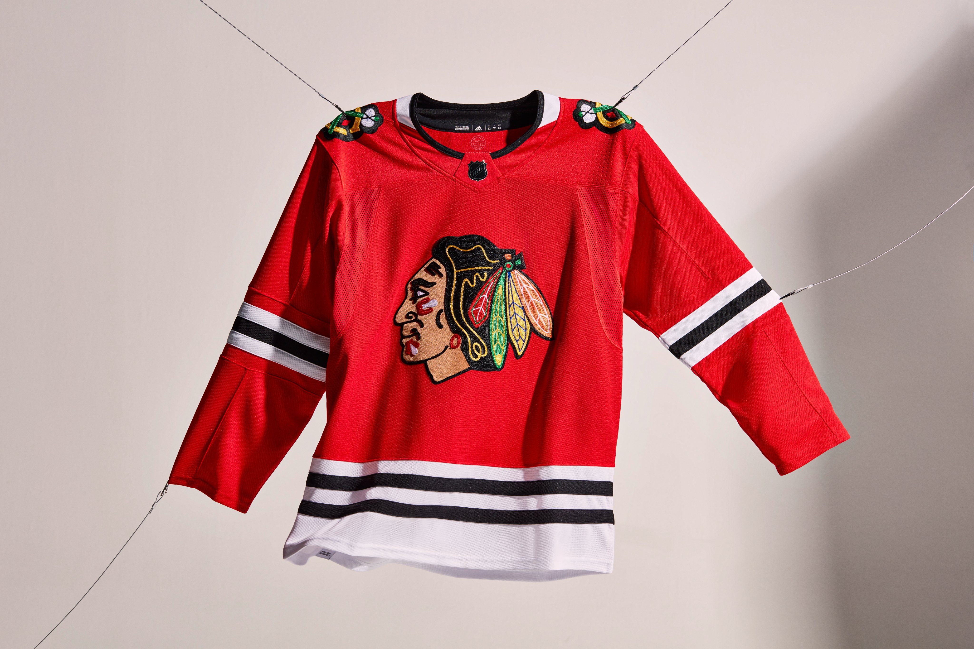
All the NHL teams have been tweeting out pictures of the new Adidas jerseys and the Blackhawks logo with the new crest style almost looks like felt.
-
4
-
-
On 9/23/2021 at 10:47 AM, the admiral said:
Does this make Cuthbert the lead voice for Hockey Night? I always thought his voice was a little goofy.
I would think so yes.
-
Re Oilers talk;
Who cares about the Navy/Orange and Royal/Orange debate when the Oilers best and most true look remains mothballed?
-
4
-
-
On 9/22/2021 at 12:08 PM, spartacat_12 said:
If it was the actual team logo it would be fine, but the fact that it's a grayscale has me a bit concerned. I'm worried this could mean they're planning on introducing some sort of black & grey 'stealth' alternate like Tampa.
I think you might be reading too much into it. I think they were just going for a b/w or grey scale logo just to have a more muted logo on the pants. The Flames had the white flaming-C from the pedestal jerseys on their pants for over 20 years, even long after that white flaming-C was retired, and they never had a black jersey with the white flaming-C.


/cdn.vox-cdn.com/uploads/chorus_image/image/67983256/50892528.0.jpg)

2021-2022 NHL Jersey Changes
in Sports Logo News
Posted
Update, Ducks now have UCI Health on their helmets.