


monkeypower
-
Posts
4,722 -
Joined
-
Last visited
-
Days Won
5
Posts posted by monkeypower
-
-
On 9/26/2022 at 7:07 PM, Dilbert said:
Team logos have been revealed for the Binghamton Bombers, Charlotte Bootleggers, Hampton Hammerheads, and Trenton Terror of the new Pro Box Lacrosse Association

Notice the wing on left side (when viewing) being longer than the wing on the right side. Can't imagine that was intentional considering the rest of the plane is equal and straight on.
-
 1
1
-
-
On 9/23/2022 at 2:32 AM, Stroboy said:
As well, the Brandon Wheat Kings of the WHL have unveiled new Home and Away uniforms (a huge downgrade in my opinion). Gone are the unique wheat stalk stripes for a boring and generic look.
For comparison, what they got rid of
Absolutely brutal decision. Huge downgrade.
9 hours ago, Dante_X said:Saskatoon Blades of the WHL got an updated logo
Everything else appears to be the same with the Blades besides this new logo. This blue does strike me a darker than what the logo used to be and what the jersey blue is, but that could just be a digital application thing for this logo.
-
10 hours ago, mcj882000 said:
Isn't it funny, then, that despite the presumption that they would "need" the ad revenue as much as if not more than the minor leagues, the CHL major junior leagues seem to lack uniform ads entirely?
And heck, even going a level lower to the junior-A AJHL, none whatsoever.
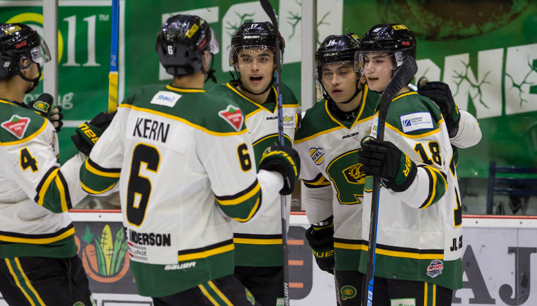
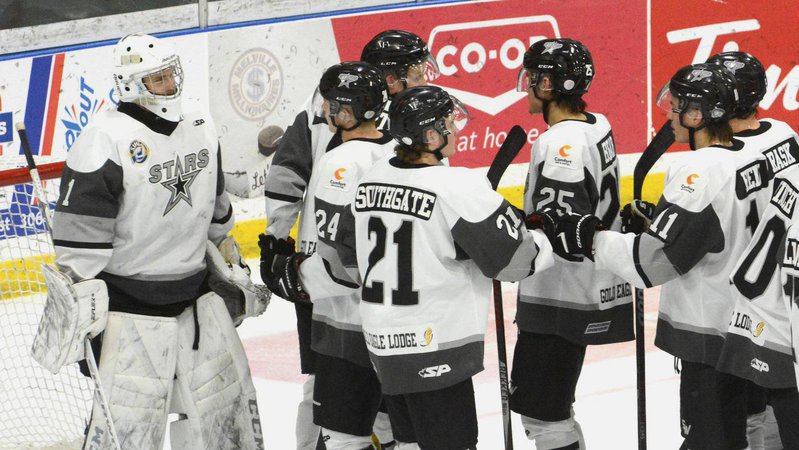
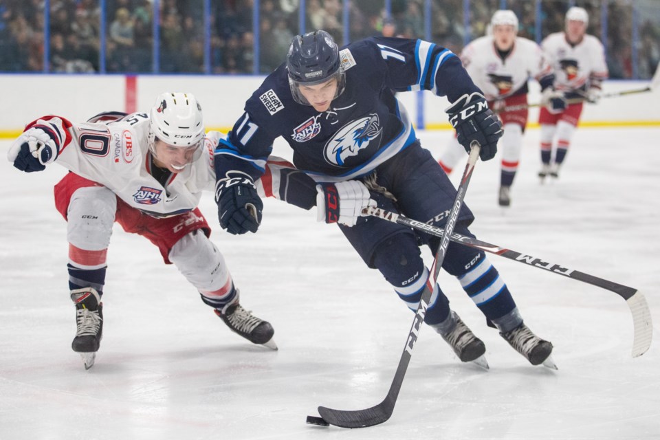
Even considering the fact that these leagues barely play their players anything, if they pay anything at all, it would be a safe assumption that the income and budget franchises in these leagues have is incredibly low, especially post-pandemic, wouldn't it? (The last Calgary Canucks game I went to was 6 years ago, and even before COVID the building was half-full at best and their goal horn was tape recorded.) And yet they still haven't sold out to on-uniform advertising.The CHL doesn't have any regular jersey ads to my knowledge (minus some special event jerseys for some events that are sponsored), but Jr. A definitely does. Maybe not the Canucks, but ads are all over the Jr. A circuit and have been for years. These pictures are from three different leagues, including the AJHL.
-
4 hours ago, the admiral said:
It's going to be a 50/50 split of Albertans and redditors.
There's going to be so many.
-
I don't really like that they kept orange around. there was a blog article I read where a supposed source said the goalies had been instructed not to use orange on their pads this year, but I do like those jerseys.
I could honestly take or leave the grey but I've always had a bit of a soft spot for jerseys like these where the middle stripe is the main jersey colour so it looks like negative space (not the right word for it, but gets the point across I think).
-
1
-
-
I know there's been some discussion here about the Sharks dropping the black equipment, and I'll have to see it in the physical, but right now I like the mockup of the all teal look.
-
3
-
-
-
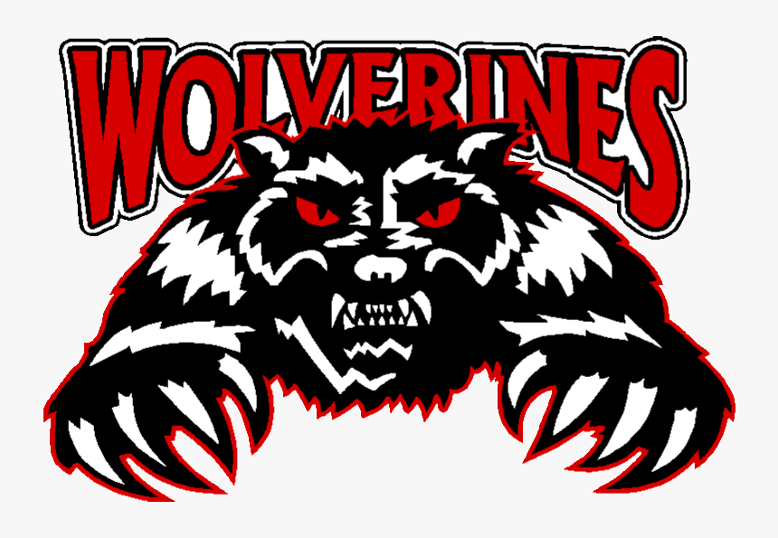
Couple Jr. A changes I've come across.
The Calgary Canucks switched from the blue and green they've used since they started in the '70s to red and yellow, making it so they look like the Flames and not Vancouver.
There's also this colour flipped version which doesn't look good at all.
The Whitecourt Wolverines also made a change, old on top and new on bottom.
And the Melville Millionaires dropped red.
I don't know if I like the blue dollar sign on the blue jersey, especially since they use a white dollar sign in the blue shoulder patch.
-
7 hours ago, TheRealPepman said:
Confirmed
The overuse of CGY stinks, but they seem pretty inoffensive for what they are and they kind of fit in with the striping of the home jersey.
-
7 minutes ago, Sport said:
I would not lie in this case. I think it was after the Browns blew this game to the Steelers. In Athens, Ohio the bar where all the Steelers fans would go (Lucky's) is right across the street from the Browns bar (Cat's Eye). I went to get food at Big Mama's Burritos on Court Street and I was walking to my friends' place to watch the Bengals game, which was an apartment on the other side of those two bars and I walked right into a melee between a bunch of drunk children in football jerseys.
If West Side Story was set in the Rust Belt.
-
2
-
 2
2
-
-
Hoo boy Arte... It will be good when he is gone. He did a lot for the team and then did just as much, if not more, in the opposite direction. Complicated legacy is right.
Will a new owner fix everything? Probably not, but we can only hope it couldn't be worse.
-
1
-
-
6 hours ago, wildwing64 said:
That would be surprising, but probably the best they can do with these colours. I suppose they could call it a 2015 throwback and use it to test the waters that way. It looks like the Knights are using it as an excuse to put out a black version of their existing uniform, so there's that.
No, it's probably going to be like every Ducks concept ever and be a colour swapped version of the Mighty Ducks jersey.
-
2
-
-
Those jerseys are so bad.
-
1
-
-
While I'm not super jazzed about the Ducks going with white again, it makes sense if they wanted to go the route they appear to be going with the Mighty Ducks in current colours. They already wear black jerseys so it makes sense they wouldn't go that way and an orange RR in this style would just look like the current alternate.
One could hope it's something similar to the current alternate so it could be a tryout for making that set, with the orange alternate, the primary set (with the new uniform supplier, the Ducks 30th anniversary and the opening of the renovated Honda Center/surrounding area all scheduleded to happen at around the same time)?
I will say if that is the case, the Ducks should standardize the Mighty Ducks logo because including this Reverse Retro, there's three different Mighty Ducks logos floating around right now, which is somehow worse than back in the day when they had two for some reason.
-
2
-
-
23 minutes ago, Ridleylash said:
Honestly, I think the Canes going black at home is fine; there's a lot more teams that go red at home (Calgary, Chicago, Detroit, Florida, New Jersey, Montréal, Washington) than black at home (which is really just LA and Ottawa). Making themselves more distinct from the crowd is a good branding decision.
LA and Ottawa... and Anaheim, Arizona, Boston and Pittsburgh.
Carolina is the swing vote here now making it 7-7 in terms of red vs black from 8-6 in favour of red.
-
1
-
-
21 hours ago, Discrim said:
Wait...so their black jersey has yellow gold. Their white jersey uses Vegas gold. Their third uses no gold.
The explanation for why they did this on purpose will probably be a doozy.
They couldn't decide if they wanted to keep the Vegas gold or match the Pens by updated to the yellow so they did both, then added a throwback inspired alternate for good measure (I assume the red and black is supposed to be a Wheeling Thunderbirds/early-Nailers nod).
-
13 minutes ago, spartacat_12 said:
Upon a closer look at that prototype graphic I noticed a few other differences from what we ended up with. It shows the Devils jersey having red numbers instead of white, the Knights wearing white gloves, the Pens, Ducks, Wild, and Avs all pairing dark helmets with white jerseys, with the Avs in black pants & helmets instead of burgundy.
The Ducks would have been even weirder if they did also go with the dark helmets along with having the dark socks with a white jersey.
I wonder what the reasoning was?
-
I kind of like that Blackhawks jersey.
Is it a RR? Maybe? (which is why I'm less bullish on the second go around of RR).
-
I don't like it.
It looks more like a team called the Wichita Flames than it does the Calgary Wranglers.
-
1 hour ago, DTConcepts said:
Even though “O6 dress-up” is a dumb concept on the whole, the Wild are by definition not an O6-looking team. Last I checked, none of the Original 6 have green prominently in their identity.
I agree with @Sport, the only real "Original 6 dress-up" are the Lightning because it was so deliberate and intentional to look like the Detroit Maple Wings.
Every other instance of supposed "Original 6 dress-up" are just teams looking at the platonic ideal of a hockey jersey, which most of that ideal stems from the Original 6 and "old time hockey", and then trying to emulate that ideal.
It's not Original 6 dress-up for a team to use Northwestern stripes or Brashier stripes or a chest stripe or a team colour/jersey colour/white/jersey colour/team colour pattern, that's just what a hockey jersey "is".
-
3
-
-
2 hours ago, AFirestormToPurify said:
What I'm saying is, teams from the 60s look like teams from the 60s. So do 70s teams. And 80s teams. And a lot of 90s teams. And so on
Except the Wild. The Wild can't look like a Y2K team for some reason, they had to do the faux-retro thing out of nowhere when their original uniforms were perfectly fine
Except the Ducks and the Blue Jackets and the Kings and the Panthers (open that can of worms right back up) and the Predators and the Senators (kind of, it's what they wore in the 90s but it's not really a 90s jersey, but I guess it is by definition since they wore it in the 90s) and the Sharks and the Lightning and the Capitals by my count.
-
5
-
-
In USPORTS changes, Ryerson University in Toronto officially changed their name this past April to Toronto Metropolitan University following five or six years of discussions and last year's discoveries of residential school mass graves in Canada because of the Egerton Ryerson's, the school's namesake, involvement with the introduction of the residential school system. As part of the changes, they are changing the name of the sports teams and the mascot. They were the Rams and the mascot was a ram named Eggy, taken from Egerton.
They narrowed it down to three names and six mascots and allowed for community feedback up until like two weeks ago when they closed the response form. The three names are
- Bold
- Meteors
- Towers
The six mascots are
- Bee
- Caribou
- Meteor
- Moose
- Squirrel
- Tower
Here's the website where you can read the reasoning behind all the choices.
-
I see that the AHL schedule was released a couple days ago which includes the new Calgary team showing they are playing in Calgary and the Calgary release says they will be playing at the Saddledome.
The WHL schedule was released a month ago showing the Hitmen still playing in the Saddledome and last year's NLL schedule wasn't released until September so it appears we won't know the Roughnecks schedule for a bit, but looks to me that there are going to be four teams running out of the Saddledome now. There's also some double bookings right now between the Flames, the Hitmen and the AHLers. We'll see how that goes and how much people take to the AHL team.
However, there's been absolutely nothing other than that, to my knowledge, that I have heard about this team. Not that I'm a Flames fan nor an AHL fan, but I am local to Calgary. Looking right now, the Flames Twitter account made a post about the AHL schedule release and tagged the Stockton Heat account. The AHL website uses the Flames logo. Tuscon's schedule release video just says Calgary instead of listing an arena name like they do for the other teams.
There'll have to be a name and logo announcement soon-ish, right?
-
My money's on Koho taking over.
-
2
-
1
-


2022-2023 NHL Jersey Changes
in Sports Logo News
Posted
Here's Icethetics 2022-23 Jerseywatch. Personally not a fan of it being a 21 minute video instead of an article, but hopefully it'll get turned into one later.