


monkeypower
-
Posts
4,721 -
Joined
-
Last visited
-
Days Won
5
Posts posted by monkeypower
-
-
It's not like the orca logo has any significance to the Canucks besides the ownership name at the time being Orca Bay.
They really brute forced that logo into representing the team to the point where now it's sacred?
-
 1
1
-
-
1 hour ago, BadSeed84 said:
I like some whimsical logo's, but don't need most of the league having them.
The Reds, Orioles (Tho the Ripken era bird I did really like as well) I do like and it suits them.
But then there's teams like the Blue Jays who best logo is when its just the regular bird head.
And to me this is easily the worst logo they had.

I wouldn't consider this a "whimsical" logo. If anything the regular bird head is the whimsical logo, especially when you compare it to the Black Jays they switched from.
-
There aren't great?
They're supposed to be oars I gather, but Oregon Argonauts.
-
1
-
 1
1
-
-
From Larry Brooks:
QuoteSlap Shots has also learned that Coyotes players filed multiple complaints with the PA during the season about sub-standard travel, lodging and logistical issues that were in violation of the collective bargaining agreement.
-
1
-
 3
3
-
-
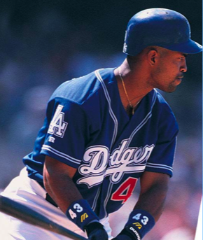
I kind of like these very short lived Dodger blue jerseys. I remember using them on Triple Play Baseball (with Giambi on the cover) on the computer.
-
2
-
4
-
 1
1
-
-
10 hours ago, tBBP said:
So I'm sure there's a good reason I just saw a large Savannah Bananas logo superimposed onto the side of a resort hotel...in Las Vegas....
Like, why would anyone care about an MiLB in South Georgia team way the freak out here??
Because they're not an MiLB team. They were a summer collegiate team that started doing Harlem Globetrotters-eque games of baseball on the side and then dropped the summer team aspect and are now essentially just baseball's version of the Globetrotters. Looking them up, they're in Las Vegas this weekend.
-
3
-
-
2 hours ago, CS85 said:
Easily a fireable decision. Just...the epitome of brand suicide.
The EE on the helmet is the brand. Part of the reason Elks was chosen was because it kept the EE and the new name was always going to start with an E.
The antler on the helmet didn't work in person from the stands IMO. It *didn't have the same line weight *nor the size/prominence as something like the Rams, Vikings or Eagles, it just looked like a twig on the helmet.
-
4
-
 1
1
-
-
18 hours ago, the admiral said:
I think Warriors ownership's table will be ready before Fisher can start sniffing around Portland or Salt Lake City.
Joe Lacob was pretty in on the Angels this offseason before Arte got cold feet. Sigh
Lacob did grow up in Anaheim and worked for the Angels and/or Angel Stadium in his youth, so we'll have to see if he wants a baseball team or just wanted the Angels.
-
Kind of a neat thing; for training camp and the pre-season, the Stamps will be handing out retired numbers to some players and those players will be wearing jersey patches signifying the player who the number was retired for.
The numbers will be taken back out of circulation once the regular season starts.
-
2
-
-
21 hours ago, Ridleylash said:
I just don't get the ruling consistency; why the hell is skirting the combine rules an infinitely worse crime than an organization actively covering for a rapist for a solid decade? You'd think the team with the much more severe infraction would be the one getting the much more severe punishment here, not getting off with nothing and receiving a generational talent.
One team lost two picks for skirting draft combine rules, one team lost no picks and got a generational talent after covering up rape for a decade. I would think the latter deserves the far more severe punishment here, since it's the far more severe crime.
It's pretty consistent really. What Arizona did was against the established rules that are set in place in the CBA related to the actual on-ice playing of games and they were punished per those rules. What Chicago did was not. There weren't any punishments in writing/place for what they did (and what they did didn't really impact the actual on-ice playing of games) so it's different situations.
--
I'm so disappointed the Ducks aren't getting Bedard.
-
1
-
-
11 hours ago, M4One said:
I agree with you about the past logos. The current is fine for me.
The current one stinks. It's a modified RCAF logo with a jet slapped on and a notch in the top the celebrate the ownership group.
Plus I hate the maple leaf usage, it's one of my logo pet peeves. The Jets aren't the only Canadian team in the NHL and one other team who is also Canadian already uses that as their name.
-
3
-
-
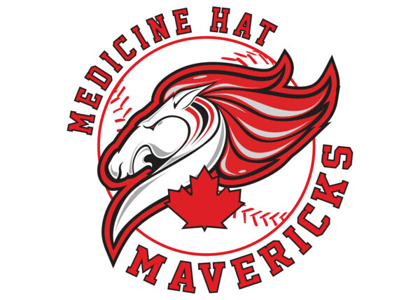
The Medicine Hat Mavericks of the WCBL (Alberta and Saskatchewan summer collegiate) have a 20th anniversary logo. The black shape is the horse head from their logo.
-
3 hours ago, Unocal said:
EDM and VGK should have played last night.
TOR/FLA and VGK/SEA should be playing tonight.
The 2nd round scheduling is absurd.
To think last year round 1 EVERY series was every other day with no 2 day breaks in between games.
I believe they've hit some issues with concerts and other arena events that have pushed the entire schedule around.
-
1
-
-
1 hour ago, DCarp1231 said:
Is it just me or is the helmet logo horribly placed/too far back?
It is far back but I'm pretty sure it's because of the size and shape of the decal. The previous helmets had the same issue.
-
I wonder if the helmet change was made because the football boat was getting lost in the helmet.
-
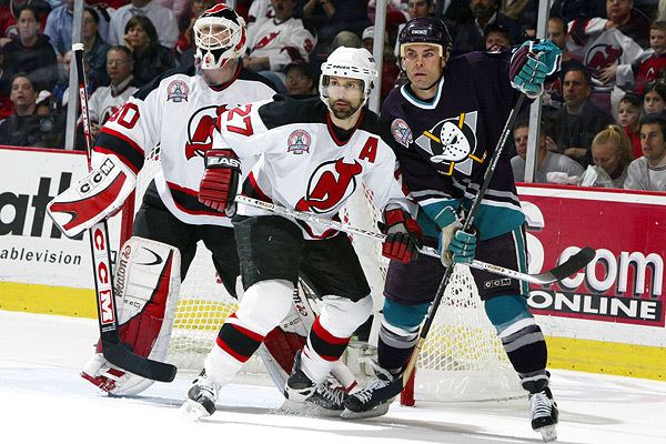
Also before we get too far off the Devils, underrated Stanley Cup Finals jersey matchup.
-
12
-
 3
3
-
1
-
1
-
-
The issue I can see with that Senators concept is that the gold would get so lost in the red, especially with how thin that stripe is. I've seen it to an extent with the Ducks and the Hitmen where I think it would look muddy.
-
1
-
-
6 hours ago, Krudler said:
It's a travesty what've they've done to those sweaters. Such seemingly small changes causing such a major downgrade.
They made a change to what? Depart from the old era into a new one? But the change was such a minimal thing that was barely a change and was a change that looks like it should have happened with the initial EDGE rollout era of jerseys and then they would have gone back to the old ones by now.
It's kind of like the Devils were the sheltered kid with the strict parent in Lamoriello and once the parent was gone the kid decided to try to get a little wild, but they didn't know what that meant and considered drinking two glasses of sparkling apple juice instead of one as "wild".
-
3
-
 1
1
-
-
If you want the "best" teams to win the league championship, watch European soccer.
Same with the little pockets of internet who say that North American sports need promotion/relegation. That ship sailed 150 years ago. (It more so comes up in regards to MLS, and then sort of to other sports, but that would dry up their expansion fees if the MLS did that)
-
1
-
-
Friedman said on a 32 Thoughts or a Marek Show back when the those Atlanta rumblings were going over the internet (based on like three tweets and did those go rumblings go away quickly) that he believes the NHL doesn't want to expand soon and the league views Houston as more of a back-up plan for Arizona right now.
-
1
-
-
10 hours ago, fortunat1 said:
The pattern on the inside of the letters is actually really nice, and has lots of potential to enhance the uniform (if employed tastefully). I wouldn't bank on getting a jersey with PGH on the front, but I will be a bit disappointed if that is what we get. I'm undecided on the font, but leaning a bit towards the positive side. My expectations are high, but I am prepared to be let down as well.
Not sure which way they go with pants though. It's completely believable that they could go with any combination of a black or yellow top with black or yellow pants. It seems like a lay-up to make that decision though, so Nike will probably make some mind boggling decision for the pants. I wouldn't put it past them to make a yellow jersey and pair it with "Steel Grey" pants, with rivets acting as a stripe down the side of the leg.
I was in Pittsburgh last October for the Jets-Steelers game and then a couple Pirates games and I found myself really liking Pittsburgh (and was disappointed the Angels weren't playing there this season so I have no reason to go back anytime soon) so I was looking forward to see what the Pirates would come up with.
Colour me disappointed from everything Pittsburgh has if all we get is "PGH". It could be a sleeve patch, but I'm not liking the t-shirt look.
-
14 minutes ago, Kramerica Industries said:
The Rangers have that one Cup from 1994, long enough ago that I was less than year old when they won it, and you still never hear the end of it, so they're absolutely in this equation as well, btw.
I wrote elsewhere the other night that when the Wild got eliminated that them being eliminated in 6 games is the perfect embodiment of that entire franchise. They define the concept of being aggressively average in the regular season already; they make the playoffs more often than not, but they also never win their division, so they're never one of the top teams. Then they go into the playoffs, win a couple of games to show that they aren't bad enough to get humiliated, but also never good enough to be in position to win their series, either. Every Minnesota Wild season unfolds the same way. It's honestly impressive and a perfect reflection of Minnesota sports.
Yeah, the Rangers should fit in there as well, but I think their playoff struggles are more well documented than the Bruins and the Bruins always seem to go into the playoffs in recent years as a "contender" of some kind. I don't know if the Rangers have that same kind of aura, warranted or not, as the Bruins do.
The Wild's playoff peak was scoring one goal in four games in the Western Conference Finals 20 years ago.
Not to go further off topic, but I think the Flames don't get enough guff for their historical mediocrity (probably a bit worse that mediocrity actually because the Wild and Bruins/Rangers et al at least make the playoffs consistently). Since the cup win in 1989, they've won six* playoff series and three of those were in the same playoffs.
*One of those six was the 2020 bubble qualifying round, so don't know if that counts as playoffs in the eyes of the NHL.
-
1
-
-
1 minute ago, the admiral said:
I don't hate the Bruins as many do. Maaaaaan, that one stings. That's two historic chokejobs in the Bergeron era. Wow. You really get the highs and the lows with that team, huh.
I wonder if the Bruins deserve to be more in the same tier with teams such as the Maple Leafs (this year not withstanding) and Wild and other poor playoff performers. They do have the one Cup in 2011 but it was their first since 1972 and they haven't done much playoff wise any other time.
-
1
-
-
7 hours ago, infernoqueso said:
Also the victim of being associated with an inferior uniform set as a whole. Same problem I think people have with Sharks logo 2.0 vs 1.0.
I think it's also a bigger issue of that logo never being used anywhere so it doesn't have the recognition it could have to warrant Sens fans wanting it.
I don't think either Sharks logos are all that great. They both have design issues.
-
2
-


 - A Blue Jay holding a bat and tossing a ball behind red and blue T SportsLogos.Net")


2023-24 NHL Jersey Changes
in Sports Logo News
Posted
Would they even be able to have a yellow away jersey with the Perds having a yellow home jersey?
The Patriots have a pretty defined brand and identity in the US Revolutionary War that has been consistent for their entire history.
The Yankees, Canadiens and Giants also all have letter based logos where the vagueness created their identities. The difference between these three and the Canucks is what you said,
Canucks is so vague where anything could be considered "Canuck" after enough time. Any of their logos could have been their NY, CH or SF, but they never stuck to anything.