


monkeypower
-
Posts
4,717 -
Joined
-
Last visited
-
Days Won
5
Posts posted by monkeypower
-
-
On 7/4/2023 at 8:24 AM, the admiral said:
It's possible, but it doesn't look especially good. The yellow hockey sticks were a nice accent, and the eggplant circle blends into the rest of the base too much.
I never understood why the triangle went from jade to grey on an eggplant background. It seemed so bland that way. I thought the jade stood out just fine, as it does here.
I've always found any concept that switches out the black from the logo makes it look too washed out.
I don't know if there's ever been anything said about the decision to have the grey triangle. I can only assume they were worried about the jade not contrasting enough?
-
 1
1
-
-
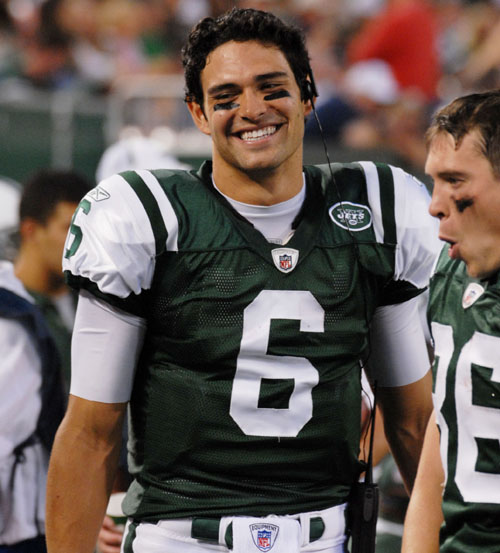
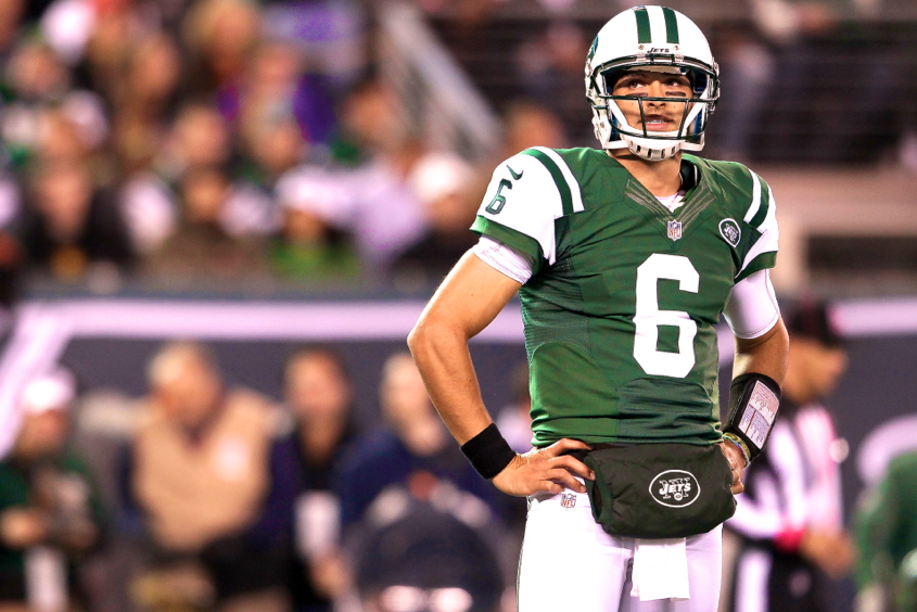
What Nike screwed up with those Jets jerseys was going with a straight Colts recolour and then slapping on the coloured sleeve and calling it a day.
The goal of this Jets look is for the striping to be sleeve colour/jersey/stripe of sleeve colour and not UCLA stripes with a coloured sleeve (I hope that makes sense). With Reebok, that is achieved by using UCLA stripes but rounding off the outer, in relation to the neck, stripe to make it look like it is part of the sleeve.

Nike wasn't able to achieve the same look as Reebok because the cut is different, so what they did was have the coloured sleeve and then do g/w/g striping (or w/g/w for the greens) on the shoulders. The outer green stripe, in relation to the neck, is intended to be part of the sleeve and that sleeve is intended to be continuously bordered by the white but it doesn't work because the white stripe at the top is disconnected from the perforated white jersey section below.
What Nike should have done, besides come up a different template for the Jets, was flipping the shoulder striping so that the jersey colour stripe is able to continuously border the sleeve. It wouldn't have been perfect, but it would have been so much better. Excuse the limited editing effort.
-
19
-
-
2 hours ago, Lights Out said:
This feels like cherrypicking. Reebok did a better job with the QB cuts, I guess, but for many players, their jerseys didn't look any better than Nike's. Maybe the shade of green looked a little nicer, but they had the exact same problems with the stripes:
I could say you're cherry picking too because the Reebok stripe issues were only with the lineman cuts. With Nike, every jersey cut had the striping issue of the Reebok lineman cuts.
You can see Revis with a cut similar to Sanchez and then #30 Coleman in a different cut which I would approximate to be the closest to the Nike cut around the shoulders for skill players that Reebok ever got. Coleman's jersey has some sleeve cut out, but it's nowhere near as pronounced as the Reebok lineman cuts nor Nike's cut for every jersey.
Side note: this is the first time I'm noticing the different patch placements on the jerseys. You'd think I would have noticed that as a young Jets fan who was obsessed enough about sports branding to end up on this forum.
-
7
-
-
2 hours ago, IceCap said:
I know they're your favourite team and I get the desire to go to bat here, but the "est 2006" bit on a jersey meant to celebrate a 30th anniversary isn't even the worst part here.
So having the wrong founding date on the sleeve is just one more thing to laugh at on top the pile of disappointment this thing is.
This is what the Ducks marketing VP said this about the years, which is what I was getting at in this thread.
Quote"It's a nice little token or metaphorical timeline as we like to describe it," Tully explained.
People might not like it, which is fine because all it is is years embossed on a sleeve stripe, but that is the Ducks explanation for the years. It's the two different eras internally considered by the Ducks regardless of what LLC incorporation dates say.
2 hours ago, IceCap said:Ducks fans (and everyone else) seemed to want something invoking the original Mighty Ducks sweaters. If not a straight throwback then perhaps the Cup winning template in Mighty Ducks colours and with the Mighty Ducks logo.
I never was expecting it to be a straight throwback based on both the 20th and 25th anniversaries and I'm surprised that people are so shocked that it's something more conceptual, especially when you consider what they did for the 25th jersey. At the end of the day, this is just intended to be a one season anniversary jersey.
2 hours ago, IceCap said:Maybe this is a case of fans working themselves into disappointment
Yes and I think this is the biggest reason for the reaction to the jersey. It's been a really unfortunate week to be part of the Ducks online fanbase because a lot of them really worked themselves into a shoot (that's for you wrestling guy)(you are a wrestling guy right?) with the #2 pick and then the 30th anniversary jersey.
They just got so convinced because of the media saying that Fantilli was #2, it turned into him being the best non-Bedard player since Sidney McDavid-Gretzky, but they didn't take him and instead took a different guy(who was also discussed as #2) and some people couldn't handle that. Then the 30th anniversary jersey came out and it wasn't a straight throwback or the Cup winning template in Mighty Ducks colours and there was another meltdown from some people. People then see these Ducks fans negatively reacting and build on that.
Regardless if people like the jersey or not, which I myself have some problems with it and don't really have any desire to go out and buy it, I can't really find any sympathy for people who built up the head canon of it being a throwback when that never was going to be the case and the Ducks never said it was going to be the case (same with the Carlsson pick). Also, there were still online Ducks fans up to the draft believing the team was going to unveil a completely new jersey set when everything pointed to the contrary.
If people don't like the decision, great, but the Ducks didn't have the intention of it being a straight throwback.
QuoteFrom there, the Ducks worked with the NHL and their apparel supplier, Adidas, to come up with a design that was historic, unique and could serve as a thread for where the team has been and where they want to go next.
Just like the 25th, a more conceptual anniversary jersey.
Ducks marketing guy again,
Quote"I hope they see the depth of thought and the unique take on our history," he said. "We recognize the popularity of our original mark and we're super open-minded about future plans with that mark. But I hope [fans] are as excited as we are to take in the dozen or so games in this anniversary season and give the Anaheim Ducks this new and exciting fresh look."
However, I don't know how much I liked him saying "we're super open-minded about future plans with that mark".
I had always believed that the change the Ducks were going to make would be going back to the Mighty Ducks logo, but keeping the Anaheim Ducks name and colours. But the owners really seem to love their webbed-D baby.
I don't see them ever going back to the eggplant and jade full time outside of an alternate or keeping in a break in case of emergency throwback night.
-
2
-
-
55 minutes ago, Seido_Ace said:
Or perhaps Cheers? I loved that show.
Seattle's should have been a brown suit.
-
2
-
 1
1
-
-
15 hours ago, HOOVER said:
I can’t take anyone seriously who thinks Reebok did a better job with NFL uniforms than Nike, in any capacity.
Reebok did better with the Jets previous set than Nike did. Nike messed it up with the mismatching greens and the more pronounced shoulder cut out, which is because the Nike jersey was the Colts jersey with a coloured sleeve, so it added an extra white line that didn't need to be there.
The one improvement Nike made, I guess, would be the moving down of the logo onto the chest.
-
10
-
-
Saskatoon is rejoining the summer collegiate WCBL after the city's previous team folded in 2014. They asked for name the team submissions and opened a poll and here's where the voting is as of June 29th (I voted for Berries, though River Pirates could be fun with the song).
-
13 hours ago, VampyrRabbit said:
It's still the same organisation, the team still existed and weren't refounded as an expansion franchise. They already acknowledge that history with the Duck foot logo being incorporated into the main roundel, and the critism over the Est 2006 is justified.
People also have a right not to like script embossed into the sleeve stripes.Like I said, it's a little Easter egg for the fans and the franchise who understand and recognize the significance of the dates. Yes, it is the same franchise but the Ducks as a franchise have always viewed the team in two distinct eras. I didn't realize we're dealing with legal documents of establishment that need to be followed to the letter.
If you really want to get specific here then, it should really say Est 1992 because they were awarded the franchise in 1992.
-
3
-
-
9 minutes ago, VampyrRabbit said:
It still says est 2006, and it's still wrong - the team didn't cease to exist as the Mighty Ducks of Anaheim and then refounded in 2006. It's the same organisation, and the designers still f***ed up by putting est 2006 on the jersey.
I like the idea of embossing the sleeve stripes, but for stuff like the waves on the new Sharks jerseys, not an inaccurate foundation date.They did cease to exist as the Mighty Ducks of Anaheim. No, they weren't refounded, but they did cease to exist as the Mighty Ducks of Anaheim in 2006.
Like I said the other person, the Ducks have a unique franchise history and they are choosing to acknowledge that unique history. People doesn't have to be so obtuse and/semantic about what's essentially a jersey Easter egg for the Ducks fan who understand what it is trying to mean and what the dates mean.
-
2
-
-
1 hour ago, BoysClub said:
Your defense makes sense, but it seems like a weird decision to make for a professional organization. The jersey is almost completely inspired by pre-2006 jerseys and anything included from post-2006 seems forced, including the "est 2006". They are supposed to be celebrating 30 years as a franchise in the NHL, not splitting hairs and isolating specific events. Did current ownership really need the pat on their own back that bad?
It's not the ownership patting their backs and it's definitely not "splitting hairs and isolating specific events", it's almost the complete opposite because it's a pretty big moment in the 30 year history of the Ducks. They're a pretty unique case as a franchise in sports and it's acknowledging both distinct parts of their history.
-
1
-
-
2 hours ago, SFGiants58 said:
It’s fine. Perfectly adequate.
It could be better, but the 25th anniversary one proved it could be worse.
I think the 25th anniversary one was a couple moves away from being really great. Namely getting rid of the jade shoulders and finding a way to use more eggplant.
-
3 hours ago, Ridleylash said:
The :censored:'s the point of having the Webbed D there at all if it's going to be so small you'd need a microscope to see it on TV?
I could see the thinking being they wanted to include both logos and just had it there without considering how it would look on tv or it being a little detail that doesn't have to come across on tv. Plus, I'm sure it'll show up fine on on tv anyways when it's not the broadcast angle like any other small details in logos.
QuoteWhy'd they hop on the roundel train so late?
Technically they didn't hope on the roundel train late because this is clearly inspired by the old shoulder patch which was a roundel.
QuoteHow do you not at least fill the cuffs to match the hem?
Because it's going off the orange alternate where the sleeves and hems are different.
QuoteWhy do you not even have the Mighty Ducks logo on the jersey as a shoulder patch?
Because it's an anniversary jersey and they have both logos in the chest logo. They really should have put the Mighty Ducks logo on one shoulder and the Ducks logo on the other.
Note: I am not meaning to defend the jersey decisions with the above, as I don't like some of the choices, more just trying to explain possible thinking.
HOWEVER, I do think people on the internet need to calm down (as if) and really think about these jerseys as being anniversary jerseys. They were never going to be straight up Mighty Ducks throwbacks and they aren't intended to be Mighty Ducks throwbacks. It's an anniversary jersey and you may not like the decisions made, but anyone was wrong to think that this was going to be straight throwbacks or a straight up rebrand like some people on the internet may think.
3 hours ago, CDCLT said:I cannot believe they have "EST 2006" on the sleeves. Forget the fact that words don't belong in sleeve stripes, that's not when the team was established. Unbelievable failure from what should've been an easy slum dank.
I will defend the jersey on this point though because it is wrong.
One sleeve says "Mighty Ducks est 1993" and the other sleeve says "Anaheim Ducks est 2006".
-
6
-
-
Because uniform unveilings suck in terms of having concrete photos right away, this is the best quality photo as of this moment.
-
2
-
 1
1
-
-
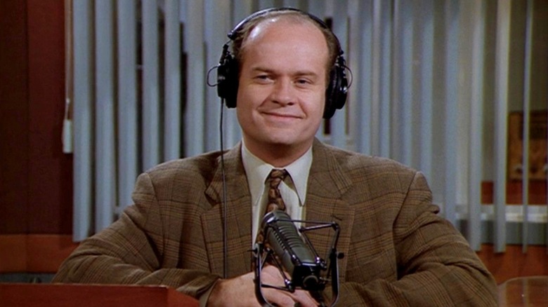
On 6/25/2023 at 5:51 PM, the admiral said:
Don't know the post in question, but is it about how everyone glosses over the Global Coffeehouse style of earth tones and crudely drawn spirals?
Not to derail the thread, but question for you and the thread, would this colourful border design here Global Coffeehouse? I didn't know Global Coffeehouse was the name for that style until right now, but don't think so? (spoilered for space and thread purposes)
SpoilerI have distinct memories of this style, most prominently with old Swiss Chalets, but I remember seeing it other places too but have never known the name.
-
1
-
-
2 hours ago, JohnnyCowboy5 said:
[other pic snipped for space]
I know this game was colour vs colour, but it was a special event game where the look was part of the spectacle.
The Ducks-Hurricanes game was just a regular, run of the mill regular season game. Not that it wasn't planned or anything like that, but it was an otherwise normal game.
-
Has there been any rumblings of a Jets throwback look?
I ask because the release of the black helmet last years kind of implied that throwbacks would eventually show up and there have been plenty of throwback logo appearances, the original full plane logo and the 80s-90s logo, on the coach apparel in offseason content.
-
35 minutes ago, VampyrRabbit said:
I wish there were colour vs colour games in the NHL. San Jose vs Vegas might work as one.
The Ducks and Hurricanes did one in 2018.
-
6
-
1
-
 1
1
-
-
6 hours ago, adsarebad said:
nice to see different colors every home game. For example if your team is hosting the Maple Leafs and then the Red Wings, it’s a visually different experience to see blue in one game and red in the next. As it is, you’re always seeing the same colors at home.
 6 hours ago, the admiral said:
I'm still in favor of white at home as well: the color white generally symbolizes good, and a dark base for the road team makes them look like even more of a foreign body on the rink with the white and team colors coming together at home. The road team was in even sharper relief in NBA games: picture the Bulls in white with some red and black on a court with some red and black and fans wearing some red and black, and then the visiting Boston Celtics wearing kelly green.
The argument to that, which I subscribe to, is that the home team should be wearing their colours at home. Make the visiting team come in and look non-descript in the white jerseys that every team has and then the home team gets to show off their colours with the crowd.
As someone who goes to WHL games where they go half and half with dark and white at home, which more and more teams have been eschewing more and more "white at home" games over recent years, seeing the different team visiting team colour is an overrated thought experiment that you don't even notice in practice, IMO.
-
7
-
-
I was walking through my neighborhood here in Calgary and noticed a backyard that had a New Mexico Lobos mini basketball hoop stuck to the side of the fence. Like one of those indoor hoops that come with the foam balls.
I also could have been the subject of this thread as I was wearing a Stampeders shirt in Polly's Pancake Parlor in Sugar Hill, New Hampshire and an old man came up to me and said he visited Calgary during the Olympics.
-
4 hours ago, zubazpirate said:
The ICE's facility at The Rink was essentially a team complex. It's located under the stands of the main rink. You can get a taste of it from this video... I've been in there and there is more to it than what the video shows, but this hits the highlights.
There is still a CSSHL team playing at The Rink, so maybe they will adopt it for their use.
Yeah, I think with some repainting and some signage changes, that could still get some use by the CSSHL teams.
4 hours ago, zubazpirate said:As for the arena situation, one of the owners' friends explains it pretty succinctly in this HFBoards post he wrote yesterday:
Not surprisingly the carrying costs skyrocketed due to inflation and interest rate hikes. When the ICE owners presented a plan B, the WHL turned it down and forced the sale which resulted in the relocation. Clearly the league had lost its taste for trying to make it work in Winnipeg.
See none of those were made public, at least to my knowledge and I doubt they were public if the first explanation of it comes from the owner's friend on a message board, so I had nothing to go off of.
I think your comment at the end here and a person in that thread a couple replies down from your linked one explain it really, I think the league just wanted to wash their hands of Winnipeg after everything fell apart and no new arena appeared to be coming. Winnipeg was so far away from every other team and for being in a large metro (in relation to junior hockey), the WHL wasn't getting much benefit out of it when Winnipeg wouldn't get a brand new facility and couldn't be a flagship franchise.
I'm not surprised the WHL said no to the plan B, if that is all true, because that plan still wouldn't have fixed the issues with the location. 20 million is pretty steep for still not getting up to the 5000 seat requirement and it wasn't going to be a new arena which the WHL wanted.
-
To get back on thread,
I could see the Ducks coming out with a new anniversary jersey as an alternate for this year. The 25th anniversary one was pretty well received and the write up for the jersey ad says
Quoteintroducing the addition of the Western National Property Management patch on the Ducks' black home and alternate jerseys.
Is it supposed to read as "black" being applied to both the home and alternate jerseys or is it two separate statements "black home" and "alternate"? If the latter is the case, why specify the colour of the home jersey and not the alternate? All it could end up being is just a grammatical issue but it's still interesting wording.
I saw some comments online that STH's got an email saying some more 30th anniversary announcements are going to be made at the draft party.
-
9 minutes ago, IceCap said:
Chances are I'm in a Leafs sweater and he's in a Sharks sweater.
We bond over shared crushed dreams
Do you take turns on who wears the respective Marleau and Thornton jerseys?
Edit: Or break out the Toskala's on special occasions?
-
 1
1
-
-
On 6/20/2023 at 6:15 PM, AFirestormToPurify said:
How come Montreal's new alternate hasn't been leaked/released yet??
 On 6/21/2023 at 2:18 PM, Jer15 said:
Here's a little something for you
Lots or red I assume. And the old logos as pants stripe?
They snuck them out yesterday.
Pretty classic football look. Not that there's anything wrong with that but I do wish the helmet striping was used instead.
-
3
-
-
2 hours ago, zubazpirate said:
The plan at the outset was to build a new arena next to a then-new ice rink facility, called The Rink Training Centre. The ICE's owners actually threw down a fair bit of money to build a team facility next to what was going to be their arena, but obviously the WHL arena never materialized and they only ever used it for practices (no idea what happens to all that stuff now, that's pretty big 4 year old facility to be sitting there without a use).
Yes, the initial plan was for the Ice to go in on the new arena with the the Rink program but I believe, from some online scuttlebutt, the Ice ownership had a falling out of some kind with the Rink and the plan fell apart.
Did the Ice actually build a new facility or was it just an addition to the Rink's building? If it's the latter, maybe it could still get some use after taking down some signage and repainting?
2 hours ago, zubazpirate said:I would imagine the pandemic threw them quite a curveball. The first season's playoffs were wiped out, and then the team was off the radar for the entire second season when they played a short bubble season in Saskatchewan. In the meantime, inflation caused construction costs to skyrocket. Maybe they could cobble together money for a new arena at cost of $60 million or whatever the original figure was going to be, but not at, say, $85 million. Clearly circumstances changed significantly between 2019 and 2022.
Obviously circumstances changed, but I don't think the ownership were ever at a point where they would be impacted by construction costs or costs exceeding the original figure because they had nothing about an arena. They didn't even have a site. I don't even know if they had any plans past the Rink partnership and once that didn't materialize, nothing happened.
You can point to the pandemic or rising construction costs and it could have bought them some more leniency if they had shovels in the ground or even a solid plan but they had absolutely nothing to show. They were allowed to be moved under the condition there would be an arena built and they had nothing.


/cdn.vox-cdn.com/photo_images/8622590/20120826_ajl_se8_331.jpg)


/cdn.vox-cdn.com/uploads/chorus_asset/file/19298565/1080018630.jpg.jpg)


2023-24 NHL Jersey Changes
in Sports Logo News
Posted
While we're still DuckJacked, two things I remember seeing in an internet post years ago that want to take the temperature of.
Firstly, everyone knows the Mighty Ducks name came from the movie and the in-canon reason being that Gordan Bombay named the team after his boss Mr. Duckworth as a way to get Duckworth to sponsor the team. The post I saw says Michael Eisner named the movie after his fraternity, which was Delta Upsilon and who's animal/mascot is a duck.
Secondly, the NHL team logo is based on a flipped Delta Upsilon badge.
Eisner naming the movie after his fraternity seems plausible enough for me, but I don't know about the logo.
When searching it now, the only thing that comes up is some old Delta Upsilon info webpage hosted on the Old Dominion University website claiming the Mighty Ducks name comes from the fraternity.