


monkeypower
-
Posts
4,720 -
Joined
-
Last visited
-
Days Won
5
Posts posted by monkeypower
-
-
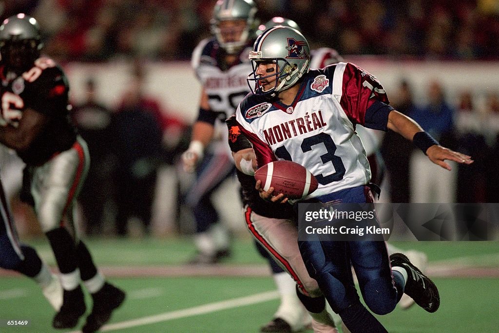
On 6/20/2023 at 6:15 PM, AFirestormToPurify said:
How come Montreal's new alternate hasn't been leaked/released yet??
 On 6/21/2023 at 2:18 PM, Jer15 said:
Here's a little something for you
Lots or red I assume. And the old logos as pants stripe?
They snuck them out yesterday.
Pretty classic football look. Not that there's anything wrong with that but I do wish the helmet striping was used instead.
-
 3
3
-
-
2 hours ago, zubazpirate said:
The plan at the outset was to build a new arena next to a then-new ice rink facility, called The Rink Training Centre. The ICE's owners actually threw down a fair bit of money to build a team facility next to what was going to be their arena, but obviously the WHL arena never materialized and they only ever used it for practices (no idea what happens to all that stuff now, that's pretty big 4 year old facility to be sitting there without a use).
Yes, the initial plan was for the Ice to go in on the new arena with the the Rink program but I believe, from some online scuttlebutt, the Ice ownership had a falling out of some kind with the Rink and the plan fell apart.
Did the Ice actually build a new facility or was it just an addition to the Rink's building? If it's the latter, maybe it could still get some use after taking down some signage and repainting?
2 hours ago, zubazpirate said:I would imagine the pandemic threw them quite a curveball. The first season's playoffs were wiped out, and then the team was off the radar for the entire second season when they played a short bubble season in Saskatchewan. In the meantime, inflation caused construction costs to skyrocket. Maybe they could cobble together money for a new arena at cost of $60 million or whatever the original figure was going to be, but not at, say, $85 million. Clearly circumstances changed significantly between 2019 and 2022.
Obviously circumstances changed, but I don't think the ownership were ever at a point where they would be impacted by construction costs or costs exceeding the original figure because they had nothing about an arena. They didn't even have a site. I don't even know if they had any plans past the Rink partnership and once that didn't materialize, nothing happened.
You can point to the pandemic or rising construction costs and it could have bought them some more leniency if they had shovels in the ground or even a solid plan but they had absolutely nothing to show. They were allowed to be moved under the condition there would be an arena built and they had nothing.
-
I'm whelmed by the Pirates set.
I visited Pittsburgh last fall and really enjoyed it so I was looking forward to seeing what they could come up with.
-
1
-
-
4 hours ago, AFirestormToPurify said:
How come Montreal's new alternate hasn't been leaked/released yet??
The initial thing posted here from their promotional schedule made it sound like the jerseys won't be unveiled until the day of the first game they're wearing them.
-
 1
1
-
-
1 hour ago, zubazpirate said:
If a smaller, let's say, 5,000 seat arena had already existed in Winnipeg the ICE could have made a go of it. The interest and fan support was there. But it's understandable that no one wanted to lay out the better part of a hundred million dollars to build them a new arena, that part was hard to swallow.
That's the issue. Nobody wanted to do it. Not even the ownership who was allowed to move under the condition that they get an arena built. If there was less competition, maybe there would have been more appetite to build an arena.
It was going to be a problem when the ICE (I am so glad all the Dub teams are now back to the correct number of 0 all-capitalized team names) moved to Winnipeg and not being owned by True North. That's why the Ice move out of Edmonton to Cranbrook in the first place, because they were being squeezed out by the Oilers.
1 hour ago, zubazpirate said:So what's the deal with the Wenatchee Wild's identity? Do they just carry everything forward from the BCHL to the WHL? Or is a new look likely?
That's what the plan appears to be. I personally hope they take a look at updating the logo because it's not great.

-
The namebar and the inconsistent number application really degrade what is an otherwise alright set.
-
2
-
-
So the Ice finally got moved. Not surprised.
-
And it doesn't look nearly as much like a scrimmage anymore when these two play.
-
12
-
-
6 hours ago, WSU151 said:
This was the Als' jersey in 2000, which seems like what Buffalo was trying to emulate in 2002.
I think ESPN personalities were joking about how the Bilks looked like Montreal in preseason 2002…for some reason I remember Chris Berman saying something about the similarity.
I don't think I see the Bills in those. Those jerseys to me always stuck out to me as the CFL's answer to the Patriots, but looking it up now, these Als jerseys and the Pats jerseys came out in the same year.
-
1
-
-
13 hours ago, Brave-Bird 08 said:
the 2002 Bills redesign had some major CFL feel to it, not sure why. 12 year old me thought they were awesome...
...he was wrong
Here's the thing, and you're not the only person to kind of make this comment here, these Bills jerseys predate the CFL look by three years. Reebok didn't take over the CFL and do their thing until 2005. So if anything, the CFL redesign had some major Bills feeling to it.
2002
2005
27 minutes ago, Lights Out said:The execution was just off because it was 2002 and everything needed to have side panels.
I think it was just what Reebok was doing at the time. They did the Bills and then did the entire CFL a few years later.
-
2
-
-
6 hours ago, dont care said:
Initially atleast on retail jerseys they were putting the cup patch on the right side (players left) regardless of if an ad was their or not.
I'm wondering if that was just some retail workers putting on the patches in the store for display once they got them and thinking to keep the location consistent.
-
3 hours ago, Old School Fool said:
They look like the Bills to me.
-
 3
3
-
-
2 hours ago, BBTV said:
Did he say "we want to make sure we explore all options before ... we consider whether to relocate"?
Haven't they been doing that for the past 10 years? What option hasn't been explored?
https://en.wikipedia.org/wiki/List_of_municipalities_in_Arizona
*Bettman sorts by population*
-
5
-
-
-
39 minutes ago, WSU151 said:
Weird that Fanatics didn't want to include one blue stripe (or possible two stripes) for the Leafs:
I wonder if that's a style guide thing or a stylistic choice from Fanatics because of the Leafs logos. The logos don't have an outline so regardless of which logo/stripes combo they went with, the stripe would look like it connects into the logo.
-
3
-
-
What I think is kind of a neat part with the draft hats is a patch on the side with an alternate logo (or the primary again if no alternate logo) and the arena's coordinates on it.
This would also confirm that the Ducks aren't changing for this upcoming season? Not that I ever believed they would.
-
2
-
-
Really cool website but FWIW, the Stampeders logos are wrong. Despite what graphics are out on the internet, even on the mothership, I don't know how often the Stampeders have actually used the primary logo on the helmets and jerseys, if at all. They've had like a Yankees thing going on where the logo on the uniforms is different than the primary, instead essentially using SMU's versions of the horse. Every other application, including the retail versions of the jerseys, uses the primary.
The most notable differences being the tail and the mane.
-
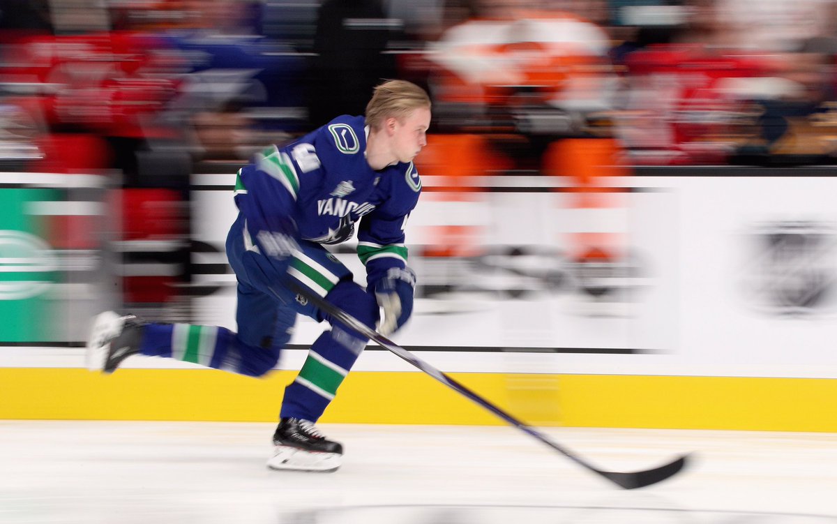
3 hours ago, AFirestormToPurify said:
Now that you mention it... lmao
But you're right. The back leg should be extended instead. It doesn't even look like he's skating. It's like they hired a designer who had never seen anyone skate before or seen a hockey game. Even the way he's holding his hockey stick looks wrong
Can a photoshop expert give it a try? I'm sure it would look a thousand times better and less silly
I've always liked the idea of the logo but not necessarily the logo itself. Good idea, bad execution. Now I know why!
Johnny's just in a later stride position than your picture. He's in the process of bringing his left foot forward and starting to stride with his right as opposed to your picture who is just at the end of his left foot stride. A couple frames later and the pictures would look more similar. Yeah, it's exaggerated and cartoon because it is an update of a drawing from like the 1940s but I never thought it looks like he wasn't skating correctly.
My issue has always been the head angle.
-
12
-
-
9 hours ago, YELDARBfield said:
It's better described as a mesh material with fine holes, which lays flat easier while building up the ice.
I knew tarp wasn't the right word, I just didn't know how else to describe it.
-
I would have to assume Vegas' is not painted.
-
37 minutes ago, WSU151 said:
Devils posted this on IG, apparently the center ice logo isn’t painted onto the floor, it’s more of a vinyl wrap maybe? edit: Maybe that wrap being washed has nothing to do with center ice (the “outer” circle in the video is black, but the center ice circle is blue for games).
Always thought crews painted everything.
https://www.instagram.com/reel/CsrBgDoPWab/?igshid=MTc4MmM1YmI2Ng==
I think it depends. Some are painted, some are the tarp things (which is typically what the ice ads are). I know the Ducks and Flames paint theirs.
-
1
-
-
36 minutes ago, Ted Cunningham said:
I think I said this in the 2022 college thread at one point, but two major things throw me off about this helmet:
- The non-shell vent cutouts look AWFUL on any helmet that isn't black (or maybe navy). They aren't holes in the shell; there's plastic in them! Why can't that plastic be colored the same as the shell? (Hint: It's got to be because Riddell is first a company trying to sell its product, and those vents are distinctive. Anything to make them stand out arguably helps their brand.)
-
The top bar(s) of the facemask being missing looks weird. Facemasks have had those since well before I was born, so I'm used to seeing them there. All of the sudden, there isn't one on this model. And that looks weird. Not to mention that, combined with the shape of the visor itself, makes this look like a motorcycle helmet.
- A subpoint to this is also that the facemask fastens on the sides behind (or inside?) the shell instead of on top. When I first saw these, I thought "Well, it will kind of be like 50s/60s helmets where the facemask only connected on the sides and didn't go around the top." But even then, the facemask fastened on the outside of the helmet. So there was simply more facemask to see. As a result, there was more contrast between shell and facemask. Now, the facemask is reduced to almost being an extension of the visor, in some ways, at least from a shape and real estate standpoint.
- A second subpoint about the facemask: black on black helmets, like the Steelers, look way less weird, especially from far away because it's harder to see the details, especially at any distance. However, lighter combinations (especially with dark visors like Elliot's) or higher-contrast combinations (especially if the facemask is darker than the shell) look weird, or at least very different than what I'm used to.
Summing up point no. 2 as a tl;dr: With the Axiom, the facemask is part of the helmet instead of being something that is affixed onto the helmet, and it's jarring to see a football helmet that departs from what has been a fairly linear evolution of helmet styles. (Not to mention it looks more like a motorcycle helmet now.)
A couple of the Stampeders have been wearing them since last season and I also think it looks so weird.
-
7 hours ago, Bmac said:
Holy
 can we PLEASE not have the Canucks discussion again?
We need like a CCSLC rodeo clown to distract from discussions.
"Quick, quick! Look over here! Pay no attention to the Canucks! Anaheim is a different city than Los Angeles and the Angels should use Anaheim!"
I also submit what outfits the rodeo clowns should wear.
Spoiler-
1
-
 1
1
-
2
-
-
1 hour ago, bowld said:
Who originally posted this yellow road jersey talk? I need to find it and look up their previous posts to see how connected they are. As a Canucks fan I must know if this has any legs or not
Would they even be able to have a yellow away jersey with the Perds having a yellow home jersey?
40 minutes ago, Chromatic said:It’s no different really than the Patriots, Yankees, Canadiens, Giants etc.
The Patriots have a pretty defined brand and identity in the US Revolutionary War that has been consistent for their entire history.
The Yankees, Canadiens and Giants also all have letter based logos where the vagueness created their identities. The difference between these three and the Canucks is what you said,
40 minutes ago, Chromatic said:The problem is they’ve changed so many times that none of the looks have ever really established preeminence. There are some terrible logos that are considered untouchable classics because they’ve been around decades and/or are associated with championships.
Canucks is so vague where anything could be considered "Canuck" after enough time. Any of their logos could have been their NY, CH or SF, but they never stuck to anything.
-
1
-


 can we PLEASE not have th

2023-24 NHL Jersey Changes
in Sports Logo News
Posted
Do you take turns on who wears the respective Marleau and Thornton jerseys?
Edit: Or break out the Toskala's on special occasions?