


monkeypower
-
Posts
4,717 -
Joined
-
Last visited
-
Days Won
5
Posts posted by monkeypower
-
-
15 minutes ago, LMU said:
Yep, that's @Still MIGHTY in his professional sportswriting glory.
Yeah, I thought so being a listener of BASS. Shout out to the Flin Flon moose leg.
He hasn't been around here in a while, hope he's doing well. (Not in the sense that I think the reason he hasn't been around is because he's not doing well. There's two distinct thoughts there)
-
-
 3
3
-
 1
1
-
-
1 hour ago, Kevin W. said:
No they aren't. In almost 25 years, they've had three primary dark jersey designs and two primary light jersey designs, plus one alternate dark jersey design that didn't later become a primary. You forget that they had the same white jersey (on two separate templates) for almost the entirety of their first 15 years in the league.
I do see where they were coming from. The Wild haven't had matching jerseys since 2007 (with varying levels of team colour usage and balance) and have introduced a new alternate that is wildly (ha) different from the brand.
-
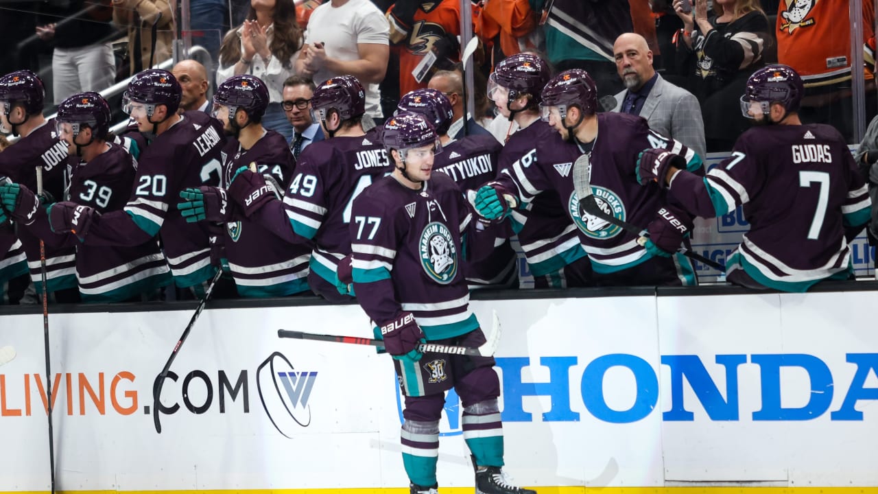
The Ducks also have some player issue (currently at least) stuff for the alternate, which is kind of cool and you can see the game pucks. Check the skate guards too.

-
1
-
 1
1
-
-
5 hours ago, Sport said:
It's a great color scheme that they should readopt full-time. My only issue with this alternate is it's close enough to the originals that it begs the question why not just wear the originals?
I think they wanted to recreate the relative success they had with the 25th anniversary jersey and again go with a larger encompassing "anniversary" jersey as opposed to just a throwback. I don't think the answer is as simple as just "money", I think they do like to make an attempt to play around with that stuff and attempt to combine eras.
-
1
-
-
-
It is kind of weird seeing the socks that way. The broadcast is also using that logo and the
plumeggplant.-
2
-
1
-
-
Also also, the Jets have played Allen, Mahomes and Hurts who have put up a combined 3 touchdowns to 8 interceptions against the defence.
-
Also, what is this Jets team?
3-3 at the bye after the Rodgers injury and only really being out of one of those losses? I'll take that.
-
1
-
-
5 minutes ago, BBTV said:
I said in this very thread that anyone picking the game should go with the Jets. They're coached very well (at least they were today), Wilson didn't let getting beaten up get to him, the Eagles don't have the depth to overcome missing 3 star players, and the Jets defense changed something after the first quarter that the Eagles just couldn't solve (the fact that their new OC is proving to be an idiot doesn't help.) Good clean win by the Jets.
The Jets defence this season has always seemed to start slow, so it's not just an Eagles thing. They've given up 119 points so far this season and only 31 of those have come in the second half whereas they have given up 44 in the first quarter alone.
-
1
-
-
8 minutes ago, habsfan1 said:
This is another good one from the black flaming C era.
The template fit wonderfully for a western canadian hockey team.
The template was fun but everything else about it sucked, minus not having the flags as shoulder patches.
I also don't see much, if any, of this jersey around Calgary so it just kind of came and went.
-
1
-
-
Ignore the question if you want but you can see some of the Ducks breaking in the 30th equipment.
-
6 hours ago, ruttep said:
That wasn't me bro lmao. I just said I didn't like the black "C." I said the jersey with black wasn't bad, but wasn't great either.
The argument you're looking to pick apart was from @monkeypower.
No, I think he was agreeing with me and was meaning to quote the post I first quoted.
-
1
-
-
10 hours ago, the admiral said:
The black C sweaters were very well-received at the time because they represented a return to relative normalcy after years of one of the worst road uniforms in the league. As time has gone by, it's easier to see the flaws, namely way too much black on the logo and elsewhere (not sure about any of this stuff about natural flows and fat guys), but they served their purpose. Black should be no more than a minimal accent color for the Flames.
Blasty, and the Flames subsequent chevron period, was introduced in 1998 and that same season was the first after the Flames bought the Hitmen and introduced new chevron jerseys for the Hitmen. I'm pretty sure I've posted this thought here before, but I wonder if it would have been a better look had the Flames adopted the jerseys they gave the Hitmen.
Just flip the black and red and change the copper to yellow with the white C on the red jerseys. (I do have a concept I threw together but I don't know if we can still post them in non-concept threads anymore. Did I remember reading that somewhere?)
It still is a chevron and keeps black as an accent, but promotes yellow to secondary.
-
12 hours ago, steve61 said:
I'd be one of the few to argue that it IS in fact a bad uniform. The bottom half looks like it's swallowing up the red portion of the jersey. The weird chevron comes up far too high, taking up way too much space and the point doesn't follow a natural flow in any meaningful way. It's like they took two completely random jerseys and stiched them together. Also the black C is terrible.
What are you talking about?
"The chevron comes up far too high, taking up way too much space"? The chevron is barely the bottom third of the jersey and the highest point doesn't seem any higher than the highest point of any basic hem striping.
"the point doesn't follow a natural flow in any meaningful way"? It's the middle of the jersey.
-
1
-
-
New Brandon Wheat Kings alternate.
I hate what they did to the brand.
-
2
-
1
-
-
1 hour ago, Brave-Bird 08 said:
Bring the look to life without overhauling it.
I feel about the Rays the same way I feel about the Astros. There's a good base with good colours but the usage and application on the jerseys is just so uninspired.
-
1 hour ago, Dilbert said:
Missed this earlier this month. The Toronto Rock
of Hamilton,will now play the full upcoming season in Hamilton at First Ontario Centre. The team was originally scheduled to start the season in Hamilton before shifting games to Mississauga for arena renovations.First Ontario Centre renovations are now being delayed and the Rock will now play all of next season in Mississauga. At this point they either need to just stay in the Toronto area or rebrand to the Ontario Rock
Oh interesting. Yeah, they need to change the name.
I wonder what the Bulldogs (OHL junior hockey) think considering they already moved for this season because of the renovations.
-
6 hours ago, henburg said:
Adidas has begun transitioning to the wordmark-less logo, this can be seen on all of their new soccer shirts as well. I guess since the contract expires after this season, they're simply opting to leave it alone.
Yeah, no point in making new jerseys for all 32 teams just to remove a wordmark if said jerseys are getting mothballed in a year. These new jerseys have the wordmarked logo to match existing ones.
-
1 hour ago, Rygi13 said:
Not sure if this has been mentioned, but I find it interesting that the Jets' and Bruins' new jerseys have the old Adidas logo (with the wordmark). All of the reverse retro unis had the new wordmarkless logo.
I don't know why it's so interesting because none of those jerseys are Reverse Retros and all regular NHL jerseys have the logo w/wordmark.
-
2
-
-
14 hours ago, pluggerplugger1 said:
I personally love the change. It's been long overdue for each team to play each opponent once each season. I do wonder how it will impact some of the smaller franchises though, like Panther City or Albany.
Would it have any impact? Some of the travel would be a bit further but they're still playing the same amount of games.
-
The Rush also have this new alternate logo, which I can't figure out the perspective of because the horns on bison aren't positioned like that.
-
1
-
-
3 hours ago, the admiral said:
Neither/nor, it's time to forget about jade and eggplant, forget about black and beige, and go with the dark green and orange that they should have gone with in 2006. I normally don't advocate for team color changes but this Ducks situation is really bad!
Just throw a third identity on the pile? That'll make no one happy.
-
7
-
-
Stampeders logo for National Day for Truth and Reconciliation that's going on the helmets.
QuoteDesigned by Jacob Alexis, Richard Running Rabbit and Siksika Health Services CEO Dr. Tyler White, the basic concept for the special logo to be worn on the Stampeders’ helmets emulates the Contemporary Plains Style Traditional Art. The symbols used are paint styles that would be used for horses on special occasions including going into battle: Lightning bolts for speed and agility, stripes for acts of valour, paint around the eye for keen vision, feathers also for valour or to represent coups and the spotted hind quarter representing creation stories and teachings.
The handprint on the chest represents a fierce, fearless horse who would knock down enemies and bring the rider home unharmed.
They are also wearing accompanying helmet numbers and helmet stripe.
-
5
-


2023-24 NHL Jersey Changes
in Sports Logo News
Posted